Subscribe to OW blog for an instantly better inbox
Oops! Something went wrong while submitting the form.
Articles and Podcasts on Customer Service, AI and Automation, Product, and more

In our Value of UX Research report, nearly 70% of participants identified analysis and synthesis as the area where AI could make the biggest impact.
At Optimal, we're all about cutting the busywork so you can spend more time on meaningful insights and action. That’s why we’ve built automated Insights, powered by AI, to instantly surface key themes from your survey responses.
No extra tools. No manual review. Just faster insights to help you make quicker, data-backed decisions.
Automated Insights are just one part of our ever-growing AI toolkit at Optimal. We're making it easier (and faster) to go from raw data to real impact, such as our AI Simplify tool to help you write better survey questions, effortlessly. Our AI assistant suggests clearer, more effective wording to help you engage participants and get higher-quality data.
Ready to level up your UX research? Log into your account to get started with these newest capabilities or sign up for a free trial to experience them for yourselves.

It’s been a long day. Scratch that - it’s been a long week! Admit it. You loved every second of it.
Twelve hour days, the mad scramble to get the prototype ready in time, the stakeholders poking their heads in occasionally, dealing with no-show participants and the excitement around the opportunity to speak to real life human beings about product or service XYZ. Your mind is exhausted but you are buzzing with ideas and processing what you just saw. You find yourself sitting in your war room with several pages of handwritten notes and with your fellow observers you start popping open individually wrapped lollies leftover from the day’s sessions. Someone starts a conversation around what their favourite flavour is and then the real fun begins. Sound familiar? Welcome to the post user testing debrief meeting.
How do you turn those scribbled notes and everything rushing through your mind into a meaningful picture of the user experience you just witnessed? And then when you have that picture, what do you do next? Pull up a bean bag, grab another handful of those lollies we feed our participants and get comfy because I’m going to share my idiot-proof, step by step guide for turning your user testing notes into something useful.
Get the ball rolling by holding a post session debrief meeting while it’s all still fresh your collective minds. This can be done as one meeting at the end of the day’s testing or you could have multiple quick debriefs in between testing sessions. Choose whichever options works best for you but keep in mind this needs to be done at least once and before everyone goes home and forgets everything. Get all observers and facilitators together in any meeting space that has a wall like surface that you can stick post its to - you can even use a window! And make sure you use real post its - the fake ones fall off!
Before you put sharpie to post it, it’s essential to agree as a group on how you will tag your observations. Tagging the observations now will make the analysis work much easier and help you to spot patterns and themes. Colour coding the post its is by far the simplest and most effective option and how you assign the colours is entirely up to you. You could have a different colour for each participant or testing session, you could have different colours to denote participant attributes that are relevant to your study eg senior staff and junior staff, or you could use different colours to denote specific testing scenarios that were used. There’s many ways you could carve this up and there’s no right or wrong way. Just choose the option that suits you and your team best because you’re the ones who have to look at it and understand it. If you only have one colour post it eg yellow, you could colour code the pen colours you use to write on the notes or include some kind of symbol to help you track them.
That pile of paper is not going to process itself! Your next job as a group is to work through the task of transposing your observations to post it notes. For now, just stick them to the wall in any old way that suits you. If you’re the organising type, you could group them by screen or testing scenario. The positioning will all change further down the process, so at this stage it’s important to just keep it simple. For issues that occur repeatedly across sessions, just write them down on their own post its- doubles will be useful to see further down the track.In addition to holding a debrief meetings, you also need to round up everything that was used to capture the testing session/s. And I mean EVERYTHING.
Handwritten notes, typed notes, video footage and any audio recordings need to be reviewed just in case something was missed. Any handwritten notes should be typed to assist you with the completion of the report. Don’t feel that you have to wait until the testing is completed before you start typing up your notes because you will find they pile up very quickly and if your handwriting is anything like mine…. Well let’s just say my short term memory is often required to pick up the slack and even that has it’s limits. Type them up in between sessions where possible and save each session as it’s own document. I’ll often use the testing questions or scenario based tasks to structure my typed notes and I find that makes it really easy to refer back to.Now that you’ve processed all the observations, it’s time to start sorting your observations to surface behavioural patterns and make sense of it all.
Affinity diagramming is a fantastic tool for making sense of user testing observations. In fact it’s just about my favourite way to make sense of any large mass of information. It’s an engaging and visual process that grows and evolves like a living creature taking on a life of its own. It also builds on the work you’ve just done which is a real plus!By now, testing is over and all of your observations should all be stuck to a wall somewhere. Get everyone together again as a group and step back and take it all in. Just let it sit with you for a moment before you dive in. Just let it breathe. Have you done that? Ok now as individuals working at the same time, start by grouping things that you think belong together. It’s important to just focus on the content of the labels and try to ignore the colour coded tagging at this stage, so if session one was blue post its don’t group all the blue ones together just because they’re all blue! If you get stuck, try grouping by topic or create two groups eg issues and wins and then chunk the information up from there.
You will find that the groups will change several times over the course of the process and that’s ok because that’s what it needs to do.While you do this, everyone else will be doing the same thing - grouping things that make sense to them. Trust me, it’s nowhere near as chaotic as it sounds! You may start working as individuals but it won’t be long before curiosity kicks in and the room is buzzing with naturally occurring conversation.Make sure you take a step back regularly and observe what everyone else is doing and don’t be afraid to ask questions and move other people’s post its around- no one owns it! No matter how silly something may seem just put it there because it can be moved again. Have a look at where your tagged observations have ended up. Are there clusters of colour? Or is it more spread out? What that means will depend largely on how you decided to tag your findings. For example if you assigned each testing session its own colour and you have groups with lot’s of different colours in them you’ll find that the same issue was experienced by multiple people.Next, start looking at each group and see if you can break them down into smaller groups and at the same time consider the overall picture for bigger groups eg can the wall be split into say three high level groups.Remember, you can still change your groups at anytime.
Once you and your team are happy with the groups, it’s time to start condensing the size of this beast. Look for doubled up findings and stack those post its on top of each other to cut the groups down- just make sure you can still see how many there were. The point of merging is to condense without losing anything so don’t remove something just because it only happened once. That one issue could be incredibly serious. Continue to evaluate and discuss as a group until you are happy. By now clear and distinct groups of your observations should have emerged and at a glance you should be able to identify the key findings from your study.
Scoring relates to how serious the issues are and how bad the consequences of not fixing them are. There are arguments for and against the use of scoring and it’s important to recognise that it is just one way to communicate your findings.I personally rarely use scoring systems. It’s not really something I think about when I’m analysing the observations. I rarely rank one problem or finding over another. Why? Because all data is good data and it all adds to the overall picture.I’ve always been a huge advocate for presenting the whole story and I will never diminish the significance of a finding by boosting another. That said, I do understand the perspective of those who place metrics around their findings. Other designers have told me they feel that it allows them to quantify the seriousness of each issue and help their client/designer/boss make decisions about what to do next.We’ve all got our own way of doing things, so I’ll leave it up to you to choose whether or not you score the issues. If you decide to score your findings there are a number of scoring systems you can use and if I had to choose one, I quite like Jakob Nielsen’s methodology for the simple way it takes into consideration multiple factors. Ultimately you should choose the one that suits your working style best.
Let’s say you did decide to score the issues. Start by writing down each key finding on it’s own post it and move to a clean wall/ window. Leave your affinity diagram where it is. Divide the new wall in half: one side for wins eg findings that indicate things that tested well and the other for issues. You don’t need to score the wins but you do need to acknowledge what went well because knowing what you’re doing well is just as important as knowing where you need to improve. As a group (wow you must be getting sick of each other! Make sure you go out for air from time to time!) score the issues based on your chosen methodology.Once you have completed this entire process you will have everything you need to write a kick ass report.
No process is perfect and there are a few potential dramas to be aware of:
In the middle of the debrief meeting, someone has an epiphany. Shouts of We should move the help button! or We should make the yellow button smaller! ring out and the meeting goes off the rails.I’m not going to point fingers and blame any particular role because we’ve all done it, but it’s important to recognise that’s not why we’re sitting here. The debrief meeting is about digesting and sharing what you and the other observers just saw. Observing and facilitating user testing is a privilege. It’s a precious thing that deserves respect and if you jump into solution mode too soon, you may miss something. Keep the conversation on track by appointing a team member to facilitate the debrief meeting.
Handwritten notes taken by multiple observers over several days of testing adds up to an enormous pile of paper. Not only is it a ridiculous waste of paper but they have to be securely stored for three months following the release of the report. It’s not pretty. Typing them up can solve that issue but it comes with it’s own set of storage related hurdles. Just like the handwritten notes, they need to be stored securely. They don’t belong on SharePoint or in the share drive or any other shared storage environment that can be accessed by people outside your observer group. User testing notes are confidential and are not light reading for anyone and everyone no matter how much they complain. Store any typed notes in a limited access storage solution that only the observers have access to and if anyone who shouldn’t be reading them asks, tell them that they are confidential and the integrity of the research must be preserved and respected.
Before the storage dramas begin, you have to actually pick through the mountain of paper. Not to mention the video footage, and the audio and you have to chase up that sneaky observer who disappeared when the clock struck 5. All of this takes up a lot of time. Another time related issue comes in the form of too much time passing in between testing sessions and debrief meetings. The best way to deal with both of these issues is to be super organised and hold multiple smaller debriefs in between sessions where possible. As a group, work out your time commitments before testing begins and have a clear plan in place for when you will meet. This will prevent everything piling up and overwhelming you at the end.
At the end of that long day/week we’re all tired and discussions around scoring the issues can get a little heated. One person’s showstopper may be another person’s mild issue. Many of the ranking systems use words as well as numbers to measure the level of severity and it’s easy to get caught up in the meaning of the words and ultimately get sidetracked from the task at hand. Be proactive and as a group set ground rules upfront for all discussions. Determine how long you’ll spend discussing an issue and what you will do in the event that agreement cannot be reached. People want to feel heard and they want to feel like their contributions are valued. Given that we are talking about an iterative process, sometimes it’s best just to write everything down to keep people happy and merge and cull the list in the next iteration. By then they’ve likely had time to reevaluate their own thinking.
We all have our own ways of making sense of our user testing observations and there really is no right or wrong way to go about it. The one thing I would like to reiterate is the importance of collaboration and teamwork. You cannot do this alone, so please don’t try. If you’re a UX team of one, you probably already have a trusted person that you bounce ideas off. They would be a fantastic person to do this with. How do you approach this process? What sort of challenges have you faced? Let me know in the comments below.
"Dear UX Agony Aunt I'm a recent graduate, and I'm interested in becoming a UI/UX designer/developer. The problem is, I don't really know where to start! Is it too much to hope for that out there in the industry, somewhere, is a pro who would be willing to mentor me? Any tips, advice, or leads?" — Nishita
Dear Nishita, Congrats on your recent graduation! I think it’s wonderful that you’ve found what that you’re interested in — and even better that it’s UX! Girl, I bet you don't know where to start! I've been there, let me tell you. One thing I know for sure: UX is a multifaceted industry that defies strict definitions and constantly evolves. But there are plenty of ways in, and you'll have no trouble if you foster these three things: empathy, drive, and an open mind. I now humbly present 5 of my best tips for starting your career with a bang. After you read these, explore the resources I've listed, and definitely head on over to UX Mastery (a place that any Uxer can call home).
That's right — do these things and you'll be on your way to a dazzling career.
One of my favourite things about UX the sheer number of options available to you. It's that hot, and that in demand, that YOU get to choose which piece of it you want to bite off first. I’m an industrial designer, but the user research side of things makes me so so happy, so that's what I do. It may seem daunting, impossible, or even slightly cliche to simply "Do what you love". But armed with the three essential ingredients I mentioned above — empathy, drive, and an open mind — you actually can do anything. And you must make use of UX Mastery's UX Self Assessment Sundial. Trust me — it'll help you to clarify the skills you have and what you love.

A mentor is a wonderful thing to have no matter what stage you are at in your UX career. You might even find yourself with more than one — I personally have four! They each bring their own experiences and skills into the mix, and I bring mine too. And here's the great thing about mentoring — I also have four mentees of my own. Mentoring is two-way street, so think about what you could bring to the relationship as well. You might have a skill your mentor wants to learn, or they may have never mentored before and you'll be their guinea pig. You asked if someone out there would be willing to mentor you. Yes absolutely! UX people are some of the nicest people around (if I do say so myself!). We devote our time to improving the experience of others, and truthfully, we never stop interating ourselves (an ever-evolving project). How do you find a mentor? Oh, that’s easy: just ask. Seriously, it’s that simple. Reach out to people who inspire you — email, social media, and video calling mean you don't have to let a silly thing like the ocean be a barrier!
Connecting with other UX humans, both online and face-to-face, is essential. Why? Because people are the heart of UX. We also make excellent company, what with our creative intelligence and our wicked sense of humor (well, that's describing me and the people I know, anyway!) For online connections, get thee straight to the UX Mastery community — it's where I found my feet as a new UXer — where it's totally fine to out yourself as a newbie and ask those questions burning a hole in your pocket (or mind). For in-person connections, a quick google search should turn up UX events and meetups in your area — be brace and just go! You will have a great time, promise.
Twitter is my favourite online resource for UX articles and resources. There are just SO many potential things to read, so Twitter acts as the perfect filter. Set up a Twitter account for all your professional UX stuff (do remember that this means no tweeting about how cranky you are that your cat didn’t keep its breakfast down). Only follow the people who do the things you're interested in (so no following the Kardashians). And make an effort to not just skim read the posts and resources people share, but to absorb the content, make notes, reflect, agree or disagree, brainstorm and wrestle with the ideas, put them into practise, discuss them with people, tweet, retweet, and retweet other peoples' retweets. And whenever you stumble upon a particularly interesting or useful post, sign up for their newsletter or add them to your RSS feed.
The best advice I received when starting out was to build an online presence. At the time, I was iterating my CV and asking for feedback — the traditional "How to get a job" approach we were taught as tots.My manager told me then that it’s really not about your CV — it’s more about your LinkedIn profile, and your ability to share your thoughts with others through blogging and tweeting. CVs are still useful, but things are different now. Was he right? Damn straight he was! In addition to the professional Twitter account you’re going to set up, update your Linkedin profile and consider starting a blog (which, incidentally, is a great way to engage with the UX content you'll already be reading and tweeting about — double whammy!).
Subscribe to updates and dive into the archives of these places:
Then search for these accounts and hit 'Follow' on Twitter:
Go for it Nishita — you'll do great!

In 2009, Bob Bailey and Cari Wolfson published apaper entitled “FirstClick Usability Testing: A new methodology for predicting users’ success on tasks”. They’d analyzed 12 scenario-based user tests and concluded that the first click people make is a strong leading indicator of their ultimate success on a given task. Their results were so compelling that we got all excited and created Chalkmark, a tool especially for first click usability testing. It occurred to me recently that we’ve never revisited the original premise for ourselves in any meaningful way.
And then one day I realized that, as if by magic, we’re sitting on quite possibly the world’s biggest database of tree test results. I wondered: can we use these results to back up Bob and Cari’s findings (and thus the relevanceof Chalkmark)?Hell yes we can.So we’ve analyzed tree testing data from millions of responses in Treejack, and we're thrilled (relieved) that it confirmed the findings from the 2009 paper — convincingly.
Bob and Cari analyzed data from twelve usability studies on websites and products ‘with varying amounts and types of content, a range of subject matter complexity, and distinct user interfaces’. They found that people were about twice as likely to complete a task successfully if they got their first click right, than if they got it wrong:
If the first click was correct, the chances of getting the entire scenario correct was 87%If the first click was incorrect, the chances of eventually getting the scenario correct was only 46%
We analyzed millions of tree testing responses in our database. We've found that people who get the first click correct are almost three times as likely to complete a task successfully:
If the first click was correct, the chances of getting the entire scenario correct was 70%If the first click was incorrect, the chances of eventually getting the scenario correct was 24%
To give you another perspective on the same data, here's the inverse:
If the first click was correct, the chances of getting the entire scenario incorrect was 30%If the first click was incorrect, the chances of getting the whole scenario incorrect was 76%
Bob and Cari proved the usefulness of the methodology by linking two key metrics in scenario-based usability studies: first clicks and task success. Chalkmark doesn't measure task success — it's up to the researcher to determine as they're setting up the study what constitutes 'success', and then to interpret the results accordingly. Treejack does measure task success — and first clicks.
In a tree test, participants are asked to complete a task by clicking though a text-only version of a website hierarchy, and then clicking 'I'd find it here' when they've chosen an answer. Each task in a tree test has a pre-determined correct answer — as was the case in Bob and Cari's usability studies — and every click is recorded, so we can see participant paths in detail.
Thus, every single time a person completes an individual Treejack task, we record both their first click and whether they are successful or not. When we came to test the 'correct first click leads to task success' hypothesis, we could therefore mine data from millions of task.
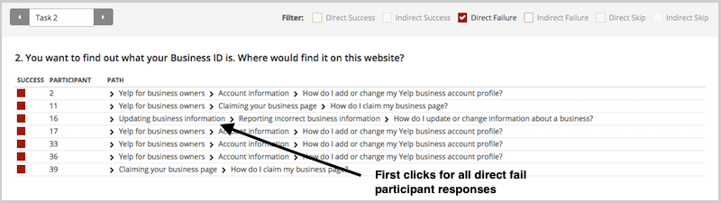
To illustrate this, have a look at the results for one task.The overall Task result, you see a score for success and directness, and a breakdown of whether each Success, Fail, or Skip was direct (they went straight to an answer), or indirect (they went back up the tree before they selected an answer):

In the pietree for the same task, you can look in more detail at how many people went the wrong way froma label (each label representing one page of your website):

In the First Click tab, you get a percentage breakdown of which label people clicked first to complete the task:

And in the Paths tab, you can view individual participant paths in detail (including first clicks), and can filter the table by direct and indirect success, fails, and skips (this table is only displaying direct success and direct fail paths):
This analysis reinforces something we already knew that firstclicks matter. It is worth your time to get that first impression right.You have plenty of options for measuring the link between first clicks and task success in your scenario-based usability tests. From simply noting where your participants go during observations, to gathering quantitative first click data via online tools, you'll win either way. And if you want to add the latter to your research, Chalkmark can give you first click data on wireframes and landing pages,and Treejack on your information architecture.
To finish, here's a few invaluable insights from other researchers ongetting the most from first click testing:

Wynyard Group is a market leader in risk management and crime fighting software used in investigations and intelligence operations by government agencies and financial crime organisations. Wynyard Group has recently joined the journey to incorporate a User Experience (UX) team into their family.
One of our first steps towards UX integration was to create a style guide that our web developers and UX designers can look to for styling, components and patterns. Our purpose was twofold: to help them create high-quality products that are visually and behaviourally consistent. And to free them up to focus on workflow, information architecture, and interaction design elements of the whole rather than the styling of individual parts.
Wynyard currently uses Confluence as an internal wiki for information, so we added a section to it called 'User Experience' which included the subsections 'User Experience Tools' and 'Style Guide'. It then occurred to us that how we group and arrange elements of our style guide might be (probably will be) completely different to our web developers. Thus, we decided to run a card sort to make sure our style guide meets the needs of the audience. And because we're always looking for a chance to test out new technologies, our journey into card sorting with OptimalSort began.
A great idea when starting up new testing projects is to go back to the basics. I’d heard of card sorts before but had never been directly involved in one. So I hit the books, and in particular, Donna Spencer’s book Card Sorting: Designing Usable Categories. After reading through this and researching a few tools we came across OptimalSort. Our developers were spread across Christchurch and Auckland, so having an online tool was definitely a requirement. Having tested it out, I found it was very quick, easy, and customisable. I was sold.
To pick our card sort participants, I went to our internal message board (Yammer) and looked at the members of our Engineering Guild — Web Guild. We had 50 members at the time, but this included a mix of marketers, UX designers, architects, front and back-end developers, and anyone else who was interested in the messages being posted up for this group. Of this I took a subset of 20 that were most likely to be involved in implementing our designs. So I recruited the people that would be taking our wireframes or prototypes and integrating them into current products or new products.
I kicked the process off by creating a card sort that I could test on colleagues to get feedback before I opened it up to our main participants. Some of the cards tested well, while others were a little confusing, and feedback was given. The bonus about this was that while they were completing the test online, I was able to stand in the room and watch, asking and answering questions around the cards.
As with most things you try for the first time, my sort wasn’t ready. One point that came out quite quickly was that I had combined some cards that were process, such as Information Architecture and User Research, and others that could be explored through workplace education (style guide importance). Therefore, I could remove these as they clouded the areas that I wanted participants to group around.
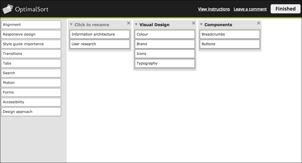
I made changes to the cards based on the feedback I received, and decided to go with a very simple approach with a limited amount of cards. This was because our participants hadn’t completed a card sort before, the card concepts may have been relatively new, and I wanted to see if we got any convergence to start off with. It was also a double check to see if I had created the correct cards. So, my first official card sort looked like this:
I published the sort, and emailed the link with an explanation out to our participants. And the results were … not what we had expected. To come up with this sort, I had ideated around base groups such as visual design, patterns, components and layout, then created cards to go under those categories. I was expecting very similar groupings and even category names to what I had come up with, but this was not quite the case.
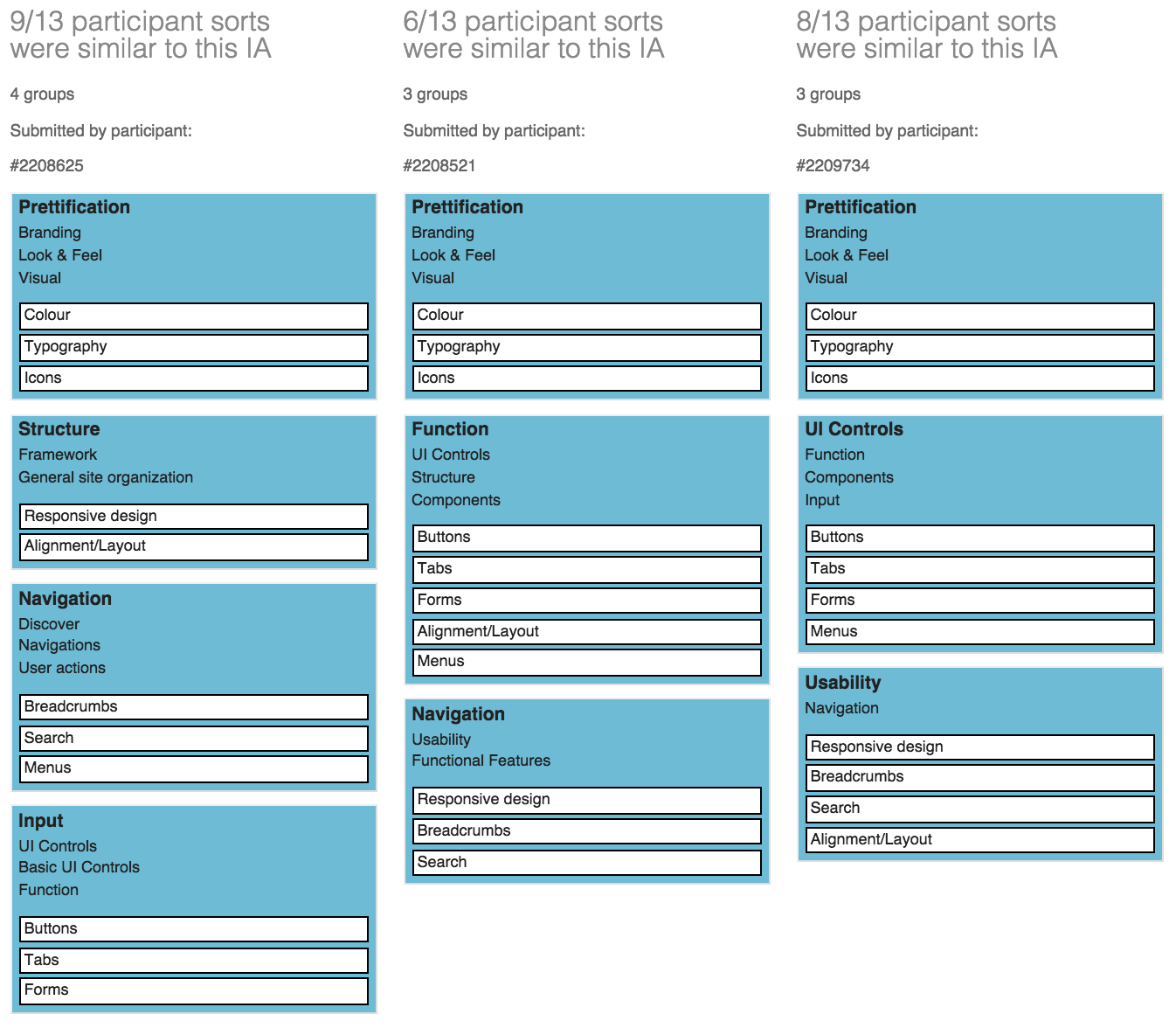
OptimalSort has some really good analysis tools that let you get into more detail behind how the participants grouped the cards. The two tools that we focused on were Participant-Centric Analysis (PCA), and the Similarity Matrix.This is the PCA, which displays common grouping among all participants, and some of the different labels.
And here's the Similarity Matrix:
Overall we had 16 responses, with 4 abandoned. We ended up including 2 of the abandoned results as they were fully complete but were not submitted. So all together that made for 12 participants from our web development team.From these we re-grouped and discussed the results. The first word to jump out was 'Prettification'.
Although this was the main grouping across participants, we decided to use 'Look & Feel' as we felt it connected more with our goals. We also didn’t want to associate visual design with the limitations of prettification, as it is much more than that. It was interesting to see that the cards tended to be grouped by overarching concepts of what the cards were used for (such as 'Navigation'), although more specific concepts such as 'Components' were used. The groupings were a cross between what we would have done in User Experience, and what the developers would call things.
Then we decided to run a closed card sort. We decided to add more cards to see if there was convergence towards the categories they had made, and whether people could group what we believed were easier (ie. Buttons) versus the more difficult (ie Search) cards.
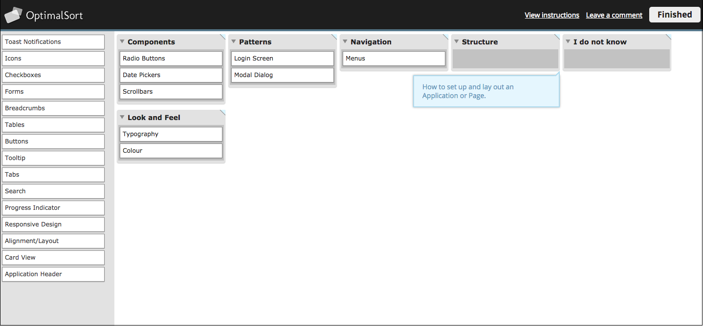
Most of the categories were taken from the results of the previous card sort, but patterns for us were also a very important concept that we wanted to include. By including definitions, we wanted to see if these group concepts were understandable:
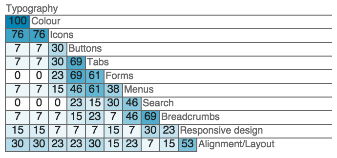
The closed sort ended up with 10 completed responses and 4 abandoned. Below is a Popular Placement Matrix. It let us see very clearly where cards had been grouped, and the level of uncertainty around each.
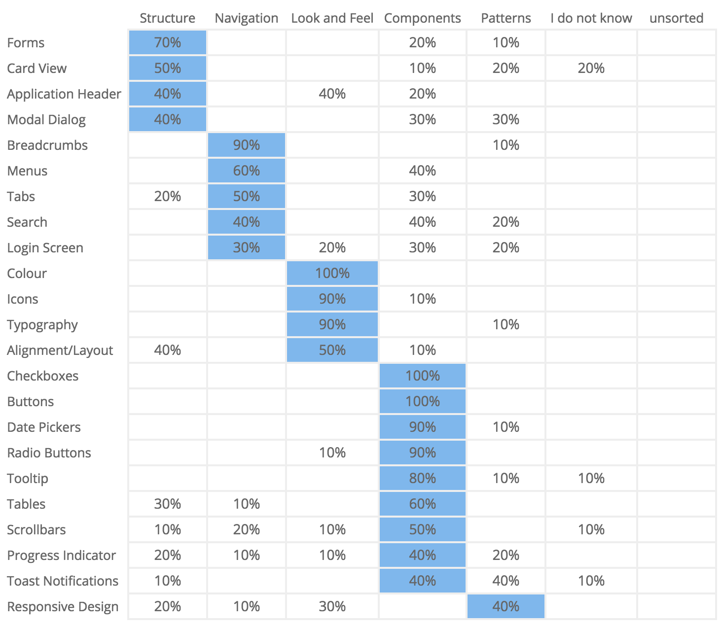
Our participants were relatively clear around what could be grouped under 'Components', such as Checkboxes (100%), and Buttons (100%). They also had high placement confidence around 'Look & Feel', such as Colour (100%), Icons and Typography (90%). The more complicated concept of Responsive Design, which we viewed as a more difficult card to sort, had a fairly even split leaning towards patterns.Some interesting points to note include that 40% thought that Search was part of 'Navigation', or 'Components', and only 20% thought it was a 'Pattern' (which is where we placed it).
The link to navigation could be because people associate search with navigation when they can’t find what they are looking for, or the information architecture has failed. It was also good to note that a majority of the cards were sorted into groups, instead of going into the 'I don’t know' category.Below is a Results Matrix which clearly shows how often cards were sorted into each category.
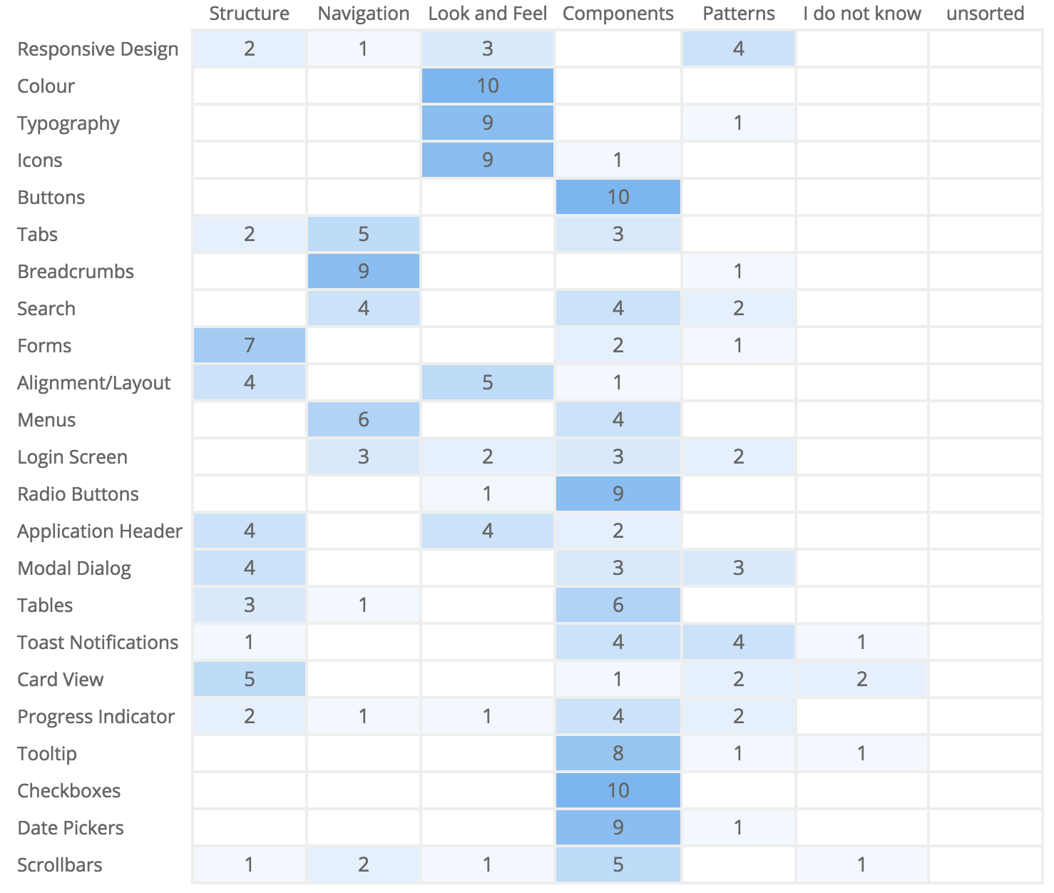
The Results Matrix also shows high confidence around the placement of components and visual elements. This gave us relatively good confidence that if we had an area called 'Visual Design - Look & Feel', and 'Components', our web developers would know what they might find within it. But we also had to acknowledge the uncertainty around some of the cards, shown by the low scores across a range of groups. We decided that 'Structure' was too complicated a concept, as some of the things that had been put under there were patterns, and there didn’t seem to be high confidence around placing cards in this category (other than forms). 'Patterns' was also not well understood, which validated the need to have workplace education and advocacy around them to raise awareness, as they were a grouping we wanted to keep.Overall we had some strong groupings, and some that would need changing or updating, and some that would involve further research and learning.
Overall the card sort was a great learning experience because it cemented the fact that our UX designers and our web developers have a crossover of terminology, but we also have differences. To get the best of both worlds, and to be able to present consistent groupings, we will have a mix from both, where some will require more description and learning than others.
Next steps when we pick up the style guide again will be to present what we have done internally to increase understanding. Then, depending on our direction, we'll run a tree test using Treejack to find out how our style guide structure is working, and if the same people can easily find what they are looking for.
Tweak, test, rinse and repeat.

“If storymapping could unearth patterns and bring together a cohesive story that engages audiences in the world of entertainment and film, why couldn’t we use a similar approach to engage our audiences?’Donna Lichaw and Lis Hubert
User Experience work makes the most sense to me in the context of storytelling. So when I saw Donna Lichaw and Lis Hubert’s presentation on storymapping at edUi recently, it resonated. A user’s path through a website can be likened to the traditional storytelling structure of crisis or conflict, exposition — and even a climax or two.
So just how can the same structure that suits fairytales help us to design a compelling experience for our customers? Well, storyboarding is an obvious example of how UX design and storytelling mesh. A traditional storyboard for a movie or TV episode lays out sequential images to help visualize what the final production will show. Similarly, we map out users' needs and journeys via wireframes, sketches, and journey maps, all the while picturing how people will actually interact with the product.
But the connection between storytelling and the user experience design process goes even deeper than that. Every time a user interacts with our website or product, we get to tell them a story. And a traditional literary storytelling structure maps fairly well to just how users interact with the digital stories we’re telling.Hence Donna and Lis’ conception of storymapping as ‘a diagram that maps out a story using a traditional narrative structure called a narrative arc.’ They concede that while ‘using stories in UX design...is nothing new’, a ‘narrative-arc diagram could also help us to rapidly assess content strengths, weaknesses, and opportunities.’
The edUi conference in Richmond, Virginia brought together an assembly of people who produce websites or web content for large institutions. I met people from libraries, universities, museums, various levels of government, and many other places. The theme of storytelling was present throughout, both explicitly and implicitly.Keynote speaker Matt Novak from Paleofuture talked about how futurists of the past tried to predict the future, and what we can learn from the stories they told. Matthew Edgar discussed what stories our failed content tell — what story does a 404 page tell? Or a page telling users they have zero search results? Two great presentations that got me thinking about storytelling in a different way.
Ultimately, it all clicked for me when I attended Donna and Lis’ presentation ‘Storymapping: A Macguyver Approach to Content Strategy’ (and yes, it was as compelling as the title suggests). They presented a case study of how they applied a traditional narrative structure to a website redesign process. The basic story structure we all learned in school usually includes a pretty standard list of elements. Donna and Lis had tweaked the definitions a bit, and applied them to the process of how users interact with web content.

Donna and Lis pointed out that in the context of doing content strategy work, the inciting incident could be the problem that kicks off a development process. I think it can also be the need that brings users to a website to begin with.
Here I think the analogy is a little looser. While a story can sometimes be well-served by a long and winding rising action, it’s best to keep this part of the process a bit more straightforward in web work. If there’s too much opportunity for wandering, users may get lost or never come back.
The crisis is what leads users to your site in the first place — a problem to solve, an answer to find, a purchase to make. And to me the climax sounds like the aha! moment that we all aspire to provide, when the user answers their question, makes a purchase, or otherwise feels satisfied from using the site. If a user never gets to this point, their story just peters out unresolved. They’re forced to either begin the entire process again on your site (now feeling frustrated, no doubt), or turn to a competitor.
A confirmation of purchase is sent, or maybe the user signs up for a newsletter.
The user goes away with a hopefully positive experience, having been able to meet their information or product needs. If we’re lucky, they spread the word to others!Check out Part 2 of Donna and Lis' three-part article on storymapping. I definitely recommend exploring their ideas in more depth, and having a go at mapping your own UX projects to the above structure.
A word about crises. The idea of a ‘crisis’ is at the heart of the narrative arc. As we know from watching films and reading novels, the main character always has a problem to overcome. So crisis and conflict show up a few times through this process.While the word ‘crisis’ carries some negative connotations (and that clearly applies to visiting a terribly designed site!), I think it can be viewed more generally when we apply the term to user experience. Did your user have a crisis that brought them to your site? What are they trying to resolve by visiting it? Their central purpose can be the crisis that gives rise to all the other parts of their story.
Mapping a user interaction along the narrative arc makes it easy to spot potential points of frustration, and also serves to keep the inciting incident or fundamental user need in the forefront of our thinking. Those points of frustration and interaction are natural fits for testing and further development.
For example, if your site has a low conversion rate, that translates to users never hitting the climactic point of their story. It might be helpful to look at their interactions from the earlier phases of their story before they get to the climax. Maybe your site doesn’t clearly establish its reason for existing (exposition), or it might be too hard for users to search and explore your content (rising action).Guiding the user through each phase of the structure described above makes it more difficult to skip an important part of how our content is found and used.
We can ask questions like:
These questions bring up great objectives for qualitative testing — sitting down with a user and asking them to show us their story.
Many sessions at edUi also touched on analytics or user testing. In crafting a new story, we can’t ignore what’s already in place — especially if some of it is appreciated by users. So before we can start storymapping the user journey, we need to analyze our site analytics, and run quantitative and qualitative user tests. This user research will give us insights into what story we’re already telling (whether it’s on purpose or not).
What’s working about the narrative, and what isn’t? Even if a project is starting from scratch on a new site, your potential visitors will bring stories of their own. It might be useful to check stats to see if users leave early on in the process, during the exposition phase. A high bounce rate might mean a page doesn't supply that expositional content in a way that's clear and engaging to encourage further interaction.Looking at analytics and user testing data can be like a movie's trial advance screening — you can establish how the audience/users actually want to experience the site's content.
Since I returned from edUi, I've been thinking about the narrative structure constantly. I find it helps me frame user interactions in a new way, and I've already spotted gaps in storytelling that can be easily filled in. My attention instantly went to the many forms on our site. What’s the Rising Action like at that point? Streamlining our forms and using friendly language can help keep the user’s story focused and moving forward toward clicking that submit button as a climax.
I’m also trying to remember that every user is the protagonist of their own story, and that what works for one narrative might not work for another. I’d like to experiment with ways to provide different kinds of exposition to different users. I think it’s possible to balance telling multiple stories on one site, but maybe it’s not the best idea to mix exposition for multiple stories on the same page.And I also wonder if we could provide cues to a user that direct them to exposition for their own inciting incident...a topic for another article perhaps.What stories are you telling your users? Do they follow a clear arc, or are there rough transitions? These are great questions to ask yourself as you design experiences and analyze existing ones. The edUi conference was a great opportunity to investigate these ideas, and I can’t wait to return next year.

Have you ever suggested doing an online card sort and been told no 'because the conversation in the room is the most valuable part of a card sort'? I have.
Repeatedly.
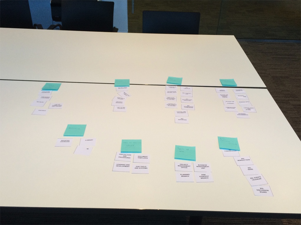
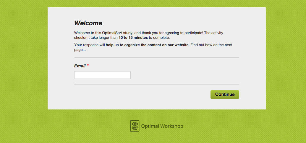
I decided it was time someone actually tested that theory. So when the opportunity came up at work, I jumped on the chance to run this experiment. My research task was to determine the information architecture (IA) for a business line’s area of the workplace intranet. I ran an A/B test with five face-to-face moderated card sorts, each with 2-3 users, and I ran twenty-five online card sorts using OptimalSort. I chose OptimalSort because I’d never used it before, and since I enjoyed using Treejack so much I thought I’d try it out. There were forty-five cards in total. I conducted both tests using only the resources available, mostly of the human variety.
In this piece, I examine the benefits and challenges of both techniques.
I love meeting users. It reminds me of why I do what I do and motivates me to continuously improve.
All five groups of 2-3 people worked well together and nobody had any reservations about sharing their thoughts. Each session was productive. I listened carefully and asked questions to help me understand why decisions were being made.
Working with paper. There’s something satisfying about moving pieces of paper around on a table and being able to cross things out and add new cards. The overall picture is so much clearer when the cards are all spread out in front of you. Users are more inclined to criticise the work at this early stage when it’s on paper and looks unresolved. It’s also inexpensive. Moderated card sorts allow you to spread all the cards out on the table in front of you and narrow it down from there.
Recruiting and organising users for the face to face card sort sessions took almost three days to complete! It was not easy trying to organise fifteen people into groups of three let alone book session times that everyone could agree upon! Even after all that, a few of the sessions still had no shows. I can forgive people their busy lives, but it’s still frustrating.
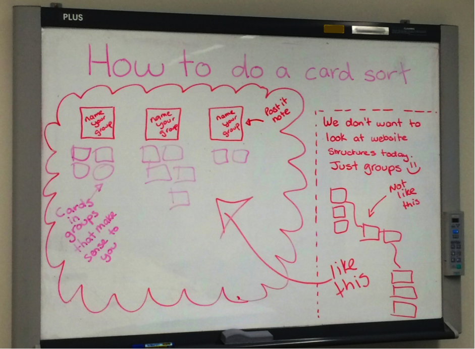
No matter how carefully and patiently I explained to the users that we were just grouping like things together, many felt the need to construct a tree structure. I chose to run this study with a flat hierarchy, for the purposes of understanding what belongs together and how users would name each high level group of information. It’s like as soon as users hear the word ‘website’ they have trouble detaching from what they know. Ultimately I solved this problem by sketching instructions on the whiteboard for each session. This gave users something visual to refer to and kept them focussed on what we all needed to achieve during the session.
I would have loved to have tried the moderated card sort the OptimalSort way with the barcode scanner, but unfortunately I just didn’t have access to one. As a result of this, I had to manually input the cards retrospectively from the moderated sorts into OptimalSort to take advantage of the amazing results graphs. That took a few hours. I know you can pick them up pretty cheap, so I’ll be prepared for next time.
This study received really positive comments from users that showed that they liked the activity were well and truly on board with the coming changes. Presenting positive feedback to executive staff is pretty powerful.
— 'This was an interesting exercise, thanks! I'm glad I got to do this individually via the online approach, rather than having to discuss it in a group: I much prefer solo activities to group ones, as it usually takes less time.'— 'Logical grouping is extremely important in finding information. I'm pleased you are looking at this.'
While it is entertaining to refresh the browser every five seconds to see if it has changed, OptimalSort really does take care of itself. The provided instructions are very useful and I did not receive a single phone call or email asking for help. This gave me time to start putting together the report and work on other projects, which saved both time and money.
You really can’t go past the beautiful yet useful way OptimalSort presents the results. These are charts that carry serious thud value when presented to management or executives because they back up your findings with actual numbers. The charts also make it incredibly easy to interpret the results and start iterating the next phase of the design. My personal favourite is the PCA (Participant-Centric Analysis) tab on the results dashboard. It provides advice on what you could do next when building your IA.
Basically, if OptimalSort had to pick a winning user submission, the first one would be it. It makes taking the next step in the design process that much easier.
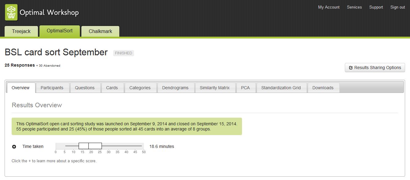
This study closed after one week with twenty-five completed responses and thirty abandoned responses. This is quite high; however I honestly don’t believe the tool itself to be the culprit. Of the thirty abandoned responses received, twenty-one of those participants ended the activity having sorted less than 5% of the cards. Of that number, twelve participants ended the task not having sorted any cards at all. This tells me that they may have been overwhelmed by the size of the task and felt unable to complete it, especially since they were at work after all and had competing priorities. Drawing on this experience, next time I will keep the survey short and sweet to avoid overwhelming the user.
I have a rule around online testing activities. All recorded responses are anonymous — even from me. I do this because I want users to feel comfortable and be willing to participate in future testing activities. I also feel that it preserves the integrity of the results and doesn’t allow for assumptions to come into play. Because of this, I don’t know who responded with what and I can’t ask questions if I’m not clear on something. Had I included some targeted post survey questions, this issue would have been avoided.
I always try to use softer colours to avoid scaring people on the opening screen, but you have to be careful with this one. The background colour is [Ed: was!] also the colour of the submit button on the card sorting screen and it appears against a black background. Choosing a colour that looks nice on your opening screen will not do you any favours when that same colour appears on the submit button and does not contrast well against the black background. Beyond the obvious accessibility issue, you also risk committing the crime of playing ‘Where’s Wally?’ with the user when they can’t find the button!This challenge does however have a happy ending. I mentioned this issue to Optimal Workshop and they fixed it! How awesome is that?!
They complemented each other! Despite the differences in delivery methods, both sets of card sort results told a similar story and each enriched the overall picture. There were no show-stopping differences or contradictions between the two. The themes of comments left in the online version also matched those overheard during the conversations in the moderated sorts.
— 'I was unsure what a couple of these actually meant; I would rename them to make their meaning explicit.' Comment left by a user from the online card sort— 'There’s too much jargon! Make it real and use language that people understand.' Comment made by a user during a moderated card sort
The biggest finding overall was that the user was grouping content by keywords and task related subjects. Not entirely groundbreaking information on its own, however it does break the current model which groups content by organisational structure and product owner. This study indicated that the users don’t see the organisational structure; they just want to solve a problem or find information without having to think about where it lives or who owns it. This research is valuable because we can now back up our design decisions with evidence. We can use this information to construct an IA that will actually work. It has also provided insights into user workflows and their understanding of the organisation as a whole.So, there you have it: mystery solved! But which card sorting activity wins?
Conduct a moderated card sort the OptimalSort way! This study has shown that on their own, moderated card sorts and online card sorts are both valuable in their own way. When combined, they join forces to create a powerful hybrid and it’s really easy to do. You still type your card labels into OptimalSort, but the difference is you print them out and each card has a barcode on it. The next step is to run your moderated card sort as you normally would. Then using a common barcode scanner, you would scan the cards back into OptimalSort and reap all the benefits of the result graphs and analysis tools. This approach gives you the qualitative face time with your users and the quantitative results to back up your thinking.
I really enjoyed running this experiment and I’m huge fan of A/B testing. I would love to hear your thoughts, and look forward to sharing my next discovery with you.
