From Exposition to Resolution: Looking at User Experience as a Narrative Arc
“If storymapping could unearth patterns and bring together a cohesive story that engages audiences in the world of entertainment and film, why couldn’t we use a similar approach to engage our audiences?’Donna Lichaw and Lis Hubert
User Experience work makes the most sense to me in the context of storytelling. So when I saw Donna Lichaw and Lis Hubert’s presentation on storymapping at edUi recently, it resonated. A user’s path through a website can be likened to the traditional storytelling structure of crisis or conflict, exposition — and even a climax or two.
The narrative arc and the user experience
So just how can the same structure that suits fairytales help us to design a compelling experience for our customers? Well, storyboarding is an obvious example of how UX design and storytelling mesh. A traditional storyboard for a movie or TV episode lays out sequential images to help visualize what the final production will show. Similarly, we map out users' needs and journeys via wireframes, sketches, and journey maps, all the while picturing how people will actually interact with the product.
But the connection between storytelling and the user experience design process goes even deeper than that. Every time a user interacts with our website or product, we get to tell them a story. And a traditional literary storytelling structure maps fairly well to just how users interact with the digital stories we’re telling.Hence Donna and Lis’ conception of storymapping as ‘a diagram that maps out a story using a traditional narrative structure called a narrative arc.’ They concede that while ‘using stories in UX design...is nothing new’, a ‘narrative-arc diagram could also help us to rapidly assess content strengths, weaknesses, and opportunities.’
Storytelling was a common theme at edUI
The edUi conference in Richmond, Virginia brought together an assembly of people who produce websites or web content for large institutions. I met people from libraries, universities, museums, various levels of government, and many other places. The theme of storytelling was present throughout, both explicitly and implicitly.Keynote speaker Matt Novak from Paleofuture talked about how futurists of the past tried to predict the future, and what we can learn from the stories they told. Matthew Edgar discussed what stories our failed content tell — what story does a 404 page tell? Or a page telling users they have zero search results? Two great presentations that got me thinking about storytelling in a different way.
Ultimately, it all clicked for me when I attended Donna and Lis’ presentation ‘Storymapping: A Macguyver Approach to Content Strategy’ (and yes, it was as compelling as the title suggests). They presented a case study of how they applied a traditional narrative structure to a website redesign process. The basic story structure we all learned in school usually includes a pretty standard list of elements. Donna and Lis had tweaked the definitions a bit, and applied them to the process of how users interact with web content.
Points on the Narrative Arc (from their presentation)
Exposition — provides crucial background information and often ends with ‘inciting incident’ kicking off the rest of the story
Donna and Lis pointed out that in the context of doing content strategy work, the inciting incident could be the problem that kicks off a development process. I think it can also be the need that brings users to a website to begin with.
Rising Action — Building toward the climax, users explore a website using different approaches
Here I think the analogy is a little looser. While a story can sometimes be well-served by a long and winding rising action, it’s best to keep this part of the process a bit more straightforward in web work. If there’s too much opportunity for wandering, users may get lost or never come back.
Crisis / Climax — The turning point in a story, and then when the conflict comes to a peak
The crisis is what leads users to your site in the first place — a problem to solve, an answer to find, a purchase to make. And to me the climax sounds like the aha! moment that we all aspire to provide, when the user answers their question, makes a purchase, or otherwise feels satisfied from using the site. If a user never gets to this point, their story just peters out unresolved. They’re forced to either begin the entire process again on your site (now feeling frustrated, no doubt), or turn to a competitor.
Falling Action — The story or user interaction starts to wind down and loose ends are tied up
A confirmation of purchase is sent, or maybe the user signs up for a newsletter.
Denouement / Resolution — The end of the story, the main conflict is resolved
The user goes away with a hopefully positive experience, having been able to meet their information or product needs. If we’re lucky, they spread the word to others!Check out Part 2 of Donna and Lis' three-part article on storymapping. I definitely recommend exploring their ideas in more depth, and having a go at mapping your own UX projects to the above structure.
A word about crises. The idea of a ‘crisis’ is at the heart of the narrative arc. As we know from watching films and reading novels, the main character always has a problem to overcome. So crisis and conflict show up a few times through this process.While the word ‘crisis’ carries some negative connotations (and that clearly applies to visiting a terribly designed site!), I think it can be viewed more generally when we apply the term to user experience. Did your user have a crisis that brought them to your site? What are they trying to resolve by visiting it? Their central purpose can be the crisis that gives rise to all the other parts of their story.
Why storymapping to a narrative arc is good for your design
Mapping a user interaction along the narrative arc makes it easy to spot potential points of frustration, and also serves to keep the inciting incident or fundamental user need in the forefront of our thinking. Those points of frustration and interaction are natural fits for testing and further development.
For example, if your site has a low conversion rate, that translates to users never hitting the climactic point of their story. It might be helpful to look at their interactions from the earlier phases of their story before they get to the climax. Maybe your site doesn’t clearly establish its reason for existing (exposition), or it might be too hard for users to search and explore your content (rising action).Guiding the user through each phase of the structure described above makes it more difficult to skip an important part of how our content is found and used.
We can ask questions like:
How does each user task fit into a narrative structure?
Are we dumping them into the climax without any context?
Does the site lack a resolution or falling action?
How would it feel to be a user in those situations?
These questions bring up great objectives for qualitative testing — sitting down with a user and asking them to show us their story.
What to do before mapping to narrative arc
Many sessions at edUi also touched on analytics or user testing. In crafting a new story, we can’t ignore what’s already in place — especially if some of it is appreciated by users. So before we can start storymapping the user journey, we need to analyze our site analytics, and run quantitative and qualitative user tests. This user research will give us insights into what story we’re already telling (whether it’s on purpose or not).
What’s working about the narrative, and what isn’t? Even if a project is starting from scratch on a new site, your potential visitors will bring stories of their own. It might be useful to check stats to see if users leave early on in the process, during the exposition phase. A high bounce rate might mean a page doesn't supply that expositional content in a way that's clear and engaging to encourage further interaction.Looking at analytics and user testing data can be like a movie's trial advance screening — you can establish how the audience/users actually want to experience the site's content.
How mapping to the narrative arc is playing out in my UX practice
Since I returned from edUi, I've been thinking about the narrative structure constantly. I find it helps me frame user interactions in a new way, and I've already spotted gaps in storytelling that can be easily filled in. My attention instantly went to the many forms on our site. What’s the Rising Action like at that point? Streamlining our forms and using friendly language can help keep the user’s story focused and moving forward toward clicking that submit button as a climax.
I’m also trying to remember that every user is the protagonist of their own story, and that what works for one narrative might not work for another. I’d like to experiment with ways to provide different kinds of exposition to different users. I think it’s possible to balance telling multiple stories on one site, but maybe it’s not the best idea to mix exposition for multiple stories on the same page.And I also wonder if we could provide cues to a user that direct them to exposition for their own inciting incident...a topic for another article perhaps.What stories are you telling your users? Do they follow a clear arc, or are there rough transitions? These are great questions to ask yourself as you design experiences and analyze existing ones. The edUi conference was a great opportunity to investigate these ideas, and I can’t wait to return next year.
Improved organization, privacy controls, and more with new Workspaces 🚀
One of our key priorities in 2024 is making Optimal Workshop easier for large organizations to manage teams and collaborate more effectively on delivering optimal digital experiences. Workspaces is going live this week, which replaces teams, and introduces projects and folders for improved organization and privacy controls. Our latest release lays the foundations to provide more control over managing users, licenses, and user roles in the app in the near future.
More control with project privacy 🔒
Private projects allow greater flexibility on who can see what in your workspace, with the ability to make projects public or private and manage who can access a project. Find out more about how to set up private projects in this help article.
What changes for Enterprise customers? 😅
The teams you have set up today will remain the same; they are renamed workspaces.
Studies will be moved to a 'Default project' within the new workspace, from here you can decide how you would like to organize your studies and access to them.
You can create new projects, move studies into them, and use the new privacy features to control who has access to studies or leave them as public access.
Optimal Workshop are here to help if you would like to review your account structure and make changes, please reach out to your Customer Success Manager.
What changes for Professional and Team customers? 😨
Customers on either a Professional or Team plan will notice the studies tab will now be called Workspace. We have introduced another layer of organization called projects, and there is a new-look sidebar on the left to create projects, folders, and studies.
What's next for Workspaces? 🔮
This new release is an essential step towards improving how we manage users, licenses, and different role types in Optimal Workshop. We hope to deliver more updates, such as the ability to move studies between workspaces, in the near future. If you have any feedback or ideas you want to share on workspaces or Optimal Workshop, please email product@optimalworkshop.com; we'd love to hear from you.
“If storymapping could unearth patterns and bring together a cohesive story that engages audiences in the world of entertainment and film, why couldn’t we use a similar approach to engage our audiences?’Donna Lichaw and Lis Hubert
User Experience work makes the most sense to me in the context of storytelling. So when I saw Donna Lichaw and Lis Hubert’s presentation on storymapping at edUi recently, it resonated. A user’s path through a website can be likened to the traditional storytelling structure of crisis or conflict, exposition — and even a climax or two.
The narrative arc and the user experience
So just how can the same structure that suits fairytales help us to design a compelling experience for our customers? Well, storyboarding is an obvious example of how UX design and storytelling mesh. A traditional storyboard for a movie or TV episode lays out sequential images to help visualize what the final production will show. Similarly, we map out users' needs and journeys via wireframes, sketches, and journey maps, all the while picturing how people will actually interact with the product.
But the connection between storytelling and the user experience design process goes even deeper than that. Every time a user interacts with our website or product, we get to tell them a story. And a traditional literary storytelling structure maps fairly well to just how users interact with the digital stories we’re telling.Hence Donna and Lis’ conception of storymapping as ‘a diagram that maps out a story using a traditional narrative structure called a narrative arc.’ They concede that while ‘using stories in UX design...is nothing new’, a ‘narrative-arc diagram could also help us to rapidly assess content strengths, weaknesses, and opportunities.’
Storytelling was a common theme at edUI
The edUi conference in Richmond, Virginia brought together an assembly of people who produce websites or web content for large institutions. I met people from libraries, universities, museums, various levels of government, and many other places. The theme of storytelling was present throughout, both explicitly and implicitly.Keynote speaker Matt Novak from Paleofuture talked about how futurists of the past tried to predict the future, and what we can learn from the stories they told. Matthew Edgar discussed what stories our failed content tell — what story does a 404 page tell? Or a page telling users they have zero search results? Two great presentations that got me thinking about storytelling in a different way.
Ultimately, it all clicked for me when I attended Donna and Lis’ presentation ‘Storymapping: A Macguyver Approach to Content Strategy’ (and yes, it was as compelling as the title suggests). They presented a case study of how they applied a traditional narrative structure to a website redesign process. The basic story structure we all learned in school usually includes a pretty standard list of elements. Donna and Lis had tweaked the definitions a bit, and applied them to the process of how users interact with web content.
Points on the Narrative Arc (from their presentation)
Exposition — provides crucial background information and often ends with ‘inciting incident’ kicking off the rest of the story
Donna and Lis pointed out that in the context of doing content strategy work, the inciting incident could be the problem that kicks off a development process. I think it can also be the need that brings users to a website to begin with.
Rising Action — Building toward the climax, users explore a website using different approaches
Here I think the analogy is a little looser. While a story can sometimes be well-served by a long and winding rising action, it’s best to keep this part of the process a bit more straightforward in web work. If there’s too much opportunity for wandering, users may get lost or never come back.
Crisis / Climax — The turning point in a story, and then when the conflict comes to a peak
The crisis is what leads users to your site in the first place — a problem to solve, an answer to find, a purchase to make. And to me the climax sounds like the aha! moment that we all aspire to provide, when the user answers their question, makes a purchase, or otherwise feels satisfied from using the site. If a user never gets to this point, their story just peters out unresolved. They’re forced to either begin the entire process again on your site (now feeling frustrated, no doubt), or turn to a competitor.
Falling Action — The story or user interaction starts to wind down and loose ends are tied up
A confirmation of purchase is sent, or maybe the user signs up for a newsletter.
Denouement / Resolution — The end of the story, the main conflict is resolved
The user goes away with a hopefully positive experience, having been able to meet their information or product needs. If we’re lucky, they spread the word to others!Check out Part 2 of Donna and Lis' three-part article on storymapping. I definitely recommend exploring their ideas in more depth, and having a go at mapping your own UX projects to the above structure.
A word about crises. The idea of a ‘crisis’ is at the heart of the narrative arc. As we know from watching films and reading novels, the main character always has a problem to overcome. So crisis and conflict show up a few times through this process.While the word ‘crisis’ carries some negative connotations (and that clearly applies to visiting a terribly designed site!), I think it can be viewed more generally when we apply the term to user experience. Did your user have a crisis that brought them to your site? What are they trying to resolve by visiting it? Their central purpose can be the crisis that gives rise to all the other parts of their story.
Why storymapping to a narrative arc is good for your design
Mapping a user interaction along the narrative arc makes it easy to spot potential points of frustration, and also serves to keep the inciting incident or fundamental user need in the forefront of our thinking. Those points of frustration and interaction are natural fits for testing and further development.
For example, if your site has a low conversion rate, that translates to users never hitting the climactic point of their story. It might be helpful to look at their interactions from the earlier phases of their story before they get to the climax. Maybe your site doesn’t clearly establish its reason for existing (exposition), or it might be too hard for users to search and explore your content (rising action).Guiding the user through each phase of the structure described above makes it more difficult to skip an important part of how our content is found and used.
We can ask questions like:
How does each user task fit into a narrative structure?
Are we dumping them into the climax without any context?
Does the site lack a resolution or falling action?
How would it feel to be a user in those situations?
These questions bring up great objectives for qualitative testing — sitting down with a user and asking them to show us their story.
What to do before mapping to narrative arc
Many sessions at edUi also touched on analytics or user testing. In crafting a new story, we can’t ignore what’s already in place — especially if some of it is appreciated by users. So before we can start storymapping the user journey, we need to analyze our site analytics, and run quantitative and qualitative user tests. This user research will give us insights into what story we’re already telling (whether it’s on purpose or not).
What’s working about the narrative, and what isn’t? Even if a project is starting from scratch on a new site, your potential visitors will bring stories of their own. It might be useful to check stats to see if users leave early on in the process, during the exposition phase. A high bounce rate might mean a page doesn't supply that expositional content in a way that's clear and engaging to encourage further interaction.Looking at analytics and user testing data can be like a movie's trial advance screening — you can establish how the audience/users actually want to experience the site's content.
How mapping to the narrative arc is playing out in my UX practice
Since I returned from edUi, I've been thinking about the narrative structure constantly. I find it helps me frame user interactions in a new way, and I've already spotted gaps in storytelling that can be easily filled in. My attention instantly went to the many forms on our site. What’s the Rising Action like at that point? Streamlining our forms and using friendly language can help keep the user’s story focused and moving forward toward clicking that submit button as a climax.
I’m also trying to remember that every user is the protagonist of their own story, and that what works for one narrative might not work for another. I’d like to experiment with ways to provide different kinds of exposition to different users. I think it’s possible to balance telling multiple stories on one site, but maybe it’s not the best idea to mix exposition for multiple stories on the same page.And I also wonder if we could provide cues to a user that direct them to exposition for their own inciting incident...a topic for another article perhaps.What stories are you telling your users? Do they follow a clear arc, or are there rough transitions? These are great questions to ask yourself as you design experiences and analyze existing ones. The edUi conference was a great opportunity to investigate these ideas, and I can’t wait to return next year.
Today, we’re thrilled to announce the arrival of the latest member of the Optimal family: Prototype Testing! This exciting and much-requested new tool allows you to test designs early and often with users to gather fast insights, and make confident design decisions to create more intuitive and user-friendly digital experiences.
Optimal gives you tools you need to easily build a prototype to test using images and screens and creating clickable areas, or you can import a prototype from Figma and get testing. The first iteration of prototype testing is an open beta, and we’ll be working closely with our customers and community to gather feedback and ideas for further improvements in the months to come.
When to use prototype testing
Prototype testing is a great way to validate design ideas, identify usability issues, and gather feedback from users before investing too heavily in the development of products, websites, and apps. To further inform your insights, it’s a good idea to include sentiment questions or rating scales alongside your tasks.
Early in the design process: Test initial ideas and concepts to gauge user reactions and feelings about your conceptual solutions.
Iterative design phases: Continuously test and refine prototypes as you make changes and improvements to the designs.
Before major milestones: Validate designs before key project stages, such as stakeholder reviews or final approvals.
Usability Testing: Conduct summative research to assess a design's overall performance and gauge real user feedback to guide future design decisions and enhancements.
How it works 🧑🏽💻
No existing prototype? No problem. We've made it easy to create one right within Optimal. Here's how:
Import your visuals
Start by uploading a series of screenshots or images that represent your design flow. These will form the backbone of your prototype.
Create interactive elements
Once your visuals are in place, it's time to bring them to life. Use our intuitive interface to designate clickable areas on each screen. These will act as navigation points for your test participants.
Set up the flow
Connect your screens in a logical sequence, mirroring the user journey you want to test. This creates a seamless, interactive experience for your participants.
Preview and refine
Before launching your study, take a moment to walk through your prototype. Ensure all clickable areas work as intended and the flow feels natural.
The result? A fully functional prototype that looks and feels like a real digital product. Your test participants will be able to navigate through it just as they would a live website or app, providing you with authentic, actionable insights.
By empowering you to build prototypes from scratch, we're removing barriers to early-stage testing. This means you can validate ideas faster, iterate with confidence, and ultimately deliver better digital experiences.
Or…import your prototypes directly from Figma
There’s a bit of housekeeping you’ll need to do in Figma in order to provide your participants with the best testing experience and not impact loading times of the prototype. You can import a link to your Figma prototype into your study, and it will carry across all the interactions you have set up. You’ll need to make sure your Figma presentation mode is made public in order to share the file with participants. If you make any updates to your Figma file, you can sync the changes in just one click.
When you set up your study, you’ll create tasks for participants to complete.
There are two different ways to build tasks in your prototype tests. You can set a correct destination by adding a start screen and a correct destination screen. That way, you can watch how participants navigate your design to find their way to the correct destination. Another option is to set a correct pathway and evaluate how participants navigate a product, app, or website based on the pathway sequence you set. You can add as many pathways or destinations as you like.
Adding post-task questions is a great way to help gather qualitative feedback on the user's experience, capturing their thoughts, feelings, and perceptions.
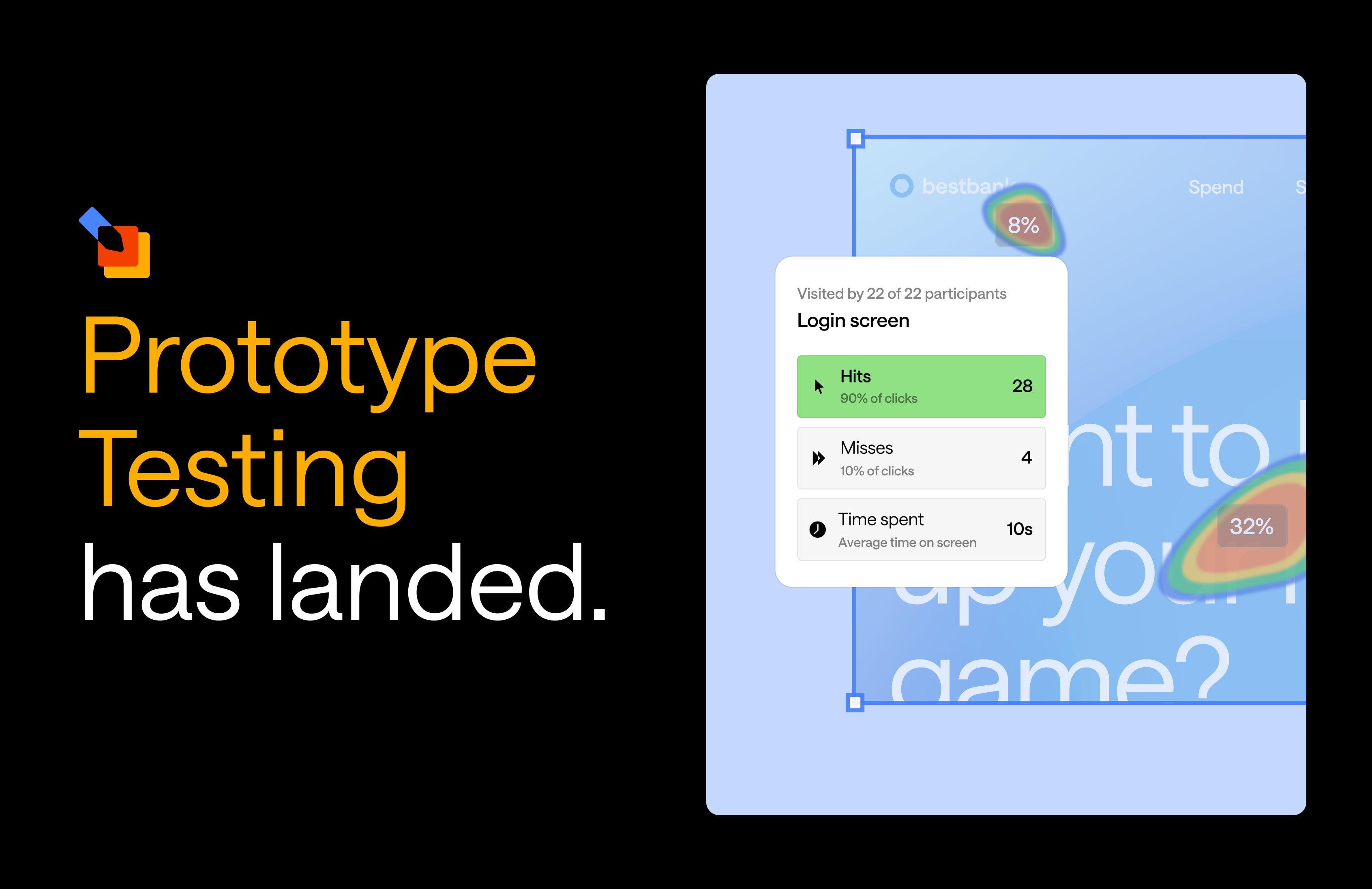
Prototype testing offers a variety of analysis options and metrics to evaluate the effectiveness and usability of your design. By using these analysis options and metrics, you can get comprehensive insights into your prototype's performance, identify areas for improvement, and make informed design decisions:
Task results
The task results provide a deep analysis at a task level, including the success score, directness score, time taken, misclicks, and the breakdown of the task's success and failure. They provide great insight into the usability of your design to achieve a task.
Success score tells you the total percentage of participants who reached the correct destination or pathway that you defined for this task. It’s a good indicator of a prototype's usability.
Directness score is the total completed results minus the ‘indirect’ results.
A path is ‘indirect’ when a participant backtracks, viewing the same page multiple times, or if they nominate the correct destination but don’t follow the correct pathway
Time taken is how long it took a participant to complete your task and can be a good indicator of how easy or difficult it was to complete.
Misclicks measure the total number of clicks made on areas of your prototype that weren’t clickable, clicks that didn’t result in a page change.
Clickmaps
Clickmaps provide an aggregate view of user interactions with prototypes, visualizing click patterns to reveal how users navigate and locate information. They display hits and misses on designated clickable areas, average task completion times, and heatmaps showing where users believed the next steps to be. Filters for first, second, and third page visits allow analysis of user behavior over time, including how they adapt when backtracking. This comprehensive data helps designers understand user navigation patterns and improve prototype usability.
Participant paths
The Paths tab in Optimal provides a powerful visualization to understand and identify common navigation patterns and potential obstacles participants encounter while completing tasks. You can include thumbnails of your screens to enhance your analysis, making it easier to pinpoint where users may face difficulties or where common paths occured.
Coming soon to prototyping 🔮
Later this year, we’re running a closed beta for video recording with prototype testing. This feature captures behaviors and insights not evident in click data alone. The browser-based recording requires no plugins, simplifying setup. Consent for recording is obtained at the start of the testing process and can be customized to align with your organization's policies. This new feature will provide deeper insights into user experience and prototype usability.
These enhancements to prototype testing offer a comprehensive toolkit for user experience analysis. By combining quantitative click data with qualitative video insights, designers and researchers can gain a more nuanced understanding of user behavior, leading to more informed decisions and improved product designs.