Subscribe to OW blog for an instantly better inbox
Oops! Something went wrong while submitting the form.
Articles and Podcasts on Customer Service, AI and Automation, Product, and more
The pace of product development has never been faster, and the cost of building on assumptions has never been higher. At Optimal, we've spent nearly two decades helping teams get closer to their users, and what we're seeing right now is a fundamental shift in how research gets done. More teams are running research than ever before and timelines to act on findings are tighter, while the expectations for what research needs to deliver keep rising.
That shift is exactly what's driving Optimal 3.0, our most ambitious reinvention of the platform yet, designed to give every team the speed, depth, and flexibility that modern research demands. Today's release is the next step in that journey.
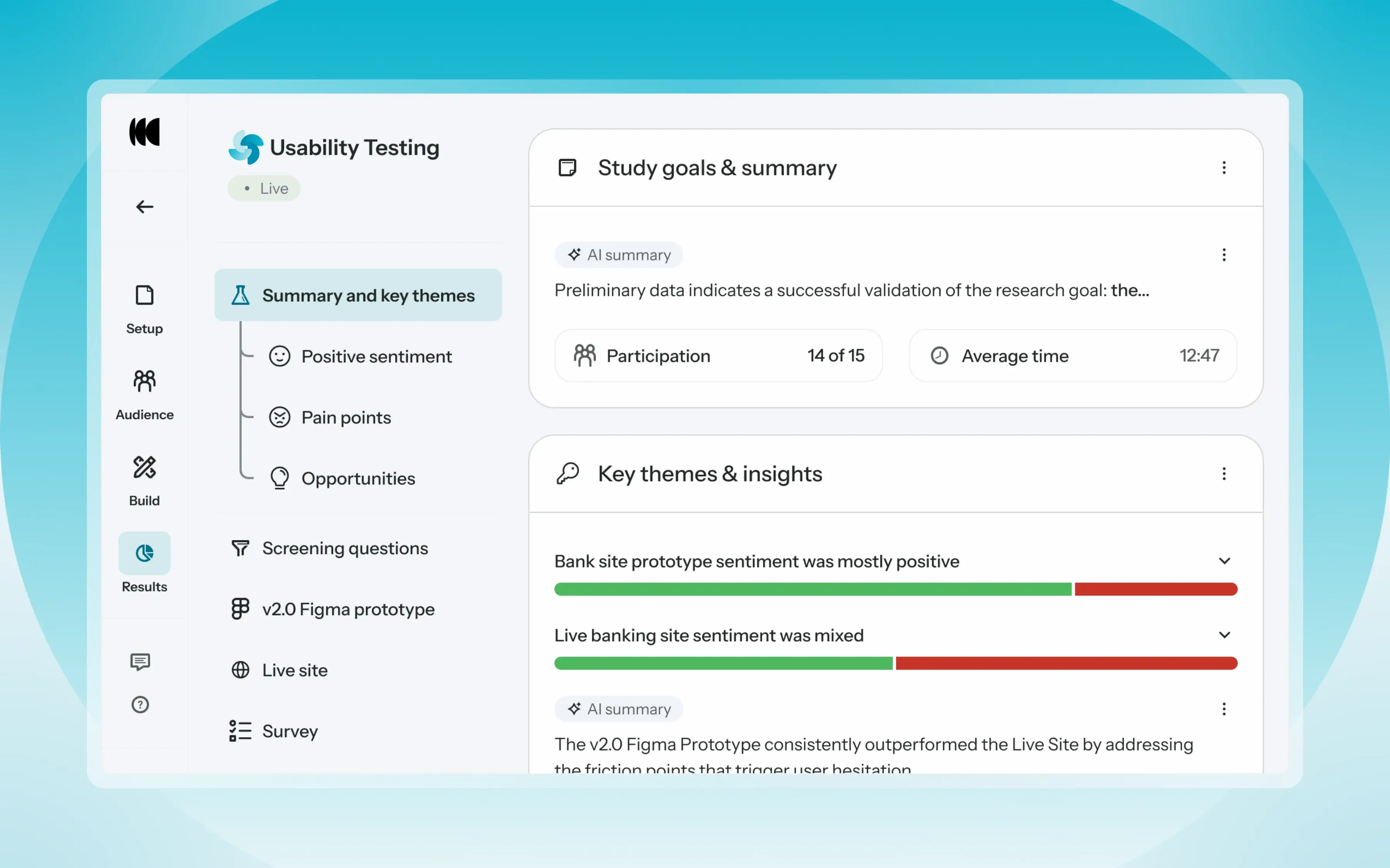
Optimal's new mixed-methods research tool tears down the boundaries between methods. It brings prototype testing, live site testing, and surveys into a single, end-to-end study workflow. And grounded in our product principles: speed to insights, access for all, and communication.
Optimal’s new Usability Testing tool marks the next step in the evolution of Optimal 3.0, giving teams the flexibility to evaluate experiences in whatever form they exist today.
Combine prototype testing, AI prototype testing, live site testing, and surveys in a single study. Test multiple prototypes side by side, compare different live URLs, or mix prototype and live site tasks together all in one workflow. Research can now mirror how products actually evolve, from early concept to shipped experience.
New speak-aloud question types, custom message blocks, auto-generated transcripts and insights, citations and highlight clips help you capture the context and reasoning behind every action. AI-assisted analysis then helps you make sense of it all fast and communicate with impact.
Review a study overview surfacing key themes, pain points, and sentiment analysis combining insights across all your study methods along with detailed results, task analysis and recordings, transcripts, key quotes, and automatically generated citations and video clips.
Coming soon: you can also use AI Chat to chat with your data directly, asking questions and pulling new insights and evidence across all your qualitative and quantitative inputs.
Modern product development is no longer linear. Teams continuously move between:
Traditional usability testing tools were not built for this fluidity. Optimal’s Usability Testing brings the flexibility to match how teams actually work today.
By combining multiple methods into a single study and pairing it with AI-powered synthesis, Usability Testing helps teams reduce setup and analysis time, recruit once, capture richer qualitative context, compare experiences more easily, move faster from feedback to action, and tell clearer, more compelling insight stories.
Learn how to get started with Usability Testing in Optimal and accelerate your path from idea to insight. Book a meeting, start exploring in your account, or join our live training webinar on June 24th to see it in action.

User research is vital to the product development process as it helps product teams understand their users' needs, behaviors, preferences, and pain points. By gathering insights from various research methods, such as user interviews, surveys, usability testing, and analytics data, product teams can make informed decisions based on evidence, rather than assumptions or personal opinions.
A UX research repository is a centralized database that stores all user research conducted by a product team, making it easily accessible and shareable across the entire team. There are many benefits to having a UX research repository, such as saving time and resources, enabling data-driven decision-making, and keeping everyone on the product team informed about user needs and preferences.
Specialized tools, like the Treejack tool, can make UX research easier, quicker, and more collaborative. In this article, we’ll discuss a bunch of tools and how they can (and should!) contribute to a centralized UX research repository.
A centralized UX research repository is a valuable asset for product teams to store and access research data related to user experience. It enables product managers and development teams to better understand their user's behavior, preferences, and expectations, which in turn enables them to make informed design and development decisions.
One of the key benefits of UX research repositories, like the Reframer tool, is that it saves time and resources. By storing user research data in one central location, teams can easily access and reuse existing research data. This saves them from having to conduct the same research repeatedly, which can be a waste of precious time and resources. Additionally, a centralized UX research repository can help teams to identify gaps in their research and prioritize areas for future research.
Another advantage of a UX research repository is that it facilitates collaboration across the entire team. With a central repository, research findings can be shared and discussed, enabling cross-functional collaboration. This promotes transparency and helps to ensure that everyone is working towards the same goals. It also helps to avoid duplication of effort, as team members can easily see what others have done, and what is still required.
Additionally, a UX research repository helps to ensure consistency in research practices. By defining research methodology, protocols, and use of prescribed specialized tools, product teams can collect data systematically and compare findings across different studies. This helps to ensure that the insights gained from user research are reliable and accurate, which in turn can be used to guide design decisions.
A UX research repository helps product managers in several ways, including supporting informed product decisions, enhancing the user experience, and providing stakeholders with evidence-based research.
One of the significant advantages of a UX research repository is that it provides product managers with a wealth of data to make informed product decisions. Through usability testing, user interviews, and first-click testing (check out the Chalkmark tool), product managers can gain insights into how users interact with their products, what they like and dislike, and how they use them. By storing all this data in a central repository, product managers can quickly access all research data, not just their own, to inform their decisions about product development and design.
Another advantage of a UX research repository is that it helps to enhance user experience. Using video clips and other multimedia, product managers can share research findings with their team members and stakeholders, making it easier to understand user needs and preferences. This helps ensure that the product design is aligned with user needs, resulting in a better user experience.
Finally, a UX research repository provides stakeholders with evidence-based research to support product decisions. By presenting research findings to stakeholders, product managers can confidently stand behind future recommendations and iterations. This evidence-based approach helps to demonstrate that decisions are grounded in data and not just intuition or opinion.
Specialized tools are essential for conducting high-quality UX research as they provide User Researchers with powerful data collection, analysis, and visualization features. These tools are particularly useful for conducting usability testing, user interviews, and surveys, as they help researchers to gather reliable and accurate data from users. Integrating these specialized tools into a UX research repository can help product teams to streamline their research process and facilitate collaboration within the team.
One such specialized tool is Treejack, which helps researchers to test the information architecture of a product or website. By using Treejack, researchers can review how users interact with navigation, site structure, and content, to ensure users can quickly and easily find the information they need. The results can then be stored in a UX research repository, allowing the team to access and analyze the data at any time.
Chalkmark is another tool that can enhance the quality of research by providing heatmaps and click-density grids of user interactions. These interactions can be tested on mockups and wireframes. Chalkmark helps researchers to identify where users are clicking and which areas are receiving the most attention, providing valuable insights for product design. By integrating Chalkmark into a UX research repository, product teams can store and access the data, making it easier to share insights and collaborate on product development.
Another useful tool is Reframer, which helps researchers to capture insights from user interviews and user testing sessions. Reframer enables researchers to record and transcribe interviews, tag key insights, and share findings with the team - acting as a functional research repository.
User interviews and usability testing are used in UX research to gather insights into user behavior, needs, and preferences. User interviews involve a one-on-one conversation between a User Researcher and a participant, where the researcher asks open-ended questions to understand the user's perspective. Usability testing, on the other hand, involves observing users as they interact with a product to identify usability issues.
Specialized tools play a crucial role in conducting user interviews and usability testing efficiently and effectively. These tools can help with data collection, organization, and analysis, making the research process more streamlined and insightful.
OptimalSort is a specialized tool that aids in conducting card sorting activities for usability testing. Card sorting involves asking users to organize concepts or items into categories to understand how they think about and categorize information. The OptimalSort tool enables researchers to conduct card sorting activities remotely and collect data on how participants group and label items. The tool also generates data visualizations and reports that can be added to the UX research repository for further analysis.
Optimal Workshop’s Reframer tool, mentioned earlier, has been designed specifically to enable researchers to capture and organize interview data in real-time. Researchers can tag and categorize interview data, making it easier to analyze and identify patterns across participants. It then stores this information in a centralized location for all research insights. Reframer also generates reports and data visualizations, making data efficient to share and analyze across teams.
A UX research repository empowers entire teams to make informed product decisions, enhance user experiences, and provide stakeholders with evidence-based research. They can also support awareness and participation in UX among senior leaders, encouraging further research.
Teams are increasingly using specialized tools like Treejack, Chalkmark, OptimalSort, and Reframer to conduct high-quality UX research as they provide powerful data collection, analysis, and visualization features. By using these tools together, product teams can streamline their research process and facilitate improved collaboration within the team.
Are you interested in the benefits of a UX research repository? Check out how Optimal Workshop’s specialized research tools can add value to not only the quality of your data, but how your team collects, analyzes, and shares the results!

In many ways, Information architecture (IA) is the backbone of a digital product or service. It is a conceptual structure for information, designed in a way that allows users to navigate and interact with it in a meaningful way. This is done by organizing, structuring, and labeling content that is intuitive for users. IA considers user needs and goals, as well as the relationships between different types of content, in order to create a user-centric design.
An effective IA design approach leads to better user experiences as it ensures that information is presented in a logical and intuitive way. Essentially, good IA attempts to reduce the chance of a clunky, frustrating user experience by organizing information in a way that makes sense for the target user.
In this article, we’ll discuss the history of information architecture and how user research impacts its effectiveness. We’ll also discuss the roles of conceptual and structural design in user experience. And along the way, we’ll introduce Optimal Workshop’s IA tools, and how they can help you design exceptional IA.
The world is full of information and humans have always had a knack for structuring and organizing it. Take libraries, for example. In ancient Egypt, workers in the Library of Alexandria created a catalog of 120 scrolls to order and describe the inventory. They needed to - estimates of the number of scrolls the library contained range between 40,000 and 400,000! Fast-forward to 1873, and Melvil Dewey came up with the Dewey Decimal System to further categorize and universalize much larger collections of books. Why come up with these solutions? To efficiently comb through, and navigate, masses of information.
As computer technology started to rise more prominently in the 1950s and 1960s, we started organizing computer programs and system designs in a way that made them easier to navigate too. In fact, IBM first mentioned the term architecture in a computational context in 1959 [ref]. When the wonderful ‘worldwide web’ was born in the 1990s, digital information began to be displayed and interacted with on a much larger scale. And, like our librarians, the world decided that online order was desperately needed. This is where the foundations of information architecture as we know it today really started to take shape.
In 1998, Peter Morville and Louis Rosenfeld wrote the book ‘Information Architecture for the World Wide Web’, which became Amazon’s best internet book that year. The authors integrated the ‘librarian’ approach to IA, where the main goal is to design a system where information is labeled for easy navigation and search. This focus on user-centric, logical design has become the backbone of user experience (UX) design today, and why Optimal Workshop’s Treejack tool, among other, exist for researching and designing great IA.
Information architecture is like the blueprint of your digital product - it’s a conceptual structure of how content is organized and arranged to create seamless interactions. But, no matter how much experience you have, or how much you trust your instincts, you will never truly get inside your end users' minds without performing user research. They will be the ones to tell you what information is relevant to them, how to structure it, and even how to label and categorize it.
There are some best practices for organizing information. Start by ordering your content from most critical to least. Think like a web page. What will immediately engage a user, and what subsequent content will keep them engaged? This exercise helps to prioritize and order content. Next, think about how your information should be grouped or categorized. Content that is grouped intuitively helps users consume and navigate information on your website or digital product. Another useful exercise is to consider how different users might access your content. Mapping user journeys (often with entirely different users in mind), challenges how you design your organizational structures in a way that meets multiple users' needs.
But, while those principles can get you started, user research is where designing modern, user-centric products really begins. In terms of information architecture and organizing content, card sorting is one of the most effective ways of designing conceptual structures. Card sorting, executed by Optimal Workshop’s OptimalSort tool, for example, involves asking people to arrange things like labels, articles, and products in a way that makes sense to them. People are different, and the benefit of this technique is that you can identify how information is most commonly organized. It also highlights potential ambiguity that you may need to address early on in the design of your IA.
The roles of conceptual and structural design in user experience are crucial in the development of effective information architecture and user experience (UX) design. Conceptual design involves the creation of a high-level, abstract representation of the overall structure of the information architecture, which helps designers to understand the content, functionality, and overall user experience. Generally, there are limited or no restrictions as to what shape the design can take. Structural design, on the other hand, involves the development of the actual information architecture, including the organization of content, navigation systems, and interaction design.
Effective conceptual and structural design can significantly improve user experience by creating a clear and consistent design language. This allows your target users to easily understand and navigate through content, leading to better engagement and satisfaction. Essentially, well-structured IA can increase the accessibility of content, making it easier for users to find the information they are looking for, regardless of their level of experience with the website or digital product.
Tools such as Optimal Workshop's Chalkmark tool can help designers to test and validate their conceptual and structural design decisions by enabling them to create and analyze user interactions with information architecture. This helps designers identify areas of the structure that are confusing or difficult to navigate, which can then be streamlined to create a more intuitive user experience.
As we discussed earlier, modern information architecture is no longer limited to physical implementation, like libraries, but instead extends to digital platforms and software applications. With the rise of the internet and mobile devices, IA has become a critical aspect of UX design. The focus has shifted from organizing information in a static, hierarchical manner to creating dynamic and interactive information environments that adapt to the needs of individual users.
One of the key changes in IA has been the shift towards a more user-centered design approach. This involves creating IA that is tailored to the needs and preferences of specific user groups, such as individuals with disabilities or users with different levels of technical expertise. This approach requires a deep understanding of user needs and behaviors, which is achieved through research and user testing. This research is increasingly done remotely and online using a suite of tools, like those provided by Optimal Workshop.
Optimal Workshop's Reframer tool, for example, allows designers to collaborate and capture user insights and translate them into design solutions. This tool helps designers to identify patterns in user behavior and preferences, enabling them to create IA that is intuitive and easy to use.
As technology continues to evolve, IA is likely to become even more integral to UX design. With the emergence of new technologies such as artificial intelligence, virtual and augmented reality, designers will need to create IA that is capable of adapting to these new interfaces and provide solid structures that lead to seamless user experiences.
Information architecture is an essential aspect of user experience design that involves organizing, structuring, and labeling digital content in a way that makes it easy for users to find and understand. Great IA leads to better user experiences by presenting information in intuitive and logical designs. This is why information architecture is crucial for website design.
The history of IA as we know it today dates back to the 1950s and evolved with the rise of the internet. Now, we think of modern IA design as being user-centric, which involves in-depth research to understand users' needs and goals. Optimal Workshop's IA tools, such as Treejack, OptimalSort, and Chalkmark, can help designers create exceptional IA by testing and validating conceptual and structural designs.
Well-structured information architecture can significantly improve the accessibility of content, which leads to better engagement and user satisfaction. This will become increasingly important as users interact with technology through new mediums, like virtual and augmented reality. So, remember to set solid foundations by investing in IA design when you start your next project!

Every month we have fun and informative “bite sized” presentations to add some inspiration to your lunch break. These virtual events allow us to partner with amazing speakers, community groups and organizations to share their insights and hot takes on a variety of topics impacting our industry.
Join us at the end of every month for Lunch n' Learn.
The post-pandemic landscape is defined by increased levels of uncertainty and disruption in both personal and professional contexts. Tech sector layoffs as well as education and health care employee burnout are just some examples of the human resource challenges we face at a time when our best, most creative selves are required to meet the challenge of larges-scale systems change. Regardless of our functional roles within orgs, conditions demand we enhance our capacity for self-leadership in ways that make us more adaptive at navigating change.
Susanna Carman joins us to lead an exploration of our very human resistance to change. Together we will be introduced to a practice that reveals the gap between our great intentions, the results we actually produce, and the potential for adaptation that is available to us when we unlock the energy bound up in this polarising tension.
Susanna Carman is a Strategic Designer and research-practitioner who helps people solve complex problems, the types of problems that have to do with services, systems and human interactions. Specializing in design, leadership and learning, Susanna brings a high value toolkit and herself as Thinking Partner to design leadership and change practitioners who are tasked with delivering sustainable solutions amidst disruptive conditions.
Susanna holds a Masters of Design Futures degree from RMIT University, and has over a decade of combined experience delivering business performance, cultural alignment and leadership development outcomes to the education, health, community development and financial services sectors. She is also the founder and host of Transition Leadership Lab, a 9-week learning lab for design, leadership and change practitioners who already have a sophisticated set of tools and mindsets, but still feel these are insufficient to meet the challenge of leading change in a rapidly transforming world.
Grab your lunch, invite your colleagues and we hope to see you at our next Lunch n' Learn

Every month we have fun and informative “bite sized” presentations to add some inspiration to your lunch break. These virtual events allow us to partner with amazing speakers, community groups and organizations to share their insights and hot takes on a variety of topics impacting our industry.
Join us at the end of every month for Lunch n' Learn.
Annotating designs with accessibility information is a powerful way to focus on accessibility in the design phase, as well as communicate your accessibility decisions to others in your team.
In this presentation, Sarah will talk about why accessibility annotations are useful, what they can be used for and how you can use popular design tools such as Figma to document accessibility requirements.
Sarah is co-founder and director at Intopia. She has been working in accessibility and inclusive design for 13 years. She has a breadth of knowledge and experience helping organisations create more inclusive digital products and services. One minute she may be talking with senior leadership about strategic accessibility programs, the next she is getting technical with designers and developers. She is also affectionately known as the walking WCAG by her team.
Sarah is an extremely passionate accessibility advocate. She is founder of A11y Bytes and A11y Camp, Australia’s largest accessibility and inclusive design events which supports the sharing of knowledge and community connection.
Grab your lunch, invite your colleagues and we hope to see you at our next Lunch n' Learn

Optimal Workshop, a leading provider of User Research and Information Architecture tools, is pleased to announce the appointment of Anne Ting to its board of directors. Ting, who is currently the Chief Design Officer at Totango, brings a wealth of expertise in design and user experience to the Optimal Workshop team.
“We’re so excited to have Anne join our board,” said Andrew Mayfield, CEO of Optimal Workshop. “We are confident that she will make a significant contribution to the company's future success and that her unique perspective will be instrumental in shaping the company's culture and values.”
Ting has over 20 years of experience in marketing, operations and design. At Totango, she is responsible for leading go-to-market, research, and user experience across web, product, and the entire customer journey. Prior to joining Totango, Ting held senior roles at several technology companies, including Unity and Wishlife, where she was responsible for operations, growth and customer success.
"I am thrilled to join the board of directors for Optimal Workshop. The company is dedicated to empowering designers and researchers around the world to create better digital experiences, and I look forward to contributing my expertise to help drive their mission forward," said Anne Ting, Chief Design Officer at Totango.
About Optimal Workshop
Optimal Workshop is a user research platform that gathers fast, actionable insights necessary for understanding user needs and making informed decisions. Our superior analysis tools, testing methods and participant recruitment options increase efficiency and empower teams to deliver customer focused solutions. Our products have created value for a diverse range of roles including UX designers and researchers, content strategists, information architects, and more. Learn more about how we can help you create better user experiences today!
If you're more of a visual person, you can watch a 20 minute talk which explains how to use the narrative arc in your in-person research.
Stories are powerful things. You don’t need me to tell you that! You’ve probably read a book, seen a play, a film or a TV series and thought: “Man*, that was brilliant! The way they drew all those threads together in that last scene. I was totally with them!”
We’ve been telling each other stories for millennia - they were the way we explained the world around us as well as the way in which we entertained ourselves.
From an early age, the logic of stories is hard-wired into our minds through repetition. This is why, two thirds of the way through a story you have a fair idea of where things are headed and can take a good guess at what is going to happen in the end.
*Except you didn't say 'Man', as you aren't as old as me.
In 1863 Freytag developed this pyramid which he used to explain what was happening in stories:

Many, many stories follow this arc; they may miss off the exposition or skip the resolution but they will have that story climax where all the threads come together.
So, the narrative arc is interesting, but how does it relate to in-person research? How does knowing the plot of Little Red Riding Hood help you become a better researcher?
In-person research can be very nerve-wracking for you and for your participants.
I’ve seen people conducting interviews who know what they want to find out get lost in futile questions having taken the wrong turn, or ‘spoiling’ an interview by revealing too much about the subject or mentioning it too soon.
Participants can also find interviews nerve-wracking. They might struggle to understand the context of questioning and may feel they have ‘done a bad job’ as they haven’t given useful answers. As apparently random questions come at them, they can feel off balance and concerned. The whole experience can start to feel like a police interview*. There’s no thread for them to follow.
*Real police interviews are not like they are shown on TV. Real police interviews are thorough, repetitive, detailed and rational. No shouting or table-tipping.
Let’s look at the steps in the narrative arc and how they apply to an in-person research situation.
Start the story by introducing the characters - yourself and who else is in attendance but also give the participant the chance to say something about themselves.
Give a little backstory or context about the research - not so much that you ‘give away the plot.’ Explain ‘why we’re here’, let the participant answer some really simple questions so that they can get some 'runs on the board' and get over any nerves.
Ask the first question that gets things moving. Usually something that lets the participant give their context. For example, “Tell me about the last time you…”
Here’s where you can ask questions that build on each other and let the participant really expand on their story. Your job is to guide them towards the story climax which is where you hit them with your most important question.
The trick in the rising action is to reduce the bias as much as you can by carefully ordering and phrasing the questions so that you don’t give away too much and so the participant can respond without feeling driven to an answer.
You've got your participant to the point where they have all of the context to answer your most important question or questions, so go ahead and ask them.
Strictly speaking in stories, you tend only to have one story climax. In your research you may have several, but not so many that the participant feels like a quote machine. The story climax is going to line up with the research objectives you set before you wrote your discussion guide. If it doesn’t, your research is not going to give you the insights you were looking for.
Now that the cat's out of the bag, your participant will understand why you asked some of the questions in the rising action. Go ahead and give them the chance to reflect. You can also tie up those loose ends, things you skated over as they might color the key response: “So earlier, when I asked you about X you said Y. Tell me about that.”
Every session ends with a final word from the participant. People like to ask the ‘what if you had a magic wand’ question, but I find it better to ask about people’s feelings towards something. Whether that’s an existing issue or a future opportunity.
It’s a fancy French term for 'ending' and all sessions must have one. This is where you thank the participant for their time, give them their incentive, encourage them to reach out if they have further thoughts. For some participants, it's important as they may have all the time in the world and need to be given the right signals that ‘we’re done, thanks’!
Use the narrative arc to help you order your thoughts when you're writing your discussion guide and when running your sessions.
If your in-person session shows clear drive in a direction - has subtle guiding story cues - even if the participant doesn’t know exactly where you are heading, they will be able to contribute meaningfully. The arc of the story that you are both telling will provide enough context for them to answer each question you ask - at the point you ask it.
Furthermore, your participant will leave your session feeling good about the experience and your organization. It’s a win-win!
