Subscribe to OW blog for an instantly better inbox
Oops! Something went wrong while submitting the form.
Articles and Podcasts on Customer Service, AI and Automation, Product, and more
The pace of product development has never been faster, and the cost of building on assumptions has never been higher. At Optimal, we've spent nearly two decades helping teams get closer to their users, and what we're seeing right now is a fundamental shift in how research gets done. More teams are running research than ever before and timelines to act on findings are tighter, while the expectations for what research needs to deliver keep rising.
That shift is exactly what's driving Optimal 3.0, our most ambitious reinvention of the platform yet, designed to give every team the speed, depth, and flexibility that modern research demands. Today's release is the next step in that journey.
Optimal's new mixed-methods research tool tears down the boundaries between methods. It brings prototype testing, live site testing, and surveys into a single, end-to-end study workflow. And grounded in our product principles: speed to insights, access for all, and communication.
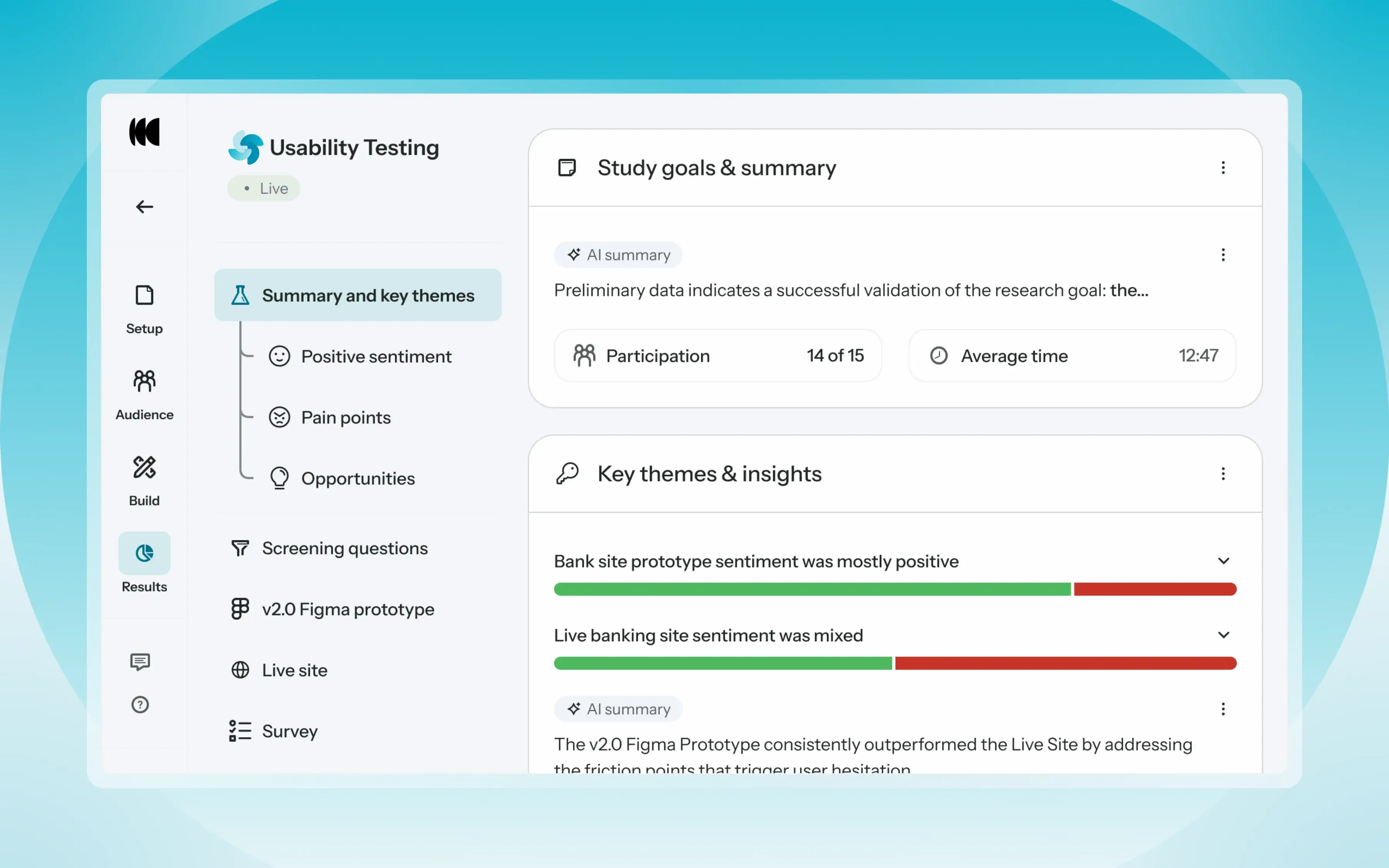
Optimal’s new Usability Testing tool marks the next step in the evolution of Optimal 3.0, giving teams the flexibility to evaluate experiences in whatever form they exist today.
Combine prototype testing, AI prototype testing, live site testing, and surveys in a single study. Test multiple prototypes side by side, compare different live URLs, or mix prototype and live site tasks together all in one workflow. Research can now mirror how products actually evolve, from early concept to shipped experience.
New speak-aloud question types, custom message blocks, auto-generated transcripts and insights, citations and highlight clips help you capture the context and reasoning behind every action. AI-assisted analysis then helps you make sense of it all fast and communicate with impact.
Review a study overview surfacing key themes, pain points, and sentiment analysis combining insights across all your study methods along with detailed results, task analysis and recordings, transcripts, key quotes, and automatically generated citations and video clips.
Coming soon: you can also use AI Chat to chat with your data directly, asking questions and pulling new insights and evidence across all your qualitative and quantitative inputs.
Modern product development is no longer linear. Teams continuously move between:
Traditional usability testing tools were not built for this fluidity. Optimal’s Usability Testing brings the flexibility to match how teams actually work today.
By combining multiple methods into a single study and pairing it with AI-powered synthesis, Usability Testing helps teams reduce setup and analysis time, recruit once, capture richer qualitative context, compare experiences more easily, move faster from feedback to action, and tell clearer, more compelling insight stories.
Learn how to get started with Usability Testing in Optimal and accelerate your path from idea to insight. Book a meeting, start exploring in your account, or join our live training webinar on June 24th to see it in action.

Every month we have fun and informative “bite sized” presentations to add some inspiration to your lunch break. These virtual events allow us to partner with amazing speakers, community groups and organizations to share their insights and hot takes on a variety of topics impacting our industry.
Join us at the end of every month for Lunch n' Learn.
Many of us choose human centred design because we see it as an opportunity to have a positive impact on people's lives through the products and services we help create. Satisfying a need in us to do something good. Sometimes those good intentions can be thwarted by the many business and technical challenges that get in the way of delivering the product or service the way we originally intended it.
What if we are able to see the normal challenges of every design project and the relationships and tensions involved, as serving us and shaping us, to be better people? This is the essence of conscious design leadership.
In this lunch and learn, find out what Conscious Design Leadership is and isn't, learn about the 'three lines of work', a key framework from regenerative design theory, and come away with some guides to practicing conscious leadership every day.
Currently in the role of Service Design Director at BNZ, Jodine also offers coaching and consulting services across a range of disciplines - UX research, service design and leadership through her business Fireside Consulting. Jodine is the cofounder of UXCONNECT, a monthly meet up online for leading designers and researchers in Aotearoa.
View Jodine's slides here

I started at Optimal Workshop as CEO over a decade ago and in that time I have seen this company grow from humble beginnings in Wellington, into a globally recognized leader in the UX tools industry, with hundreds of thousands of users from some of the world’s most recognized brands. I am proud to have built an organization that is primed for the future. One that values its people, cares for its product, and loves its customers.
It’s been an incredible journey, but with growth comes change, and so, after 14 years, I’ve decided it’s time for me to step down. This has been an incredibly hard decision because I am still (and always will be) very excited about the future for Optimal Workshop. The momentum, creativity, and innovation that is flowing within the team assure me that the best is absolutely yet to come. Nonetheless, I feel that my part is now played and I’ve got another baby on the way. I’m very much looking forward to spending more time with family and friends while I take a break.
I’d like to sincerely thank everyone who has been a part of this incredible journey, whether by advising, supplying, introducing, challenging, listening to or working, thinking and dreaming with me in my time here. Together, we've seen a tiny company flourish into a vibrant, resilient, and thriving organization on a shared mission to reinvent information architecture and help our customers create better experiences for everyone.
Moving forward, we’re incredibly lucky that our original founder, Sam Ng has recently rejoined our board and it feels like we’ve come full circle and are ready for a new chapter with fresh leadership who are ready and empowered to focus on innovation and long-term growth. To that end, I am also thrilled to announce that Meiken Bassant now joins me as co-CEO for the next few weeks, and will step into an Acting CEO role once I leave. Her dedication, clarity, and ability to lead make her the perfect choice for this transition. I’ve never had more confidence in Optimal Workshop’s leadership, in all our people, and in our product, than I do today.
I'll be at Optimal Workshop for a little while longer and welcome any conversations or thoughts you may wish to share with me, before and after that time of course.
Thank you again to everyone who reads this, you’ve helped me more than you know and I appreciate it.
With endless gratitude,
Andrew Mayfield

We’re excited to share some new features and product updates that we've rolled out lately and what’s coming up next.
Customer feedback and research have shown that users analyse results in Treejack in a task-by-task manner. To better support this way of working, we’ve updated Treejack results to ensure the success and directness of each task are easier to compare with the new Task overview tab in Results. This new visualisation is available in Results > Overview> Task overview section in Optimal Workshop.

We have also introduced the aggregate paths view in the Paths tab (it used to only be visible via the compare tasks button). This allows users to more easily see what the popular paths are for each task and how much each successful path was used (or not).
Over the next few months, we’ll continue working through our results tabs to update them to a task-by-task view and highlight insights at a task level.
We’re continuing work to improve the quality of participants recruited in Optimal Workshop. Our latest release involves eliminating all participants that rush through a Treejack study. We’ve analysed years of participants to get a good idea of what ‘rushing’ means, and we can now identify these ‘speeders’ and remove them from our participant pools. We have also removed the limit in-app for replacement participants across all study types, and released updates to immediately eliminate poor quality participants from custom orders.
Help guide: How to replace study participants in-app
We are excited to announce our first six project templates are now available. Templates have been created with industry experts to give you the confidence to quickly launch studies and back your results to make data-driven decisions. These ready-made templates give you a headstart on your research by providing you with the right range of study types and when to use them.
Templates are accessible in the app from the Dashboard > Browse Templates. From the ‘templates menu’ select a template that matches your use case for example ‘I need to organise content into categories’ and get going faster than before. You can edit and customise the templates to suit your research goals.
This is just the beginning of our template journey and while we continue to build up our collection we’d love your input too. If there are templates that you regularly use and think the community could benefit from we’d love to hear from you. Email us at product@optimalworkshop.com.
The Optimal Academy is due to launch in later this month. The Academy will provide education that enables our customers to get started faster with our tools and elevate their knowledge of all things Information Architecture and UX.
The first courses available will be a series of Optimal Workshop tool-based lessons, including best practice study setup analysis and recruitment. You can expect to see more exclusive content and courses from industry experts and institutions on a diverse range of topics continuing to drop in 2023 and 2024.
We’re committed to making things easier for our team customers, particularly on the administration side of our product. Our product team have begun discovery on improving our administration features, and have had a lot of great customer feedback to help shape up the opportunities. We are aiming to make improvements to this area of the product later this year.
Simply put, ResearchOps is about making sure your research operations are robust, thought through and managed.
Having systems and processes around your UX research and your team keep everyone (and everything) organized. Making user research projects quicker to get started and more streamlined to run. And robust sharing, socializing, and knowledge storage means that everyone can understand the research insights and findings and put these to use - across the organization. And even better, find these when they need them.
Using the same tools across the team allows the research team to learn from each other, and previous research projects and be able to compare apples with apples, with everyone included. Bringing the team together across tools, research and results.
We go into more detail in our ebook ResearchOps Checklist about exactly what you can do to make sure your research team is running at its best. Let’s take a quick look at 5 way to ensure you have the grounding for a successful ResearchOps team.
What do you do with all of the insights and findings of a user research project? How do you store them, how do you manage the insights, and how do you share and socialize?
Having processes in place that manage this knowledge is important to the longevity of your research. From filing to sharing across platforms, it all needs to be standardized so everyone can search, find and share.
Providing a framework for how to run research projects is are important. Building on the knowledge base from previous research can improve research efficiencies and cut down on groundwork and administration. Making research projects quicker and more streamlined to get underway.
User research is all about people, real people. It is incredibly important that any research be legal, safe, and ethical. Having effective governance covered is vital.
Every research team needs a ‘toolbox’ that they can use whenever they need to run card sorts, tree tests, usability tests, user interviews, and more. But which software and tools to use?
Making sure that the team is using the same tools also helps with future research projects, learning from previous projects, and ensuring that the information is owned and run by the organization (rather than whichever individuals prefer). Reduce logins and password shares, and improve security with organization-wide tools and platforms.
Key to great UX research is the ability to recruit quality participants - fast! Having strong processes in place for screening, scheduling, sampling, incentivizing, and managing participants needs to be top of the list when organizing the team.
Each of these ResearchOps processes are not independent of the other. And neither do they flow from one to the other. They are part of a total wrap around for the research team, creating processes, systems and tools that are built to serve the team. Allowing them to focus on the job of doing great research and generating insights and findings that develop the very best user experience.
Afterall, we are creating user experiences that keep our users engaged and coming back. Why not look at the teams user experience and make the most of that. Freeing time and space to socialize and share the findings with the organization.

What’s better than a UX team doing awesome research? A whole organization backing investment in UX research. What’s that look like in practice? Collaboration and support from stakeholders across the organization throughout the research process from set up, doing studies, sharing insights, and digesting, understanding, and actioning recommendations based on the amazing insights you generate.
UX research should be something that is known, understood, and expected across your organization. Rather than keeping all the insight goodies to yourselves, why not democratize user research by making it accessible and shareable to all stakeholders to drive understanding of its value wherever they sit in the organization?
We go into this in more detail in our ebook UX Research for Teams. By including the stakeholders throughout the process, the role of research becomes a lot more visible throughout the organization. Having the best online tools to make the whole process simple and straightforward is a great place to start.
Recognition that the user research undertaken in your organization benefits the whole organization is essential for setting up key resources. By ensuring that everyone is operating from the same set of tools, the insights and results are easier to manage, find and file. It also means if someone leaves, they don’t leave with all the insights and knowledge.
Everyone within the organization should have the opportunity to be involved with UX research and should be encouraged to have a base understanding of the process (and even try out the tools) or, at the very least, have some understanding of the results and insights. If everyone has access to the tools, they can use these no matter where they sit in the organization.
Maintaining a single source of research, with a well-organized filing system means you can always look at what has gone before. It is a great place to start. The best UX researchers often revisit past studies to see where to go from here. Creating consistency through the process and output means comparing insights are simpler.
What’s better than one mind? It’s two or more. Working alongside a team opens new perspectives, thinking, problem-solving, and approaches. New ways to see a problem and how to interpret insights and results. By socializing your results with the key stakeholders, you bring them on the journey, explaining how and why UX research is important to the project and the wider team. Firming up the opportunity for future research.
Qualitative research tools are designed to assist you with testing types, including user interviews, contextual inquiries, and usability tests. Working as a team with tags, sorting, and recording can be made simple and streamlined.
One of the best decisions you can make as a researcher is to bring the organization along for the ride. Setting up consistent tools across the team (and beyond) will help streamline research, making it simpler for all to be involved at each step of the process. Embedding UX research into each part of the organization.
Take a look at our ebook UX Research for Teams, where we go into more detail.

Usability experts play an essential role in the user interface design process by evaluating the usability of digital products from a very important perspective - the users! Usability experts utilize various techniques such as heuristic evaluation, usability testing, and user research to gather data on how users interact with digital products and services. This data helps to identify design flaws and areas for improvement, leading to the development of user-friendly and efficient products.
Heuristic evaluation is a usability research technique used to evaluate the user interface design of a digital product based on a set of ‘heuristics’ or ‘usability principles’. These heuristics are derived from a set of established principles of user experience design - attributed to the landmark article “Improving a Human-Computer Dialogue” published by web usability pioneers Jakob Nielsen and Rolf Molich in 1990. The principles focus on the experiential aspects of a user interface.
In this article, we’ll discuss what heuristic evaluation is and how usability experts use the principles to create exceptional design. We’ll also discuss how usability testing works hand-in-hand with heuristic evaluation, and how minimalist design and user control impact user experience. So, let’s dive in!
Heuristic evaluation helps usability experts to examine interface design against tried and tested rules of thumb. To conduct a heuristic evaluation, usability experts typically work through the interface of the digital product and identify any issues or areas for improvement based on these broad rules of thumb, of which there are ten. They broadly cover the key areas of design that impact user experience - not bad for an article published over 30 years ago!
The ten principles are:
Heuristic evaluation is a cost-effective way to identify usability issues early in the design process (although they can be performed at any stage) leading to faster and more efficient design iterations. It also provides a structured approach to evaluating user interfaces, making it easier to identify usability issues. By providing valuable feedback on overall usability, heuristic evaluation helps to improve user satisfaction and retention.
Usability experts play a central role in the heuristic evaluation process by providing feedback on the usability of a digital product, identifying any issues or areas for improvement, and suggesting changes to optimize user experience.
One of the primary goals of usability experts during the heuristic evaluation process is to identify and prevent errors in user interface design. They achieve this by applying the principles of error prevention, such as providing clear instructions and warnings, minimizing the cognitive load on users, and reducing the chances of making errors in the first place. For example, they may suggest adding confirmation dialogs for critical actions, ensuring that error messages are clear and concise, and making the navigation intuitive and straightforward.
Usability experts also use user testing to inform their heuristic evaluation. User testing involves gathering data from users interacting with the product or service and observing their behavior and feedback. This data helps to validate the design decisions made during the heuristic evaluation and identify additional usability issues that may have been missed. For example, usability experts may conduct A/B testing to compare the effectiveness of different design variations, gather feedback from user surveys, and conduct user interviews to gain insights into users' needs and preferences.
Conducting user testing with users that represent, as closely as possible, actual end users, ensures that the product is optimized for its target audience. Check out our tool Reframer, which helps usability experts collaborate and record research observations in one central database.
Minimalist design and user control are two key principles that usability experts focus on during the heuristic evaluation process. A minimalist design is one that is clean, simple, and focuses on the essentials, while user control refers to the extent to which users can control their interactions with the product or service.
Minimalist design is important because it allows users to focus on the content and tasks at hand without being distracted by unnecessary elements or clutter. Usability experts evaluate the level of minimalist design in a user interface by assessing the visual hierarchy, the use of white space, the clarity of the content, and the consistency of the design elements. Information architecture (the system and structure you use to organize and label content) has a massive impact here, along with the content itself being concise and meaningful.
Incorporating minimalist design principles into heuristic evaluation can improve the overall user experience by simplifying the design, reducing cognitive load, and making it easier for users to find what they need. Usability experts may incorporate minimalist design by simplifying the navigation and site structure, reducing the number of design elements, and removing any unnecessary content (check out our tool Treejack to conduct site structure, navigation, and categorization research). Consistent color schemes and typography can also help to create a cohesive and unified design.
User control is also critical in a user interface design because it gives users the power to decide how they interact with the product or service. Usability experts evaluate the level of user control by looking at the design of the navigation, the placement of buttons and prompts, the feedback given to users, and the ability to undo actions. Again, usability testing plays an important role in heuristic evaluation by allowing researchers to see how users respond to the level of control provided, and gather feedback on any potential hiccups or roadblocks.
Usability testing and heuristic evaluation are both important components of the user-centered design process, and they complement each other in different ways.
Usability testing involves gathering feedback from users as they interact with a digital product. This feedback can provide valuable insights into how users perceive and use the user interface design, identify any usability issues, and help validate design decisions. Usability testing can be conducted in different forms, such as moderated or unmoderated, remote or in-person, and task-based or exploratory. Check out our usability testing 101 article to learn more.
On the other hand, heuristic evaluation is a method in which usability experts evaluate a product against a set of usability principles. While heuristic evaluation is a useful method to quickly identify usability issues and areas for improvement, it does not involve direct feedback from users.
Usability testing can be used to validate heuristic evaluation findings by providing evidence of how users interact with the product or service. For example, if a usability expert identifies a potential usability issue related to the navigation of a website during heuristic evaluation, usability testing can be used to see if users actually have difficulty finding what they need on the website. In this way, usability testing provides a reality check to the heuristic evaluation and helps ensure that the findings are grounded in actual user behavior.
Usability testing and heuristic evaluation work together in the design process by informing and validating each other. For example, a designer may conduct heuristic evaluation to identify potential usability issues and then use the insights gained to design a new iteration of the product or service. The designer can then use usability testing to validate that the new design has successfully addressed the identified usability issues and improved the user experience. This iterative process of designing, testing, and refining based on feedback from both heuristic evaluation and usability testing leads to a user-centered design that is more likely to meet user needs and expectations.
Heuristic evaluation is a powerful usability research technique that usability experts use to evaluate digital product interfaces based on a set of established principles of user experience design. After all these years, the ten principles of heuristic evaluation still cover the key areas of design that impact user experience, making it easier to identify usability issues early in the design process, leading to faster and more efficient design iterations. Usability experts play a critical role in the heuristic evaluation process by identifying design flaws and areas for improvement, using user testing to validate design decisions, and ensuring that the product is optimized for its intended users.
Minimalist design and user control are two key principles that usability experts focus on during the heuristic evaluation process. A minimalist design is clean, simple, and focuses on the essentials, while user control gives users the freedom and control to undo/redo actions and exit out of situations if needed. By following these principles, usability experts can create an exceptional design that enhances visibility, reduces cognitive load, and provides a positive user experience.
Ultimately, heuristic evaluation is a cost-effective way to identify usability issues at any point in the design process, leading to faster and more efficient design iterations, and improving user satisfaction and retention. How many of the ten heuristic design principles does your digital product satisfy?
