Subscribe to OW blog for an instantly better inbox
Oops! Something went wrong while submitting the form.
Articles and Podcasts on Customer Service, AI and Automation, Product, and more
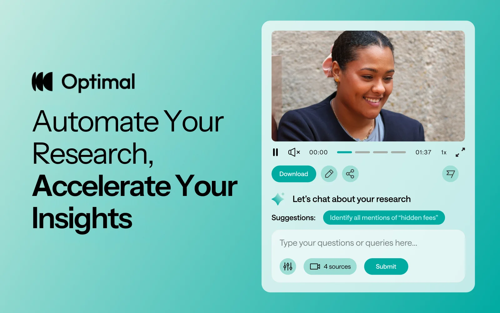
At Optimal, we know the reality of user research: you've just wrapped up a fantastic interview session, your head is buzzing with insights, and then... you're staring at hours of video footage that somehow needs to become actionable recommendations for your team.
User interviews and usability sessions are treasure troves of insight, but the reality is reviewing hours of raw footage can be time-consuming, tedious, and easy to overlook important details. Too often, valuable user stories never make it past the recording stage.
That's why we’re excited to announce the launch of Interviews, a brand-new tool that saves you time with AI and automation, turns real user moments into actionable recommendations, and provides the evidence you need to shape decisions, bring stakeholders on board, and inspire action.
We surveyed more than 100 researchers, designers, and product managers, conducted discovery interviews, tested prototypes, and ran feedback sessions to help guide the discovery and development of Optimal Interviews.
The result? What once took hours of video review now takes minutes. With Interviews, you get:
This tool is powered by AI designed for researchers, product owners, and designers. This isn’t just transcription or summarization, it’s intelligence tailored to surface the insights that matter most. It’s like having a personal AI research assistant, accelerating analysis and automating your workflow without compromising quality. No more endless footage scrolling.
The AI used for Interviews as well as all other AI with Optimal is backed by AWS Amazon Bedrock, ensuring that your AI insights are supported with industry-leading protection and compliance.
A big thank you to our early access users! Your feedback helped us focus on making Optimal Interviews even better. Here's what's new:
This new tool is just the beginning. Our vision is to help you manage the entire moderated interview process inside Optimal, from recruitment to scheduling to analysis and sharing.
Here’s what’s coming:
Imagine running your full end-to-end interview workflow, all in one platform. That’s where we’re heading, and Interviews is our first step.
Interviews is available now for our latest Optimal plans with study limits. Start transforming your footage into minutes of clarity and bring your users’ voices to the center of every decision. We can’t wait to see what you uncover.

In 2020, over 64,200,000,000,000 gigabytes of data was produced online. This would take 1.8 billion years to download! With so much data at our fingertips, how can UX Researchers leverage it to better understand their business and user needs? This talk uses real-life examples of how the discipline of data science can (and should!) complement UX research to create better user experiences.
Grishma Jena, Data Scientist with the UX Research Operations team for IBM Software in San Francisco, USA, recently spoke at UXNZ, the leading UX and IA conference in New Zealand hosted by Optimal Workshop, on how Data Scientists can work in synergy with UX researchers.
In her talk, Grishma uncovers the benefits of bridging the gap between quantitative and qualitative perspectives in the pursuit of creating better, more user-centric products.
Grishma is a Data Scientist with the UX Research Operations team for IBM Software. As the only Data Scientist in the organization, she supports 100+ user researchers and designers and uses data to understand user struggles and opportunities to enhance user experiences. She earned her Masters in Computer Science at the University of Pennsylvania. Her research interests are in Machine Learning and Natural Language Processing. She has spoken and facilitated workshops at multiple conferences including PyCon US (the largest Python conference in the world). She has also taught Python at the San Francisco Public Library.
She enjoys introducing new technical concepts to people and helping them use data and code to drive change. In her free time, Grishma enjoys traveling, cooking, writing, and acting.
Contact Details:
Email: grishma.jena@gmail.com
Grishma highlights the beneficial and often necessary synergy between data science and user experience research. She first explains how data science fits into UX, and then briefly provides an overview of the data science process. Through this process, valuable insights can be shared with user research teams who can then interpret and share them with designers, developers, and product managers to create better user experiences.
Data science in user research involves using data-driven techniques to gain insights from user behavior and interactions, ultimately improving the user experience. Examples of data science in user research include:
Data Scientists generally start off with a question and a set of data, followed by a process of ‘data wrangling’, cleaning, exploring/modeling, and evaluating. Data Scientists use various processes, algorithms, and machine learning techniques, for example, to extract patterns and insights.
Generally, the process is as follows:
The goal of the data science pipeline is to transform raw data into actionable insights that drive decision-making and lead to improved user experiences. The process involves iteratively refining the analysis based on feedback from users and other teams, and revisiting earlier stages as needed, to ensure the quality and relevance of the insights generated.
Generally, data scientists are more quantitative, whereas user researchers are more qualitative. But what if we were to combine the two? Grishma goes on to explain real-life examples of how these disciplines can work in harmony to achieve exceptional user experience.
Data scientists delve deep into the numerical aspects of user behavior and product performance, while user researchers typically focus on understanding user preferences, motivations, and behaviors through direct interaction and observation. These two roles approach the same challenge – improving products and user experiences – from different angles, each offering unique insights into user behavior and product performance.
By combining the quantitative rigor of data science with the empathetic understanding of user researchers, a synergy emerges that can unlock a deeper, more holistic understanding of user needs, behaviors, and pain points. This collaboration has the potential to not only reveal blind spots in product development but also drive innovation and enhance the overall user experience.
To illustrate the power of this collaboration, Grishma describes real-life case studies from Airbnb, Google, Spotify, and ABN Amro. Below is a high-level summary of each case study:
In summary, data scientists and user researchers have different perspectives, strengths, and weaknesses. Collaborating allows the two disciplines to:
The synergy between data science and user research ultimately leads to a more comprehensive understanding of user needs, better product design, and improved user experiences. It ensures that both the quantitative and qualitative aspects of user behavior are considered, creating a more empathetic and user-centric approach to product development.


Our exciting new feature, segments, saves time by allowing you to create and save groups of participant responses based on various filters. Think of it as your magic wand to effortlessly organize and scrutinize the wealth of data and insight you collect in your studies. Even more exciting is that the segments are available in all our quantitative study tools, including Optimal Sort, Treejack, Chalkmark, and Questions.
In a nutshell, segments let you effortlessly create and save groups of participants' results based on various filters, saving you and the team time and ensuring you are all on the same page.
A segment represents a demographic within the participants who completed your study. These segments can then be applied to your study results, allowing you to easily view and analyze the results of that specific demographic and spot the hidden trends.
Put simply, you've got a treasure trove of participant data, and you need to be able to slice and dice it in various ways. Segmenting your data will help you dissect and explore your results for deeper and more accurate results.
Question responses: Using a screener survey or pre - or post-study questions with pre-set answers (like multi-choice), you can segment your results based on their responses.
URL tag: If you identify participants using a unique identifier such as a URL tag, you can select these to create segments.
Tree test tasks, card sort categories created, first click test and survey responses: Depending on your study type, you can create a segment to categorize participants based on their response in the study.
Time taken: You can select the time taken filter to view data from those who completed your study in a short space of time. This may highlight some time wasters who speed through and probably haven’t provided you with high-quality responses. On the other hand, it can provide insight into A/B tests for example, it could show you if it’s taking participants of a tree test longer to find a destination in one tree or another.
With this feature, you can save and apply multiple segments to your results, using a combination of AND/OR logic when creating conditions. This means you can get super granular insights from your participants and uncover those gems that might have otherwise remained hidden.
This feature is your go-to when you have results from two or more participant segments. For example, imagine you're running a study involving both teachers and students. You could focus on a segment that gave a specific answer to a particular task, question, or card sort. It allows you to drill down into the nitty-gritty of your data and gain more understanding of your customers.
Let's explore how you can harness the power of segments:
Save time: Create and save segments to ensure everyone on your team is on the same page. With segments, there's no room for costly data interpretation mishaps as everyone is singing from the same hymn book.
Surface hidden trends: Identifying hidden trends or patterns within your study is much easier. With segments, you can zoom in on specific demographics and make insightful, data-driven decisions with confidence.
Organized chaos: No more data overload! With segments, you can organize participant data into meaningful groups, unleashing clarity and efficiency.
Ready to take segments for a spin? To create a new segment or edit an existing one, go to Results > Participants > Segments. Select the ‘Create segment’ button and select the filters you want to use. You can add multiple conditions, and save the segment. To select a segment to apply to your results, click on ‘All included participants’ and select your segment from the drop-down menu. This option will apply to all your results in your study.

We can't wait to see the exciting discoveries you'll make with this powerful tool. Get segmenting, and let us know what you think!

They say a picture is worth a thousand words. So what does it mean when that picture is forced to live in a predefined category?
Q Walker, Experience Lead at PaperKite, a digital product/tech agency based in Wellington, recently spoke at UX New Zealand, the leading UX and IA conference in New Zealand hosted by Optimal Workshop, about Information Architecture (IA) and the world of emojis.
In their talk, Q discusses how emoji IA reflects how humans make sense of a nuanced world. Through painstaking manual analysis of emojis across platforms, Q discovered the limitations of neatly defined categories. When it comes to IA, should one-size-fit-all?
Q Walker (they/them) is the Experience Lead at PaperKite, a digital product/tech agency based in Wellington. Q passionately specializes in UX research and strategy and has never quite let go of their graphic design roots - which is a good thing, because they also lead a cross-disciplinary team of researchers, designers, and marketers. Q is also a musician, actor, public speaker, horror movie aficionado, tightwire walker, and avid gardener, and has been described as a walking exclamation point.
Contact details
Email address: q@paperkite.co.nz
Emoji, those tiny digital icons that have become ubiquitous in our online conversations, play a significant role in enhancing our written communication. They add humor, nuance, clarity, and even a touch of mischief to our messages. However, behind the scenes, there is a complex system of information architecture (IA) that helps us navigate and utilize the vast array of over 3600 different emojis available today, each with its own variations in skin tone, gender, color, and more. In this exploration of emoji organization, Q Walker delves into the world of IA to understand how these expressive icons are categorized, and why it matters.
This journey into emoji IA began as a personal curiosity for Q, initially observing how certain emojis seemed to shift between categories on different platforms, while others remained stable. For instance, emojis like the ‘lobster’ and ‘heart’ were found in various categories. This initial research aimed to understand why this inconsistency occurred across different platforms, whether it posed a problem for emoji IA, and whether it could (or should) be fixed.
The research evolved over time, incorporating emojis across platforms like Unicode, Apple, Slack, and others, which have slight variations in style and categorization. Emojis from each platform were organized and sorted (manually!) on a spreadsheet.
The core finding of the research revolved around two prevailing emoji frameworks or categories: explicit and implicit. “Explicit” categorization is utilitarian, describing precisely what an emoji represents based on its visual elements. In contrast, “Implicit” categorization highlights the symbolic and contextual meanings of emojis, reflecting what they represent beyond their visual appearance.
Two methods emerged to identify which framework, explicit or implicit, emoji fell into:
Even within these two prevailing frameworks, disagreements persist. For instance, the lobster emoji is categorized as "food" by some platforms and as "animal" or "nature" by others, showcasing discrepancies in explicit categorization.
Emoji design is important, as it influences how users perceive and interpret them. For instance, the choice to depict a red lobster implies that lobster is categorized as “food” because lobsters are typically not red unless cooked. Another example is the “syringe” emoji, which is undergoing an evolution from a blood-filled needle, to something more generic with clear or no liquid. In this way, the syringe emoji has broader application to things like vaccination.
This lack of standardization between platforms can be the cause of serious and unfortunate miscommunication! For example, the transformation of the gun emoji into a toy water pistol, despite its innocent appearance, still carries its historical baggage, as seen in its categorization within Apple’s IA near other weapons and dangerous objects. This highlights the messy and non-standard nature of emoji IA.
So, what do emojis teach us about information architecture?
Firstly, it teaches us to be flexible with how we navigate a multitude of data. With thousands of emojis and limited categories, finding the right emoji can be challenging. Platforms have adopted various approaches to address this issue:
Secondly, it may be that a fully standardized framework for emoji categorization isn’t feasible or even desirable. Where IA would like us to neatly categorize an emoji as one thing, the reality is that they are nuanced and can have multiple meanings, making them difficult to fit into rigid categories - just as ballet shoes can represent “shoes” (Unicode) and “art/entertainment” (Apple) simultaneously. Instead, we have the flexibility to categorize emojis based on what is most meaningful to their users. A standardized framework may not capture this complexity, and embracing the diversity of categorization enriches our understanding of human expression.
The lobster emoji serves as a poignant example of how emoji can take on new meaning and human expression. A Unicode approval of the lobster emoji over the trans pride flag a few years ago highlighted issues of representation. This decision led to the adaptation of the lobster emoji as a symbol within the trans community, further demonstrating how meaning is adapted and attributed to emoji in many ways.
Emoji IA is a testament to the diverse ways we make sense of our world and a reminder that often there are no limits to interpretation and creativity. As designers we should ask ourselves - how do we ensure that our IA and products cater to our diverse reality?

Every month we have fun and informative “bite sized” presentations to add some inspiration to your lunch break. These virtual events allow us to partner with amazing speakers, community groups and organizations to share their insights and hot takes on a variety of topics impacting our industry.
Join us at the end of every month for Lunch n' Learn.
Many of us choose human centred design because we see it as an opportunity to have a positive impact on people's lives through the products and services we help create. Satisfying a need in us to do something good. Sometimes those good intentions can be thwarted by the many business and technical challenges that get in the way of delivering the product or service the way we originally intended it.
What if we are able to see the normal challenges of every design project and the relationships and tensions involved, as serving us and shaping us, to be better people? This is the essence of conscious design leadership.
In this lunch and learn, find out what Conscious Design Leadership is and isn't, learn about the 'three lines of work', a key framework from regenerative design theory, and come away with some guides to practicing conscious leadership every day.
Currently in the role of Service Design Director at BNZ, Jodine also offers coaching and consulting services across a range of disciplines - UX research, service design and leadership through her business Fireside Consulting. Jodine is the cofounder of UXCONNECT, a monthly meet up online for leading designers and researchers in Aotearoa.
View Jodine's slides here

I started at Optimal Workshop as CEO over a decade ago and in that time I have seen this company grow from humble beginnings in Wellington, into a globally recognized leader in the UX tools industry, with hundreds of thousands of users from some of the world’s most recognized brands. I am proud to have built an organization that is primed for the future. One that values its people, cares for its product, and loves its customers.
It’s been an incredible journey, but with growth comes change, and so, after 14 years, I’ve decided it’s time for me to step down. This has been an incredibly hard decision because I am still (and always will be) very excited about the future for Optimal Workshop. The momentum, creativity, and innovation that is flowing within the team assure me that the best is absolutely yet to come. Nonetheless, I feel that my part is now played and I’ve got another baby on the way. I’m very much looking forward to spending more time with family and friends while I take a break.
I’d like to sincerely thank everyone who has been a part of this incredible journey, whether by advising, supplying, introducing, challenging, listening to or working, thinking and dreaming with me in my time here. Together, we've seen a tiny company flourish into a vibrant, resilient, and thriving organization on a shared mission to reinvent information architecture and help our customers create better experiences for everyone.
Moving forward, we’re incredibly lucky that our original founder, Sam Ng has recently rejoined our board and it feels like we’ve come full circle and are ready for a new chapter with fresh leadership who are ready and empowered to focus on innovation and long-term growth. To that end, I am also thrilled to announce that Meiken Bassant now joins me as co-CEO for the next few weeks, and will step into an Acting CEO role once I leave. Her dedication, clarity, and ability to lead make her the perfect choice for this transition. I’ve never had more confidence in Optimal Workshop’s leadership, in all our people, and in our product, than I do today.
I'll be at Optimal Workshop for a little while longer and welcome any conversations or thoughts you may wish to share with me, before and after that time of course.
Thank you again to everyone who reads this, you’ve helped me more than you know and I appreciate it.
With endless gratitude,
Andrew Mayfield

We’re excited to share some new features and product updates that we've rolled out lately and what’s coming up next.
Customer feedback and research have shown that users analyse results in Treejack in a task-by-task manner. To better support this way of working, we’ve updated Treejack results to ensure the success and directness of each task are easier to compare with the new Task overview tab in Results. This new visualisation is available in Results > Overview> Task overview section in Optimal Workshop.

We have also introduced the aggregate paths view in the Paths tab (it used to only be visible via the compare tasks button). This allows users to more easily see what the popular paths are for each task and how much each successful path was used (or not).
Over the next few months, we’ll continue working through our results tabs to update them to a task-by-task view and highlight insights at a task level.
We’re continuing work to improve the quality of participants recruited in Optimal Workshop. Our latest release involves eliminating all participants that rush through a Treejack study. We’ve analysed years of participants to get a good idea of what ‘rushing’ means, and we can now identify these ‘speeders’ and remove them from our participant pools. We have also removed the limit in-app for replacement participants across all study types, and released updates to immediately eliminate poor quality participants from custom orders.
Help guide: How to replace study participants in-app
We are excited to announce our first six project templates are now available. Templates have been created with industry experts to give you the confidence to quickly launch studies and back your results to make data-driven decisions. These ready-made templates give you a headstart on your research by providing you with the right range of study types and when to use them.
Templates are accessible in the app from the Dashboard > Browse Templates. From the ‘templates menu’ select a template that matches your use case for example ‘I need to organise content into categories’ and get going faster than before. You can edit and customise the templates to suit your research goals.
This is just the beginning of our template journey and while we continue to build up our collection we’d love your input too. If there are templates that you regularly use and think the community could benefit from we’d love to hear from you. Email us at product@optimalworkshop.com.
The Optimal Academy is due to launch in later this month. The Academy will provide education that enables our customers to get started faster with our tools and elevate their knowledge of all things Information Architecture and UX.
The first courses available will be a series of Optimal Workshop tool-based lessons, including best practice study setup analysis and recruitment. You can expect to see more exclusive content and courses from industry experts and institutions on a diverse range of topics continuing to drop in 2023 and 2024.
We’re committed to making things easier for our team customers, particularly on the administration side of our product. Our product team have begun discovery on improving our administration features, and have had a lot of great customer feedback to help shape up the opportunities. We are aiming to make improvements to this area of the product later this year.
