Subscribe to OW blog for an instantly better inbox
Oops! Something went wrong while submitting the form.
Articles and Podcasts on Customer Service, AI and Automation, Product, and more
A year ago, we looked at the user research market and made a decision.
We saw product teams shipping faster than ever while research tools stayed stuck in time. We saw researchers drowning in manual work, waiting on vendor emails, stitching together fragmented tools. We heard "should we test this?" followed by "never mind, we already shipped."
The dominant platforms got comfortable. We didn't.
Today, we're excited to announce Optimal 3.0, the result of refusing to accept the status quo and building the fresh alternative teams have been asking for.
The gap between product velocity and research velocity has never been wider. The situation isn't sustainable. And it's not the researcher's fault. The tools are the problem. They’re:
These platforms haven't changed because they don't have to, so we set out to challenge them.
Optimal 3.0 isn't an incremental update to the old way of doing things. It's a fundamental rethinking of what a research platform should be.
Research For All, Not Just Researchers.
For 18 years, we've believed research should be accessible to everyone, not just specialists. Optimal 3.0 takes that principle further.
Unlimited seats. Zero gatekeeping.
Designers can validate concepts without waiting for research bandwidth. PMs can test assumptions without learning specialist tools. Marketers can gather feedback without procurement nightmares. Research shouldn't be rationed by licenses or complexity. It should be a shared capability across your entire team.
A Complete Ecosystem in One Place.
Stop stitching together point solutions.Optimal 3.0 gives you everything you need in one platform:
Recruitment Built In Access millions of verified participants worldwide without the vendor tag. Target by demographics, behaviors, and custom screeners. Launch studies in minutes, not days. No endless email chains. No procurement delays.
Testing That Adapts to You
Learn more about Live Site Testing
AI-Powered Analysis (With Control) Interview analysis used to take weeks. We've reduced it to minutes.
Our AI automatically identifies themes, surfaces key quotes, and generates summaries, while you maintain full control over the analysis.
As one researcher told us: "What took me 4 weeks to manually analyze now took me 5 minutes."
This isn't about replacing researcher judgment. It's about amplifying it. The AI handles the busywork, tagging, organizing, timestamping. You handle the strategic thinking and judgment calls. That's where your value actually lives.
Learn more about Optimal Interviews
Chat Across All Your Data Your research data is now conversational.
Ask questions and get answers instantly, backed by actual video evidence from your studies. Query across multiple Interview studies at once. Share findings with stakeholders complete with supporting clips.
Every insight comes with the receipts. Because stakeholders don't just need insights, they need proof.
A Dashboard Built for Velocity See all your studies, all your data, in one place. Track progress across your entire team. Jump from question to insight in seconds. Research velocity starts with knowing what you have.
Integration Layer
Optimal 3.0 fits your workflow. It doesn't dominate it. We integrate with the tools you already use, Figma, Slack, your existing tech stack, because research shouldn't force you to abandon how you work.
What Didn't Change: Methodological Rigor
Here's what we didn't do: abandon the foundations that made teams trust us.
Card sorting, tree testing, first-click tests, surveys, the methodologically sound tools that Amazon, Google, Netflix, and HSBC have relied on for years are all still here. Better than ever.
We didn't replace our roots. We built on them.
18 years of research methodology, amplified by modern AI and unified in a complete ecosystem.
Product development isn't slowing down. AI is accelerating everything. Competitors are moving faster. Customer expectations are higher than ever.
Research can either be a bottleneck or an accelerator.
The difference is having a platform that:
Optimal 3.0 is built for research that arrives before the decision is made. Research that shapes products, not just documents them. Research that helps teams ship confidently because they asked users first.
A Fresh Alternative
We're not trying to be the biggest platform in the market.
We're trying to be the best alternative to the clunky tools that have dominated for years.
Amazon, Google, Netflix, Uber, Apple, Workday, they didn't choose us because we're the incumbent. They chose us because we make research accessible, fast, and actionable.
"Overall, each release feels like the platform is getting better." — Lead Product Designer at Flo
"The one research platform I keep coming back to." — G2 Review
This launch represents our biggest transformation, but it's not the end. It's a new beginning.
We're continuing to invest in:
Our goal is simple: make user research so fast and accessible that it becomes impossible not to include users in every decision.
See What We've Built
If you're evaluating research platforms and tired of the same old clunky tools, we'd love to show you the alternative.
Book a demo or start a free trial
The platform that turns "should we?" into "we did."
Welcome to Optimal 3.0.
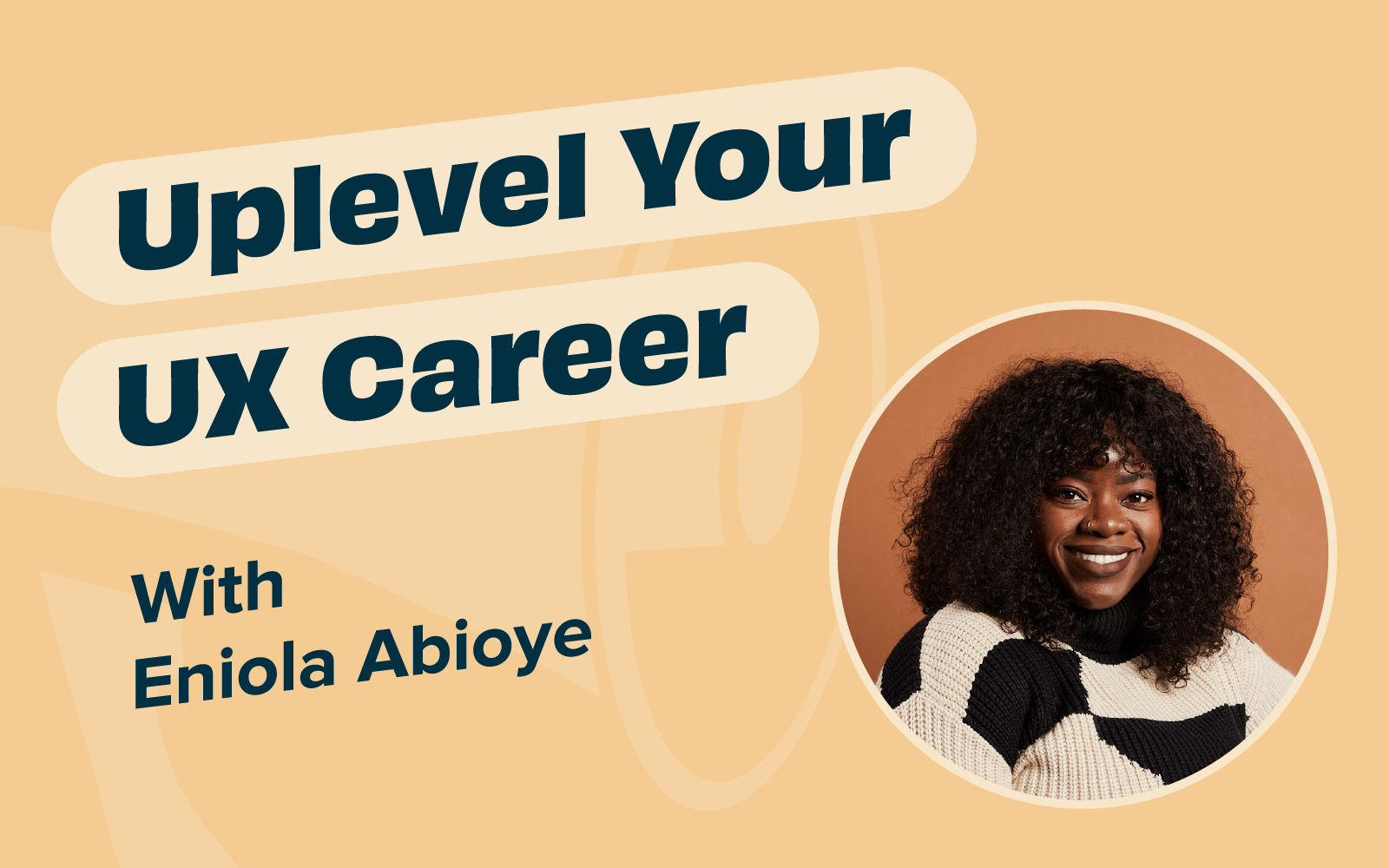
Recently, Optimal Workshop partnered with Eniola Abioye, Lead UX Researcher at Meta and UXR Career Coach at UX Outloud to host a career masterclass featuring practical advice and guidance on how to: revamp and build a portfolio, emphasize the impact of your projects and showcase valuable collaborations. It also included panel discussions with experts from a variety of roles (UX, product management, engineering, career coaching and content design) talking about their journeys to becoming UX leaders.
Keep reading to get key takeaways from the discussion on:
At a time when businesses are reducing costs to focus on profitability - proving the value of your work is more important than ever. Unfortunately, measuring the impact of UX isn’t as straightforward as tracking sales or marketing metrics. With this in mind, Eniola asked the panelists - how do you show the impact of UX in your work?Providing insights is simply not enough. “As a product manager, what I really care about is insights plus recommendations, because recommendations make my life easier,” said Kwame Odame.
Auset Parris added her perspective on this topic as a Growth Content Designer, “the biggest thing for me to be impactful in my space [Content Design] is to consistently document the changes that I’ve made and share them with the team along with recommendations.” Auset also offered her perspective regarding recommendations, “recommendations are not always going to lead to the actual product executions, but recommendations are meant to guide us.” When it comes to deciding which recommendation to proceed with (if any) it's important to consider whether or not they are aligned with the overarching goal.
As UXR becomes more democratized in many businesses and the number of stakeholders increases, the ability to gain cross-functional buy-in for the role and outcomes of UXR is a key way to help keep research a priority.
In his past experience, Kwame has realized that the role of a user experience researcher is just as important as that of a product manager, data scientist, engineer, or designer. However, one of the biggest blockers for him as a product manager is how the role of a UX researcher is often overlooked. “Just because I’m the product manager doesn’t mean that I’m owning every aspect of the product. I don’t have a magic wand right? We all work as a team.” Furthermore, Kwame notes that a user researcher is an incredibly hard role and a very important one, and I think we need to invest more in the UX space.
Auset also shared her perspective on the topic, “I wouldn’t say this is a blocker, but I do think this is a challenging piece of working in a team - there are so many stakeholders.” Although it would be ideal for each of the different departments to work seamlessly together at all times, that’s not always the case. Auset spoke about a time where the data scientists and user researchers were in disagreement. Her role as a Growth Content Designer is to create content that enhances the user experience. “But if I’m seeing two different experiences, how do I move forward? That’s when I have to ask everyone - come on let’s dig deeper. Are we looking at the right things?” If team members are seeing different results, or having different opinions, then maybe they are not asking the right questions and it's time to dig deeper.
The number and type of roles that now engage with research are increasing. As they do, the ability to collaborate and manage stakeholders in research projects has become essential.
Kwame discussed how he sets up a meeting for the team to discuss their goals for the next 6 months. Then, he meets with the team on a weekly basis to ensure alignment. The main point of the meeting is to ensure everyone is leaving with their questions answered and blockers addressed. It's important to ensure everyone is moving in the right direction.
Auset added that she thinks documentation is key to ensuring alignment. “One thing that has been helpful for me is having the documentation in the form of a product brief or content brief.” The brief can include the overarching goal, strategy, and indicate what each member of the team is working on. Team members can always look back at this document to ensure they are on the right track.
One of the participants asked the panel, “how do you secure the stability of your UX career?”
Eniola took this opportunity to share some invaluable advice as a career coach, “I think the biggest thing that comes to mind is value proposition. It's important to be very clear about the value and impact you bring to the team. It used to be enough to just be really, really good at research and just do research and provide recommendations. Now that’s not enough. Now you have to take your teams through the process, integrate your recommendations into the product, and focus on driving impact.”
Companies aren’t looking to hire someone who can perform a laundry list of tasks, they’re looking for UX professionals who can drive results. Think about the metrics you can track, to help showcase the impact of your work. For example, if you’re a UX designer - how much less time did the user spend on the task with your new design? Did the abandonment or error rate decrease significantly as a result of your work? How much did the overall customer satisfaction score rise, after you implemented your project? Before starting your project, decide on several metrics to track (make sure they align with your organization’s goals), and reflect on these after each project.
Fatimah Richmond offered another piece of golden career advice. She encourages UX researchers to create an ongoing impact tracker. She’ll create a document where she lists the company's objectives, the projects she worked on, and the specific impact she made on the companies objectives. It's much easier to keep track of the wins as they happen, and jot a few notes about the impact you’ve made with each project, then scrambling to think of all the impact you’ve made when writing your resume. It's also important to note the impact your work has made on the different departments - product, marketing, sales, etc.
She also advises UX researchers to frequently share their science insights with their colleagues as the project progresses. Instead of waiting until the very end of the project and providing a “perfectly polished” deck, be transparent with the team about what you are working on and the impact it's having throughout the duration of the project.
Another participant asked - what if you need help determining the value you bring? Auset recommends asking for actionable feedback from coworkers. These people work with you every single day, so they know your contributions you are making to the team.
Documenting the tangible impact you make as a UX professional is crucial - not only will it help create greater stability for your career, but it will also help organizations recognize the importance of a UX research. As Kwame discussed in the “blockers” section, one of the biggest challenges he faces as a product manager is the perception of the UX role as less important than the more traditional product manager, Engineer, and Designer roles.
Eniola helps UX researchers improve their research practice. Whether you’re seasoned and looking to level up or a new researcher looking to get your bearings in UX, Eniola can help you focus and apply your skillset. She is a UX Researcher and Founder of UX Outloud. As a career coach, she guides her clients through short and long term SMART goals and then works with them to build a strategic plan of attack. She is innately curious, a self-starter, adaptable, and communicative with a knack for storytelling.
Learn more about UX Outloud.
Connect with Eniola on Linkedin.
The panel was comprised of talented professionals from a variety of fields including UX research, content strategy, product management & engineering, and career coaching. Their diverse perspectives led to an insightful and informative panel session. Keep reading to get to know each of the amazing panelists:
Growth Content Designer: Auset Parris is a growth content designer at Meta. She has spent 7 years navigating the ever-evolving landscape of content strategy. She is passionate about the role of user research in shaping content strategies. Furthermore, Auset believes that understanding user behavior and preferences is fundamental to creating content that not only meets but exceeds user expectations.
Senior UX Researcher: Jasmine Williams, Ph.D. is a senior researcher with over a decade of experience conducting youth-focused research. She has deep expertise in qualitative methods, child and adolescent development, and social and emotional well-being. Jasmine is currently a user experience researcher at Meta and her work focuses on teen safety and wellbeing.
Product Manager: Kwame Odame has over 7 years of high-tech experience working in product management and software engineering. At Meta, Kwame is currently responsible for building the product management direction for Fan Engagement on Facebook. Kwame has also helped build Mastercard’s SaaS authentication platform, enabling cardholders to quickly confirm their identity when a suspicious transaction occurred, leveraging biometric technology.
UX Researcher (UXR): Fatimah Richmond is a well-rounded UX researcher with over 15 years of experience, having influenced enterprise products across leading tech giants like Google, SAP, Linkedin, and Microsoft. Fatimah has led strategy for research, programs and operations that have significantly impacted the UXR landscape, from clinician engagement strategist to reshaping Linkedin Recruiter and Jobs. As a forward thinker, she’s here to challenge our assumptions and the status quo on how research gets planned, communicated, and measured.
Career Coach: An Xia spent the first decade of her professional life in consulting and Big Tech data science (Netflix, Meta). As a career coach, An has supported clients in gaining clarity on their career goals, navigating challenges of career growth, and making successful transitions. As a somatic coach, An has helped clients tap into the wisdom of their soma to reconnect with what truly matters to them.
UX Strategist: Natalie Gauvin is an experienced professional with a demonstrated history of purpose-driven work in agile software development industries and higher education. Skilled in various research methodologies. Doctor of Philosophy (Ph.D.) Candidate in Learning Design and Technology from the University of Hawaii at Manoa, focused on empathy in user experience through personas
Here at Optimal we really care about helping UX researchers level up their career. This is why we’ve developed the Optimal Academy, to help you master your Optimal Workshop skills and learn more about user research and information architecture.
Check out some of our free courses here: https://academy.optimalworkshop.com/

When you have a small design team or none at all, how do you ensure that your content is consistent, has the right tone, and is captivating? It can be difficult, but it doesn’t have to be! Julia Steffen, Principal Content Designer at Varis, spoke at UX New Zealand, the leading UX and IA conference in New Zealand hosted by Optimal Workshop, about how startups can achieve impactful content and delight users.
In her talk, Julia shares her most useful tips, tricks, and rules of thumb to ensure meaningful content design. She also shares some helpful tools to achieve maximum efficiency.
Julia has worked in content for 10+ years at St.Jude, Wunderman Thompson, MetaLab, and Grubhub. She is based in the United States and is the Principal Content Designer at Varis.
Contact Details:
Email address: julia.steffen@govaris.com
You can find Julia on LinkedIn
Why should you care about content design? Julia argues that “content design is product success”. Because Julia specifically talks about content design in relation to startups, she focuses on how to achieve the best results possible with a small, lean team. To that end, Julia discusses four must-haves for content design:
Why is your company’s voice important? Voice tells your users who you are, creates meaningful connections, and provides valuable signals that convey whether or not your company is deserving of trust. Choosing the voice for your startup begins with a competitor audit. Documenting who you compete against, and how you might want to differentiate your startup is crucial to finding your corner of the market. For example, is your voice welcoming, gentle, and positive, or are you more formal and technical?
User research can also be really helpful when determining and monitoring your voice. Involve your research team and learn what does and doesn’t delight your audience when it comes to your messaging.
It’s also important to map your voice to your startup’s values. Be sure to connect to your mission and your brand. Julia sums up product voice as:
Product voice = your values + space to differentiate + what research tells you
So, when you find your voice, where can you lean into it? There are several key areas or moments that provide opportunities to share your unique voice, such as:
To remain lean and efficient as a startup, one of the best things you can do is create a style guide. This helps to keep your content and voice consistent. For example, what pronouns do you use in your interface, do you capitalize certain words, etc? There is actually a lot to consider here, so Julia points viewers to various resources that allow you to copy and paste, such as Quinn Keast’s Product Language Framework.
A glossary or language bank is also important. Record branded words, terms that you never use, and terms that you’ve heard your users say organically. This helps to ensure that you’re using language that resonates with your audience and language that reduces cognitive load as much as possible.
Pro tip: Use the Writer app with Figma. This integration helps to ensure that your style guide is actually used! It includes your style guide and glossary so that you’re being consistent as you work. You can also use the Hemingway app or Grammarly to look out for passive voice, hard-to-parse sentences, and overall readability.
The first thing Julia points out when approaching writing is the need to be user-focused. This might seem obvious to UX practitioners, but word selection can be nuanced, and subtle changes can be powerful. For example, instead of writing “[Your company] introduces a new feature”, think about how can you change the statement to be more about what the new feature means for the user, rather than your company. Here are a few rules of thumb to help refine your writing.
Julia suggests that design reviews are the perfect place to sense-check your words and content. Review your designs intentionally and through a content lens. Again, the Microcopy Canvas can be a useful tool when conducting this step, helping to ensure you have considered the right tone and achieved your purpose with your words.
Following a design review process, it’s important to test for clarity and affinity. Conduct user tests frequently to ensure your words and content are clear, understood, and hitting the mark in the intended way.
Finally, make sure your content goals are recorded in your dashboards. Be accountable to your own success measures, KPIs, and OKRs (Objectives and Key Results). Some metrics that help track success are:
If you’re falling short on some metrics, review your content and try to figure out where words can be sharpened to be clearer, more friendly, or less technical, for example. Then, feed this information into your prioritization and planning. What changes are going to have the most impact on your product’s success? What changes are quick wins?
Julia’s talk is important for UX and content designers, particularly those working in startup environments, as it highlights the critical role of content design in achieving product success. The content you share, the voice and tone you adopt, and the clarity of communication, all add to the user's overall experience with your product. Investing time into your content is critical and, as Julia explains, it doesn’t have to put too much stress on your team's workload. If time isn’t invested, however, you may find yourself with poor content, delivering poor experiences, resulting in high customer attrition.
Efficiency, therefore, should be a focus for startups wanting to achieve great content design without being weighed down. Julia offers pragmatic advice on maintaining consistency through tools like style guides and language banks and by leveraging apps like Hemingway and Grammarly. Tools like these are incredibly helpful when streamlining processes and ensuring a cohesive and polished user interface.
At the end of the day, Julia stresses the impact that content design has on user experiences and encourages startups to pay close attention to content in ways that are achievable for small teams.


There is strong backlash about the perceived failures of Human Centred Design (HCD) and its contribution to contemporary macro problems. There seems to be a straightforward connection: HCD and Design Thinking have been adopted by organizations and are increasingly part of product/experience development, especially in big tech. However the full picture is more complex, and HCD does have some issues.
Dan Dixon, UX and Design Research Director and Stéphan Willemse, Strategy Director/Head of Strategy, both from the Digital Arts Network, recently spoke at UX New Zealand, the leading UX and IA conference in New Zealand hosted by Optimal Workshop, about the evolution and future of HCD.
In their talk, Dan and Stéphan cover the history of HCD, its use today, and its limitations, before presenting a Post HCD future. What could it be, and how should it be different? Dan and Stéphan help us to step outside of ourselves as we meet new problems with new ways of Design Thinking.
Dan is a long-term practitioner of human-centred experience design and has a wealth of experience in discovery and qual research. He’s worked in academic, agency and client-side roles in both the UK and NZ, covering diverse fields such as digital, product design, creative technology and game design. His history has blended a background in the digital industry with creative technology teaching and user experience research. He has taken pragmatic real-world knowledge into a higher education setting as well as bringing deeper research skills from academia into commercial design projects. In higher education, as well as talks and workshops, Dan has been teaching and sharing these skills for the last 16 years.
Stéphan uses creativity, design and strategy to help organizations innovate towards positive, progressive futures. He works across innovation, experience design, emerging technologies, cultural intelligence and futures projects with clients including Starbucks, ANZ, Countdown, TradeMe and the public sector. He holds degrees in PPE, Development Studies, Education and an Executive MBA. However, he doesn’t like wearing a suit and his idea of the perfect board meeting is at a quiet surf break. He thinks ideas are powerful and that his young twins ask the best questions about the world we live in.
Contact Details:
Email: dan.dixon@digitalartsnetwork.com
Dan and Stéphan take us through the evolving landscape of Human Centred Design (HCD) and Design Thinking. Can HCD effectively respond to the challenges of the modern era, and can we get ahead of the unintended consequences of our design? They examine the inputs and processes of design, not just the output, to scrutinize the very essence of design practice.
In the 1950s and 1960s, designers began exploring the application of scientific processes to design, aiming to transform it into a systematic problem-solving approach. Later in the 1960s, design thinkers in Scandinavia initiated the shift towards cooperative and participative design practices. Collaboration and engagement with diverse stakeholders became integral to design processes. Then, the 1970s and 1980s marked a shift in perspective, viewing design as a fundamentally distinct way of approaching problems.
Moving into the late 1980s and 1990s, design thinking expanded to include user-centered design, and the idea of humans and technology becoming intertwined. Then the 2000s witnessed a surge in design thinking, where human-centered design started to make its mark.
Dan and Stéphan discuss the “design squiggle”, a concept that portrays the messy and iterative nature of design, starting chaotically and gradually converging toward a solution. For 20 years, beginning in the early 90s, this was a popular way to explain how the design process feels. However, in the past 10 years or so, efforts to teach and pass down design processes have become common practice. Here enter concepts like the “double diamond” and “pattern problem”, which seek to be repeatable and process-driven. These neat processes, however, demand rigid adherence to specific design methods, which can ultimately stifle innovation.
The critique of such rigid design processes, which developed alongside HCD, highlights the need to acknowledge that humans are just one element in an intricate network of actors. By putting ourselves at the center of our design processes and efforts, we already limit our design. Design is just as much about the ecosystem surrounding any given problem as it is about the user. A limitation of HCD is that we humans are not actually at the center of anything except our own minds. So, how can we address this limitation?
Post-anthropocentric design starts to acknowledge that we are far less rational than we believe ourselves to be. It captures the idea that there are no clear divisions between ‘being human’ and everything else. This concept has become important as we adopt more and more technology into our lives, and we’re getting more enmeshed in it.
Post-human design extends this further by removing ourselves from the center of design and empathizing with “things”, not just humans. This concept embraces the complexity of our world and emphasizes how we need to think about the problem just as much as we think about the solution. In other words, post-human design encourages us to “live” in our design problem(s) and consider multiple interventions.
Finally, Dan and Stéphan discuss the concept of Planetary design, which stresses that everything we create, and everything we do, has the possibility to impact everything else in the world. In fact, our designs do impact everything else, and we need to try and be aware of all possibilities.
To think beyond HCD and to foster innovation in design, we can begin by embracing emerging design practices and philosophies such as "life-centered design," "Society-centered design," and "Humanity-centered design." These emerging practices have toolsets that are readily available online and can be seamlessly integrated into your design approach, helping us to break away from traditional, often linear, methodologies. Or, taking a more proactive stance, we can craft our own unique design tools and frameworks.
To illustrate how design processes can evolve to meet current and future challenges of our time, Dan and Stéphan present their concept of “Post human-centered design” (Post HCD). At its heart, it seeks to take what's great about HCD and build upon it, all while understanding its issues/limitations.
Dan and Stéphan put forward, as a starting point, some challenges for designers to consider as we move our practice to its next phase.
Suggested Post HCD principles:
The talk wraps up by encouraging designers to incorporate some of this thinking into everyday practice. Some key takeaways are:

As information professionals, we work with the “stuff” of information in our everyday work. We search for information, we spend time analyzing and synthesizing it, and we carefully create and structure it. Whether you elicit information from users and stakeholders, explore large data sets, design ‘journeys’ or interfaces, or create information architectures, understanding the information you are using and creating as information can help you do your work better.
Kat King, Business Intelligence Analyst at the University of Michigan Library, recently spoke at UX New Zealand, the leading UX and IA conference in New Zealand hosted by Optimal Workshop, about understanding exactly what information is, and where it is, in our work.
In her talk, Kat uses simple examples to teach you to “see” the information around you and understand what makes something “information” in the context of working as a human to accomplish something.
Kat King is an Information Architect interested in language, meaning, and the things we make. She currently works as a Business Intelligence Analyst for the University of Michigan Library.
Contact Details:
Email: Katalogofchaos@gmail.com
Information theory can be dense and jargon-filled, and discussions in academic texts can feel divorced from the practice of actually working with information. We’re all told that information architecture is much more than website navigation. So, what is it? IA has a reputation for being difficult to understand, and in her talk, Kat attempts to help us understand what it is, where the information is, and what is it that we’re doing when we use IA methods.
Kat defines IA as “the practice of ensuring ontological alignment”. ‘Ontological’ relates to concepts, categories, properties, and relationships. ‘Alignment’ means arrangements into appropriate relative positions. Therefore, information architecture is “the practice of ensuring concepts, categories and their properties and relationships are arranged into appropriate relative positions.”
To align information then, you need to begin by sorting it into concepts and categories, which is difficult because information can sometimes be “slippery and abstract”. Kat argues this is the real reason that IA is sometimes hard to wrap our heads around. So, getting to the heart of the question, what is information?
Kat defines information as “a patterned relationship between differences that reduces uncertainty”. The key word here is ‘differences’. The trick to understanding and taming information is to identify what is different about sets of information. The next trick is to identify consistencies between these differences.
This can be a little confusing, so Kat uses the example of picking fruit. We tend to use color (the difference) to identify when fruit is ripe and sweet. We know for a fact that, at some point, the fruit will be at its sweetest and, while there is a scientific way of identifying this point, we have to use the information we have at our disposal instead i.e. the colour of the fruit. The skin of the fruit in this example is like an interface - allowing a flow of information from the fruit’s ripening process to our eyes.
The relationship between the information described in the fruit example can be split into two categories. “Information 1” is a factual, objective description of when the fruit is ripe (i.e. the science of why the fruit is the color that it is right now), whereas our subjective observation, based on color, is “Information 2”.
Information 1 poses challenges for us because we have a narrow range of perception, attention, and aggregation, which means we, as humans, can’t possibly understand the laws of nature just by observing. We have evolved to be simple, efficient observers of what is important to us. In other words, we don’t need to understand everything in order to get things right. We see patterns and generalize. Going back to the fruit example – we only need to know the color of ripe fruit, not the exact chemistry of why it is ripe.
We use semantic information by processing concepts, patterns, categories, mental models, and even language as inputs to form our understanding. As social animals, we tend to reinforce general ‘truths’ about things because we’re constantly cooperating using shared information. General ‘truths’ are good enough.
Kat uses the following interaction to demonstrate the interplay of different information.
In this interaction, the different pieces of information can be broken down by category:
Using our ability to communicate and understand concepts (words “red”, “good”, and “raspberries”) helps us to understand Information 2 (processing the words and concepts to understand that a red berry is good”), which aligns with Information 1 (the evolutionary science and ongoing consistency of red/ripe berries being sweet) that helps us decide when processing all of this information.
So, now that we understand a little more about information, how does this influence our roles as designers?
Thanks to our individual lived experiences, people have many different inputs/concepts about things. However, Kat points out that we’re pretty good at navigating these different concepts/inputs.
Take conversations, for example. Conversations are our way of getting a “live” alignment of information. If we’re not on the same page we can ask each other questions to ensure we’re communicating semantic information accurately.
When we start to think about technology and digital products, the interfaces that we design and code become the information that is being transmitted, rather than words in a conversation. The design and presentation become semantic information structures, helping someone to understand the information we’re putting forward. This highlights the importance of aligning the interface (structure and semantic information) and the users' ontology (concepts and categories). For the interface to work, IA practitioners and designers need to know what most people understand to be true when they interact with information, concepts, and categories.
We need to find some sort of stability that means that most users can understand what they need to do to achieve a goal or make a decision. To do this, we need to find common ground between the semantic information (that might vary between users) so that users can have successful Information 2 style interactions (i.e. absorbing and understanding the concepts presented by the interface).
To wrap up, let’s remind ourselves that information architecture is “the practice of ensuring concepts, categories and their properties and relations are arranged into appropriate and relevant positions”. As IA practitioners and designers, it’s our job to ensure that concepts and categories are arranged in structures that can be understood by the nuance of shared human understanding and semantic information – not just in some physical diagram.
We need to present stable, local structures that help to reduce uncertainty at the moment of interaction. If we don’t, the information flow breaks and we aren’t reducing uncertainty; instead, we create confusion and disappointing user interactions with our digital products. Making sure we present information correctly is important (and difficult!) for the success of our products – and for better or worse, it’s the work of information architecture!

It’s a chicken and egg situation when it comes to securing funding for a large transformation program in government. On one hand, you need to submit a business case and, as part of that, you need to make early decisions about how you might approach and deliver the program of work. On the other hand, you need to know enough about the problem you are going to solve to ensure you have sufficient funding to understand the problem better, hire the right people, design the right service, and build it the right way.
Now imagine securing hundreds of millions of dollars to design and build a service, but not feeling confident about what the user needs are. What if you had the opportunity to change this common predicament and influence your leadership team to carry out alignment activities, all while successfully delivering within the committed time frames?
Meera Pankhania, Design Director and Co-founder of Propel Design, recently spoke at UX New Zealand, the leading UX and IA conference in New Zealand hosted by Optimal Workshop, on traceability and her learnings from delivering a $300 million Government program.
In her talk, Meera helps us understand how to use service traceability techniques in our work and apply them to any environment - ensuring we design and build the best service possible, no matter the funding model.
As a design leader, Meera is all about working on complex, purpose-driven challenges. She helps organizations take a human-centric approach to service transformation and helps deliver impactful, pragmatic outcomes while building capability and leading teams through growth and change.
Meera co-founded Propel Design, a strategic research, design, and delivery consultancy in late 2020. She has 15 years of experience in service design, inclusive design, and product management across the private, non-profit, and public sectors in both the UK and Australia.
Meera is particularly interested in policy and social design. After a stint in the Australian Public Service, Meera was appointed as a senior policy adviser to the NSW Minister for Customer Service, Hon. Victor Dominello MP. In this role, she played a part in NSW’s response to the COVID pandemic, flexing her design leadership skills in a new, challenging, and important context.
Contact Details:
Email address: meera@propeldesign.com.au
Meera’s talk explores a fascinating case study within the Department of Employment Services (Australia) where a substantial funding investment of around $300 million set the stage for a transformative journey. This funding supported the delivery of a revamped Employment Services Model, which had the goal of delivering better services to job seekers and employers, and a better system for providers within this system. The project had a focus on aligning teams prior to delivery, which resulted in a huge amount of groundwork for Meera.
Her journey involved engaging various stakeholders within the department, including executives, to understand the program as a whole and what exactly needed to be delivered. “Traceability” became the watchword for this project, which is laid out in three phases.
Meera’s work initially meant conducting extensive research and engagement with executives, product managers, researchers, designers, and policymakers. Through this process, a common theme was identified – the urgent (and perhaps misguided) need to start delivering! Often, organizations focus on obtaining funding without adequately understanding the complexities involved in delivering the right services to the right users, leading to half-baked delivery.
After this initial research, some general themes started to emerge:
The conclusion of this phase was that “what” needed to be delivered wasn’t clearly defined. The same was true for “how” it would be delivered.
Meera’s journey heavily revolved around the concept of "traceability” and sought to ensure that every step taken within the department was aligned with the ultimate goal of improving employment services. Traceability meant having a clear origin and development path for every decision and action taken. This is particularly important when spending taxpayer dollars!
So, over the course of eight weeks (which turned out to be much longer), the team went through a process of combing through documents in an effort to bring everything together to make sense of the program as a whole. This involved some planning, user journey mapping, and testing and refinement.
Numerous artifacts and documents played a crucial role in shaping decisions. Meera and her team gathered and organized these artifacts, including policy requirements, legislation, business cases, product and program roadmaps, service maps, and blueprints. The team also included prior research insights and vision documents which helped to shape a holistic view of the required output.
After an effort of combing through the program documents and laying everything out, it became clear that there were a lot of gaps and a LOT to do.
As a result of these gaps, a process of task prioritization was necessary. Tasks were categorized based on a series of factors and then mapped out based on things like user touch points, pain points, features, business policy, and technical capabilities.
This then enabled Meera and the team to create Product Summary Tiles. These tiles meant that each product team had its own summary ahead of a series of planning sessions. It gave them as much context (provided by the traceability exercise) as possible to help with planning. Essentially, these tiles provided teams with a comprehensive overview of their projects i.e. what their user needs, what certain policies require them to deliver, etc.
Meera wanted every team to feel confident that we weren’t doing too much or too little in order to design and build the right service, the right way.
Standard design and research check-ins were well adopted, which was a great start, but Meera and the team also built a Delivery Readiness Tool. It was used to assess a team's readiness to move forward with a project. This tool includes questions related to the development phase, user research, alignment with the business case, consideration of policy requirements, and more. Ultimately, it ensures that teams have considered all necessary factors before progressing further.
As the program progressed, several sustainable work practices emerged which Government executives were keen to retain going forward.
Some of these included:
Meera's journey serves as a valuable resource for those working on complex design programs, emphasizing the significance of aligning diverse stakeholders and maintaining traceability. Alignment and traceability are critical to ensuring that programs never lose sight of the problem they’re trying to solve, both from the user and organization’s perspective. They’re also critical to delivering on time and within budget!

At Optimal Workshop, we're dedicated to building the best user research platform to empower you with the tools to better understand your customers and create intuitive digital experiences. We're thrilled to announce some game-changing updates and new products that are on the horizon to help elevate the way you gather insights and keep customers at the heart of everything you do.
Last month, we joined forces with design powerhouse Figma to launch our integration. You can import images from Figma into Chalkmark (our click-testing tool) in just a few clicks, streamlining your workflows and getting insights to make decisions based on data not hunches and opinions.
With session replay you can focus on other tasks while Optimal Workshop automatically captures card sort sessions for you to watch in your own time. Gain valuable insights into how participants engage and interpret a card sort without the hassle of running moderated sessions. The first iteration of session replays captures the study interactions, and will not include audio or face recording, but this is something we are exploring for future iterations. Session replays will be available in tree testing and click-testing later in 2024.
Say goodbye to juggling note-taking and hello to more efficient ways of working with Transcripts! We're continuing to add more capability to Reframer, our qualitative research tool, to now include the importing of interview transcripts. Save time, reduce human errors and oversights by importing transcripts, tagging and analyzing observations all within Reframer. We’re committed to build on transcripts with video and audio transcription capability in the future, we’ll keep you in the loop and when to expect those releases.
The team is fizzing to be working on a new Prototype testing product designed to expand your research methods and help test prototypes easily from the Optimal Workshop platform. Testing prototypes early and often is an important step in the design process, saving you time and money before you invest too heavily in the build. We are working with customers and on delivering the first iteration of this exciting new product. Stay tuned for Prototypes coming in the second quarter of 2024.
Making Optimal Workshop easier for large organizations to manage teams and collaborate more effectively on projects is a big focus for 2024. Workspaces are the first step towards empowering organizations to better manage multiple teams with projects. Projects will allow greater flexibility on who can see what, encouraging working in the open and collaboration alongside the ability to make projects private. The privacy feature is available on Enterprise plans.
Our survey product Questions is in for a glow up in 2024 💅. The team are enjoying working with customers, collecting and reviewing feedback on how to improve Questions and will be sharing more on this in the coming months.
We are looking for new customers to join our research panel to help influence product development. From time to time, you’ll be invited to join us for interviews or surveys, and you’ll be rewarded for your time with a thank-you gift. If you’d like to join the team, email product@optimalworkshop.com
