Subscribe to OW blog for an instantly better inbox
Oops! Something went wrong while submitting the form.


The footer of a website sits at the very bottom of every single web page and contains links to various types of content on your website. It’s an often overlooked component of a website, but it plays several important roles in your information architecture (IA) – it’s not just some extra thing that gets plonked at the bottom of every page.
Getting your website footer right matters!
The footer communicates to your website visitors that they’ve reached the bottom of the page and it’s also a great place to position important content links that don’t belong anywhere else – within reason. A website footer is not a dumping ground for random content links that you couldn’t find a home for, however there are some content types that are conventionally accessed via the footer e.g., privacy policies and copyright information just to name a few.
Lastly, from a usability and navigation perspective, website footers can serve as a bit of a safety net for lost website visitors. Users might be scrolling and scrolling trying to find something and the footer might be what catches them and guides them back to safety before they give up on your website and go elsewhere. Footers are a functional and important part of your overall IA, but also have their own architecture too.
Read on to learn about the types of content links that might be found in a footer, see some real life examples and discuss some approaches that you might take when testing your footer to ensure that your website is supporting your visitors from top to bottom.
Deciding which content links belong in your footer depends entirely on your website. The type of footer, its intent and content depends on its audience of your customers, potential customers and more — ie your website visitors. Every website is different, but here’s a list of links to content types that might typically be found in a footer.
Let’s take a look at three diverse real life examples of website footers.
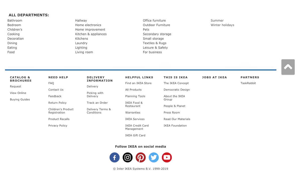
IKEA’s US website has an interesting double barrelled footer that is also large and complex – a ‘fat footer’ as it’s often called – and its structure changes as you travel deeper into the IA. The below image taken from the IKEA US home page shows two clear blocks of text separated by a blue horizontal line. Above the line we have the heading of ‘All Departments’ with four columns showing product categories and below the line there are seven clear groups of content links covering a broad range of topics including customer service information, links that appear in the top navigation menu and careers. At the very bottom of the footer there are social media links and the copyright information for the website.
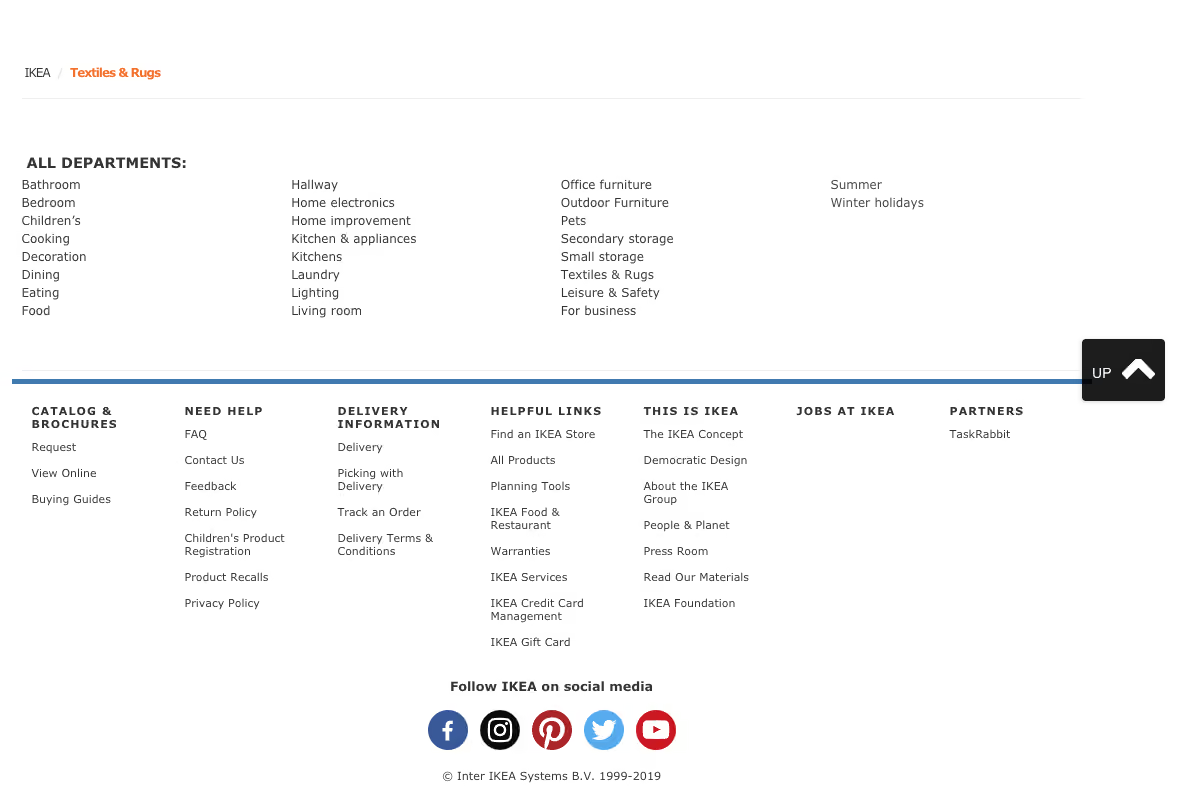
As expected, IKEA’s overall website IA is quite large, and as a website visitor clicks deeper into the IA, the footer starts to change. On the product category landing pages, the footer is mostly the same but with a new addition of some handy breadcrumbs to aid navigation (see below image).
When a website visitor travels all the way down to the individual product page level, the footer changes again. In the below image found on the product page for a bath mat, while the blue line and everything below it is still there, the ‘All Departments’ section of the footer has been removed and replaced with non-clickable text on the left hand side that reads as ‘More Bath mats’ and a link on the right hand side that says ‘Go to Bath mats’. Clicking on that link takes the website visitor back to the page above.

Overall, evolving the footer content as the website visitor progresses deeper into the IA is an interesting approach - as the main page content becomes more focussed as does the footer while still maintaining multiple supportive safety net features.
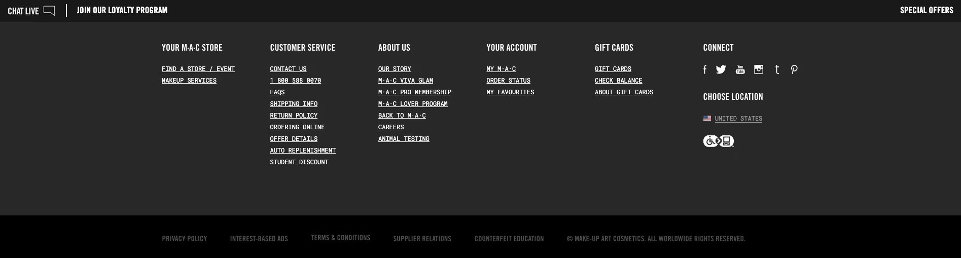
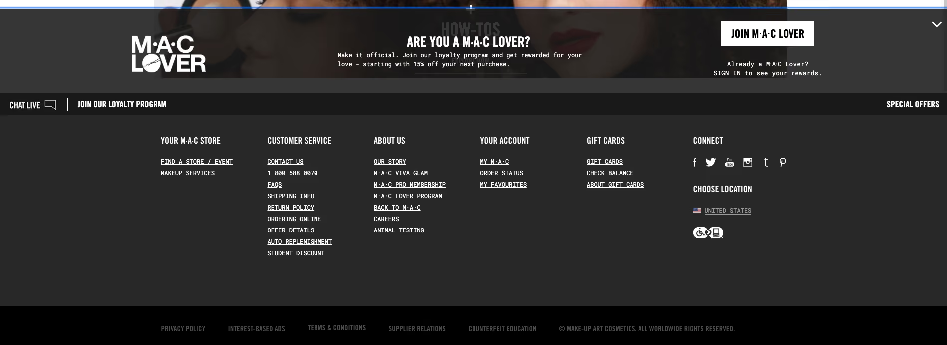
The footer for the US website of this well known cosmetics brand has a four part footer. At first it appears to just have three parts as shown in the image below: a wide section with seven content link categories covering a broad range of content types as the main part with a narrow black strip on either end of it making up the second and third parts. The strip above has loyalty program and live chat links and the strip below contains mostly links to legal content.
When a website visitor hovers over the ‘Join our loyalty program’ call to action (CTA) in that top narrow strip, the hidden fourth part of the footer which is slightly translucent pulls up like a drawer and sits directly above the strip capping off the top of the main section (as shown in the below image). This section contains more information about the loyalty program and contains further CTAs to join or sign in. It disappears when the cursor is moved away from the hover CTA or it can be collapsed manually via the arrow in the top right hand corner of this fourth part. It’s an interesting and unexpected interaction to have with a footer, but it adds to the overall consistent and cohesive experience of this website because it feels like the footer is an active participant in that experience.
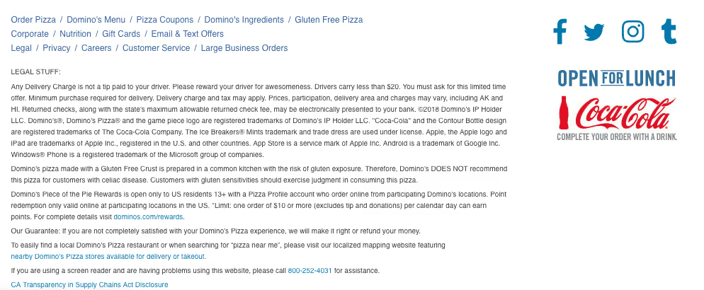
Domino’s Pizza’s US website has a reasonably flat footer in terms of architecture but it occupies as much space as a more complex or deeper footer. As shown in the image below, its content links are presented horizontally over three rows on the left hand side of the footer and these links are visually separated by forward slashes. It also displays social media links and some advertising content on the right hand side. The most interesting feature of this footer is the large paragraph of text titled ‘Legal Stuff’ below the links. Delightfully it uses direct, clear and plain language and even includes a note about delivery charges not including tips and to ‘Please reward your driver for awesomeness’.
Like every other part of your website, the only way you’re going to know if your footer is supporting your website visitors is if you test it with them. When testing a website’s IA overall, the footer is often excluded. This might be because we want to focus on other areas first or maybe it’s because testing everything at once has the potential to be overwhelming for our research participants.
Testing a footer is fairly easy thing to do and there’s no right or wrong approach – it really does depend on where you are up to in your project, the resources you have available to you and the size and complexity of the footer itself!
If you’re designing a footer for a new website there’s a few ways you might approach ensuring your footer is best supporting your website visitors. If you’re planning to include a large and complex footer, it’s a good idea to start by running an open card sort just on those footer links. An open card sort will help you understand how your website visitors expect those content links in your footer to be grouped and what they think those groups should be called.
If you’re redesigning an existing website, you might first run a tree test on the existing footer to benchmark test it and to pinpoint the exact issues. You might tree test just the footer in the study or you might test the whole website including the footer. Optimal's tree testing is really flexible and you can tree test just a small section of an IA or you can do the whole thing in one go to find out where people are getting lost in the structure. Your approach will depend on your project and what you already know so far. If you suspect there may be issues with the website’s footer, for example, if no one is visiting it and/or you’ve been receiving customer service requests from visitors to help them find content that only lives in the footer, it would be a good idea to consider isolating it for testing. This will help you avoid any competition between the footer and the rest of your IA as well as any potential confusion that may arise from duplicated tree branches (i.e. when your footer contains duplicate labels).
If you’re short on time and there aren’t any known issues with the footer prior to a redesign, you might tree test the entire IA in your benchmark study, iterate your design and then along with everything else, include testing activities for your footer in your moderated usability testing plan. You might include a usability testing scenario or question that requires your participants to complete a task that involves finding content that can only be found in the footer (e.g., shipping information if it’s an ecommerce website). Also keep a close eye on how your participants are moving around the page in general and see if/when the footer comes into play – is it helping people when they’re lost and scrolling? Or is it going unnoticed? If so, why and so on. Talk to your research participants like you would about any other aspect of your website to find out what’s going on there. When resources are tight, use your best judgement and choose the research approach that’s best for your situation, we’ve all had moments where we’ve had to be pragmatic and do our best with what we have.
When you’re at a stage in your design process where you have a visual design or concept for your footer, you could also run a first-click test. First-click tests are quick and easy and will help you determine how your website visitors are faring once they reach your footer and if they can identify the correct content link to complete their task. Studies can be run remotely or in person and just like the rest of the tools in Optimal's user research platform, are super quick to run and great for reaching website visitors all over the world simply by sharing a link to the study.
Having a library of user research books is invaluable. Whether you’re an old hand in the field of UX research or just dipping your toes in the water, being able to reference detailed information on methods, techniques and tools will make your life much easier.
There’s really no shortage of user research/UX reading lists online, so we wanted to do something a little different. We’ve broken our list up into sections to make finding the right book for a particular topic as easy as possible.
These books cover everything you need to know about a number of UX/user research topics. They’re great to have on your desk to refer back to – we certainly have them on the bookshelf here at Optimal Workshop.
Mike Kuniavsky
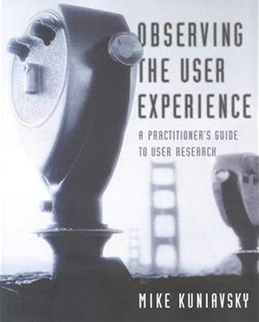
This book covers 13 UX research techniques in a reference format. There’s a lot of detail, making it a useful resource for people new to the field and those who just need more clarification around a certain topic. There’s also a lot of practical information that you’ll find applicable in the real world. For example, information about how to work around research budgets and tight time constraints.
Erika Hall
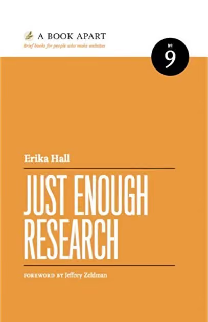
In Just Enough Research, author Erika Hall explains that user research is something everyone can and should do. She covers several research methods, as well as things like how to identify your biases and make use of your findings. Designers are also likely to find this one quite useful, as she clearly covers the relationship between research and design.
Harry Hochheiser, Jonathan Lazar, Jinjuan Heidi Feng
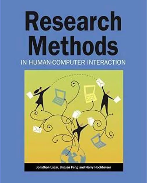
Like Observing the User Experience, this is a dense guide – but it’s another essential one. Here, experts on human-computer interaction and usability explain different qualitative and quantitative research methods in an easily understandable format. There are also plenty of real examples to help frame your thinking around the usefulness of different research methods.
If you’re new to information architecture (IA), understanding why it’s such an important concept is a great place to start. There’s plenty of information online, but there are also several well-regarded books that make great starting points.
Peter Morville, Louis Rosenfeld

You’ll probably hear this book referred to as “the polar bear book”, just because the cover features a polar bear. But beyond featuring a nice illustration of a bear, this book clearly covers the process of creating large websites that are both easy to navigate and appealing to use. It’s a useful book for designers, information architects and user researchers.
Abby Covert
This is a great introduction to information architecture and serves as a nice counter to the polar bear book, being much shorter and more easily digestible. Author Abby Covert explains complex concepts in a way anyone can understand and also includes a set of lessons and exercises with each chapter.
For those new to the task, the prospect of interviewing users is always daunting. That makes having a useful guide that much more of a necessity!
Steve Portigal
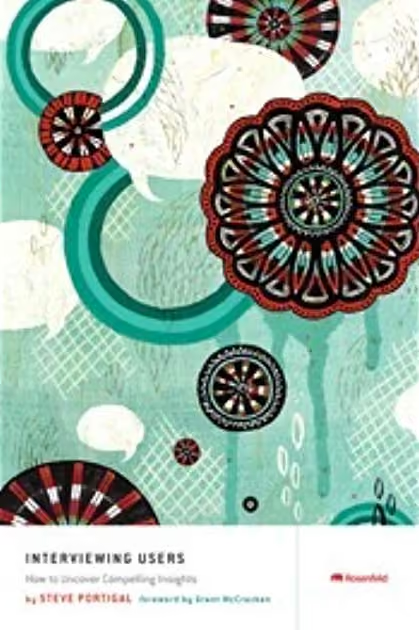
While interviewing users may seem like something that doesn’t require a guide, an understanding of different interview techniques can go a long way. This book is essentially a practical guide to the art of interviewing users. Author Steve Portigal covers how to build rapport with your participants and the art of immersing yourself in how other people see the world – both key skills for interviewers!
Web usability is basically the ease of use of a website. It’s a broad topic, but there are a number of useful books that explain why it’s important and outline some of the key principles.
Steve Krug
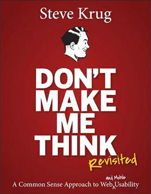
Don’t Make Me Think is the first introduction to the world of UX and usability for many people, and for good reason – it’s a concise introduction to the topics and is easy to digest. Steve Krug explains some of the key principles of intuitive navigation and information architecture clearly and without overly technical language. In the latest edition, he’s updated the book to include mobile usability considerations.
As a testament to just how popular this book is, it was released in 2000 and has since had 2 editions and sold 400,000 copies.
The design–research relationship is an important one, even if it’s often misunderstood. Thankfully, authors like Don Norman and Vijay Kumar are here to explain everything.
Don Norman
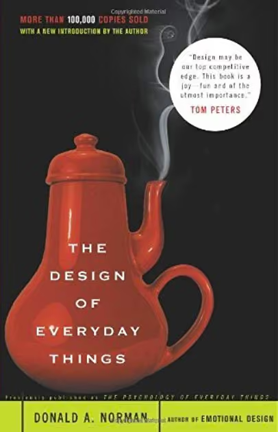
This book, by cognitive scientist and usability engineer Don Norman, explains how design is the communication between an object and its user, and how to improve this communication as a way of improving the user experience. If nothing else, this book will force you to take another look at the design of everyday objects and assess whether or not they’re truly user-friendly.
Vijay Kumar
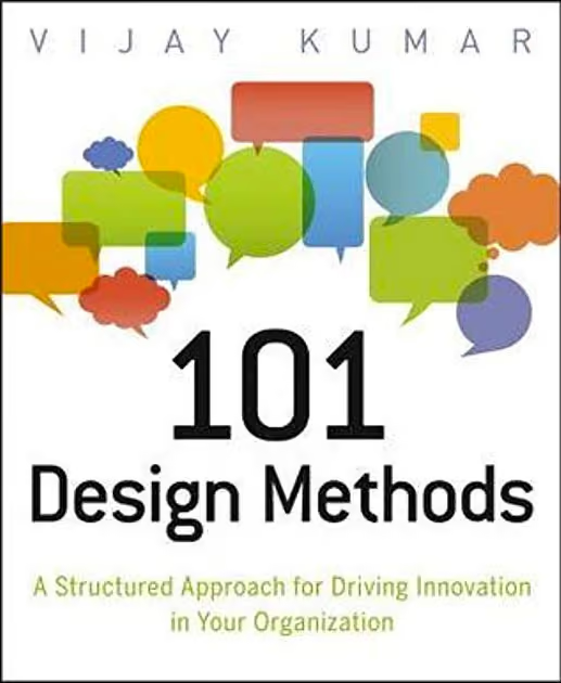
A guidebook for innovation in the context of product development, this book approaches the subject in a slightly different way to many other books on the same subject. The focus here is that the practice of creating new products is actually a science – not an art. Vijay Kumar outlines practical methods and useful tools that researchers and designers can use to drive innovation, making this book useful for anyone involved in product development.
We've put together a list of all of the above books on Goodreads, which you can access here.
For experienced practitioners and newcomers alike, user research can often seem like a minefield to navigate. It can be tricky to figure out which method to use when, whether you bring a stakeholder into your usability test (you should) and how much you should pay participants. Take a look at some of the other articles on our blog if you’d like to learn more.
Did you know that we process visuals 60,000 times faster than text? That’s according to some interesting research from the company behind the Post-it Note. Humans are visual creatures, and there’s a reason video is hard to beat when it comes to taking on new information – especially interesting video.
With that in mind, we’ve asked our user researchers for their favorite TED talks for people getting started in the UX space. We’ve also included 2 extra videos we think are definitely worth watching.
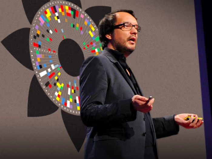
What it’s about: David McCandless explains how complex datasets (whether on military spending or even something like Facebook status updates) can be transformed into beautiful visualizations to unearth previously-unseen patterns and connections. The point of this talk is essentially that good design through visualizations is the key to making sense of the huge quantities of data available today.
About the speaker: David McCandless is a data journalist and information designer, founder of the Information is Beautiful blog.
What it’s about: Designer Rochelle King explains her journey overhauling the Spotify interface, in which she was challenged to combine the various interfaces of the product into a single layout. She covers the process of redesigning the website as well as how to best manage the relationships between designers, users and data.
About the speaker: Rochelle King was the global vice president of user experience and design at Spotify and is now vice president of product creative at Netflix.
What it’s about: Margaret Gould Stewart (whose designs have undoubtedly touched hundreds of millions of people) speaks about the 3 rules for design at scale, and points out that even tiny tweaks can cause either global outrage or have sweeping positive impacts.
About the speaker: Facebook's Director of Product Design, Margaret Gould Stewart also worked at YouTube. She certainly has the right experience for this topic.
What it’s about: The man (no, not that man) behind the original Apple iPod shares some of his tips for noticing and driving change – specifically the importance of noticing the little things. It’s a light, funny talk that’s as useful for UX researchers as it is for designers.
About the speaker: Tony Fadell is an Apple veteran and creator of the original iPod. After that, he moved onto Nest, the home automation company that was eventually acquired by Google.
What it’s about: David Pogue presents one of the more lighthearted TED talks, running through some of the worst user interface designs and some of the underlying principles that went into their design. As just one example, he talks about the different approaches to logging off that Microsoft and Apple use, and at one point he breaks out into song.
About the speaker: David Pogue is a bestselling author, columnist for the New York Times covering personal technology and technology correspondent for CBS News.
What it’s about: Vulnerability researcher Brené Brown delves into one particularly deep human insight she came across during her research. She explains that this insight sent her on a journey to understand both herself and humanity. It’s not strictly UX research, but this talk has valuable learnings for every UX professional.
About the speaker: Brené Brown is a researcher who focuses on vulnerability, courage, shame and authenticity. She wrote the bestselling book Daring Greatly: How the courage to be vulnerable transforms the way we live, love, parent and lead.
What it’s about: One of the most important skills for any UX professional is communicating with others, and this talk by Julian Treasure holds some valuable advice. He explains the “how-to’s of speaking”, including how to speak with empathy and exercises for warming up your vocal chords.
About the speaker: Julian Treasure is a sound and communication expert, traveling the world and teaching people and businesses to use sound more effectively.
What it’s about: Figuring out motivation is a constant puzzle for user researchers. Career analyst Dan Pink explores motivation in this talk, examining the fact that traditional rewards aren’t actually as effective as most think.
About the speaker: Dan Pink was Al Gore’s speech writer before heading into the world of career analysis. He’s also written 6 books, including the bestseller When: The Scientific Secrets of Perfect Timing.
As the focus on user-centered design continues to grow in organizations around the world, we’ll also need effective leaders to guide UX teams. But what makes a great UX leader?
Leadership may come as naturally as breathing to some people, but most of us need some guidance along the way. We created this article to pull together a few tips for effectively running UX teams, but be sure to leave a comment if you think we’ve missed anything. After all, part of what makes a great leader is being able to take feedback and to learn from others!
There’s a pretty clear distinction between managers and leaders. As a leader, your job isn’t necessarily to manage and tell people what to do, but instead to lead. You should enable your team to succeed by providing them with the tools and resources they need.
Intel’s Andy Grove, who infamously ruled the Silicon Valley semiconductor company with an iron fist, may be a polarizing figure in the leadership sphere, but he did institute (or at least help popularize) some techniques that are still widely practised today. One of these was to sit in an office cube with his fellow employees, instead of in a siloed office by himself. There’s a good lesson here. Instead of sealing yourself away from your team, immerse yourself in their environment and their work. You’ll develop a much better understanding of the types of problems they deal with on a daily basis and as a result be in a better position to help them.
You can also take this a step further and conduct an audit of your team’s strengths and weaknesses. Also known as a skills audit, this process is more commonly performed in organizations at scale, but it’s a good way to show you where your capabilities lie – even in small teams. With an intimate understanding of your UX team you’ll be in a good position to assess which projects your team can and can’t take on at any given time.
Taking this process even further, you can undertake a skills audit of yourself. If you want to develop yourself as a leader, you have to understand your own strengths and weaknesses.
This quote by Donald Rumsfeld, although it applies to crisis management, provides a great way to self-audit: “There are known knowns: there are things we know we know. We also know there are known unknowns: That is to say, we know there are some things we do not know. But there are also unknown unknowns: the things we don't know we don't know". You can see a visual example of this in the Johari Window:
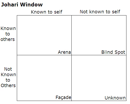
Source: Wikipedia
Here’s how you can take this approach and use it for yourself:
NASA astronaut Frank Borman, echoing a sentiment since shared by many people who’ve been to space, said: “When you're finally up on the moon, looking back at the earth, all these differences and nationalistic traits are pretty well going to blend and you're going to get a concept that maybe this is really one world and why the hell can't we learn to live together like decent people?”.
On an admittedly much smaller scale, the same learning can and should be applied to UX teams. When it comes time to take on a new project and define the vision, scope and strategy, bring in as many people as possible. The idea here isn’t to just tick an inclusivity box, but to deliver the best possible outcome.
Get input from stakeholders, designers, user researchers and developers. You certainly don’t have to take every suggestion, but a leader’s job is to assess every possible idea, question the what, why and how, and ultimately make a final decision. ‘Leader’ doesn’t necessarily have to mean ‘devil’s advocate’, either, but that’s another role you’ll also want to consider when taking suggestions from a large number of people.
Anyone who’s ever stepped into a leadership role will understand the significant workload increase that comes along with it – not to mention the meetings that seemingly start to crop up like weeds. With such time pressures it can be easy to overlook things like regular one-on-ones, or at the very least making time for members to approach you with any issues.
Even with the associated pressures that come along with being a leader, stand-ups or other weekly meetings and one-on-ones should not be ignored.
Sit down with each member of your team individually to stay up to date on what they’re working on and to get a feel for their morale and motivation. What’s more, by simply setting some time aside to speak with someone individually, they’re more likely to speak about problems instead of bottling them away. Rotating through your team every fortnight will mean you have a clear understanding of where everyone is at.
Hosting larger stand-ups or weekly meetings, on the other hand, is useful in the way that large team meetings have always been useful. You can use the forum as a time for general status updates and to get new team members acclimated. If there’s one piece of advice we can add on here, it’s to have a clear agenda. Set the key things to cover in the meeting prior to everyone stepping into the room, otherwise you’re likely to see the meeting quickly get off track.
You know the feeling. It’s Wednesday afternoon and one of the product teams has just dropped a significant amount of work on your team’s plate – a plate that’s already loaded up. While it can be tempting to join in with the bickering and complaining, it’s your job as the leader of your UX team to keep a level head and remain calm.
It’s basic psychology. The way you act and respond to different situations will have an impact of everyone around you – most importantly, your team. By keeping calm in every situation, your team will look to you for guidance in times of stress. There’s another benefit to keeping a level head: your own leaders are more likely to recognize you as a leader as well as someone who can handle difficult situations.
Two leadership development consultants ran a study of over 300,000 business leaders, and sorted the leadership skills they found most important for success into a numbered list. Unsurprisingly, an ability to motivate and inspire others was listed as the most important trait.
While no user researcher or designer will doubt the value of UX research, it’s still an emerging industry. As a result, it can often be misunderstood. If you’re in charge of leading a UX team, it’s up to you to ensure that your team always has a seat at the table – you have to know when to speak up for yourself and your team.
If you a problem, you need to voice your concern. Of course, you need to be able to back up your arguments, but that’s the point of your role as a leader. Those new to leadership can find this aspect of the the job one of the hardest parts to master – it’s no surprise one of the key qualities in a great leader is an ability to speak up if they feel it’s the right thing to do.
Finally, you’ve got to assume the role of a buffer. This is another general leadership quality, and it’s similarly important. Take the flak from executives, upper management or the board of directors and defend your UX team, even if they’re not aware of it. If you need to take some information or feedback from these people and give it to your team, pay close attention to how you relay it to them. As an example, you want to be sure that a message about reducing customer churn is made relevant and actionable.
Stepping into a UX leadership position isn’t an excuse to stop developing yourself professionally. After all, it was those skills that got you there in the first place. Continue to focus on upskilling yourself, staying up to date on movements and trends in the industry and immersing yourself in the work your team carries out.
A leader with the skills to actually function as a member of their team is that much more capable – especially when another pair of hands can help to get a project over the line.
The field of user research continues to grow and mature, meaning the need for effective leaders is also increasing. This means there are near-limitless opportunities for those willing to step into UX leadership roles, provided they’re willing to put in the work and become capable leaders.
As we stated earlier, many of the skills that make a great leader also translate to UX leadership, and there’s really no shortage of resources available to provide guidance and support. In terms of UX specifically, here are a few of our favorite articles – from our blog and elsewhere:
"Dear Optimal WorkshopI need to add an upsell item for a charity group into the checkout process. This will include a 'Would you like to add this item?" question, and a tick box that validates the action in one click. Which step of the checkout process do you think this would be best on? Thanks in advance."— Mary
Dear MaryAbout a month ago, I found myself with some time to kill in Brisbane airport (Australia) before my flight home. I wandered on into a stationery store and it was seriously gorgeous, believe me. Its brick-walled interior had an astroturf floor and a back corner filled with design books — I could've spent hours in there.I selected a journal that facilitates daily ranting through guided questions, and made my way to the counter to pay.
Just as I was about to part with my hard-earned dollars, the sales assistant offered me a charity upsell in the form of a 600ml bottle of water for $2 (AUD). Now, I don’t know how familiar you are with Australian domestic airports, but a bottle of water bought from the airport costing less than an absurdly expensive $5 is something I’d written off as a unicorn!Yes, that’s right.
$5 for WATER is considered normal, and this nice man was offering it to me for $2, in a coloured bottle of my choice, complete with that feel-good feeling of giving to charity! I left the store feeling pretty proud of myself and silently had a giggle at people who were buying bottled water elsewhere.
Charity upselling at the check out can be a tricky thing. If we get it wrong, we not only fail to raise money for the charity, but we also risk annoying our customers at a moment we want them to be particularly happy with us. The experience I had at the airport is one that I would describe as near perfect. Not all experiences are as positive. It falls down when people start feeling pressured or tricked; when it turns into an ambush.I like the approach you’re looking at.
It’s non-threatening and seamless for the user. So, where should you position it in the checkout?Online checkout is a process like any other: it follows a uniform, often-linear order, and each step involves an action that moves things forward.From my vast online shopping experience (and I do mean vast), I've observed that the generic checkout process looks something like this:
There are two ways that I would consider approaching this and it largely depends on the actual charity upsell item itself.
If we're talking about the equivalent of my water bottle (offering a product), then I say introduce it earlyin the checkout process (either Step 1 or 2). Why? Because the customer is still in buying mode.
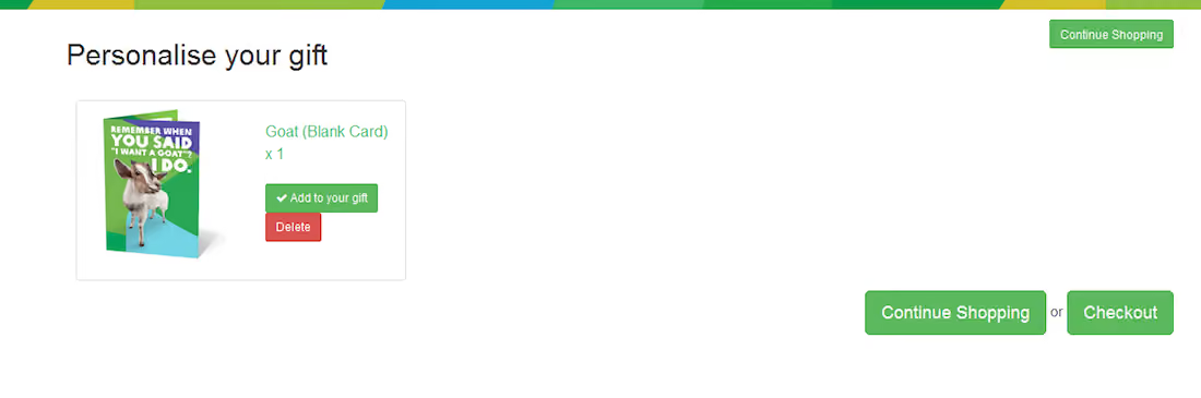
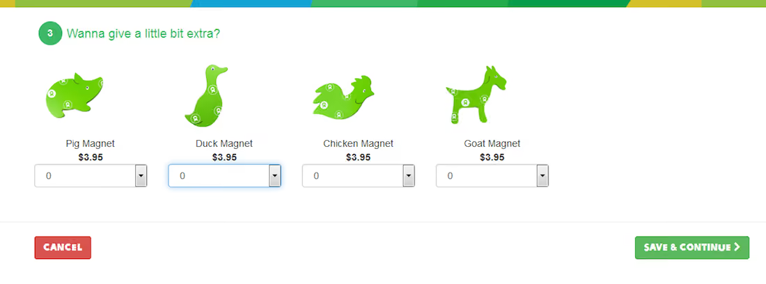
Once they click ‘Proceed to checkout’, they transition and theirfocus shifts tothe business end of their purchase. The stationery store at Brisbane Airport offered the water before telling me how much I owed them. I hadn't quite got to the real world version of checkout mode, which for me was Where did I put my debit card? mode. I quite like the way Oxfam Australia handles the charity upsell by including an 'Add to your gift' button (screen 1) which takes you to the charity upsell option (screen 2) and guides you back to the previous screen, all before checkout.
Now, if we'retalking about a donation, such as rounding the purchase price up to the nearest dollar, or asking straight out, it’s a slightly different story. I'd say addthe charity upsell option when they first review their whole intended purchase. It might be before confirming the shipping address, or even just before confirming payment details. They've got money on the brain, and they haven't quite sealed the deal. And it can only be good for the charity if the customer can easily see how small the requested donation is compared to their entire purchase (ahh, the art of persuasion...).
Once they start typing in their payment details, they're essentially signing on the dotted line and entering into a contract with you. So there's no asking after that.David Moth published an interesting article discussing upselling and the online checkout process that's worth a look, so do check it out.In the end, this is something that you'll still want to testwith users, and ultimately it will be up to them. If you have scope, try out a few different options and see which results in more sales. Hopefully this post has given you a good place to start.
All the best Mary!
"Dear Optimal Workshop
How do you make a small link attractive to people (icon vs. text)?"
— Cassie
Dear Cassie,
I'm going to dive straight into this interesting question with a good old game of Pros and Cons, and then offer a resolution of sorts, with a meandering thought or two along the way. Let's kick things off with Team Icon.
When shopping online, the number above the little shopping trolley icon tells me how badly behaved I’ve been, and if I click on it, I know I’ll get to gleefully review all the shoes I've selected so far. There’s a whole heap of icons out there like this that people have absorbed and can use without thinking twice. Marli Mesibov wrote a fantastic article on the use of icons for UX Booth on the use of icons that is well worth a look. Marli discusses how they work well on small screens, which is a definite bonus when you’re on the go! Young children who aren’t yet literate can easily figure out how to open and play Angry Birds on their parent’s smartphones thanks to icons. And icons also have a great capacity for bridging language barriers.
On the flipside, there are some issues that may huff and puff and blow that cute little home icon down. Starting with there being no consistent standard for them. Sure, there are a handful that are universal like home and print, but beyond that it seems to be a free-for-all. Icons are very much in the hands of the designer and this leaves a lot of room for confusion to grow like bacteria in a badly maintained office refrigerator. Difficult to understand icons can also seriously hinder a user’s ability to learn how to use your website or application. When icons don't communicate what they intend, well, you can guess what happens. In a great piece advocating for text over icons, Joshua Porter writes about an experience he had:
"I have used this UI now for a week and I still have do a double-take each time I want to navigate. I’m not learning what the icons mean. The folder icon represents 'Projects', which I can usually remember (but I think I remember it because it’s simply the first and default option). The second icon, a factory, is actually a link to the 'Manage' screen, where you manage people and projects. This trips me up every time."
If people can't pick up the meaning of your icons quickly and intuitively, they may just stop trying altogether. And now, over to Team Label.
Sometimes language really is the fastest vehicle you've got for delivering a message. If you choose the right words to label your links, you'll leave the user with very little doubt as to what lies beneath. It’s that simple. Carefully-considered and well-written labels can cut through the noise and leave minimal ambiguity in their wake. Quoting Joshua Porter again: "Nothing says 'manage' like 'manage'. In other words, in the battle of clarity between icons and labels, labels always win."
Text labels can get messy and be just as confusing as unfamiliar icons! Words and phrases sometimes don’t mean the same thing to different people. One person’s flat enclosed shoe may be another person’s ballet pump, and the next person may be left scratching their head because they thought pumps were heels and all they wanted was a ballet flat! Text only labels can also become problematic if there isn’t a clear hierarchy of information, and if you have multiple links on one page or screen. Bombarding people with a page of short text links may make it difficult for them to find a starting point. And text may also hold back people who speak other languages.
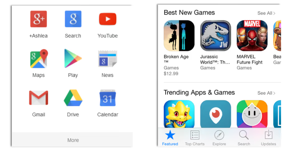
Because things are always better when we work together! Capitalise on the combined force of text and icons to solve the dilemma. And I don’t mean you should rely on hovers — make both text and icon visible at all times. Two great examples are Google Apps (because nothing says storage like a weird geometric shape...) and the iPhone App store (because the compass and magnifying glass would pose an interesting challenge without text...):
Whatever you decide to run with, test it. Use whatever techniques you have on hand to test all three possibilities — icons only, text only, and icons and text — on real people. No Pros and Cons list, however wonderful, can beat that. And you know, the results will probably surprise you. I ran a quick study recently using Chalkmark to find out where people on the ASOS women's shoes page would click to get to the homepage (and yes, I can alway find ways to make shoe shopping an integral part of my job). 28 people responded, and...
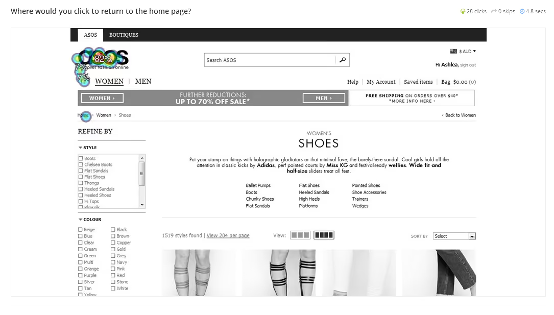
...a whopping 89% of them clicked the logo, just 7% clicked the home icon, and just one person (the remaining 4%) clicked the label 'Home'. Enough said. Thanks for your question Cassie. To finish, here's some on-topic (and well-earned) comic relief (via @TechnicallyRon)