Subscribe to OW blog for an instantly better inbox
Oops! Something went wrong while submitting the form.


Emotional. Playful. Delightful.These words resonate with user experience (UX) practitioners. We put them in the titles of design books. We build products that move up the design hierarchy of needs, with the goal to go beyond just reliability, usability, and productivity. We want to truly delight the people who use our products.Designing for delight has parallels in the physical world. I see this in restaurants which offer not only delicious food but also an inviting atmosphere; in stores that don’t just sell clothes but also provide superior customer service. Whole industries operate on designing for delight.
The amusement industry has done this for over 500 years. The world’s oldest operating amusement park, Bakken, first opened for guests in 1583 – about 300 years before the first modern roller coaster. Amusement parks experienced a boom in growth in the US in the 1970s. As of November 2014, China had 59 new amusement parks under construction. Today, hundreds of millions of guests each year visit amusement parks throughout the world.I've been fortunate to work in the amusement industry as the owner of a digital UX design company called Thrill & Create. Here is my story of how I got to do this kind of work, and my observations as a UX practitioner in this market.
I've been a fan of amusement parks for most of my life. And it’s somewhat hereditary. Much of my family still lives in Central Florida, and several of them have annual passes to Walt Disney World. My mom was a Cast Member at the Magic Kingdom during its opening season.Although I grew up living east of Washington, DC, I spent most of my childhood waiting for our annual trip to an amusement park. I was a different kind of amusement enthusiast: scared to death of heights, loath to ride roller coasters, but so interested in water rides and swimming that my family thought I was a fish. The love for roller coasters would show up much later. But the collection of park maps from our annual trips grew, and in the pre-RollerCoaster Tycoon days, I would sketch designs for amusement parks.
In college, my interest in amusement received a healthy boost from the internet. In the mid-2000s, before fan communities shifted toward Facebook, unofficial websites were quite popular. My home park — a roller coaster enthusiasts’ term for the park that we visit most frequently, not necessarily the closest park to us — had several of these fansites.The fansites would typically last for a year or two and enjoy somewhat of a rivalry with other fansites before their creators would move on to a different hobby and close their sites. The fansites’ forums became an interesting place to share knowledge and learn history about my home park. They also gave us a place to discuss what we would do if we owned the park, to echo rumors we had heard, and start our own rumors. Some quite active forums still exist for this.
Of course, many of us on the forums wanted to be the first to hear a rumor. So we follow the industry blogs, which are typically the first sources of the news. Screamscape has been announcing amusement-industry rumors since the 1990s. And Screamscape and other sites like it announce news not only in the parks but around the industry. Regular Screamscape readers learn about ride manufacturers, trade names for each kind of ride, industry trade shows, and much more. And the International Association of Amusement Parks and Attractions (IAAPA) keeps an eye on the industry as well.Several years ago, I transitioned from being a software developer to starting a user experience design company. It is now called Thrill & Create. I was faced with a challenge: how to compete against the commoditization of freelance design services. Ultimately, selecting a niche was the answer. And seeing IAAPA’s iconic roller coaster sign outside the Orange County Convention Center during a trip to Central Florida was all I needed to shift my strategy toward the amusement industry.
Periodically, I see new articles about amusement parks in UX blogs. Here are my observations about how UX looks in the industry, both in the physical world and the digital world.
The amusement industry is known for introducing rides that are bigger, taller, and faster. But the industry has a more interactive future. Using cleverly-designed shops which produce some of the longest waits in the park, Universal Studios has sold many interactive wands to give guests additional experiences in Hogsmeade and Diagon Alley.
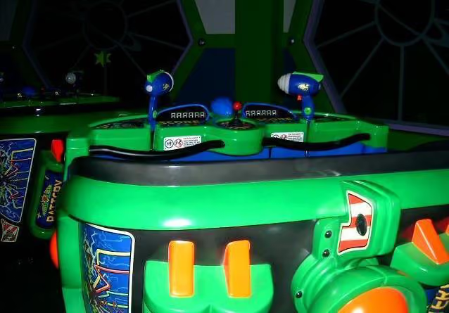
At IAAPA, interactivity and interactive rides are very hot topics. Interactive shooting dark rides came to many parks in the early 2000s. Wonder Mountain’s Guardian, a 2014 addition to Canada’s Wonderland, features the world’s longest interactive screen and a ride program that changes completely for the Halloween season.Also coming in 2015 is the elaborately-themed Justice League: Battle for Metropolis rides at two Six Flags parks. And Wet‘n’Wild Las Vegas will debut 'Slideboarding', which allows riders to participate in a video game by touching targets on their way down the slide, and is marketed as 'the world's first waterslide gaming experience'.
Terms like 'amusement industry', 'attractions industry', and 'themed entertainment industry' can be interchangeable, but they do have different focuses, and different user experience design needs. The amusement industry encompasses amusement parks, theme parks, zoos, aquaria, museums, and their suppliers; the attractions industry also includes other visitor attractions.Several experience design companies have worked extensively on user-centered themed entertainment.
Jack Rouse Associates, who see themselves as “audience advocates”, have worked with over 35 clients in themed entertainment, including Universal, Ocean Park, and LEGOLAND. Thinkwell Group, which touts a 'guest-centric approach to design', showcases 14 theme park and resort projects and attractions work in 12 countries.Consultants in the industry have been more intentionally user-centered. Sasha Bailyn and her team at Entertainment Designer write regularly about physical-world experience design, including UX, in themed entertainment. Russell Essary, owner of Interactive Magic, applies user-centered design to exhibit design, wayfinding, game design, and much more.
Several large park chains have in-house or contracted UX design teams. Most mid-sized parks work with in-house marketing staff or with outside design companies. One company I know of specializes in web design and development for the amusement industry. Smaller parks and ride companies tend to work with local web designers, or occasionally free website vendors.

Some of the best redesigns in the amusement industry recently have involved UX designers. Parc Astérix, north of Paris, hired a UX designer for a redesign with immersive pictures, interesting shapes, and unique iconography. SeaWorld Parks & Entertainment, working with UX designers, unifies their brand strongly across their corporate site, the sites for SeaWorld and Busch Gardens, and individual park sites. The Memphis Zoo’s website, which showcases videos of their animals, was built by an agency that provides UI design and UX design among their other services.

Sometimes, amusement sites with a great user experience are not made by UX practitioners. The website for Extreme Engineering has a very strong, immersive visual design which communicates their brand well. When I contacted them to learn who designed their site, I was surprised to learn that their head of marketing had designed it.
Several developments have encouraging me in my mission to help the amusement industry become more user-centered.
My clients in the industry so far have had significant fan followings. Fans have seen my user-centered approach, and they have been eager to help me improve their favorite sites. I told a recent client that it would take a week to get enough responses from his site visitors on an OptimalSort study. Within a few hours, we exceeded our target number of responses.
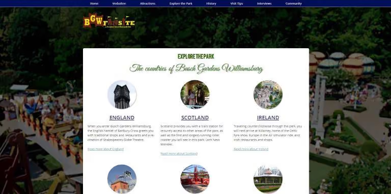
When I worked on redesign concepts for a network of park fansites, I ran separate OptimalSort studies for all 8 fansites in the network. They used comparable pages from each site as cards. We discovered that some parks’ attractions organized well by themed area, while others organized well by ride type. Based on this, we decided to let users find attractions using either way on every site. User testers received Explore the Park and the two other new features that emerged from our studies (Visit Tips and Fansite Community) very well.
Although not all of the features I designed for The Coaster Crew went live, the redesign of their official website produced solid results. Their Facebook likes increased over 50% within a year, and their site improved significantly in several major KPIs. Several site visitors have said that the Coaster Crew’s website’s design helped them choose to join The Coaster Crew instead of another club. So that's a big win.
IAAPA offered over 80 education sessions for industry professionals at this past Attractions Expo. At least nine sessions discussed guest experience. Guest experience was also mentioned in several industry publications I picked up at the show, including one which interviewed The Experience Economy author B. Joseph Pine II.
And parks are following through on this commitment, even for non-riders. Parks are increasingly theming attractions in ways that allow non-riders to experience a ride’s theme in the ride’s environment. For example, Manta at SeaWorld Orlando is a flying roller coaster themed to a manta ray. The park realized that not all of its guests will want to ride a thrilling ride with four inversions. So, separate queues allow both riders and non-riders to see aquariums with around 3,000 sea creatures. And Manta becomes, effectively, a walkthrough attraction for guests who do not want to ride the roller coaster.

The industry has also had encouraging innovations recently in accessibility. Attractions Management Magazine recently featured Morgan’s Wonderland, an amusement park geared toward people with physical and cognitive disabilities. Water parks are beginning to set aside times to especially cater to guests with autism. And at IAAPA, ride manufacturer Zamperla donated a fully-accessible ride to Give Kids the World, an amusement-industry charity.
Several successful consultancies are helping amusement parks and attractions deliver both a better guest experience in the park and better results on business metrics. And that's something I'm definitely keen to be a part of.
While this is not an exhaustive list, here are some factors in the amusement industry which have UX implications.
To keep guests interested in returning, parks reinvest between 5-10% of their revenue into improvements. Park chains typically allocate one capital improvements budget — for new attractions and any other kind of improvement — throughout their entire chain. Reserving enough capital for guest experience improvements is a challenge, even when each touchpoint in a guest’s experience has make-or-break importance. Progress in this area has been slow.
While ride manufacturers continue to innovate, they are starting to encounter limits on how much physical thrill the human body can handle. A new world’s tallest complete-circuit roller coaster should open in 2017. But that record, only broken one other time since 2003, was broken 5 times between 1994 and 2003. So the industry is shifting toward more immersive attractions and "psychological thriller" rides.
While some parks still develop their own worlds and characters for attractions, parks today increasingly rely on third-party intellectual property (IP), such as movies, TV shows, and characters. Third-party IP provides guests with a frame of references for interpreting what they see in the park. For example, The Wizarding World of Harry Potter enjoyed a very positive reception from guests due to its faithfulness to the Harry Potter books and films. In the same way, fans will notice if a themed area or attraction is not faithful to the original, and will see it as a broken experience.
Many guests now carry mobile devices with them in the parks. But so far, guests have not been able to use their mobile devices to trigger changes in a park’s environment. The closest this has come is the interactive wands in The Wizarding World of Harry Potter. Most parks ban mobile devices from most rides due to safety hazards. And amusement parks and museums are both beginning to ban selfie sticks.
Because parks look for gaps in their current offerings and customer bases, they very rarely add new attractions for similar audiences several years in a row. My regional parks tend to handle additions on a 5-10 year cycle. They alternate year by year with additions like a major roller coaster, one or more thrilling flat rides, a family ride, and at least one water ride, to appeal to different market segments, as regularly as possible.The same goes for in-park UX improvements. Themed environment upgrades in a kids’ area appeal to few people in haunted attractions’ target audiences, and vice versa.
According to the Association of Zoos and Aquariums (AZA), the fact that most people today will never see sharks, elephants, or pandas in the wild is making conservation efforts more difficult. Zoos and aquaria, in particular, have a large opportunity to allow families to empathize with animals and efforts to conserve threatened species. But, according to an International Zoo Educators Association presentation, most zoo and aquarium guests go there primarily just to see the animals or please their kids.
My primary work interest is to design digital experiences in the amusement industry that support the goals of their target users. To understand where the industry currently stands, I have visited several thousand websites for amusement parks, ride companies, suppliers, zoos, aquaria, museums, and dolphinariums. Below, I've documented a few problems I've seen, and suggested ways companies can solve these problems.
Currently, over 500 websites in the industry are on my radar as sites to improve. At least 90 of them are desktop-only websites with no mobile presence. Several of these sites — even for major ride manufacturers — use Flash and cannot be viewed at all on a mobile device.The industry’s business-to-consumer (B2C) organizations, such as parks, realize that a great deal of traffic comes from mobile and that mobile users are more likely to leave a site that is desktop-only.
These organizations recognize the simple fact that going mobile means selling more tickets. IAAPA itself has capitalized on mobile for their trade show attendees for several years by making a quite resourceful mobile app available.However, at IAAPA, I asked people from several business-to-business (B2B) companies why their sites were not mobile yet. Several told me that they didn’t consider mobile a high priority and that they might start working on a mobile site “in about a year or so.” Thus, they don't feel a great deal of urgency — and I think it's time they did.
Many professional UX designers and web designers are well aware of 1990s-style web design artefacts like misused fonts (mainly Comic Sans and Papyrus), black text on a red background,obviously-tiled backgrounds, guestbooks, and splash screens. But I've seen more than a few live amusement websites that still use each of these.Sites that prompt users to install Flash (on mobile devices) or QuickTime increase users’ interaction cost with the site, because the flow of their tasks has been interrupted.
And as Jakob Nielsen says, "Unless everything works perfectly, the novice user will have very little chance of recovery."
If a website needs to use technologies such as Flash or features such as animation or video, a more effective solution would be progressive enhancement. Users whose devices lack the capability to work with these technologies would still see a website with its core features intact and no error messages to distract them from converting.
Creating an effective website involves much more than using up-to-date design styles. It also involves the following.
Businesses promote products and services that make them money. Many amusement parks now offer front-of-line passes, VIP tours, pay-per-experience rides, locker rentals, and water park cabana rentals, which are each an additional charge for admitted guests. And per-capita spending is very important to not only parks’ operations, but also their investor relations.Users come to websites with the question, “What’s in it for me?”, and their own sets of goals. Businesses need to know when these goals match their own goals and when they conflict.
The importance of each goal should also be apparent in the design. One water park promotes its changing rooms and locker rentals on its homepage. This valuable space dedicated to logistical information for guests already coming could be used for attracting prospective visitors. Analytics tools and the search queries that they show are helpful tools for understanding why users come to a website. Sites should supplement these by conducting usability studies with users outside their organization. These studies, in turn, could include questions allowing users to describe why would visit that website. The site could use this knowledge to make sure that its content speaks to users’ reasons for visiting.
Non-technical users are bringing familiarity with how to use the internet when they visit a website. They quickly become perpetual intermediates on the internet, and don’t need to be told how buttons and links work. I've noticed amusement websites that currently label calls to action with “Click Here”, and some even do so on more than one link. This explicit instruction to people is no longer needed, and the best interfaces signal clickable elements in their visual design.
Similarly, people expect to find information in categories they understand and in language familiar to them. So it's important to not make assumptions that people who visit our websites think like us. For example, if a website is organized by model name, users will need to already be familiar with these products and the differences between them. Usability testing exercises, such as card sorting, would contribute to a better design and solve this problem.
Websites that aim to showcase a company’s creativity and sense of fun sometimes lack features that people are used to when they visit websites (like easy-to-access menus, vertical scrolling, and so on). But it's important to remember that unconventional designs may lead to increased effort for visitors, which in turn may create a negative experience. A desire to come across as fun may conflict with a visitor's need for ease and simplicity.
The site organization needs to reflect users' goals with minimal barriers to entry. People will be frustrated with things like needing to log in to see prices, having to navigate three levels deep to buy tickets, and coming across unfamiliar or contradictory terms.
Marketers have written about increased engagement and other benefits resulting from automatically playing videos, animated advertising, and rotating sliders or carousels (all of which usability practitioners have argued against). And this obsession with visual media has sometimes taken attention away from a feature people still want: easy-to-read text.There are still websites in the industry that show walls of text, rivers of text, very small text for main content, text embedded within images, and text written in all-capital letters. But telling clients, “Make the text bigger, higher-contrast, and sentence case”, can conflict with the increasing reliance on exciting visual and interactive design elements.
Goal-directed design shows us what that problem is. For example, if people visit a website to learn more about a company, the website’s design should emphasize the content that gets that message across — in the format that users find most convenient.I recently worked with a leading themed entertainment blogger to improve his site’s usability. His site, Theme Park University, provides deep knowledge of the themed entertainment industry that readers cannot get anywhere else. It first came to my attention when he published a series of posts on why Hard Rock Park in Myrtle Beach, South Carolina – one of the most ambitious new theme park projects in the US in the 2000s — failed after only one season.
As a regular reader, I knew that TPU had truly fantastic content and an engaged community on social media. But users commented to us that the site was cluttered, and so didn't spend much time on the website. We needed to give the website a more open look and feel — in other words, designed to be read.The project was not a full redesign. But by fitting small changes into the site’s existing design, we made the site more open and easier to read while retaining its familiar branding for readers. We also made his site’s advertising more effective, even by having fewer ads on each page.As D. Bnonn Tennant says, “Readership = Revenue.… [A website] has to fulfill a revenue goal. So, every element should be designed to achieve that goal. Including the copy. Especially the copy — because the copy is what convinces visitors to do whatever it is you want them to do on the website".
In helping take UX methods to the amusement industry, I have learned several lessons which would help other practitioners pioneer UX in other industries:
When I work for clients in the amusement industry, the biggest challenge that I face is unfamiliarity with UX. Most other professionals in the industry do not know about UX design principles or practices. I have had to educate clients on the importance of giving me feedback early and testing with users often. And because most of my clients have not had a technical background, I have had to explain UX and its benefits in non-UX terms.
As a business owner, I regularly prospect for new clients. The biggest challenge in landing projects here is trying to convince people that they should hire a bigger team than just me. A bigger team (and higher rates for a UXer versus a web designer) leads to bigger project costs and more reluctant approvals. So I have had to do development – and even some tech support – myself so far.
The other main challenge in selling UX to the amusement industry is project priority. Marketing departments that handle websites are used to seeing the website as one job duty out of many. Ride companies without dedicated IT staff tend to see the website as an afterthought, partially because they do most of their business at trade shows instead of online. This has led to several prospects telling me that they might pursue a redesign a year from now or later, but not in the near future. That's OK because I can be ready for them when they're ready for me.
“If storymapping could unearth patterns and bring together a cohesive story that engages audiences in the world of entertainment and film, why couldn’t we use a similar approach to engage our audiences?’Donna Lichaw and Lis Hubert
User Experience work makes the most sense to me in the context of storytelling. So when I saw Donna Lichaw and Lis Hubert’s presentation on storymapping at edUi recently, it resonated. A user’s path through a website can be likened to the traditional storytelling structure of crisis or conflict, exposition — and even a climax or two.
So just how can the same structure that suits fairytales help us to design a compelling experience for our customers? Well, storyboarding is an obvious example of how UX design and storytelling mesh. A traditional storyboard for a movie or TV episode lays out sequential images to help visualize what the final production will show. Similarly, we map out users' needs and journeys via wireframes, sketches, and journey maps, all the while picturing how people will actually interact with the product.
But the connection between storytelling and the user experience design process goes even deeper than that. Every time a user interacts with our website or product, we get to tell them a story. And a traditional literary storytelling structure maps fairly well to just how users interact with the digital stories we’re telling.Hence Donna and Lis’ conception of storymapping as ‘a diagram that maps out a story using a traditional narrative structure called a narrative arc.’ They concede that while ‘using stories in UX design...is nothing new’, a ‘narrative-arc diagram could also help us to rapidly assess content strengths, weaknesses, and opportunities.’
The edUi conference in Richmond, Virginia brought together an assembly of people who produce websites or web content for large institutions. I met people from libraries, universities, museums, various levels of government, and many other places. The theme of storytelling was present throughout, both explicitly and implicitly.Keynote speaker Matt Novak from Paleofuture talked about how futurists of the past tried to predict the future, and what we can learn from the stories they told. Matthew Edgar discussed what stories our failed content tell — what story does a 404 page tell? Or a page telling users they have zero search results? Two great presentations that got me thinking about storytelling in a different way.
Ultimately, it all clicked for me when I attended Donna and Lis’ presentation ‘Storymapping: A Macguyver Approach to Content Strategy’ (and yes, it was as compelling as the title suggests). They presented a case study of how they applied a traditional narrative structure to a website redesign process. The basic story structure we all learned in school usually includes a pretty standard list of elements. Donna and Lis had tweaked the definitions a bit, and applied them to the process of how users interact with web content.
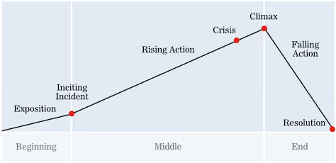
Donna and Lis pointed out that in the context of doing content strategy work, the inciting incident could be the problem that kicks off a development process. I think it can also be the need that brings users to a website to begin with.
Here I think the analogy is a little looser. While a story can sometimes be well-served by a long and winding rising action, it’s best to keep this part of the process a bit more straightforward in web work. If there’s too much opportunity for wandering, users may get lost or never come back.
The crisis is what leads users to your site in the first place — a problem to solve, an answer to find, a purchase to make. And to me the climax sounds like the aha! moment that we all aspire to provide, when the user answers their question, makes a purchase, or otherwise feels satisfied from using the site. If a user never gets to this point, their story just peters out unresolved. They’re forced to either begin the entire process again on your site (now feeling frustrated, no doubt), or turn to a competitor.
A confirmation of purchase is sent, or maybe the user signs up for a newsletter.
The user goes away with a hopefully positive experience, having been able to meet their information or product needs. If we’re lucky, they spread the word to others!Check out Part 2 of Donna and Lis' three-part article on storymapping. I definitely recommend exploring their ideas in more depth, and having a go at mapping your own UX projects to the above structure.
A word about crises. The idea of a ‘crisis’ is at the heart of the narrative arc. As we know from watching films and reading novels, the main character always has a problem to overcome. So crisis and conflict show up a few times through this process.While the word ‘crisis’ carries some negative connotations (and that clearly applies to visiting a terribly designed site!), I think it can be viewed more generally when we apply the term to user experience. Did your user have a crisis that brought them to your site? What are they trying to resolve by visiting it? Their central purpose can be the crisis that gives rise to all the other parts of their story.
Mapping a user interaction along the narrative arc makes it easy to spot potential points of frustration, and also serves to keep the inciting incident or fundamental user need in the forefront of our thinking. Those points of frustration and interaction are natural fits for testing and further development.
For example, if your site has a low conversion rate, that translates to users never hitting the climactic point of their story. It might be helpful to look at their interactions from the earlier phases of their story before they get to the climax. Maybe your site doesn’t clearly establish its reason for existing (exposition), or it might be too hard for users to search and explore your content (rising action).Guiding the user through each phase of the structure described above makes it more difficult to skip an important part of how our content is found and used.
We can ask questions like:
These questions bring up great objectives for qualitative testing — sitting down with a user and asking them to show us their story.
Many sessions at edUi also touched on analytics or user testing. In crafting a new story, we can’t ignore what’s already in place — especially if some of it is appreciated by users. So before we can start storymapping the user journey, we need to analyze our site analytics, and run quantitative and qualitative user tests. This user research will give us insights into what story we’re already telling (whether it’s on purpose or not).
What’s working about the narrative, and what isn’t? Even if a project is starting from scratch on a new site, your potential visitors will bring stories of their own. It might be useful to check stats to see if users leave early on in the process, during the exposition phase. A high bounce rate might mean a page doesn't supply that expositional content in a way that's clear and engaging to encourage further interaction.Looking at analytics and user testing data can be like a movie's trial advance screening — you can establish how the audience/users actually want to experience the site's content.
Since I returned from edUi, I've been thinking about the narrative structure constantly. I find it helps me frame user interactions in a new way, and I've already spotted gaps in storytelling that can be easily filled in. My attention instantly went to the many forms on our site. What’s the Rising Action like at that point? Streamlining our forms and using friendly language can help keep the user’s story focused and moving forward toward clicking that submit button as a climax.
I’m also trying to remember that every user is the protagonist of their own story, and that what works for one narrative might not work for another. I’d like to experiment with ways to provide different kinds of exposition to different users. I think it’s possible to balance telling multiple stories on one site, but maybe it’s not the best idea to mix exposition for multiple stories on the same page.And I also wonder if we could provide cues to a user that direct them to exposition for their own inciting incident...a topic for another article perhaps.What stories are you telling your users? Do they follow a clear arc, or are there rough transitions? These are great questions to ask yourself as you design experiences and analyze existing ones. The edUi conference was a great opportunity to investigate these ideas, and I can’t wait to return next year.

About six months ago, I came across aninteresting question on Stack Exchange headlined 'Should you concede to user demands that are clearly inferior?' It stuck in my mind because the question in itself is complex, and contains a few complicated assumptions.
In the world of user experience research and design, the users needs and wants are paramount. Dollars and hours are spent poring through data and interviewing and collating information into a cohesive explanation of what works and what doesn't for users. Designs are based on how users intuitively interact with products and websites. Organisations respond to suggestions that come through on support and on Twitter, and if a significant numbers of users want a particular change, chances are those organisations will act. But the question itself throws this most sacred of stances up in the air, because it contains the phrase 'user demands that are clearly inferior'. Now, that is a loaded statement.
I imagine it's sometimes hard for designers to get rid of the feeling that they know best. As a writer, I know what I like and don't like. I 'know' good writing from bad, and I have strong opinions about books and articles that aren't worth the pages or bandwidth it takes to publish them. But this stance often puts me in conflict with the huge amount of empirical evidence that certain writing I disdain is actually 'good': and that evidence is readers. For Fifty Shades of Lame, it's millions of them. Aggghh!
In the same way, I've never met a designer who didn't have strong opinions about what they adore and deplore in their own art forms. And I wonder how tough it sometimes is to implement changes that to a designers mind make no sense. Do any of you UX designers out there ever secretly think, when you discover what users are asking for, 'these people have no taste, they don't know what they want, how ridiculous!'? Is there a secret current of despair and frustration at user ignorance running deep and unspoken through the river of design?
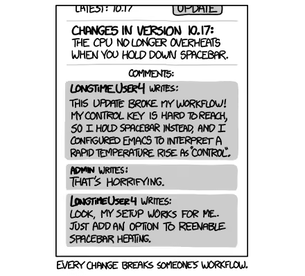
On Stack Exchange, Matt described how he and his team implemented a single tree view (75 items) with a scroll wheel, and because it was an internalchange,they were able to get quick feedback from existing users. The feedback wasn't positive, and many people wanted the change to be reversed. He explains: ‘To my mind, the way we redeveloped it is unambiguously better. But the user base was equally emphatic in rejecting it. So today, to the complaints of my fellow team members, I removed our new implementation and set it to work in the manner the users were used to.'
He then goes on to ask 'What was the right course of action here? Is there a point at which the user's fear of change becomes an important UX consideration in its own right?' The responses are varied and fascinating, and can be roughly broken into three camps:
One of the problems with the term 'User Experience' is the word 'user'. It's a depersonalised and generic way of describing who it is you're serving. Because there is a person at the heart of the enterprise who is trying to achieve something. They may not be trying to achieve what you expect them to. They certainly may not be trying to achieve what you want them to.
Context is everything.
Who is the person who is asking for a change, or asking for something to stay the same?We would argue that people aren't 'change-averse', but 'confusion/discomfort/inefficiency-averse' people want easier ways of doing things. So if by changing a feature you mess up a person's workflow, then potentially you didn't do your research.
If you look closely at the behavior of users — how people actually interact with a particular aspect of your design, rather than just hearing their opinions — then you'll be able to base your design on empirical evidence. So, we (roughly) come down on the side of the people who use the product. If they want to get something done, and they want to do that in a particular way, then they have right of way.
It's your job not to serve your tastes, but to give people the experience you promise them. And to the author of Fifty Shades of Grey, I say, 'Good on you EL James. You gave them what they wanted.'
What do you think?

As AI takes on a bigger role in product decision-making and user experience design, ethical concerns are becoming more pressing for product teams. From privacy risks to unintended biases and manipulation, AI raises important questions: How do we balance automation with human responsibility? When should AI make decisions, and when should humans stay in control?
These aren't just theoretical questions they have real consequences for users, businesses, and society. A chatbot that misunderstands cultural nuances, a recommendation engine that reinforces harmful stereotypes, or an AI assistant that collects too much personal data can all cause genuine harm while appearing to improve user experience.
AI needs personal data to work effectively, which raises serious concerns about transparency, consent, and data stewardship:
A 2023 study by the Baymard Institute found that 78% of users were uncomfortable with how much personal data was used for personalized experiences once they understood the full extent of the data collection. Yet only 12% felt adequately informed about these practices through standard disclosures.
AI can amplify existing inequalities if it's not carefully designed and tested with diverse users:
Recent research from Stanford's Human-Centered AI Institute revealed that AI-driven interfaces created 2.6 times more usability issues for older adults and 3.2 times more issues for users with disabilities compared to general populations, a gap that often goes undetected without specific testing for these groups.
Over-reliance on AI-driven suggestions may limit user freedom and sense of control:
A longitudinal study by the University of Amsterdam found that users of AI-powered decision-making tools showed decreased confidence in their own judgment over time, especially in areas where they had limited expertise.
AI-powered interfaces may create new barriers:
Who's responsible when AI makes mistakes or causes harm?
At Optimal, we advocate for research-driven AI development that puts human needs and ethical considerations at the center of the design process. Here's how UX research can help:
AI-powered experiences must be tested with real users to identify potential ethical issues:
Ensuring diverse user participation helps prevent bias and ensures AI works for everyone:
UX teams should investigate how users perceive AI-driven recommendations:
As AI becomes more sophisticated and pervasive in UX design, the ethical stakes will only increase. However, this doesn't mean we should abandon AI-powered innovations. Instead, we need to embrace responsible innovation that considers ethical implications from the start rather than as an afterthought.
AI should enhance human decision-making, not replace it. Through continuous UX research focused not just on usability but on broader human impact, we can ensure AI-driven experiences remain ethical, inclusive, user-friendly, and truly beneficial.
The most successful AI implementations will be those that augment human capabilities while respecting human autonomy, providing assistance without creating dependency, offering personalization without compromising privacy, and enhancing experiences without reinforcing biases.
As UX professionals, we have both the opportunity and responsibility to shape how AI is integrated into the products people use daily. This requires us to:
By embracing these responsibilities, we can help ensure that AI serves as a force for positive change in user experience enhancing human capabilities while respecting human values, autonomy, and diversity.
The future of AI in UX isn't just about what's technologically possible; it's about what's ethically responsible. Through thoughtful research, inclusive design practices, and a commitment to human-centered values, we can navigate this complex landscape and create AI experiences that truly benefit everyone.

AI-driven personalization is redefining digital experiences, allowing companies to tailor content, recommendations, and interfaces to individual users at an unprecedented scale. From e-commerce product suggestions to content feeds, streaming recommendations, and even customized user interfaces, personalization has become a cornerstone of modern digital strategy. The appeal is clear: research shows that effective personalization can increase engagement by 72%, boost conversion rates by up to 30%, and drive revenue growth of 10-15%.
However, the reality often falls short of these impressive statistics. Personalization can easily backfire, frustrating users instead of engaging them, creating experiences that feel invasive rather than helpful, and sometimes actively driving users away from the very content or products they might genuinely enjoy. Many organizations invest heavily in AI technology while underinvesting in understanding how these personalized experiences actually impact their users.
The technical capability to personalize digital experiences has advanced rapidly, but the quality of these experiences hasn't always kept pace. According to a 2023 survey by Baymard Institute, 68% of users reported encountering personalization that felt "off-putting" or "frustrating" in the previous month, while only 34% could recall a personalized experience that genuinely improved their interaction with a digital product.
This disconnect stems from a fundamental misalignment: while AI excels at pattern recognition and prediction based on historical data, it often lacks the contextual understanding and nuance that make personalization truly valuable. The result? Technically sophisticated personalization regularly misses the mark on actual user needs and preferences.
Many companies struggle with personalization due to several common pitfalls that undermine even the most sophisticated AI implementations:
AI that assumes too much can make users feel restricted or trapped in a "filter bubble" of limited options. This phenomenon, often called "over-personalization," occurs when algorithms become too confident in their understanding of user preferences.
Signs of over-personalization include:
A study by researchers at University of Minnesota found that highly personalized news feeds led to a 23% reduction in content diversity over time, even when users actively sought varied content. This "filter bubble" effect not only limits discovery but can leave users feeling manipulated or constrained.
AI recommendations based on incomplete or misinterpreted data can lead to irrelevant, inappropriate, or even offensive suggestions. These incorrect assumptions often stem from:
These misinterpretations can range from merely annoying (continuously recommending products similar to a one-time purchase) to deeply problematic (showing weight loss ads to users with eating disorders based on their browsing history).
A particularly striking example occurred when a major retailer's algorithm began sending pregnancy-related offers to a teenage girl before her family knew she was pregnant. While technically accurate in its prediction, this incident highlights how even "correct" personalization can fail to consider the broader human context and implications.
Users increasingly want to understand why they're being shown specific content or recommendations. When personalization happens behind a "black box" without explanation, it can create:
Research from the Pew Research Center shows that 74% of users consider it important to know why they are seeing certain recommendations, yet only 22% of personalization systems provide clear explanations for their suggestions.
Many organizations struggle to maintain consistent personalization across different touchpoints, creating disjointed experiences:
This inconsistency can make personalization feel random or arbitrary rather than thoughtfully tailored to the user's needs.
As personalization becomes more sophisticated, user concerns about privacy intensify. Key issues include:
A recent study found that 79% of users want control over what personal data influences their recommendations, but only 31% felt they had adequate control in their most-used digital products.
To create a personalized experience that feels natural and helpful rather than creepy or restrictive, UX teams need to validate AI-driven decisions through systematic research with real users. Rather than treating personalization as a purely technical challenge, successful organizations recognize it as a human-centered design problem that requires continuous testing and refinement.
Card sorting and tree testing help structure content in a way that aligns with users' expectations and mental models, creating a foundation for personalization that feels intuitive rather than imposed:
Case Study: A financial services company used card sorting with different customer segments to discover distinct mental models for organizing financial products. Rather than creating a one-size-fits-all personalization system, they developed segment-specific personalization frameworks that aligned with these different mental models, resulting in a 28% increase in product discovery and application rates.
First-click testing ensures users interact with personalized experiences as intended across different contexts and scenarios:
Research by the Nielsen Norman Group found that getting the first click right increases the overall task success rate by 87%. For personalized experiences, this is even more critical, as users may abandon a site entirely if early personalized recommendations seem irrelevant or confusing.
Direct observation and conversation with users provides critical context for personalization strategies:
These qualitative approaches help answer critical questions like:
Systematic feedback collection helps gauge users' comfort levels with AI-driven recommendations:
A streaming service discovered through targeted surveys that users were significantly more satisfied with content recommendations when they could see a clear explanation of why items were suggested (e.g., "Because you watched X"). Implementing these explanations increased content exploration by 34% and reduced account cancellations by 8%.
Experimental validation ensures personalization actually improves key metrics:
Importantly, A/B testing should look beyond immediate conversion metrics to consider longer-term impacts on user satisfaction, trust, and retention.
To implement personalization that truly enhances user experience, organizations should follow these research-backed principles:
The most effective personalization addresses genuine user needs rather than showcasing algorithmic sophistication:
Users increasingly expect to understand and control how their experiences are personalized:
Effective personalization balances predictability with discovery:
Rather than immediately implementing highly tailored experiences, consider a gradual approach:
Personalization should never be "set and forget":
As AI capabilities continue to advance, the companies that will succeed with personalization won't necessarily be those with the most sophisticated algorithms, but those who best integrate human understanding into their approach. The future of personalization lies in creating systems that:
AI should learn from real people, not just data. UX research ensures that personalization enhances, rather than alienates, users by bringing human insight to algorithmic decisions.
By combining the pattern-recognition power of AI with the contextual understanding provided by UX research, organizations can create personalized experiences that feel less like surveillance and more like genuine understanding: experiences that don't just predict what users might click, but truly respond to what they need and value.

AI is rapidly reshaping our digital landscape, powering everything from recommendation engines to automated customer service and content creation tools. But as these technologies become more widespread, we're facing a significant challenge: AI bias. When AI systems are trained on biased data, they end up reinforcing stereotypes, excluding marginalized groups, and creating inequitable digital experiences that harm both users and businesses.
This isn't just theoretical, we're seeing real-world consequences. Biased AI has led to resume screening tools that favor male candidates, facial recognition systems that perform poorly on darker skin tones, and language models that perpetuate harmful stereotypes. As AI becomes more deeply integrated into our digital experiences, addressing these biases isn't just an ethical imperative t's essential for creating products that truly work for everyone.
For those of us in UX and product teams, AI bias isn't just an ethical issue it directly impacts usability, adoption, and trust. Research has shown that biased AI can result in discriminatory hiring algorithms, skewed facial recognition software, and search engines that reinforce societal prejudices (Buolamwini & Gebru, 2018).
When AI is applied to UX, these biases show up in several ways:
These biases create real barriers that exclude users, diminish trust, and ultimately limit how effective our products can be. A 2022 study by the Pew Research Center found that 63% of Americans are concerned about algorithmic decision-making, with those concerns highest among groups that have historically faced discrimination.
To tackle AI bias effectively, we need to understand where it comes from:
AI models learn from the data we feed them. If that data reflects historical inequities or lacks diversity, the AI will inevitably perpetuate these patterns. Think about a language model trained primarily on text written by and about men, it's going to struggle to represent women's experiences accurately.
When our AI and product teams lack diversity, blind spots naturally emerge. Teams that are homogeneous in background, experience, and perspective are simply less likely to spot potential biases or consider the needs of users unlike themselves.
Without thorough testing across diverse populations, biases often go undetected until after launch when the damage to trust and user experience has already occurred.
At Optimal, we believe that continuous, human-centered research is key to designing fair and inclusive AI-driven experiences. Good UX research helps ensure AI-driven products remain unbiased and effective by:
Conducting usability tests with participants from varied backgrounds helps prevent exclusionary patterns. This means:
Product owners can create ongoing monitoring systems to detect bias:
Product owners are in a unique position to advocate for ethical AI development:
As AI becomes more sophisticated and pervasive, the role of customer insight and UX in ensuring fairness will only grow in importance. By combining AI's efficiency with human insight, we can ensure that AI-driven products are not just smart but also fair, accessible, and truly user-friendly for everyone. The question isn't whether we can afford to invest in this work, it's whether we can afford not to.

