Designing for delight in the industry of fun: My story and observations
Emotional. Playful. Delightful.These words resonate with user experience (UX) practitioners. We put them in the titles of design books. We build products that move up the design hierarchy of needs, with the goal to go beyond just reliability, usability, and productivity. We want to truly delight the people who use our products.Designing for delight has parallels in the physical world. I see this in restaurants which offer not only delicious food but also an inviting atmosphere; in stores that don’t just sell clothes but also provide superior customer service. Whole industries operate on designing for delight.
The amusement industry has done this for over 500 years. The world’s oldest operating amusement park, Bakken, first opened for guests in 1583 – about 300 years before the first modern roller coaster. Amusement parks experienced a boom in growth in the US in the 1970s. As of November 2014, China had 59 new amusement parks under construction. Today, hundreds of millions of guests each year visit amusement parks throughout the world.I've been fortunate to work in the amusement industry as the owner of a digital UX design company called Thrill & Create. Here is my story of how I got to do this kind of work, and my observations as a UX practitioner in this market.
Making user-centred purveyors of joy
I've been a fan of amusement parks for most of my life. And it’s somewhat hereditary. Much of my family still lives in Central Florida, and several of them have annual passes to Walt Disney World. My mom was a Cast Member at the Magic Kingdom during its opening season.Although I grew up living east of Washington, DC, I spent most of my childhood waiting for our annual trip to an amusement park. I was a different kind of amusement enthusiast: scared to death of heights, loath to ride roller coasters, but so interested in water rides and swimming that my family thought I was a fish. The love for roller coasters would show up much later. But the collection of park maps from our annual trips grew, and in the pre-RollerCoaster Tycoon days, I would sketch designs for amusement parks.
In college, my interest in amusement received a healthy boost from the internet. In the mid-2000s, before fan communities shifted toward Facebook, unofficial websites were quite popular. My home park — a roller coaster enthusiasts’ term for the park that we visit most frequently, not necessarily the closest park to us — had several of these fansites.The fansites would typically last for a year or two and enjoy somewhat of a rivalry with other fansites before their creators would move on to a different hobby and close their sites. The fansites’ forums became an interesting place to share knowledge and learn history about my home park. They also gave us a place to discuss what we would do if we owned the park, to echo rumors we had heard, and start our own rumors. Some quite active forums still exist for this.
Of course, many of us on the forums wanted to be the first to hear a rumor. So we follow the industry blogs, which are typically the first sources of the news. Screamscape has been announcing amusement-industry rumors since the 1990s. And Screamscape and other sites like it announce news not only in the parks but around the industry. Regular Screamscape readers learn about ride manufacturers, trade names for each kind of ride, industry trade shows, and much more. And the International Association of Amusement Parks and Attractions (IAAPA) keeps an eye on the industry as well.Several years ago, I transitioned from being a software developer to starting a user experience design company. It is now called Thrill & Create. I was faced with a challenge: how to compete against the commoditization of freelance design services. Ultimately, selecting a niche was the answer. And seeing IAAPA’s iconic roller coaster sign outside the Orange County Convention Center during a trip to Central Florida was all I needed to shift my strategy toward the amusement industry.
What UX looks like in the Amusement Industry
Periodically, I see new articles about amusement parks in UX blogs. Here are my observations about how UX looks in the industry, both in the physical world and the digital world.
Parks are focused on interactive rides
The amusement industry is known for introducing rides that are bigger, taller, and faster. But the industry has a more interactive future. Using cleverly-designed shops which produce some of the longest waits in the park, Universal Studios has sold many interactive wands to give guests additional experiences in Hogsmeade and Diagon Alley.
Buzz Lightyear's Astro Blasters at Disneyland
At IAAPA, interactivity and interactive rides are very hot topics. Interactive shooting dark rides came to many parks in the early 2000s. Wonder Mountain’s Guardian, a 2014 addition to Canada’s Wonderland, features the world’s longest interactive screen and a ride program that changes completely for the Halloween season.Also coming in 2015 is the elaborately-themed Justice League: Battle for Metropolis rides at two Six Flags parks. And Wet‘n’Wild Las Vegas will debut 'Slideboarding', which allows riders to participate in a video game by touching targets on their way down the slide, and is marketed as 'the world's first waterslide gaming experience'.
UX design is well-established for the physical space
Terms like 'amusement industry', 'attractions industry', and 'themed entertainment industry' can be interchangeable, but they do have different focuses, and different user experience design needs. The amusement industry encompasses amusement parks, theme parks, zoos, aquaria, museums, and their suppliers; the attractions industry also includes other visitor attractions.Several experience design companies have worked extensively on user-centered themed entertainment.
Jack Rouse Associates, who see themselves as “audience advocates”, have worked with over 35 clients in themed entertainment, including Universal, Ocean Park, and LEGOLAND. Thinkwell Group, which touts a 'guest-centric approach to design', showcases 14 theme park and resort projects and attractions work in 12 countries.Consultants in the industry have been more intentionally user-centered. Sasha Bailyn and her team at Entertainment Designer write regularly about physical-world experience design, including UX, in themed entertainment. Russell Essary, owner of Interactive Magic, applies user-centered design to exhibit design, wayfinding, game design, and much more.
In-house teams, agencies, and freelancers are becoming more common
Several large park chains have in-house or contracted UX design teams. Most mid-sized parks work with in-house marketing staff or with outside design companies. One company I know of specializes in web design and development for the amusement industry. Smaller parks and ride companies tend to work with local web designers, or occasionally free website vendors.
Screenshot of the Memphis Zoo homepage, designed by Speak Creative
Screenshot of the Extreme Engineering homepage, designed by Extreme Engineering
Sometimes, amusement sites with a great user experience are not made by UX practitioners. The website for Extreme Engineering has a very strong, immersive visual design which communicates their brand well. When I contacted them to learn who designed their site, I was surprised to learn that their head of marketing had designed it.
What I think is going well
Several developments have encouraging me in my mission to help the amusement industry become more user-centered.
UX methods are producing clear wins for my clients and their users
My clients in the industry so far have had significant fan followings. Fans have seen my user-centered approach, and they have been eager to help me improve their favorite sites. I told a recent client that it would take a week to get enough responses from his site visitors on an OptimalSort study. Within a few hours, we exceeded our target number of responses.
The Explore the Park feature concept of this Busch Gardens Williamsburg
When I worked on redesign concepts for a network of park fansites, I ran separate OptimalSort studies for all 8 fansites in the network. They used comparable pages from each site as cards. We discovered that some parks’ attractions organized well by themed area, while others organized well by ride type. Based on this, we decided to let users find attractions using either way on every site. User testers received Explore the Park and the two other new features that emerged from our studies (Visit Tips and Fansite Community) very well.
Although not all of the features I designed for The Coaster Crew went live, the redesign of their official website produced solid results. Their Facebook likes increased over 50% within a year, and their site improved significantly in several major KPIs. Several site visitors have said that the Coaster Crew’s website’s design helped them choose to join The Coaster Crew instead of another club. So that's a big win.
In-park guest experiences and accessibility are hot right now
IAAPA offered over 80 education sessions for industry professionals at this past Attractions Expo. At least nine sessions discussed guest experience. Guest experience was also mentioned in several industry publications I picked up at the show, including one which interviewed The Experience Economy author B. Joseph Pine II.
And parks are following through on this commitment, even for non-riders. Parks are increasingly theming attractions in ways that allow non-riders to experience a ride’s theme in the ride’s environment. For example, Manta at SeaWorld Orlando is a flying roller coaster themed to a manta ray. The park realized that not all of its guests will want to ride a thrilling ride with four inversions. So, separate queues allow both riders and non-riders to see aquariums with around 3,000 sea creatures. And Manta becomes, effectively, a walkthrough attraction for guests who do not want to ride the roller coaster.
The industry has also had encouraging innovations recently in accessibility. Attractions Management Magazine recently featured Morgan’s Wonderland, an amusement park geared toward people with physical and cognitive disabilities. Water parks are beginning to set aside times to especially cater to guests with autism. And at IAAPA, ride manufacturer Zamperla donated a fully-accessible ride to Give Kids the World, an amusement-industry charity.
Several successful consultancies are helping amusement parks and attractions deliver both a better guest experience in the park and better results on business metrics. And that's something I'm definitely keen to be a part of.
Amusement business factors with UX implications
While this is not an exhaustive list, here are some factors in the amusement industry which have UX implications.
While ride manufacturers continue to innovate, they are starting to encounter limits on how much physical thrill the human body can handle. A new world’s tallest complete-circuit roller coaster should open in 2017. But that record, only broken one other time since 2003, was broken 5 times between 1994 and 2003. So the industry is shifting toward more immersive attractions and "psychological thriller" rides.
Increased reliance on intellectual property
While some parks still develop their own worlds and characters for attractions, parks today increasingly rely on third-party intellectual property (IP), such as movies, TV shows, and characters. Third-party IP provides guests with a frame of references for interpreting what they see in the park. For example, The Wizarding World of Harry Potter enjoyed a very positive reception from guests due to its faithfulness to the Harry Potter books and films. In the same way, fans will notice if a themed area or attraction is not faithful to the original, and will see it as a broken experience.
Bring your own device
Many guests now carry mobile devices with them in the parks. But so far, guests have not been able to use their mobile devices to trigger changes in a park’s environment. The closest this has come is the interactive wands in The Wizarding World of Harry Potter. Most parks ban mobile devices from most rides due to safety hazards. And amusement parks and museums are both beginning to ban selfie sticks.
Multiple target markets at the same time
Because parks look for gaps in their current offerings and customer bases, they very rarely add new attractions for similar audiences several years in a row. My regional parks tend to handle additions on a 5-10 year cycle. They alternate year by year with additions like a major roller coaster, one or more thrilling flat rides, a family ride, and at least one water ride, to appeal to different market segments, as regularly as possible.The same goes for in-park UX improvements. Themed environment upgrades in a kids’ area appeal to few people in haunted attractions’ target audiences, and vice versa.
Empathy
According to the Association of Zoos and Aquariums (AZA), the fact that most people today will never see sharks, elephants, or pandas in the wild is making conservation efforts more difficult. Zoos and aquaria, in particular, have a large opportunity to allow families to empathize with animals and efforts to conserve threatened species. But, according to an International Zoo Educators Association presentation, most zoo and aquarium guests go there primarily just to see the animals or please their kids.
Ideas for improving the user experience of websites and software in the amusement industry
My primary work interest is to design digital experiences in the amusement industry that support the goals of their target users. To understand where the industry currently stands, I have visited several thousand websites for amusement parks, ride companies, suppliers, zoos, aquaria, museums, and dolphinariums. Below, I've documented a few problems I've seen, and suggested ways companies can solve these problems.
Treat mobile as a top priority
Currently, over 500 websites in the industry are on my radar as sites to improve. At least 90 of them are desktop-only websites with no mobile presence. Several of these sites — even for major ride manufacturers — use Flash and cannot be viewed at all on a mobile device.The industry’s business-to-consumer (B2C) organizations, such as parks, realize that a great deal of traffic comes from mobile and that mobile users are more likely to leave a site that is desktop-only.
These organizations recognize the simple fact that going mobile means selling more tickets. IAAPA itself has capitalized on mobile for their trade show attendees for several years by making a quite resourceful mobile app available.However, at IAAPA, I asked people from several business-to-business (B2B) companies why their sites were not mobile yet. Several told me that they didn’t consider mobile a high priority and that they might start working on a mobile site “in about a year or so.” Thus, they don't feel a great deal of urgency — and I think it's time they did.
Bring design styles and technologies up to date
Many professional UX designers and web designers are well aware of 1990s-style web design artefacts like misused fonts (mainly Comic Sans and Papyrus), black text on a red background,obviously-tiled backgrounds, guestbooks, and splash screens. But I've seen more than a few live amusement websites that still use each of these.Sites that prompt users to install Flash (on mobile devices) or QuickTime increase users’ interaction cost with the site, because the flow of their tasks has been interrupted.
And as Jakob Nielsen says, "Unless everything works perfectly, the novice user will have very little chance of recovery."
If a website needs to use technologies such as Flash or features such as animation or video, a more effective solution would be progressive enhancement. Users whose devices lack the capability to work with these technologies would still see a website with its core features intact and no error messages to distract them from converting.
Organize website information to support user goals and knowledge
Creating an effective website involves much more than using up-to-date design styles. It also involves the following.
Understand why users are on the website
Businesses promote products and services that make them money. Many amusement parks now offer front-of-line passes, VIP tours, pay-per-experience rides, locker rentals, and water park cabana rentals, which are each an additional charge for admitted guests. And per-capita spending is very important to not only parks’ operations, but also their investor relations.Users come to websites with the question, “What’s in it for me?”, and their own sets of goals. Businesses need to know when these goals match their own goals and when they conflict.
The importance of each goal should also be apparent in the design. One water park promotes its changing rooms and locker rentals on its homepage. This valuable space dedicated to logistical information for guests already coming could be used for attracting prospective visitors. Analytics tools and the search queries that they show are helpful tools for understanding why users come to a website. Sites should supplement these by conducting usability studies with users outside their organization. These studies, in turn, could include questions allowing users to describe why would visit that website. The site could use this knowledge to make sure that its content speaks to users’ reasons for visiting.
Understand what users know
Non-technical users are bringing familiarity with how to use the internet when they visit a website. They quickly become perpetual intermediates on the internet, and don’t need to be told how buttons and links work. I've noticed amusement websites that currently label calls to action with “Click Here”, and some even do so on more than one link. This explicit instruction to people is no longer needed, and the best interfaces signal clickable elements in their visual design.
Similarly, people expect to find information in categories they understand and in language familiar to them. So it's important to not make assumptions that people who visit our websites think like us. For example, if a website is organized by model name, users will need to already be familiar with these products and the differences between them. Usability testing exercises, such as card sorting, would contribute to a better design and solve this problem.
Design websites that are consistent with users’ expectations
Websites that aim to showcase a company’s creativity and sense of fun sometimes lack features that people are used to when they visit websites (like easy-to-access menus, vertical scrolling, and so on). But it's important to remember that unconventional designs may lead to increased effort for visitors, which in turn may create a negative experience. A desire to come across as fun may conflict with a visitor's need for ease and simplicity.
The site organization needs to reflect users' goals with minimal barriers to entry. People will be frustrated with things like needing to log in to see prices, having to navigate three levels deep to buy tickets, and coming across unfamiliar or contradictory terms.
Design content for reading
Marketers have written about increased engagement and other benefits resulting from automatically playing videos, animated advertising, and rotating sliders or carousels (all of which usability practitioners have argued against). And this obsession with visual media has sometimes taken attention away from a feature people still want: easy-to-read text.There are still websites in the industry that show walls of text, rivers of text, very small text for main content, text embedded within images, and text written in all-capital letters. But telling clients, “Make the text bigger, higher-contrast, and sentence case”, can conflict with the increasing reliance on exciting visual and interactive design elements.
Goal-directed design shows us what that problem is. For example, if people visit a website to learn more about a company, the website’s design should emphasize the content that gets that message across — in the format that users find most convenient.I recently worked with a leading themed entertainment blogger to improve his site’s usability. His site, Theme Park University, provides deep knowledge of the themed entertainment industry that readers cannot get anywhere else. It first came to my attention when he published a series of posts on why Hard Rock Park in Myrtle Beach, South Carolina – one of the most ambitious new theme park projects in the US in the 2000s — failed after only one season.
As a regular reader, I knew that TPU had truly fantastic content and an engaged community on social media. But users commented to us that the site was cluttered, and so didn't spend much time on the website. We needed to give the website a more open look and feel — in other words, designed to be read.The project was not a full redesign. But by fitting small changes into the site’s existing design, we made the site more open and easier to read while retaining its familiar branding for readers. We also made his site’s advertising more effective, even by having fewer ads on each page.As D. Bnonn Tennant says, “Readership = Revenue.… [A website] has to fulfill a revenue goal. So, every element should be designed to achieve that goal. Including the copy. Especially the copy — because the copy is what convinces visitors to do whatever it is you want them to do on the website".
Three final ideas for getting UX a seat at the table
In helping take UX methods to the amusement industry, I have learned several lessons which would help other practitioners pioneer UX in other industries:
1. Explain UX benefits without UX jargon
When I work for clients in the amusement industry, the biggest challenge that I face is unfamiliarity with UX. Most other professionals in the industry do not know about UX design principles or practices. I have had to educate clients on the importance of giving me feedback early and testing with users often. And because most of my clients have not had a technical background, I have had to explain UX and its benefits in non-UX terms.
2. Be willing to do non-UX project work yourself in a team of one
As a business owner, I regularly prospect for new clients. The biggest challenge in landing projects here is trying to convince people that they should hire a bigger team than just me. A bigger team (and higher rates for a UXer versus a web designer) leads to bigger project costs and more reluctant approvals. So I have had to do development – and even some tech support – myself so far.
3. Realize clients have a lot on their plates — so learn patience
The other main challenge in selling UX to the amusement industry is project priority. Marketing departments that handle websites are used to seeing the website as one job duty out of many. Ride companies without dedicated IT staff tend to see the website as an afterthought, partially because they do most of their business at trade shows instead of online. This has led to several prospects telling me that they might pursue a redesign a year from now or later, but not in the near future. That's OK because I can be ready for them when they're ready for me.
Taylor Swift's music has captivated millions, but what do her fans really think about her extensive catalog? We've crunched the numbers, analyzed the data, and uncovered some fascinating insights into how Swifties perceive and categorize their favorite artist's work. Let's dive in!
The great debate: openers, encores, and everything in between ⋆.˚✮🎧✮˚.⋆
Our study asked fans to categorize Swift's songs into potential opening numbers, encores, and songs they'd rather not hear (affectionately dubbed "Nah" songs). The results? As diverse as Swift's discography itself!
Opening with a bang 💥
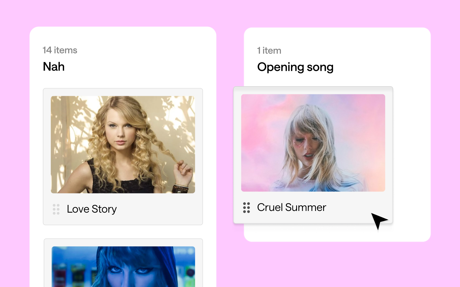
Swifties seem to agree that high-energy tracks make for the best concert openers, but the results are more nuanced than previously suggested. "Shake It Off" emerged as the clear favorite for opening a concert, with 17 votes. "Love Story" follows closely behind with 14 votes, showing that nostalgia indeed plays a significant role. Interestingly, both "Cruel Summer" and "Blank Space" tied for third place with 13 votes each.
This mix of songs from different eras of Swift's career suggests that fans appreciate both her newer hits and classic favorites when it comes to kicking off a show. The strong showing for "Love Story" does indeed speak to the power of nostalgia in concert experiences. It's worth noting that "...Ready for It?", while a popular song, received fewer votes (9) for the opening slot than might have been expected.
Encore extravaganza 🎤
When it comes to encores, fans seem to favor a diverse mix of Taylor Swift's discography, with a surprising tie at the top. "Slut!" (Taylor's Version), "exile", "Guilty as Sin?", and "Bad Blood (Remix)" all received the highest number of votes with 13 each. This variety showcases the breadth of Swift's career and the different aspects of her artistry that resonate with fans for a memorable show finale.
Close behind are "evermore", "Wildest Dreams", "ME!", "Love Story", and "Lavender Haze", each garnering 12 votes. It's particularly interesting to see both newer tracks and classic hits like "Love Story" maintaining strong popularity for the encore slot. This balance suggests that Swifties appreciate both nostalgia and Swift's artistic evolution when it comes to closing out a concert experience.
The "Nah" list 😒
Interestingly, some of Taylor Swift's tracks found themselves on the "Nah" list, indicating that fans might prefer not to hear them in a concert setting. "Clara Bow" tops this category with 13 votes, closely followed by "You're On Your Own, Kid", "You're Losing Me", and "Delicate", each receiving 12 votes.
This doesn't necessarily mean fans dislike these songs - they might just feel they're not well-suited for live performances or don't fit as well into a concert setlist. It's particularly surprising to see "Delicate" on this list, given its popularity. The presence of both newer tracks like "Clara Bow" and older ones like "Delicate" suggests that the "Nah" list isn't tied to a specific era of Swift's career, but rather to individual song preferences in a live concert context.
It's worth noting that even popular songs can end up on this list, highlighting the complex relationship fans have with different tracks in various contexts. This data provides an interesting insight into how Swifties perceive songs differently when considering them for a live performance versus general listening.
1. The "Midnights" Connection: Songs from "Midnights" like "Midnight Rain", "The Black Dog", and "The Tortured Poets Department" showed high similarity in set list placement. This suggests fans see these tracks working well in similar parts of a concert, perhaps as a cohesive segment showcasing the album's distinct sound.
2. Cross-album transitions: There's an intriguing connection between "Guilty as Sin?" and "exile", with a high similarity percentage. This indicates fans see these songs from different albums as complementary in a live setting, potentially suggesting a smooth transition point in the set list that bridges different eras of Swift's career.
3. The show-stoppers: "Shake It Off" stands out as dissimilar to most other songs in terms of placement. This likely reflects its perceived role as a high-energy, statement piece that occupies a unique position in the set list, perhaps as an opener, closer, or peak moment.
4. Set list evolution: There's a noticeable pattern of higher similarity between songs from the same or adjacent eras, suggesting fans envision distinct segments for different periods of Swift's career within the concert. This could indicate a preference for a chronological journey through her discography or strategic placement of different styles throughout the show.
5. Thematic groupings: Some songs from different albums showed higher similarity, such as "Is It Over Now? (Taylor's Version)" and "You're On Your Own, Kid". This suggests fans see them working well together in the set list based on thematic or emotional connections rather than just album cohesion.
What does it all mean?! 💃🏼📊
This card sort data paints a picture of an artist who continually evolves while maintaining certain core elements that define her work. Swift's ability to create cohesive album experiences, make bold stylistic shifts, and maintain thematic threads throughout her career is reflected in how fans perceive and categorize her songs. Moreover, the diversity of opinions on song categorization - with 59 different songs suggested as potential openers - speaks to the depth and breadth of Swift's discography. It also highlights the personal nature of music appreciation; what one fan sees as the perfect opener, another might categorize as a "Nah".
In the end, this analysis gives us a fascinating glimpse into the complex web of associations in Swift's discography. It shows us not just how Swift has evolved as an artist, but how her fans have evolved with her, creating deep and sometimes unexpected connections between songs across her entire career. Whether you're a die-hard Swiftie or a casual listener, or a weirdo who just loves a good card sort, one thing is clear: Taylor Swift's music is rich, complex, and deeply meaningful to her fans. And with each new album, she continues to surprise, delight, and challenge our expectations.
Conclusion: shaking up our understanding 🥤🤔
This deep dive into the Swiftie psyche through a card sort reveals the complexity of Taylor Swift's discography and fans' relationship with it. From strategic song placement in a dream setlist to unexpected cross-era connections, we've uncovered layers of meaning that showcase Swift's artistry and her fans' engagement. The exercise demonstrates how a song can be a potential opener, mid-show energy boost, poignant closer, or a skip-worthy track, highlighting Swift's ability to create diverse, emotionally resonant music that serves various roles in the listening experience.
The analysis underscores Swift's evolving career, with distinct album clusters alongside surprising connections, painting a picture of an artist who reinvents herself while maintaining a core essence. It also demonstrates how fan-driven analyses like card sorting can be insightful and engaging, offering a unique window into music fandom and reminding us that in Swift's discography, there's always more to discover. This exercise proves valuable whether you're a die-hard Swiftie, casual listener, or someone who loves to analyze pop culture phenomena.
It’s a chicken and egg situation when it comes to securing funding for a large transformation program in government. On one hand, you need to submit a business case and, as part of that, you need to make early decisions about how you might approach and deliver the program of work. On the other hand, you need to know enough about the problem you are going to solve to ensure you have sufficient funding to understand the problem better, hire the right people, design the right service, and build it the right way.
Now imagine securing hundreds of millions of dollars to design and build a service, but not feeling confident about what the user needs are. What if you had the opportunity to change this common predicament and influence your leadership team to carry out alignment activities, all while successfully delivering within the committed time frames?
Meera Pankhania, Design Director and Co-founder of Propel Design, recently spoke at UX New Zealand, the leading UX and IA conference in New Zealand hosted by Optimal Workshop, on traceability and her learnings from delivering a $300 million Government program.
In her talk, Meera helps us understand how to use service traceability techniques in our work and apply them to any environment - ensuring we design and build the best service possible, no matter the funding model.
Background on Meera Pankhania
As a design leader, Meera is all about working on complex, purpose-driven challenges. She helps organizations take a human-centric approach to service transformation and helps deliver impactful, pragmatic outcomes while building capability and leading teams through growth and change.
Meera co-founded Propel Design, a strategic research, design, and delivery consultancy in late 2020. She has 15 years of experience in service design, inclusive design, and product management across the private, non-profit, and public sectors in both the UK and Australia.
Meera is particularly interested in policy and social design. After a stint in the Australian Public Service, Meera was appointed as a senior policy adviser to the NSW Minister for Customer Service, Hon. Victor Dominello MP. In this role, she played a part in NSW’s response to the COVID pandemic, flexing her design leadership skills in a new, challenging, and important context.
From funding to delivery: ensuring alignment from start to finish 🏁🎉👏
Meera’s talk explores a fascinating case study within the Department of Employment Services (Australia) where a substantial funding investment of around $300 million set the stage for a transformative journey. This funding supported the delivery of a revamped Employment Services Model, which had the goal of delivering better services to job seekers and employers, and a better system for providers within this system. The project had a focus on aligning teams prior to delivery, which resulted in a huge amount of groundwork for Meera.
Her journey involved engaging various stakeholders within the department, including executives, to understand the program as a whole and what exactly needed to be delivered. “Traceability” became the watchword for this project, which is laid out in three phases.
Phase 1: Aligning key deliverables
Phase 2: Ensuring delivery readiness
Phase 3: Building sustainable work practices
Phase 1: Aligning key deliverables 🧮
Research and discovery (pre-delivery)
Meera’s work initially meant conducting extensive research and engagement with executives, product managers, researchers, designers, and policymakers. Through this process, a common theme was identified – the urgent (and perhaps misguided) need to start delivering! Often, organizations focus on obtaining funding without adequately understanding the complexities involved in delivering the right services to the right users, leading to half-baked delivery.
After this initial research, some general themes started to emerge:
Assumptions were made that still needed validation
Teams weren’t entirely sure that they understood the user’s needs
A lack of holistic understanding of how much research and design was needed
The conclusion of this phase was that “what” needed to be delivered wasn’t clearly defined. The same was true for “how” it would be delivered.
Traceability
Meera’s journey heavily revolved around the concept of "traceability” and sought to ensure that every step taken within the department was aligned with the ultimate goal of improving employment services. Traceability meant having a clear origin and development path for every decision and action taken. This is particularly important when spending taxpayer dollars!
So, over the course of eight weeks (which turned out to be much longer), the team went through a process of combing through documents in an effort to bring everything together to make sense of the program as a whole. This involved some planning, user journey mapping, and testing and refinement.
Documenting Key Artifacts
Numerous artifacts and documents played a crucial role in shaping decisions. Meera and her team gathered and organized these artifacts, including policy requirements, legislation, business cases, product and program roadmaps, service maps, and blueprints. The team also included prior research insights and vision documents which helped to shape a holistic view of the required output.
After an effort of combing through the program documents and laying everything out, it became clear that there were a lot of gaps and a LOT to do.
Prioritising tasks
As a result of these gaps, a process of task prioritization was necessary. Tasks were categorized based on a series of factors and then mapped out based on things like user touch points, pain points, features, business policy, and technical capabilities.
This then enabled Meera and the team to create Product Summary Tiles. These tiles meant that each product team had its own summary ahead of a series of planning sessions. It gave them as much context (provided by the traceability exercise) as possible to help with planning. Essentially, these tiles provided teams with a comprehensive overview of their projects i.e. what their user needs, what certain policies require them to deliver, etc.
Phase 2: Ensuring delivery readiness 🙌🏻
Meera wanted every team to feel confident that we weren’t doing too much or too little in order to design and build the right service, the right way.
Standard design and research check-ins were well adopted, which was a great start, but Meera and the team also built a Delivery Readiness Tool. It was used to assess a team's readiness to move forward with a project. This tool includes questions related to the development phase, user research, alignment with the business case, consideration of policy requirements, and more. Ultimately, it ensures that teams have considered all necessary factors before progressing further.
Phase 3: Building sustainable work practices 🍃
As the program progressed, several sustainable work practices emerged which Government executives were keen to retain going forward.
Some of these included:
ResearchOps Practice: The team established a research operations practice, streamlining research efforts and ensuring that ongoing research was conducted efficiently and effectively.
Consistent Design Artifacts: Templates and consistent design artifacts were created, reducing friction and ensuring that teams going forward started from a common baseline.
Design Authority and Ways of Working: A design authority was established to elevate and share best practices across the program.
Centralized and Decentralized Team Models: The program showcased the effectiveness of a combination of centralized and decentralized team models. A central design team provided guidance and support, while service design leads within specific service lines ensured alignment and consistency.
Why it matters 🔥
Meera's journey serves as a valuable resource for those working on complex design programs, emphasizing the significance of aligning diverse stakeholders and maintaining traceability. Alignment and traceability are critical to ensuring that programs never lose sight of the problem they’re trying to solve, both from the user and organization’s perspective. They’re also critical to delivering on time and within budget!
Traceability key takeaways 🥡
Early Alignment Matters: While early alignment is ideal, it's never too late to embark on a traceability journey. It can uncover gaps, increase confidence in decision-making, and ensure that the right services are delivered.
Identify and audit: You never know what artifacts will shape your journey. Identify everything early, and don’t be afraid to get clarity on things you’re not sure about.
Conducting traceability is always worthwhile: Even if you don’t find many gaps in your program, you will at least gain a high level of confidence that your delivery is focused on the right things.
Delivery readiness key takeaways 🥡
Skills Mix is Vital: Assess and adapt team member roles to match their skills and experiences, ensuring they are positioned optimally.
Not Everyone Shares the Same Passion: Recognize that not everyone will share the same level of passion for design and research. Make the relevance of these practices clear to all team members.
Sustainability key takeaways 🥡
One Size Doesn't Fit All: Tailor methodologies, templates, and practices to the specific needs of your organization.
Collaboration is Key: Foster a sense of community and collective responsibility within teams, encouraging shared ownership of project outcomes.
Emotional. Playful. Delightful.These words resonate with user experience (UX) practitioners. We put them in the titles of design books. We build products that move up the design hierarchy of needs, with the goal to go beyond just reliability, usability, and productivity. We want to truly delight the people who use our products.Designing for delight has parallels in the physical world. I see this in restaurants which offer not only delicious food but also an inviting atmosphere; in stores that don’t just sell clothes but also provide superior customer service. Whole industries operate on designing for delight.
The amusement industry has done this for over 500 years. The world’s oldest operating amusement park, Bakken, first opened for guests in 1583 – about 300 years before the first modern roller coaster. Amusement parks experienced a boom in growth in the US in the 1970s. As of November 2014, China had 59 new amusement parks under construction. Today, hundreds of millions of guests each year visit amusement parks throughout the world.I've been fortunate to work in the amusement industry as the owner of a digital UX design company called Thrill & Create. Here is my story of how I got to do this kind of work, and my observations as a UX practitioner in this market.
Making user-centred purveyors of joy
I've been a fan of amusement parks for most of my life. And it’s somewhat hereditary. Much of my family still lives in Central Florida, and several of them have annual passes to Walt Disney World. My mom was a Cast Member at the Magic Kingdom during its opening season.Although I grew up living east of Washington, DC, I spent most of my childhood waiting for our annual trip to an amusement park. I was a different kind of amusement enthusiast: scared to death of heights, loath to ride roller coasters, but so interested in water rides and swimming that my family thought I was a fish. The love for roller coasters would show up much later. But the collection of park maps from our annual trips grew, and in the pre-RollerCoaster Tycoon days, I would sketch designs for amusement parks.
In college, my interest in amusement received a healthy boost from the internet. In the mid-2000s, before fan communities shifted toward Facebook, unofficial websites were quite popular. My home park — a roller coaster enthusiasts’ term for the park that we visit most frequently, not necessarily the closest park to us — had several of these fansites.The fansites would typically last for a year or two and enjoy somewhat of a rivalry with other fansites before their creators would move on to a different hobby and close their sites. The fansites’ forums became an interesting place to share knowledge and learn history about my home park. They also gave us a place to discuss what we would do if we owned the park, to echo rumors we had heard, and start our own rumors. Some quite active forums still exist for this.
Of course, many of us on the forums wanted to be the first to hear a rumor. So we follow the industry blogs, which are typically the first sources of the news. Screamscape has been announcing amusement-industry rumors since the 1990s. And Screamscape and other sites like it announce news not only in the parks but around the industry. Regular Screamscape readers learn about ride manufacturers, trade names for each kind of ride, industry trade shows, and much more. And the International Association of Amusement Parks and Attractions (IAAPA) keeps an eye on the industry as well.Several years ago, I transitioned from being a software developer to starting a user experience design company. It is now called Thrill & Create. I was faced with a challenge: how to compete against the commoditization of freelance design services. Ultimately, selecting a niche was the answer. And seeing IAAPA’s iconic roller coaster sign outside the Orange County Convention Center during a trip to Central Florida was all I needed to shift my strategy toward the amusement industry.
What UX looks like in the Amusement Industry
Periodically, I see new articles about amusement parks in UX blogs. Here are my observations about how UX looks in the industry, both in the physical world and the digital world.
Parks are focused on interactive rides
The amusement industry is known for introducing rides that are bigger, taller, and faster. But the industry has a more interactive future. Using cleverly-designed shops which produce some of the longest waits in the park, Universal Studios has sold many interactive wands to give guests additional experiences in Hogsmeade and Diagon Alley.
Buzz Lightyear's Astro Blasters at Disneyland
At IAAPA, interactivity and interactive rides are very hot topics. Interactive shooting dark rides came to many parks in the early 2000s. Wonder Mountain’s Guardian, a 2014 addition to Canada’s Wonderland, features the world’s longest interactive screen and a ride program that changes completely for the Halloween season.Also coming in 2015 is the elaborately-themed Justice League: Battle for Metropolis rides at two Six Flags parks. And Wet‘n’Wild Las Vegas will debut 'Slideboarding', which allows riders to participate in a video game by touching targets on their way down the slide, and is marketed as 'the world's first waterslide gaming experience'.
UX design is well-established for the physical space
Terms like 'amusement industry', 'attractions industry', and 'themed entertainment industry' can be interchangeable, but they do have different focuses, and different user experience design needs. The amusement industry encompasses amusement parks, theme parks, zoos, aquaria, museums, and their suppliers; the attractions industry also includes other visitor attractions.Several experience design companies have worked extensively on user-centered themed entertainment.
Jack Rouse Associates, who see themselves as “audience advocates”, have worked with over 35 clients in themed entertainment, including Universal, Ocean Park, and LEGOLAND. Thinkwell Group, which touts a 'guest-centric approach to design', showcases 14 theme park and resort projects and attractions work in 12 countries.Consultants in the industry have been more intentionally user-centered. Sasha Bailyn and her team at Entertainment Designer write regularly about physical-world experience design, including UX, in themed entertainment. Russell Essary, owner of Interactive Magic, applies user-centered design to exhibit design, wayfinding, game design, and much more.
In-house teams, agencies, and freelancers are becoming more common
Several large park chains have in-house or contracted UX design teams. Most mid-sized parks work with in-house marketing staff or with outside design companies. One company I know of specializes in web design and development for the amusement industry. Smaller parks and ride companies tend to work with local web designers, or occasionally free website vendors.
Screenshot of the Memphis Zoo homepage, designed by Speak Creative
Screenshot of the Extreme Engineering homepage, designed by Extreme Engineering
Sometimes, amusement sites with a great user experience are not made by UX practitioners. The website for Extreme Engineering has a very strong, immersive visual design which communicates their brand well. When I contacted them to learn who designed their site, I was surprised to learn that their head of marketing had designed it.
What I think is going well
Several developments have encouraging me in my mission to help the amusement industry become more user-centered.
UX methods are producing clear wins for my clients and their users
My clients in the industry so far have had significant fan followings. Fans have seen my user-centered approach, and they have been eager to help me improve their favorite sites. I told a recent client that it would take a week to get enough responses from his site visitors on an OptimalSort study. Within a few hours, we exceeded our target number of responses.
The Explore the Park feature concept of this Busch Gardens Williamsburg
When I worked on redesign concepts for a network of park fansites, I ran separate OptimalSort studies for all 8 fansites in the network. They used comparable pages from each site as cards. We discovered that some parks’ attractions organized well by themed area, while others organized well by ride type. Based on this, we decided to let users find attractions using either way on every site. User testers received Explore the Park and the two other new features that emerged from our studies (Visit Tips and Fansite Community) very well.
Although not all of the features I designed for The Coaster Crew went live, the redesign of their official website produced solid results. Their Facebook likes increased over 50% within a year, and their site improved significantly in several major KPIs. Several site visitors have said that the Coaster Crew’s website’s design helped them choose to join The Coaster Crew instead of another club. So that's a big win.
In-park guest experiences and accessibility are hot right now
IAAPA offered over 80 education sessions for industry professionals at this past Attractions Expo. At least nine sessions discussed guest experience. Guest experience was also mentioned in several industry publications I picked up at the show, including one which interviewed The Experience Economy author B. Joseph Pine II.
And parks are following through on this commitment, even for non-riders. Parks are increasingly theming attractions in ways that allow non-riders to experience a ride’s theme in the ride’s environment. For example, Manta at SeaWorld Orlando is a flying roller coaster themed to a manta ray. The park realized that not all of its guests will want to ride a thrilling ride with four inversions. So, separate queues allow both riders and non-riders to see aquariums with around 3,000 sea creatures. And Manta becomes, effectively, a walkthrough attraction for guests who do not want to ride the roller coaster.
The industry has also had encouraging innovations recently in accessibility. Attractions Management Magazine recently featured Morgan’s Wonderland, an amusement park geared toward people with physical and cognitive disabilities. Water parks are beginning to set aside times to especially cater to guests with autism. And at IAAPA, ride manufacturer Zamperla donated a fully-accessible ride to Give Kids the World, an amusement-industry charity.
Several successful consultancies are helping amusement parks and attractions deliver both a better guest experience in the park and better results on business metrics. And that's something I'm definitely keen to be a part of.
Amusement business factors with UX implications
While this is not an exhaustive list, here are some factors in the amusement industry which have UX implications.
While ride manufacturers continue to innovate, they are starting to encounter limits on how much physical thrill the human body can handle. A new world’s tallest complete-circuit roller coaster should open in 2017. But that record, only broken one other time since 2003, was broken 5 times between 1994 and 2003. So the industry is shifting toward more immersive attractions and "psychological thriller" rides.
Increased reliance on intellectual property
While some parks still develop their own worlds and characters for attractions, parks today increasingly rely on third-party intellectual property (IP), such as movies, TV shows, and characters. Third-party IP provides guests with a frame of references for interpreting what they see in the park. For example, The Wizarding World of Harry Potter enjoyed a very positive reception from guests due to its faithfulness to the Harry Potter books and films. In the same way, fans will notice if a themed area or attraction is not faithful to the original, and will see it as a broken experience.
Bring your own device
Many guests now carry mobile devices with them in the parks. But so far, guests have not been able to use their mobile devices to trigger changes in a park’s environment. The closest this has come is the interactive wands in The Wizarding World of Harry Potter. Most parks ban mobile devices from most rides due to safety hazards. And amusement parks and museums are both beginning to ban selfie sticks.
Multiple target markets at the same time
Because parks look for gaps in their current offerings and customer bases, they very rarely add new attractions for similar audiences several years in a row. My regional parks tend to handle additions on a 5-10 year cycle. They alternate year by year with additions like a major roller coaster, one or more thrilling flat rides, a family ride, and at least one water ride, to appeal to different market segments, as regularly as possible.The same goes for in-park UX improvements. Themed environment upgrades in a kids’ area appeal to few people in haunted attractions’ target audiences, and vice versa.
Empathy
According to the Association of Zoos and Aquariums (AZA), the fact that most people today will never see sharks, elephants, or pandas in the wild is making conservation efforts more difficult. Zoos and aquaria, in particular, have a large opportunity to allow families to empathize with animals and efforts to conserve threatened species. But, according to an International Zoo Educators Association presentation, most zoo and aquarium guests go there primarily just to see the animals or please their kids.
Ideas for improving the user experience of websites and software in the amusement industry
My primary work interest is to design digital experiences in the amusement industry that support the goals of their target users. To understand where the industry currently stands, I have visited several thousand websites for amusement parks, ride companies, suppliers, zoos, aquaria, museums, and dolphinariums. Below, I've documented a few problems I've seen, and suggested ways companies can solve these problems.
Treat mobile as a top priority
Currently, over 500 websites in the industry are on my radar as sites to improve. At least 90 of them are desktop-only websites with no mobile presence. Several of these sites — even for major ride manufacturers — use Flash and cannot be viewed at all on a mobile device.The industry’s business-to-consumer (B2C) organizations, such as parks, realize that a great deal of traffic comes from mobile and that mobile users are more likely to leave a site that is desktop-only.
These organizations recognize the simple fact that going mobile means selling more tickets. IAAPA itself has capitalized on mobile for their trade show attendees for several years by making a quite resourceful mobile app available.However, at IAAPA, I asked people from several business-to-business (B2B) companies why their sites were not mobile yet. Several told me that they didn’t consider mobile a high priority and that they might start working on a mobile site “in about a year or so.” Thus, they don't feel a great deal of urgency — and I think it's time they did.
Bring design styles and technologies up to date
Many professional UX designers and web designers are well aware of 1990s-style web design artefacts like misused fonts (mainly Comic Sans and Papyrus), black text on a red background,obviously-tiled backgrounds, guestbooks, and splash screens. But I've seen more than a few live amusement websites that still use each of these.Sites that prompt users to install Flash (on mobile devices) or QuickTime increase users’ interaction cost with the site, because the flow of their tasks has been interrupted.
And as Jakob Nielsen says, "Unless everything works perfectly, the novice user will have very little chance of recovery."
If a website needs to use technologies such as Flash or features such as animation or video, a more effective solution would be progressive enhancement. Users whose devices lack the capability to work with these technologies would still see a website with its core features intact and no error messages to distract them from converting.
Organize website information to support user goals and knowledge
Creating an effective website involves much more than using up-to-date design styles. It also involves the following.
Understand why users are on the website
Businesses promote products and services that make them money. Many amusement parks now offer front-of-line passes, VIP tours, pay-per-experience rides, locker rentals, and water park cabana rentals, which are each an additional charge for admitted guests. And per-capita spending is very important to not only parks’ operations, but also their investor relations.Users come to websites with the question, “What’s in it for me?”, and their own sets of goals. Businesses need to know when these goals match their own goals and when they conflict.
The importance of each goal should also be apparent in the design. One water park promotes its changing rooms and locker rentals on its homepage. This valuable space dedicated to logistical information for guests already coming could be used for attracting prospective visitors. Analytics tools and the search queries that they show are helpful tools for understanding why users come to a website. Sites should supplement these by conducting usability studies with users outside their organization. These studies, in turn, could include questions allowing users to describe why would visit that website. The site could use this knowledge to make sure that its content speaks to users’ reasons for visiting.
Understand what users know
Non-technical users are bringing familiarity with how to use the internet when they visit a website. They quickly become perpetual intermediates on the internet, and don’t need to be told how buttons and links work. I've noticed amusement websites that currently label calls to action with “Click Here”, and some even do so on more than one link. This explicit instruction to people is no longer needed, and the best interfaces signal clickable elements in their visual design.
Similarly, people expect to find information in categories they understand and in language familiar to them. So it's important to not make assumptions that people who visit our websites think like us. For example, if a website is organized by model name, users will need to already be familiar with these products and the differences between them. Usability testing exercises, such as card sorting, would contribute to a better design and solve this problem.
Design websites that are consistent with users’ expectations
Websites that aim to showcase a company’s creativity and sense of fun sometimes lack features that people are used to when they visit websites (like easy-to-access menus, vertical scrolling, and so on). But it's important to remember that unconventional designs may lead to increased effort for visitors, which in turn may create a negative experience. A desire to come across as fun may conflict with a visitor's need for ease and simplicity.
The site organization needs to reflect users' goals with minimal barriers to entry. People will be frustrated with things like needing to log in to see prices, having to navigate three levels deep to buy tickets, and coming across unfamiliar or contradictory terms.
Design content for reading
Marketers have written about increased engagement and other benefits resulting from automatically playing videos, animated advertising, and rotating sliders or carousels (all of which usability practitioners have argued against). And this obsession with visual media has sometimes taken attention away from a feature people still want: easy-to-read text.There are still websites in the industry that show walls of text, rivers of text, very small text for main content, text embedded within images, and text written in all-capital letters. But telling clients, “Make the text bigger, higher-contrast, and sentence case”, can conflict with the increasing reliance on exciting visual and interactive design elements.
Goal-directed design shows us what that problem is. For example, if people visit a website to learn more about a company, the website’s design should emphasize the content that gets that message across — in the format that users find most convenient.I recently worked with a leading themed entertainment blogger to improve his site’s usability. His site, Theme Park University, provides deep knowledge of the themed entertainment industry that readers cannot get anywhere else. It first came to my attention when he published a series of posts on why Hard Rock Park in Myrtle Beach, South Carolina – one of the most ambitious new theme park projects in the US in the 2000s — failed after only one season.
As a regular reader, I knew that TPU had truly fantastic content and an engaged community on social media. But users commented to us that the site was cluttered, and so didn't spend much time on the website. We needed to give the website a more open look and feel — in other words, designed to be read.The project was not a full redesign. But by fitting small changes into the site’s existing design, we made the site more open and easier to read while retaining its familiar branding for readers. We also made his site’s advertising more effective, even by having fewer ads on each page.As D. Bnonn Tennant says, “Readership = Revenue.… [A website] has to fulfill a revenue goal. So, every element should be designed to achieve that goal. Including the copy. Especially the copy — because the copy is what convinces visitors to do whatever it is you want them to do on the website".
Three final ideas for getting UX a seat at the table
In helping take UX methods to the amusement industry, I have learned several lessons which would help other practitioners pioneer UX in other industries:
1. Explain UX benefits without UX jargon
When I work for clients in the amusement industry, the biggest challenge that I face is unfamiliarity with UX. Most other professionals in the industry do not know about UX design principles or practices. I have had to educate clients on the importance of giving me feedback early and testing with users often. And because most of my clients have not had a technical background, I have had to explain UX and its benefits in non-UX terms.
2. Be willing to do non-UX project work yourself in a team of one
As a business owner, I regularly prospect for new clients. The biggest challenge in landing projects here is trying to convince people that they should hire a bigger team than just me. A bigger team (and higher rates for a UXer versus a web designer) leads to bigger project costs and more reluctant approvals. So I have had to do development – and even some tech support – myself so far.
3. Realize clients have a lot on their plates — so learn patience
The other main challenge in selling UX to the amusement industry is project priority. Marketing departments that handle websites are used to seeing the website as one job duty out of many. Ride companies without dedicated IT staff tend to see the website as an afterthought, partially because they do most of their business at trade shows instead of online. This has led to several prospects telling me that they might pursue a redesign a year from now or later, but not in the near future. That's OK because I can be ready for them when they're ready for me.