Subscribe to OW blog for an instantly better inbox
Oops! Something went wrong while submitting the form.
Articles and Podcasts on Customer Service, AI and Automation, Product, and more

In our Value of UX Research report, nearly 70% of participants identified analysis and synthesis as the area where AI could make the biggest impact.
At Optimal, we're all about cutting the busywork so you can spend more time on meaningful insights and action. That’s why we’ve built automated Insights, powered by AI, to instantly surface key themes from your survey responses.
No extra tools. No manual review. Just faster insights to help you make quicker, data-backed decisions.
Automated Insights are just one part of our ever-growing AI toolkit at Optimal. We're making it easier (and faster) to go from raw data to real impact, such as our AI Simplify tool to help you write better survey questions, effortlessly. Our AI assistant suggests clearer, more effective wording to help you engage participants and get higher-quality data.
Ready to level up your UX research? Log into your account to get started with these newest capabilities or sign up for a free trial to experience them for yourselves.

It requires a certain kind of mind to see beauty in a hamburger bun—Ray Kroc
Maccas. Mickey D’s. The golden arches. Whatever you call it, you know I’m talking about none other than fast-food giant McDonald’s. A survey of 7000 people across six countries 20 years ago by Sponsorship Research International found that more people recognized the golden arches symbol (88%) than the Christian cross (54%). With more than 35,000 restaurants in 118 countries and territories around the world, McDonald’s has come a long way since multi-mixer salesman Ray Kroc happened upon a small fast-food restaurant in 1954.
For an organization of this size and reach, consistency and strong branding are certainly key ingredients in its marketing mix. McDonald’s restaurants all over the world are easily recognised and while the menu does differ slightly between countries, users know what kind of experience to expect. With this in mind, I wondered if the same is true for McDonald’s web presence? How successful is a large organization like McDonald’s at delivering a consistent online user experience tailored to suit diverse audiences worldwide without losing its core meaning? I decided to investigate and gave McDonald’s a good grilling by testing ten of its country-specific websites’ home pages in one Chalkmark study.
First-click testing reveals the first impressions your users have of your designs. This information is useful in determining whether users are heading down the right path when they first arrive at your site. When considering the best way to measure and compare ten of McDonald’s websites from around the world, I choose first-click testing because I wanted to be able to test the visual designs of each website and I wanted to do it all in one research study.My first job in the setup process was to decide which McDonald’s websites would make the cut.
The approach was to divide the planet up by continent, combined with the requirement that the sites selected be available in my native language (English) in order to interpret the results. I chose: Australia, Canada, Fiji, India, Malaysia, New Zealand, Singapore, South Africa, the UK, and the US. The next task was to figure out how to test this. Ten tasks is ideal for a Chalkmark study, so I made it one task per website; however, determining what those tasks would be was tricky. Serving up the same task for all ten ran the risk of participants tiring of the repetition, but a level of consistency was necessary in order to compare the sites. I decided that all tasks would be different, but tied together with one common theme: burgers.
After all, you don’t win friends with salad.
When sourcing participants for my research, I often hand the recruitment responsibilities over to Optimal Workshop because it’s super quick and easy; however, this time I decided to do something a bit different. Because McDonald’s is such a large and well-known organization visited by hundreds of millions of people every year, I decided to recruit entirely via Twitter by simply tweeting the link out. Am I three fries short of a happy meal for thinking this would work? Apparently not. In just under a week I had the 30+ completed responses needed to peel back the wrapper on McDonald’s.
Imagine what could have happened if it had been McDonald’s tweeting that out to the burger-loving masses? Ideally when recruiting for a first-click testing study the more participants you can get the more sure you can be of your results, but aiming for 30-50 completed responses will still provide viable results. Conducting user research doesn’t have to be expensive; you can achieve quality results that cut the mustard for free. It’s a great way to connect with your customers, and you could easily reward participants with, say, a burger voucher by redirecting them somewhere after they do the activity—ooh, there’s an idea!
Interpreting the results from a Chalkmark study is quick and easy.

Everything you need presented under a series of tabs under ‘Analysis’ in the results section of the dashboard:


McDonald’s tested ridiculously well right across the board in the Chalkmark study. Country by country in alphabetical order, here’s what I discovered:

This study clearly shows that McDonald’s are kicking serious goals in the online stakes but before we call it quits and go home, let’s look at why that may be the case. Approaching this the way any UXer worth their salt on their fries would, I stuck all the screens together on a wall, broke out the Sharpies and the Tesla Amazing magnetic notes (the best invention since Post-it notes), and embarked on the hunt for patterns and similarities—and wow did I find them!
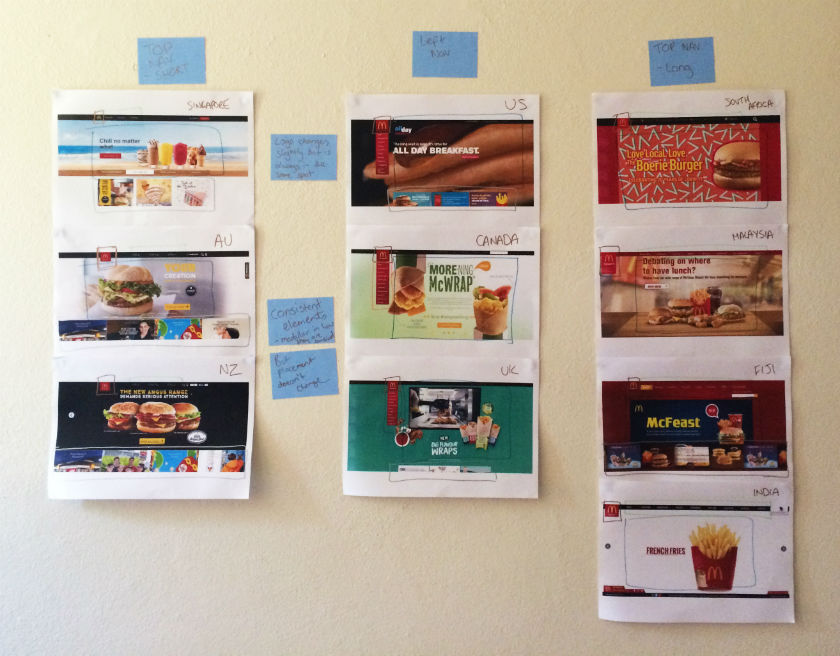
Across the ten websites, I observed just two distinct navigation patterns: navigation menus at the top and to the left. The sites with a top navigation menu could also be broken down into two further groups: those with three labels (Australia, New Zealand, and Singapore) and those with more than three labels (Fiji, India, Malaysia, and South Africa). Australia and New Zealand shared the exact same labelling of ‘eat’, ‘learn’, and ‘play’ (despite being distinct countries), whereas the others had their own unique labels but with some subject matter crossover; for example, ‘People’ versus ‘Our People’.

Canada, the UK, and the US all had the same look and feel with their left side navigation bar, but each with different labels. All three still had navigation elements at the top of the page, but the main content that the other seven countries had in their top navigation bars was located in that left sidebar.

These patterns ensure that each site is tailored to its unique audience while still maintaining some consistency so that it’s clear they belong to the same entity.
If there’s one aspect that screams McDonald’s, it’s the iconic golden arches on the logo. Across the ten sites, the logo does vary slightly in size, color, and composition, but it’s always in the same place and the golden arches are always there. Logo consistently is a no-brainer, and in this case McDonald’s clearly recognizes the strengths of its logo and understands which pieces it can add or remove without losing its identity.

Navigation and logo placement weren’t the only connections one can draw from looking at my wall of McDonald’s. There were also some very interesting but subtle similarities in the page layouts. The middle of the page is always used for images and advertising content, including videos and animated GIFs. The US version featured a particularly memorable advertisement for its all-day breakfast menu, complete with animated maple syrup slowly drizzling its way over a stack of hotcakes.

The bottom of the page is consistently used on most sites to house more advertising content in the form of tiles. The sites without the tiles left this space blank.
Looking at these results, it is quite clear that the same level of consistency and recognition between McDonald’s restaurants is also present between the different country websites. This did make me wonder what role does familiarity play in determining usability? In investigating I found a few interesting articles on the subject. This article by Colleen Roller on UXmatters discusses the connection between cognitive fluency and familiarity, and the impact this has on decision-making. Colleen writes:Because familiarity enables easy mental processing, it feels fluent. So people often equate the feeling of fluency with familiarity. That is, people often infer familiarity when a stimulus feels easy to process. If we’re familiar with an item, we don’t have to think too hard about it and this reduction in performance load can make it feel easier to use. I also found this fascinating read on Smashing Magazine by Charles Hannon that explores why Apple were able to claim ‘You already know how to use it’ when launching the iPad. It’s well worth a look!Oh and about those yoga mats … the answer is yes.
Usability testing has an important role in UX and if you’re new to it, this article gives you a solid introduction to it with practical tips, a checklist for success and a look at our remote testing tool, Treejack.
Usability testing is the process of evaluating a product or service with users prior to implementation. The goal of usability testing is to identify any usability issues before the product or service is released into the world for use. Usability testing is a research activity that results in both quantitative and qualitative insights and can be used to gauge user satisfaction.A typical usability testing session is moderated and involves a participant, a facilitator and an observer. The facilitator leads the session and the observer takes notes while the participant completes the task based scenario.
While this is common, usability testing is scalable and the possible approaches are endless giving you the flexibility to work with the resources you have available—sometimes one person performs the role of facilitator and observer!Location also varies for usability testing. For example, you might conduct your testing in a lab environment or you might talk to users in a specific environment. It also worth noting that not all usability testing sessions are moderated—more about this later.Usability testing usually occurs multiple times during the design process and can be conducted anytime you have a design you would like to test.
User research activities like a focus group for example, are conducted early in the design process to explore and gain understanding before ideas are generated. Usability testing is about testing those ideas as early and as often as possible. From a fully functioning digital prototype to a simple hand drawn wireframe on paper, nothing is too unrefined or too rough to be tested.
Before you start a round of usability testing, you need to develop a usability test plan. The usability test plan will keep you organised and is an opportunity to define roles and set clear expectations upfront. The first step in developing this is to hold a meeting with your team and stakeholders to discuss what you are going to do and how you plan to achieve it. Following this meeting, a document outlining the usability test plan as it was discussed is created and shared with the group for review. Any changes suggested by the group are then added to the final document for approval from the relevant stakeholders.
Once you have developed your test plan, you need to create a list of questions and task based scenarios for the testing session. These form the structure for your testing and provide a framework of consistency across all testing sessions in the study.The questions serve as a warm up to ease the participant into the session and can also provide insights on the user that you may not have had before. These questions can be a combination of open and closed questions and are especially useful if you are also developing personas for example. Some examples of what you might ask include:
The purpose of the task based scenarios is to simulate a real life experience as closely as possible. They provide a contextual setting for the participant to frame their approach and they need to be realistic—your participant needs an actionable starting point to work from. A good starting point for task based scenario development would be to look at a use case.It is also important that you avoid using language that provides clues to the solution or leads your participant as this can produce inaccurate results. An example of a task based scenario would be:You’re planning a Christmas vacation to New Zealand for your family of two adults and 4 children. Find the lowest priced airfares for your trip.
Treejack is a remote information architecture (IA) validation tool that shows you exactly where users are getting lost in your content. Knowing this will enable you to design a structure for your website that makes sense to users before moving on to the user interface (UI) design.Treejack works like a card sort in reverse. Imagine you have just completed a card sort with your users to determine your IA and you are now working backwards to test that thinking against real world task based scenarios. Treejack does this using a text-based version of your IA that is free from distracting visual aids such as navigation and colour allowing you to determine if your structure is usable from the ground up. A Treejack study is structured around task based scenarios and comes with the option to include pre and post study questionnaires.

As a remote testing tool, Treejack is unmoderated and provides the opportunity to reach a much larger audience because all you have to do is share a link to the study with your participants to gain insights. You also have the option of handing the task of targeted participant recruitment over to Optimal Workshop.Once launched and shared with participants, Treejack takes care of itself by recording the results as they come in giving you the freedom to multitask while you wait for the testing to finish.
The results produced by Treejack are not only detailed and comprehensive but are also quite beautiful. The story of your participants’ journey through your testing activity is told through pietrees. A pietree is a detailed pathway map that shows where your participants went at each fork in the road and their destinations. They allow you to pinpoint exactly where the issues lie and are a powerful way to communicate the results to your team and stakeholders.

Treejack also provides insights into where your participants landed their first click and records detailed information on pathways followed by each individual participant.

The following checklist will help ensure your usability testing process runs smoothly:
In this post, Daniel Szuc describes why it’s important to go beyond how we may see our roles traditionally when only focusing on job titles. By exploring other roles, as outlined in the post that follows, we can all play a part in helping to glue a team together, making project work easier for all and creating a more positive environment to help in making meaningful project experiences.
“Collaboration” is a term that gets thrown around in workplaces to encourage people to work together better. Sometimes, though, the people using the term may not understand the range of skills required to make collaboration work well, including (but not limited to) listening, expression, empathy, and curiosity.
Each of these skills requires practice.
So asking people to simply collaborate, without understanding the skills required nor the necessary spaces to practice these skills, may well frustrate people more than it helps.
As work hums along in a team, it’s easy for misalignment to creep in. Misalignments are caused by a lack of communication, limited time, poor project management, and micro/macro issues that are addressed too late, causing friction between people. If specific roles are not put in place, these frictions can create difficult work environments, making coming to work unpleasant.
Teams may lack common artifacts to help them communicate with a shared language, which in turn helps connect a project and business narrative together. Importantly, this helps aggregate what a team learns together from customer interviews to help improve a product or service.In effect, there is no light leading the way, so people can get lost in details that have nothing to do with a common and well understood purpose.
When we speak about roles, we are not referring to traditional job titles such as project manager, developer, and designer, for example. Rather, we mean roles that everyone can play at various points in a project, helping others do their job well and the team deliver on making meaningful experiences.Roles, beyond job titles or the tasks inherent in those titles, help people think in integrated and holistic ways beyond their official job title.
At times, our work requires that we delve deeply into design details; in other situations, we are required to step back and see how all the elements of our work connect in delivering solutions that are part of a broader narrative.As members of teams, we can work more effectively – whether it’s by advancing ideas or in recognizing when it’s time to consider alternative approaches.
We have identified four roles to encourage making meaningful experiences for the team and customers, as well as to encourage integrated ways of working:
Independent of whether a person works in management, engineering, product management, design, user research, or some other function, there is a common set of skills of which people need to remain aware: skills that help make our project teams’ collective efforts better.Because there is an intention to integrate ways of working, collective learning makes teamwork effective and results in more meaningful experiences. Working sessions, in which people from different teams or functions come together to solve a problem, provide a common space to focus on that problem, define approaches to help solve the problem, and work through issues together.
A team can identify the skills they practice, reflect on any gaps that may require them to expand their practice, and aggregate their learnings in common artifacts. These then help form and guide a project narrative with which the team resonates or can critique.In understanding the ways in which we work together – in essence, developing empathy for each other – we may see other benefits in addition to the work we produce.One benefit could be to move away from a blind focus on just tools and processes towards a primary focus on how we approach our work together or how we think about problems within the context of a project.
The ways in which we interact with each other suggest that we should look at the following roles, again independent of function or job title:
Thanks to Josephine Wong for contributing to this piece. For more, see Integrated Approaches to Constant Personal Learning, Improvement, and Maturity.

So I’m finally on a quick family holiday after a crazy few weeks following the wonderfully busy UX Australia conference. There are six of us in a one-bedroom apartment. It’s great … really! :-)I head to the gym to try the podcasting thing for the first time while doing a much-needed workout. It can’t be that hard.I fumble onto Dr Karl, then try “service design”, my interest area. I think I have pressed the right podcast but an entirely different one comes on. Is that my fault, or is there a mysterious trick to it all?It sounds good anyway and it’s about service design, a recount from a previous UX Australia presentation. I fail to catch the speaker's name but they are talking about the basics of service design so it will do nicely. I’m enjoying this while jogging (well, flailing, to be fair) and watching a poor elderly couple struggle over and over to enter the pool area. The card swipe that they use opens a door far away with no sounds or lights to indicate the way; there’s just a tiny insignificant sign. I had also struggled with this. With a sense of amusement – maybe irony – I’m listening to a podcast on service design while watching very poor service design in action and aching to design it better. I’m thinking of how I might write about this episode in my blog thingo when I catch who the speaker is. It’s Optimal Workshop. The very people who I’m writing the blog for. Beautiful.
I’m a UX designer. Sometimes I feel a bit fraudulent saying this. I try not to think that, but I do. I accidentally fell into the world of UX design, but it’s where I’m meant to be. I’m so pleased I found my home and my people. Finally, my weird way of thinking has a place and a name I can apply with some tentative authority these days … I am a UX designer. It’s getting easier to say.Born to immigrant parents in the 1970s, I ran away at 14 and barely made it through my High School Certificate, surviving only by training racehorses part time and skipping school to work on building sites for some very much needed cash in hand. I met an alcoholic and three beautiful daughters quickly arrived.In 2004, while travelling Australia like random gypsies in an old bus with a cute face, I suffered an accidental, medically induced heart attack and became really sick. My little heart was failing and I was told I would likely die. The girls were flown to stay with family and saying goodbye was the hardest thing I have ever done. They were so little.Clearly I didn’t die, but it was a slow and tough recovery.During this time, an opportunity to move to remote Groote Eylandt to live with the Anindilyakwan tribe in Angurugu came up, and of course we went. Family and friends said I was mad. There was little medical help available for my heart, and it was a very long way from a hospital.While living there, the local Manganese Mine decided to try using some local women to drive dump trucks. I was one of four chosen, so off I went to drive a two-story house on slippery mud. Magnificent fun!Driving dump trucks was awesome and I really enjoyed mining, but then I saw the blast crew and it looked like far more fun. I would ask Knuckles every day if I could go on blast crew. “Girls don’t do blast crew” was his constant response. I kept asking anyway. One day I said, “Knuckles, I will double your productivity as I will work twice as hard as the boys – and they can’t have a girl beat them, so your productivity will go up.” He swore, gave me a resigned look, and a one-week trial. And I was on blast crew.They were the best bunch of guys I ever had the joy of working with – such gentlemen – and I discovered I loved the adrenaline of blowing things up in the heat, humidity, mud, and storms.We left Groote in 2007, travelling in the cute bus again, and landed in Queensland’s Bowen Basin. I started blasting coal, but this was quite different to Groote Eylandt and I learned quickly that women are not always welcome on a mine site. Regardless of the enormous challenges, including death threats, I stuck it out. In fact, every challenge made me more determined than ever to excel in the industry.At the height of the global financial crisis, I found myself suddenly single with three girls to raise alone. The alcoholic had run off with another victim while I was working away on-site.I lost my job in the same week due to site shutdowns, and went to have my long hair sorted out. Sadly, due to a hairdresser’s accident, I lost all of my hair, too. It was a bad week as far as first-world problems go. In hindsight, though, it was a great week.Jobs were really scarce, but there was one going as an explosives operator in the Hunter Valley. I applied and was successful, so the girls and I packed up our meagre belongings and moved. I was the only female explosives operator working in the Valley then, and one of a handful in Australia – a highly male-dominated industry.It was a fairly tough time. Single mum, three daughters, shift work, and up to four hours of travel a day for work. I was utterly exhausted. Add to this an angry 14-year-old teenager who was doing everything to rebel against the world at the time. Much as her mum did at the same age.I found a local woman who was happy to live rent-free in exchange for part-time nannying while I worked shift work. This worked for a while but the teenagers were difficult, and challenged her authority. Needless to say, she didn’t last long term.
There was a job going with a local R&D department driving prototype explosives trucks. I submitted my little handwritten application. “Can you use a computer and Windows?” they asked. “Of course,” I said. But I couldn’t really.A few months later I had the job. It was closer to home, and only a little shift work was required.This was the golden ticket job I had been striving for. I was incredibly nervous about starting, but the night before I was woken at 11.00 pm by my 14-year-old daughter. She had tried to commit suicide by taking an overdose. I rushed her to hospital and stayed with her most of the night. Fortunately, she had not quite taken enough to cause the slow, painful, and unstoppable death, coming up four pills short. Heavily medicated, she was transferred to a troubled adolescents ward under lock and key. Unable to stay with my daughter, I turned up to my new job, exhausted and still in shock with a fake smile on my face. No one knew the ordeal.Learning how to navigate a computer at nearly 40 years of age was particularly challenging. I tried watching others, but it was not intuitive and I learned the frustration of interface rage early, almost constantly. I have computer dyslexia, for sure.Explosives operators are often like me – not very tech savvy. Some are very clever with computers, and some struggle to use a mobile phone and avoid owning a computer at all. In some countries, explosives operators are also illiterate.The job of delivering explosives is very particular. The trucks have many pumps, augers, and systems to manufacture complicated explosives mixtures accurately, utilising multiple raw materials stored in tanks on board. The management of this information is in the hands of operators who are brave, wonderfully intelligent, and hard-working people in general. Looking at a screen for up to 12 hours a day managing explosives mixtures can be frustrating if it’s set up ineffectively. Add to that new regulations and business requirements, making the job ever more complicated.I saw the new control system being created and thought the screens could be greatly improved from an operator’s perspective. I came up with an idea and designed a whole new system – very simplified, logical, and easy for the operators to use, if complicated in the back end. To be fair, at this point I had no idea about the “back end”. It was a mystical world of code the developers talked about in dark rooms.The screens now displayed only what the operator had to see at any time rather than the full suite of buttons and controls. The interface tidied right up – and with the addition of many new features that operators could turn on or off as they chose – the result was a simple, effective system that could be personalized to suit a style of loading. It was easy to manipulate to suit the changing conditions of bench loading, which requires total flexibility while offering tight control on safety, product quality, and opportunity of change.The problem was the magical choreography of the screens were dancing around in my head only; most people weren’t interested in my crazy drawings on butchers paper. I was thrown out of offices until someone finally listened to my rantings and my ideas were created as prototypes. These worked well enough to convince the business to develop the concept.A new project manager was hired to oversee the work. The less said about this person, the better, but it took a year before he was fired, and it was one of the toughest years I had to endure.In designing and developing concepts, I was actually following UX principles without knowing what they were. My main drive was to make the system consistent, logical, easy to understand at a glance, and able to capture effective data.I designed the system so as to allow the user to choose how they wanted to use the features; however, the best way was also the easiest way. I hate bossy software – being forced into corners and feeling the interface rage while just trying to do your job. It’s unacceptable.Designing interfaces and control systems is what I love to do, and I have now designed or contributed to designing four systems. I love the ability to change the way a person will perform a job just by implementing a simple alteration in software that changes the future completely. Making software suit the audience rather than the audience suit the software while achieving business goals – I love it.Deciding that I wanted to stop driving trucks, I started researching interface design. I had no degree and no skills apart from being an explosives operator. What could I possibly do?I literally stumbled upon UX design one night and noticed there was a conference soon in San Francisco, the UXDI15, so I bought a ticket and booked the flights. I had no idea what I would find, but it would be a great adventure anyway.What I found was the most incredible new world of possibility. I felt welcomed in a room full of warm hugs and acceptance. These are my people, UX people. Compassionate, empathetic, friendly, resourceful. Beautiful. I finally fit somewhere. Thank you, UX.I spent four days in awe, heard fantastic stories, met lots of clever people. Got an inappropriate tattoo…As soon as I arrived home I booked into UX Design at General Assembly. It wouldbe the first time I’d studied since high school, and meant 5.00 am wake-ups every Saturday morning to catch the train to Sydney – but hey, so worth it. I learned that the principles I stuck to fiercely during the control system designs were in fact correct UX principles. I was often right as it turns out.
Since then I have designed two apps that each solve very real problems in society, and I am excited and utterly terrified to be forging ahead with the development of them. I have a small development team, and the savings of a house deposit to throw into a startup instead.I still work full time blowing things up. I’m still an exhausted single mum with three beautiful daughters, but fortunately I now have a decent man in my life. Still, I wake up terrified at 4.00 am most mornings. Am I mad? What do I know about UX? My computer dyslexia is improving, but it still doesn’t come naturally. I have interface rage constantly. Yes, I’m mad but determined. I will make this work, because, as I tell my daughters nearly every day, “Girls – you can achieve anything you set your mind to.” And they can. (Thanks for the great quote, Eminem.)Next time I blog it will be about how I accidentally became an entrepreneur, developed two-million-dollar apps, and managed to follow my dreams of drawing portraits of life in my cafe by the sea.I look forward to telling you all about it. ;-)
"Dear Optimal Workshop
How do I quantify the ROI [return on investment] of investing in user experience?"
— Brian
Dear Brian,
I'm going to answer your question with a resounding 'It depends'. I believe we all differ in what we're willing to invest, and what we expect to receive in return. So to start with, and if you haven’t already, it's worth grabbing your stationery tools of choice and brainstorming your way to a definition of ROI that works for you, or for the people you work for.
I personally define investment in UX as time given, money spent, and people utilized. And I define return on UX as time saved, money made, and people engaged. Oh, would you look at that — they’re the same! All three (time, money, and humans) exist on both sides of the ROI fence and are intrinsically linked. You can’t engage people if you don’t first devote time and money to utilizing your people in the best possible way! Does that make sense?
That’s just my definition — you might have a completely different way of counting those beans, and the organizations you work for may think differently again.
I'll share my thoughts on the things that are worth quantifying (that you could start measuring today if you were so inclined) and a few tips for doing so. And I'll point you towards useful resources to help with the nitty-gritty, dollars-and-cents calculations.
Here are five things I think are worthy of your attention when it comes to measuring the ROI of user experience, but there are plenty of others. And different projects will most likely call for different things.
(A quick note: There's a lot more to UX than just digital experiences, but because I don't know your specifics Brian, the ideas I share below apply mainly to digital products.)
A surefire way to get a feel for the lay of the land is to look at customer support — and if measuring support metrics isn't on your UX table yet, it's time to invite it to dinner. These general metrics are an important part of an ongoing, iterative design process, but getting specific about the best data to gather for individual projects will give you the most usable data.
Improving an application process on your website? Get hard numbers from the previous month on how many customers are asking for help with it, go away and do your magic, get the same numbers a month after launch, and you've got yourself compelling ROI data.
Are your support teams bombarded with calls and emails? Has the volume of requests increased or decreased since you released that new tool, product, or feature? Are there patterns within those requests — multiple people with the same issues? These are just a few questions you can get answers to.
You'll find a few great resources on this topic online, including this piece by Marko Nemberg that gives you an idea of the effects a big change in your product can have on support activity.
This is a good one: check your analytics to see if your users are searching or navigating. I’ve heard plenty of users say to me upfront that they'll always just type in the search bar and that they’d never ever navigate. Funny thing is, ten minutes later I see the same users naturally navigating their way to those gorgeous red patent leather pumps. Why?
Because as Zoltán Gócza explains in UX Myth #16, people do tend to scan for trigger words to help them navigate, and resort to problem solving behaviour (like searching) when they can’t find what they need. Cue frustration, and the potential for a pretty poor user experience that might just send customers running for the hills — or to your competitors. This research is worth exploring in more depth, so check out this article by Jared Spool, and this one by Jakob Nielsen (you know you can't go wrong with those two).
Task completion really is a fundamental UX metric, otherwise why are we sitting here?! We definitely need to find out if people who visit our website are able to do what they came for.
For ideas on measuring this, I've found the Government Service Design Manual by GOV.UK to be an excellent resource regardless of where you are or where you work, and in relation to task completion they say:
"When users are unable to complete a digital transaction, they can be pushed to use other channels. This leads to low levels of digital take-up and customer satisfaction, and a higher cost per transaction."
That 'higher cost per transaction' is your kicker when it comes to ROI.
So, how does GOV.UK suggest we quantify task completion? They offer a simple (ish) recommendation to measure the completion rate of the end-to-end process by going into your analytics and dividing the number of completed processes by the number of started processes.
While you're at it, check the time it takes for people to complete tasks as well. It could help you to uncover a whole host of other issues that may have gone unnoticed. To quantify this, start looking into what Kim Oslob on UXMatters calls 'Effectiveness and Efficiency ratios'. Effectiveness ratios can be determined by looking at success, error, abandonment, and timeout rates. And Efficiency ratios can be determined by looking at average clicks per task, average time taken per task, and unique page views per task.
You do need to be careful not to make assumptions based on this kind of data— it can't tell you what people were intending to do. If a task is taking people too long, it may be because it’s too complicated ... or because a few people made themselves coffee in between clicks. So supplement these metrics with other research that does tell you about intentions.
A good user experience is one that gets out of bed on the right side. First clicks matter for a good user experience.
A 2009 study showed that in task-based user tests, people who got their first click right were around twice as likely to complete the task successfully than if they got their first click wrong. This year, researchers at Optimal Workshop followed this up by analyzing data from millions of completed Treejack tasks, and found that people who got their first click right were around three times as likely to get the task right.
That's data worth paying attention to.
So, how to measure? You can use software that records mouse clicks first clicks from analytics on your page, but it difficult to measure a visitor's intention without asking them outright, so I'd say task-based user tests are your best bet.
For in-person research sessions, make gathering first-click data a priority, and come up with a consistent way to measure it (a column on a spreadsheet, for example). For remote research, check out Chalkmark (a tool devoted exclusively to gathering quantitative, first-click data on screenshots and wireframes of your designs) and UserTesting.com (for videos of people completing tasks on your live website).
Here's a great piece on uxmastery.com about calculating the ROI of UX.
Here's Jakob Nielsen in 1999 with a simple 'Assumptions for Productivity Calculation', and here's an overview of what's in the 4th edition of NN/G's Return on Investment for Usability report (worth the money for sure).
Here's a calculator from Write Limited on measuring the cost of unclear communication within organizations (which could quite easily be applied to UX).
And here's a unique take on what numbers to crunch from Harvard Business Review.
I hope you find this as a helpful starting point Brian, and please do have a think about what I said about defining ROI. I’m curious to know how everyone else defines and measures ROI — let me know!
"Dear Optimal WorkshopMy question is about biasing users with the wording of questions. It seems that my co-workers and I spend too much time debating the wording of task items in usability tests or questions on surveys. Do you have any 'best practices' for wordings that evoke unbiased feedback from users?" — Dominic
Dear Dominic, Oh I feel your pain! I once sat through a two hour meeting that was dominated by a discussion on the merits of question marks!It's funny how wanting to do right by users and clients can tangle us up like fine chains in an old jewellery box. In my mind, we risk provoking bias when any aspect of our research (from question wording to test environment) influences participants away from an authentic response. So there are important things to consider outside of the wording of questions as well. I'll share my favorite tips, and then follow it up with a must-read resource or two.
The right balance of open and closed questions is essential to obtaining unbiased feedback from your users. Ask closed questions only when you want a very specific answer like 'How old are you?' or 'Are you employed?' and ask open questions when you want to gain an understanding of what they think or feel. For example, don’t ask the participant'Would you be pleased with that?' (closed question). Instead, ask 'How do you feel about that?' or even better 'How do you think that might work?' Same advice goes for surveys, and be sure to give participants enough space to respond properly — fifty characters isn’t going to cut it.
The above questions lead me to my next point — don’t use words like ‘happy’. Don’t ask if they like or dislike something. Planting emotion based words in a survey or usability test is an invite for them to tell you what they think you want to hear . No one wants to be seen as being disagreeable. If you word a question like this, chances are they will end up agreeing with the question itself, not the content or meaning behind it...does that make sense? Emotion based questions only serve to distract from the purpose of the testing — leave them at home.
No one wants to look stupid by not understanding the terms used in the question. If it’s too complicated, your user might just agree or tell you what they think you want to hear to avoid embarrassment. Another issue with jargon is that some terms may have multiple meanings which can trigger a biased reaction depending on the user’s understanding of the term. A friend of mine once participated in user testing where they were asked if what they were seeing made them feel ‘aroused’. From a psychology perspective, that means you’re awake and reacting to stimuli.
From the user's perspective? I’ll let you fill in the blanks on that one. Avoid using long, wordy sentences when asking questions or setting tasks in surveys and usability testing. I’ve seen plenty of instances of overly complicated questions that make the user tune out (trust me, you would too!). And because people don't tend to admit their attention has wandered during a task, you risk getting a response that lacks authenticity — maybe even one that aims to please (just a thought...).
Instead of asking your user what they think they would do in a given scenario, ask them to share an example of a time when they actually did do it. Try asking questions along the lines of 'Can you tell me about a time when you….?' or 'How many times in the last 12 months have you...?' Asking them to recall an experience they had allows you to gain factual insights from your survey or usability test, not hypothetical maybes that are prone to bias.
If you ask usability testing or survey questions in an order that doesn’t quite follow a logical flow, the user may think that the order holds some sort of significance which in turn may change the way they respond. It’s a good idea to ensure that the questions tell a story and follow a logical progression for example the steps in a process — don’t ask me if I’d be interested in registering for a service if you haven’t introduced the concept yet (you’d be surprised how often this happens!). For further reading on this, be sure to check out this great article from usertesting.com.
Reducing bias by asking questions the right way is really just one part of the picture. You can also reduce bias by influencing the wider aspects of the user testing process, and ensuring the participant is comfortable and relaxed.
This isn’t always possible, but it’s a good idea to try to get someone else to facilitate the usability testing on your design (and choose to observe if you like). This will prevent you from bringing your own bias into the room, and participants will be more comfortable being honest when the designer isn't asking the questions. I've seen participants visibly relax when I've told them I'm not the designer of a particular website, when it's apparent they've arrived expecting that to be the case.
The more comfortable your participants are, with both the tester and the observer, the more they can be themselves. There are labs out there with two-way mirrors to hide observers, but in all honesty the police interrogation room isn’t always the greatest look! I prefer to have the observer in the testing room, while being conscious that participants may instinctively be uncomfortable with being observed. I’ve seen observer guidelines that insist observers (in the room) stay completely silent the entire time, but I think that can be pretty creepy for participants! Here's what works best (in my humble opinion).
The facilitator leads the testing session, of course, but the observer is able to pipe up occasionally, mostly for clarification purposes, and certainly join in the welcoming, 'How's the weather?' chit chat before the session begins. In fact, when I observe usability testing, I like to be the one who collects the participant from the foyer. I’m the first person they see and it’s my job to make them feel welcome and comfortable, so when they find out I'll be observing, they know me already. Anything you can do to make the participant feel at home will increase the authenticity of their responses.
At the end of the day the reality is we’re all susceptible to bias. Despite your best efforts you’re never going to eradicate it completely, but just being aware of and understanding it goes a long way to reducing its impacts. Usability testing is, after all, something we design. I’ll leave you with this quote from Jeff Sauro's must-read article on 9 biases to watch out for in usability testing:
"We do the best we can to simulate a scenario that is as close to what users would actually do .... However, no amount of realism in the tasks, data, software or environment can change the fact that the whole thing is contrived. This doesn't mean it's not worth doing."
