Subscribe to OW blog for an instantly better inbox
Oops! Something went wrong while submitting the form.
Every day, people around the world use our research tools to craft better experiences for their users. Whether it’s a website for a new public library, an app for a self-driving car startup or even the layout of a physical retail store, our tools give researchers and designers everything they need to ensure the way people work, think and act are at the heart of every design decision.
We talk about our tools on a fairly regular basis (after all, we are quite proud of them), but this time we’re going to do something a little different. Here, we’re going to show you 17 creative ways to use OptimalSort, Treejack, Chalkmark, Reframer and Questions. Hopefully, we’ll inspire you to head off and start doing some more testing of your own. Let’s get started!
Tree testing is one of the best methods to assess the strength of your navigation structure, and Treejack is the best tool to execute this method. You can easily set up more than one Treejack study to run at the same time, allowing you to A/B test different navigation structures and pick a winner.
Ever struggle to get consensus from your team on a new logo or design? Use OptimalSort to solve the problem! Create a closed image sort with categories set up so your team can sort designs based on their preferences. You can then look at the results and determine the best path forward.
Reframer is a powerful qualitative research tool, and most of what makes it so useful for usability tests and user interviews also makes it a great tool for taking notes at conferences. Once you’ve taken all of your notes, you can use tags to mark up different insights and then share the results with your coworkers.
Card sorting is a great way to work out if you have any redundant content on your landing pages. Let’s use the example of simplifying your homepage. You can ask participants to sort cards (containing homepage links) based on how often they use them. You could then compare this data with analytics from your homepage and see if people’s actual behavior and perception are well aligned.
Determine if your icons are helping your users by testing whether they understand their purpose. Upload icons that you’re currently using (or even plan to use) to Chalkmark, and ask your participants to identify their meaning by using the post-task questions feature.
Card sorting isn’t just a technique for the digital realm. Run an open card sort with OptimalSort to figure out where items in a retail store should be grouped. If we use the example of a supermarket, the cards would be different food items and the ‘aisles’ would be the categories.
You can use Questions as a scheduling tool by setting up a survey designed to ask people which times they’re available to come in for usability testing sessions. You can send out one link to every participant and view the results in a single location. Easy!
Did you know you can use our integrated recruitment panel to remotely research participants from all around the world? This is a great way to see how different languages, countries, cultures and backgrounds interact with your website.
Chalkmark’s heatmap feature is an excellent way to get first impressions on your designs. You can see where your users clicked so you can get insights into what’s working (or not working) with your designs. It’s also fast, so it’s easy to iterate.
Empathy tests are a great way to find out whether your website, app or design is creating the right feelings with your users. Set up a closed card sort with a list of the words which could represent your design, then set up categories based on relevance. Show people your design and then ask them to sort the words into the categories which best match the experience.
The number of people using smartphones to browse websites continues to grow, making the UX of mobile websites key. Use Treejack to test the mobile IA of your website so you can work out if people are getting stuck.
Use first-click testing to find out if a text link or an icon is the best choice for navigating back to the homepage of your website. A quick test in Chalkmark will improve your website and save you design work down the line!
Ever heard of multivariate testing? It’s not too complicated. Basically, you just compare more than two versions of your studies to understand which version performs better with your audience. You can run this type of testing with Chalkmark and Treejack to determine the right design to iterate on.
Yep, you heard us. Running a card sort asking people which toppings are good for pizza and which ones aren’t is a great way to introduce people to the benefits of the card sorting method. Plus, it’s always fun to show off the results on a Friday afternoon in the office.
Search engine optimization (SEO) is an important part of any modern website, with an SEO-tuned website much more likely to show up in search results. There are many factors that go into SEO, but one of the most important is a website’s navigation. Use Treejack to improve how people navigate through your website and you’ll likely see your search engine ranking improve.
Login to your Optimal Workshop account on your laptop and get out into the field with Reframer! When you’re out conducting usability tests or user interviews with people away from your office, having Reframer makes it much easier to collect all of the necessary data. Once you’re back, use Reframer’s analysis features to make sense of your findings.
How are you supposed to test your paper prototypes when your users are spread all around the world? Well, you can simply take a photo of your prototype and use Chalkmark to remote test it with your users. Easy.
So that’s our list of 17 creative ways to use our tools. Have you got any of your own? If you do, don’t hesitate to click the little Intercom chat bubble in the corner of your screen and let us know! We always love to hear from you.
If you haven’t yet had the chance to play around with our 5 tools, you can try them for free - forever - by signing up here (no credit card required). Don’t just take our word for it, either. Check out these case studies from Xero and Intercom to learn about how 2 organizations managed to significantly improve different areas of their businesses.
Summary: The notetaking side of qualitative research is often one of the most off-putting parts of the process. We developed Reframer to make this easier, so here are 6 tips to help you get the most out of this powerful tool.
In 2018, a small team at Optimal Workshop set out to entirely revamp our approach of providing learning resources to our users and community. We wanted to practice what we preached, and build a new blog website from the ground up with a focus on usability and accessibility. As you can probably imagine, this process involved a fair amount of user research.
While we certainly ran our fair share of quantitative research, our primary focus was on speaking to our users directly, which meant carrying out a series of user interviews – and (of course) using Reframer.
There’s really no overselling the value of qualitative user research. Sure, it can be off-putting for new researchers due to its perceived effort and cost, but the insights you’ll gain about your users can’t be found anywhere else.
We knew of the inherent value in qualitative research, but we were also aware that things like interviews and usability testing would be put off due to the time required to both carry out the tests and time spent hours in workshops trying to pull insights out of the data.
So, with that in mind, here are 6 tips to make the most out of our recently released from beta tool, Reframer!
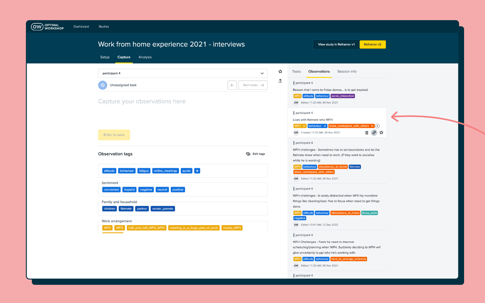
Observations are a core piece of the puzzle when it comes to effectively using Reframer. Observations are basically anything you see or hear during the course of your interview, usability test or study. It could be something like the fact that a participant struggled with the search bar or that they didn’t like the colors on the homepage.
Once you’ve collected a number of observations you can dive into the behaviors of your users and draw out patterns and themes – more on this further on in the article.
As for creating good observations using Reframer, here are a few tips:
The ability to tag different observations is one of the most powerful aspects of Reframer, and can significantly speed up the analysis side of research. You can think of tags as variables that you can use to filter your data later. For example, if you have a tag labeled “frustrated”, you can apply it to all of the relevant observations and then quickly view every instance when a participant was feeling frustrated after you’ve concluded your test.
When it comes to user interviews and usability tests, however, there are a couple of things to keep in mind when tagging.
For user interviews, it’s best not to apply tags until after you’ve finished the session. If you go and preload in a number of tags, you’ll likely (if unintentionally) introduce bias.
For usability tests, on the other hand, it’s best to set up your tags prior to going into a session. As just one example, you might have a number of tags relating to sentiment or to the tasks participants will perform. Setting up these types of tags upfront can speed up analysis later on.
If there’s one universal rule to keep in mind when it comes to Reframer tags, it’s that less is more. You can use Reframer’s merge feature to consolidate your tags, which is especially useful if you’ve got multiple people adding observations to your study. You can also set up groups to help manage large groups of tags.
Yes, it’s tempting to just shut your laptop and focus on something else for a while after finishing your session – but here’s an argument for spending just a little bit of time tidying up your data.
The time straight after a session has finished is also the best time to take a quick pass over your observations. This is the time when everything about the interview or usability test is still fresh in your mind, and you’ll be able to more easily make corrections to observations.
In Reframer, head over to the ‘Review’ tab and you’ll be presented with a list of your observations. If you haven’t already, or you think you’ve missed some important ones, now is also a good time to add tags.
You can also filter your observations to make the process of reviewing data a little easier. You can filter by the study member who wrote the observation as well as any starred observations that study members have created. If you know what you’re looking for, the keyword search is another useful tool.
Taking the time to make corrections to tags and observations now will mean you’ll be able to pull much more useful insights later on.
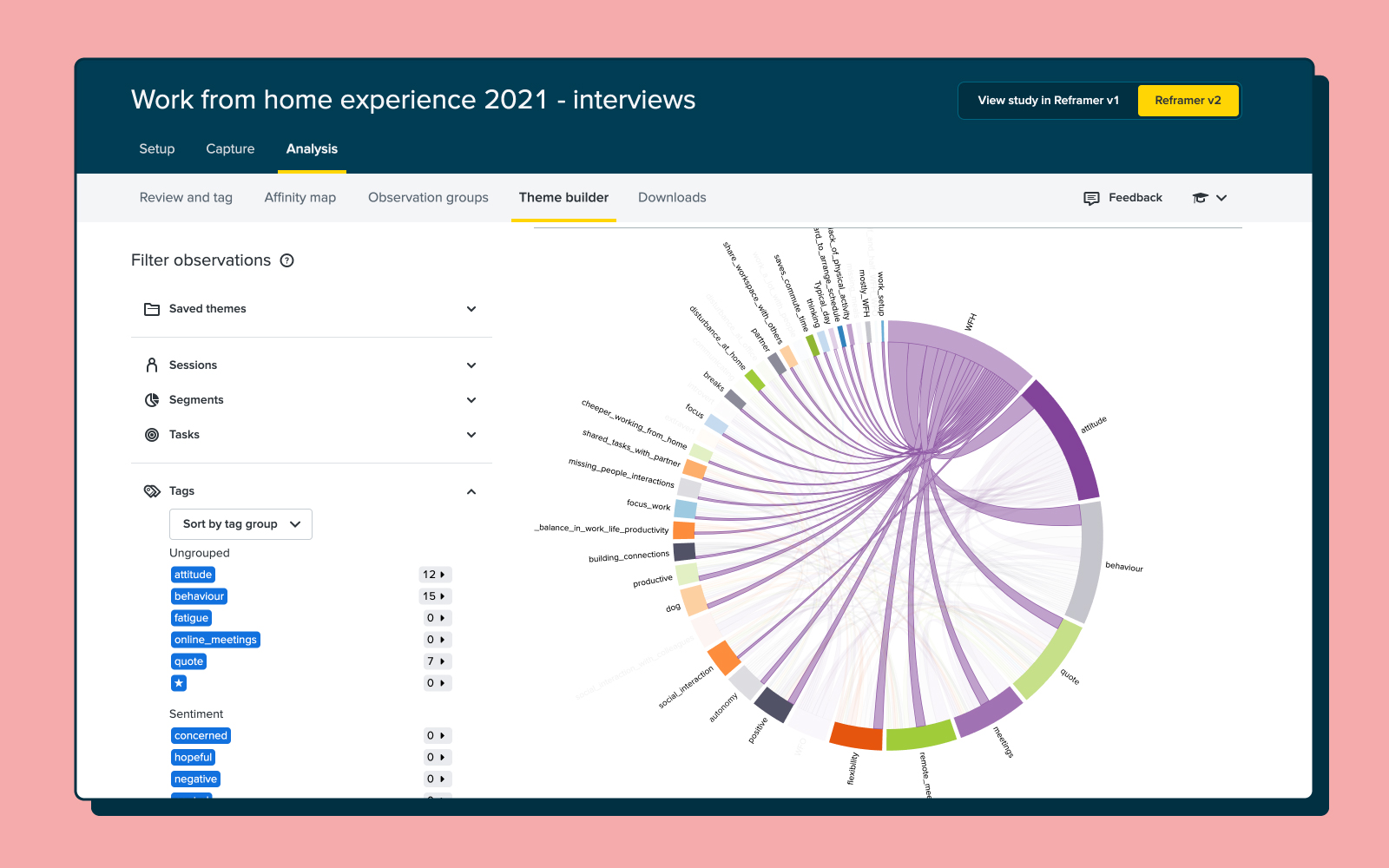
With all of your observations tidied up and tags correctly applied, it’s time to turn our attention to the theme builder. This is one of the most powerful parts of Reframer. It allows you to see all of the different relationships between your tagged observations and then create themes based on the relationships.
The really neat thing with the theme builder is that as you continue to work on your study by feeding in new observations, the top 5 themes will display on the Results Overview page. This means you can constantly refer back to this page throughout your project. Note that while the theme builder will update automatically, it’s best to tag as many observations as possible to get the most useful data.
You can read a detailed guide of how to actually create themes using the theme builder in our Knowledge Base article.
So, whether your experience with Reframer starts with this article or you’ve already had a play around with the tool, it should be clear that tags are important. This functionality is really what enables you to get the kind of analysis and insight that you can out of your data in Reframer.
But you can actually take this a step further and transform the data from your tagging into visualizations – perfect for demonstrating your results to your team or to stakeholders. There are 2 visualization options in Reframer.
First of all, there’s the chord diagram. As you can see from the picture below, the chord diagram allows you to explore the relationships between different tagged observations, which in turn helps you to spot themes. The different colored chord lines connect different tag nodes, with thicker lines representing the more times 2 tags appear on the same observation. Again, the more data you have (observations and tags), the richer or more in-depth the visualization.
The bubble chart is a little different. This visualization simply shows the frequency of your tags as ‘bubbles’ or circles. The larger the bubble, the more frequently that tag appears in your observations.
Reframer works best when it’s used as the one repository for all of your qualitative research. After all, we designed the tool to replace the clutter and mess that’s typically associated with qualitative research.
You can easily import all of your existing observations from either spreadsheets or text documents using the ‘Import’ function. It’s also possible to just enter your observations directly into Reframer at any point.
You’ll likely find that by using Reframer in this way, there’ll be little chance of you losing track of research data over time. One of the biggest issues for research or UX teams is information loss when someone leaves the organization. Keep everything in Reframer, and you can avoid that loss of data if someone ever leaves.
While quantitative research is often considered easiest to wrap your head around, qualitative research is also well-worth adding into to your workflow to ensure you're seeing the whole picture as you make important design decisions. This article is really just a surface-level overview of some of the neat things you can do with Reframer. We’ve got some other articles on our blog about how you can best use this tool, but the best place to really dig into the detail is in the Optimal Workshop Knowledge Base.

Reframer is a qualitative research tool that was built to help teams capture and make sense of their research findings quickly and easily. For those of you who have been a long-standing Optimal Workshop customer, you may know that Reframer has been in beta for some time. In fact, it has been in beta for 2 whole years. Truth was that, while we’ve cheerfully responded to your feedback with a number of cool features and improvements, we had some grand plans up our sleeve. So, we took everything we learned and went back to drawing board with the goal to provide the best dang experience we can.We’ll soon be ready to launch Reframer out of beta and let it take its place proudly as a full time member of our suite of user research tools. However, in the spirit of continuous improvement, we want to give you all a chance to use it and give us feedback on the new experience so far.
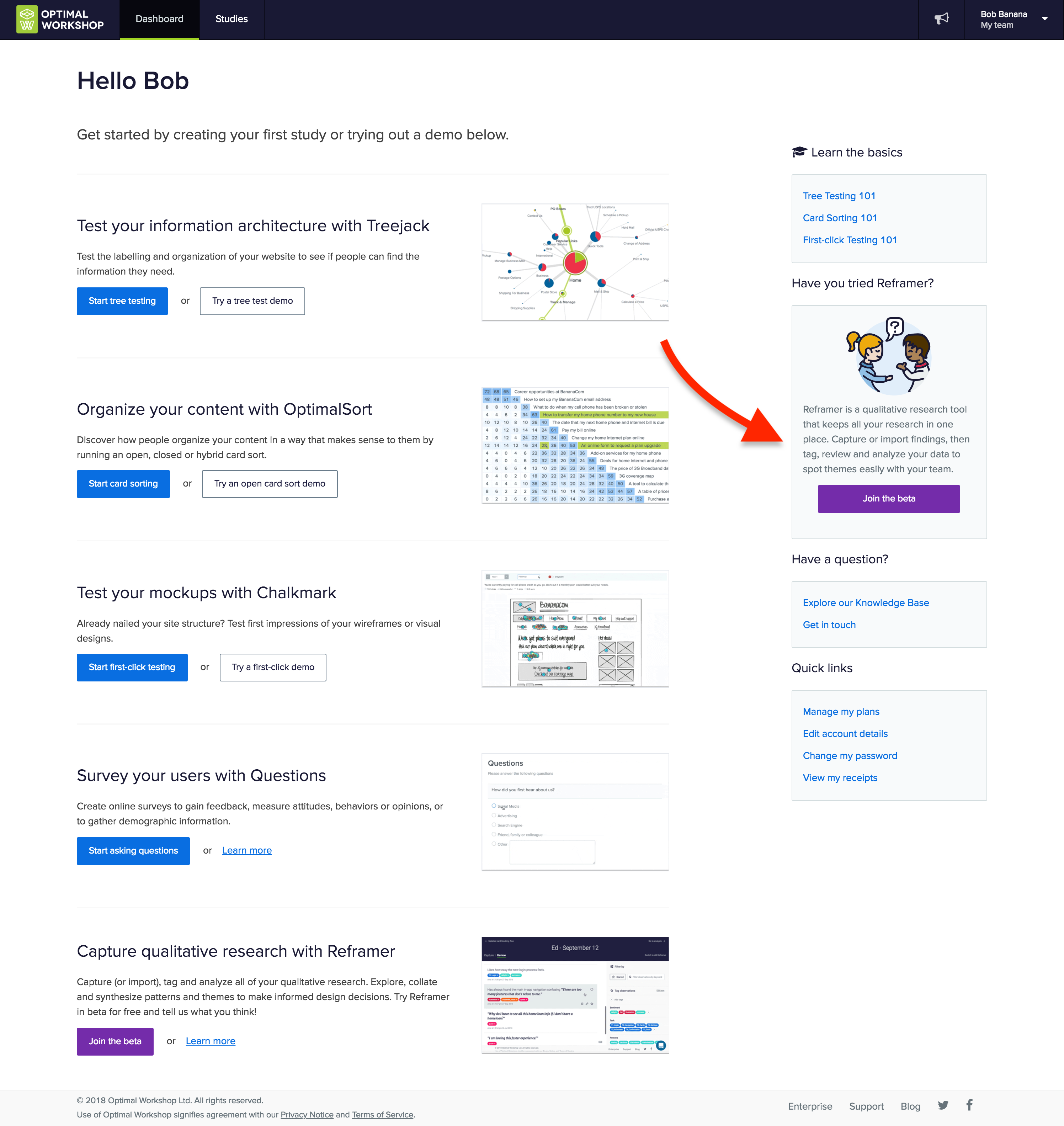
Awesome! You’ll get to experience the newer version of Reframer with a fresh set of eyes. To enable Reframer, log in to your Optimal Workshop account. On your dashboard you’ll see a button to join the Reframer beta on your screen at right.
Any new studies you create will automatically use the slick new version. Not quite ready to learn the new awesome? No worries you can toggle back and forth between the old version and the new in the top right corner of your screen.To learn about Reframer’s new look and features, watch the video or read the transcript below to hear more about these changes and why we made them.
This year. Stay tuned.
We’re this close to having our qualitative research tool, Reframer, all set to release from beta.But we just couldn’t wait to share some of the changes we’ve got lined up. So, we’ve gone ahead and launched a fresh version of Reframer to give you a taste of what’s to come.These latest updates include a more streamlined workflow and a cleaner user interface, as well as laying the foundations for some exciting features in the coming months.So let’s take a look at the revamped Reframer.We’ve updated the study screen to help you get started and keep track of where your research is at.
What’s the most important thing when observing a research session? Collecting insights of course! So we’ve simplified the capture experience to let you focus on taking great notes.
Now for something totally new — introducing review mode. Here you can see your own observations, as well as those made by anyone else in your team. This makes it easy to tidy up and edit your data after your session is complete. You can filter, search and tag observations, so you’ll be ready to make sense of everything when you move to analysis.We’ve added more guidance throughout Reframer, so you’ll have the confidence you’re on the right track. New users will be up and running in no time with improved help and easy access to resources.You might notice a few changes to our UI as well, but it’s not just about looks.
And that’s where we’re at.We've got a lot more exciting features to come, so why not jump in, give the new Reframer a try and tell us what you think!Send us your feedback and ideas at research@optimalworkshop.com and keep an eye out for more changes coming soon. Catch you later!
We’ve been working hard over the last few weeks on some nifty little changes to the way you can use, create and manage tags in Reframer. Today, we’re happy to announce that all these changes are now live. Yay!Now, you can group your tags and add custom colors. Learn a little bit about how these new features work and how you can use them below.
We made these changes so that the notetaking and analysis stages of your research projects are simpler. Previously, Reframer tags would all be the same shade of blue and organized alphabetically — not always the easiest way to find the tags you’re looking for. Now you can add as many tag groups as you like to your Reframer sessions to make managing and finding your tags much quicker and more effortless. Even better, you can also apply colors to these groups. Pick from our selected palette of colors, or choose a custom one through the hex color code chart. Grouping your tags gives you the freedom to organize your research observations in the way that makes sense to your project. Here are some of the many ways you can group and color your research observations.

These new tag features give you a lot of flexibility — each group doesn’t have to contain only one color. You can add multiple colors within one group (for example, within a ‘sentiment’ group you could select red for ‘angry’, green for ‘happy’ etc).For a bit more guidance on how to write effective research observations in Reframer, check out this article we wrote for UX Mastery.We hope you like these new tag features for Reframer. As always, if you have any feedback please let us know on support@optimalworkshop.comAlternatively, comment below with some of the ways you’ve used these new features in your research.

It’s been a long day. Scratch that - it’s been a long week! Admit it. You loved every second of it.
Twelve hour days, the mad scramble to get the prototype ready in time, the stakeholders poking their heads in occasionally, dealing with no-show participants and the excitement around the opportunity to speak to real life human beings about product or service XYZ. Your mind is exhausted but you are buzzing with ideas and processing what you just saw. You find yourself sitting in your war room with several pages of handwritten notes and with your fellow observers you start popping open individually wrapped lollies leftover from the day’s sessions. Someone starts a conversation around what their favourite flavour is and then the real fun begins. Sound familiar? Welcome to the post user testing debrief meeting.
How do you turn those scribbled notes and everything rushing through your mind into a meaningful picture of the user experience you just witnessed? And then when you have that picture, what do you do next? Pull up a bean bag, grab another handful of those lollies we feed our participants and get comfy because I’m going to share my idiot-proof, step by step guide for turning your user testing notes into something useful.
Get the ball rolling by holding a post session debrief meeting while it’s all still fresh your collective minds. This can be done as one meeting at the end of the day’s testing or you could have multiple quick debriefs in between testing sessions. Choose whichever options works best for you but keep in mind this needs to be done at least once and before everyone goes home and forgets everything. Get all observers and facilitators together in any meeting space that has a wall like surface that you can stick post its to - you can even use a window! And make sure you use real post its - the fake ones fall off!
Before you put sharpie to post it, it’s essential to agree as a group on how you will tag your observations. Tagging the observations now will make the analysis work much easier and help you to spot patterns and themes. Colour coding the post its is by far the simplest and most effective option and how you assign the colours is entirely up to you. You could have a different colour for each participant or testing session, you could have different colours to denote participant attributes that are relevant to your study eg senior staff and junior staff, or you could use different colours to denote specific testing scenarios that were used. There’s many ways you could carve this up and there’s no right or wrong way. Just choose the option that suits you and your team best because you’re the ones who have to look at it and understand it. If you only have one colour post it eg yellow, you could colour code the pen colours you use to write on the notes or include some kind of symbol to help you track them.
That pile of paper is not going to process itself! Your next job as a group is to work through the task of transposing your observations to post it notes. For now, just stick them to the wall in any old way that suits you. If you’re the organising type, you could group them by screen or testing scenario. The positioning will all change further down the process, so at this stage it’s important to just keep it simple. For issues that occur repeatedly across sessions, just write them down on their own post its- doubles will be useful to see further down the track.In addition to holding a debrief meetings, you also need to round up everything that was used to capture the testing session/s. And I mean EVERYTHING.
Handwritten notes, typed notes, video footage and any audio recordings need to be reviewed just in case something was missed. Any handwritten notes should be typed to assist you with the completion of the report. Don’t feel that you have to wait until the testing is completed before you start typing up your notes because you will find they pile up very quickly and if your handwriting is anything like mine…. Well let’s just say my short term memory is often required to pick up the slack and even that has it’s limits. Type them up in between sessions where possible and save each session as it’s own document. I’ll often use the testing questions or scenario based tasks to structure my typed notes and I find that makes it really easy to refer back to.Now that you’ve processed all the observations, it’s time to start sorting your observations to surface behavioural patterns and make sense of it all.
Affinity diagramming is a fantastic tool for making sense of user testing observations. In fact it’s just about my favourite way to make sense of any large mass of information. It’s an engaging and visual process that grows and evolves like a living creature taking on a life of its own. It also builds on the work you’ve just done which is a real plus!By now, testing is over and all of your observations should all be stuck to a wall somewhere. Get everyone together again as a group and step back and take it all in. Just let it sit with you for a moment before you dive in. Just let it breathe. Have you done that? Ok now as individuals working at the same time, start by grouping things that you think belong together. It’s important to just focus on the content of the labels and try to ignore the colour coded tagging at this stage, so if session one was blue post its don’t group all the blue ones together just because they’re all blue! If you get stuck, try grouping by topic or create two groups eg issues and wins and then chunk the information up from there.
You will find that the groups will change several times over the course of the process and that’s ok because that’s what it needs to do.While you do this, everyone else will be doing the same thing - grouping things that make sense to them. Trust me, it’s nowhere near as chaotic as it sounds! You may start working as individuals but it won’t be long before curiosity kicks in and the room is buzzing with naturally occurring conversation.Make sure you take a step back regularly and observe what everyone else is doing and don’t be afraid to ask questions and move other people’s post its around- no one owns it! No matter how silly something may seem just put it there because it can be moved again. Have a look at where your tagged observations have ended up. Are there clusters of colour? Or is it more spread out? What that means will depend largely on how you decided to tag your findings. For example if you assigned each testing session its own colour and you have groups with lot’s of different colours in them you’ll find that the same issue was experienced by multiple people.Next, start looking at each group and see if you can break them down into smaller groups and at the same time consider the overall picture for bigger groups eg can the wall be split into say three high level groups.Remember, you can still change your groups at anytime.
Once you and your team are happy with the groups, it’s time to start condensing the size of this beast. Look for doubled up findings and stack those post its on top of each other to cut the groups down- just make sure you can still see how many there were. The point of merging is to condense without losing anything so don’t remove something just because it only happened once. That one issue could be incredibly serious. Continue to evaluate and discuss as a group until you are happy. By now clear and distinct groups of your observations should have emerged and at a glance you should be able to identify the key findings from your study.
Scoring relates to how serious the issues are and how bad the consequences of not fixing them are. There are arguments for and against the use of scoring and it’s important to recognise that it is just one way to communicate your findings.I personally rarely use scoring systems. It’s not really something I think about when I’m analysing the observations. I rarely rank one problem or finding over another. Why? Because all data is good data and it all adds to the overall picture.I’ve always been a huge advocate for presenting the whole story and I will never diminish the significance of a finding by boosting another. That said, I do understand the perspective of those who place metrics around their findings. Other designers have told me they feel that it allows them to quantify the seriousness of each issue and help their client/designer/boss make decisions about what to do next.We’ve all got our own way of doing things, so I’ll leave it up to you to choose whether or not you score the issues. If you decide to score your findings there are a number of scoring systems you can use and if I had to choose one, I quite like Jakob Nielsen’s methodology for the simple way it takes into consideration multiple factors. Ultimately you should choose the one that suits your working style best.
Let’s say you did decide to score the issues. Start by writing down each key finding on it’s own post it and move to a clean wall/ window. Leave your affinity diagram where it is. Divide the new wall in half: one side for wins eg findings that indicate things that tested well and the other for issues. You don’t need to score the wins but you do need to acknowledge what went well because knowing what you’re doing well is just as important as knowing where you need to improve. As a group (wow you must be getting sick of each other! Make sure you go out for air from time to time!) score the issues based on your chosen methodology.Once you have completed this entire process you will have everything you need to write a kick ass report.
No process is perfect and there are a few potential dramas to be aware of:
In the middle of the debrief meeting, someone has an epiphany. Shouts of We should move the help button! or We should make the yellow button smaller! ring out and the meeting goes off the rails.I’m not going to point fingers and blame any particular role because we’ve all done it, but it’s important to recognise that’s not why we’re sitting here. The debrief meeting is about digesting and sharing what you and the other observers just saw. Observing and facilitating user testing is a privilege. It’s a precious thing that deserves respect and if you jump into solution mode too soon, you may miss something. Keep the conversation on track by appointing a team member to facilitate the debrief meeting.
Handwritten notes taken by multiple observers over several days of testing adds up to an enormous pile of paper. Not only is it a ridiculous waste of paper but they have to be securely stored for three months following the release of the report. It’s not pretty. Typing them up can solve that issue but it comes with it’s own set of storage related hurdles. Just like the handwritten notes, they need to be stored securely. They don’t belong on SharePoint or in the share drive or any other shared storage environment that can be accessed by people outside your observer group. User testing notes are confidential and are not light reading for anyone and everyone no matter how much they complain. Store any typed notes in a limited access storage solution that only the observers have access to and if anyone who shouldn’t be reading them asks, tell them that they are confidential and the integrity of the research must be preserved and respected.
Before the storage dramas begin, you have to actually pick through the mountain of paper. Not to mention the video footage, and the audio and you have to chase up that sneaky observer who disappeared when the clock struck 5. All of this takes up a lot of time. Another time related issue comes in the form of too much time passing in between testing sessions and debrief meetings. The best way to deal with both of these issues is to be super organised and hold multiple smaller debriefs in between sessions where possible. As a group, work out your time commitments before testing begins and have a clear plan in place for when you will meet. This will prevent everything piling up and overwhelming you at the end.
At the end of that long day/week we’re all tired and discussions around scoring the issues can get a little heated. One person’s showstopper may be another person’s mild issue. Many of the ranking systems use words as well as numbers to measure the level of severity and it’s easy to get caught up in the meaning of the words and ultimately get sidetracked from the task at hand. Be proactive and as a group set ground rules upfront for all discussions. Determine how long you’ll spend discussing an issue and what you will do in the event that agreement cannot be reached. People want to feel heard and they want to feel like their contributions are valued. Given that we are talking about an iterative process, sometimes it’s best just to write everything down to keep people happy and merge and cull the list in the next iteration. By then they’ve likely had time to reevaluate their own thinking.
We all have our own ways of making sense of our user testing observations and there really is no right or wrong way to go about it. The one thing I would like to reiterate is the importance of collaboration and teamwork. You cannot do this alone, so please don’t try. If you’re a UX team of one, you probably already have a trusted person that you bounce ideas off. They would be a fantastic person to do this with. How do you approach this process? What sort of challenges have you faced? Let me know in the comments below.
