Subscribe to OW blog for an instantly better inbox
Oops! Something went wrong while submitting the form.
Early on in my career, a wonderful mentor of mine shared what I consider to be my all time favourite analogy for describing the difference and relationship between information architecture (IA) and navigation. She called it the warehouse and the department store. A department store is a beautiful space with many different product category based departments joined by clear, wide and well lit pathways. These pathways are lined with featured products highlighting the best each department has to offer and the order and placement of each department makes perfect sense to customers. Women’s clothing is the largest department and adjacent to it, you will find the women’s shoe department and a little bit further down, women’s handbags and accessories. It flows intuitively allowing customers to find everything they need without having to hunt for it. As for the warehouse, it’s out the back of the store but it’s also hidden in pockets throughout it supporting the department store experience every step of the way by making it easy for staff to access extra stock or store special orders for customers. It’s not that nice to look at it, but without it there wouldn’t be a beautiful department store to shop in. The warehouse is the IA and the department store is the navigation. I’ve written about and have worked with IA's a lot throughout my career and today I am especially excited to step out into the department store and share some examples of great website navigation. I’ve trawled the internet and have pulled together (in no particular order) what I think are some great website navigation examples, so let’s take a look at them and why they’re awesome.
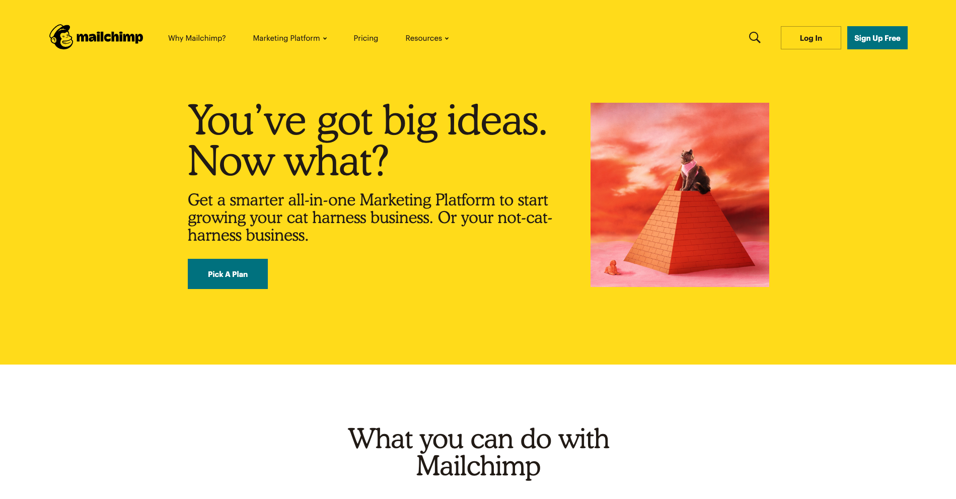
There’s a lot to love about Mailchimp’s website navigation. The overall navigation experience is simple and clean with beautiful illustrations accompanying each content category which makes them all feel just that little bit more human. The unexpected animation that appears on hover on the logo is a nice touch that engages visitors and winks at them as if to say “Yes, this will take you back to the home page”.
The universal navigation bar at the top of the page hides when a website visitor scrolls down the page and reappears when they hover over the top of the page or scroll back up. It hides when you’re moving away from it and it reappears when you’re moving back towards it. I also find Mailchimp’s take on a fat footer (see below) especially interesting — it fills an entire page view and works quite well.
A footer has many jobs including: communicating to website visitors that they’ve reached the bottom of the page, housing content that doesn’t belong anywhere else (e.g., privacy policies, social media links etc) and it serves as a safety net for people who might be feeling a bit lost. Mailchimp’s fat footer has five sections that are not overwhelming at all and is consistent with the rest of the website through its clear and simple content groupings and functionality.

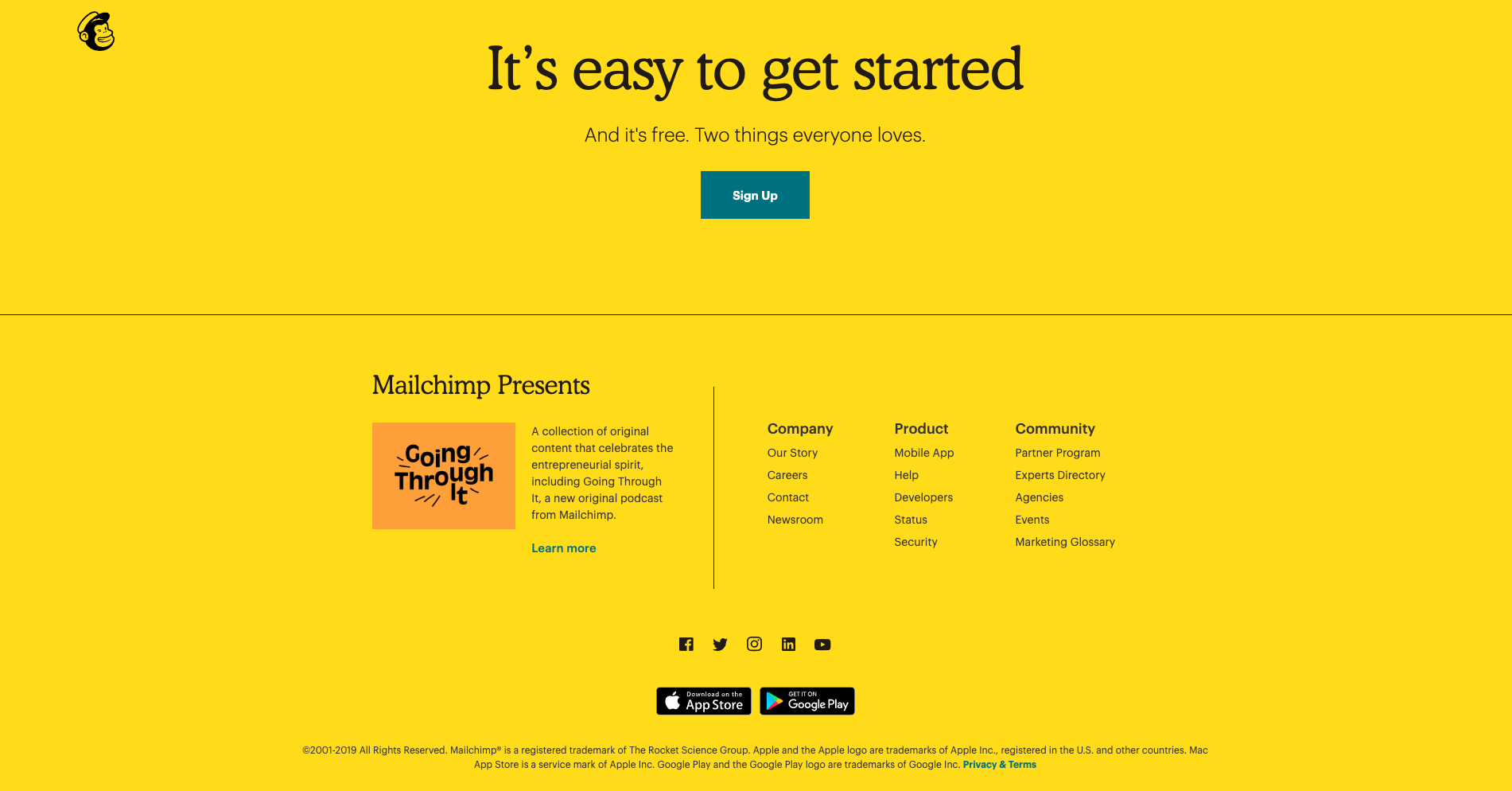
With a riot of colour and delightfully animated illustrations, Mosster Studio’s website is amazing to look at. It also takes that animation one step further through a really cool navigational feature that helps orient website visitors. The top navigation bar is sticky on scroll and the building block-like shapes for each page are animated — on hover they push out and on click they push in as shown in the below image for the ‘Info’ page.
This is a really nice way to show people where they are on this website and it’s definitely consistent with the overall experience. This website also has a sticky minimal non-footer footer that can be seen at the bottom of both the images above. It works because it only has two items in it — copyright information and the privacy policy — and no matter where you are on the website, it’s always there within easy viewing and reach. I feel that it’s just right for this particular website. The IA is quite shallow and the sticky top navigation menu ensures that the footer safety net isn’t really needed in this case.
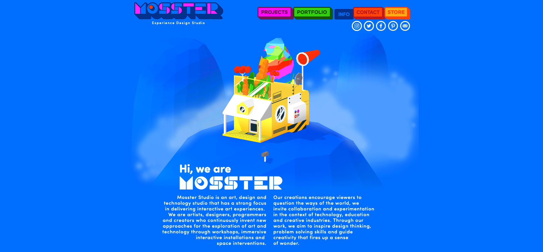
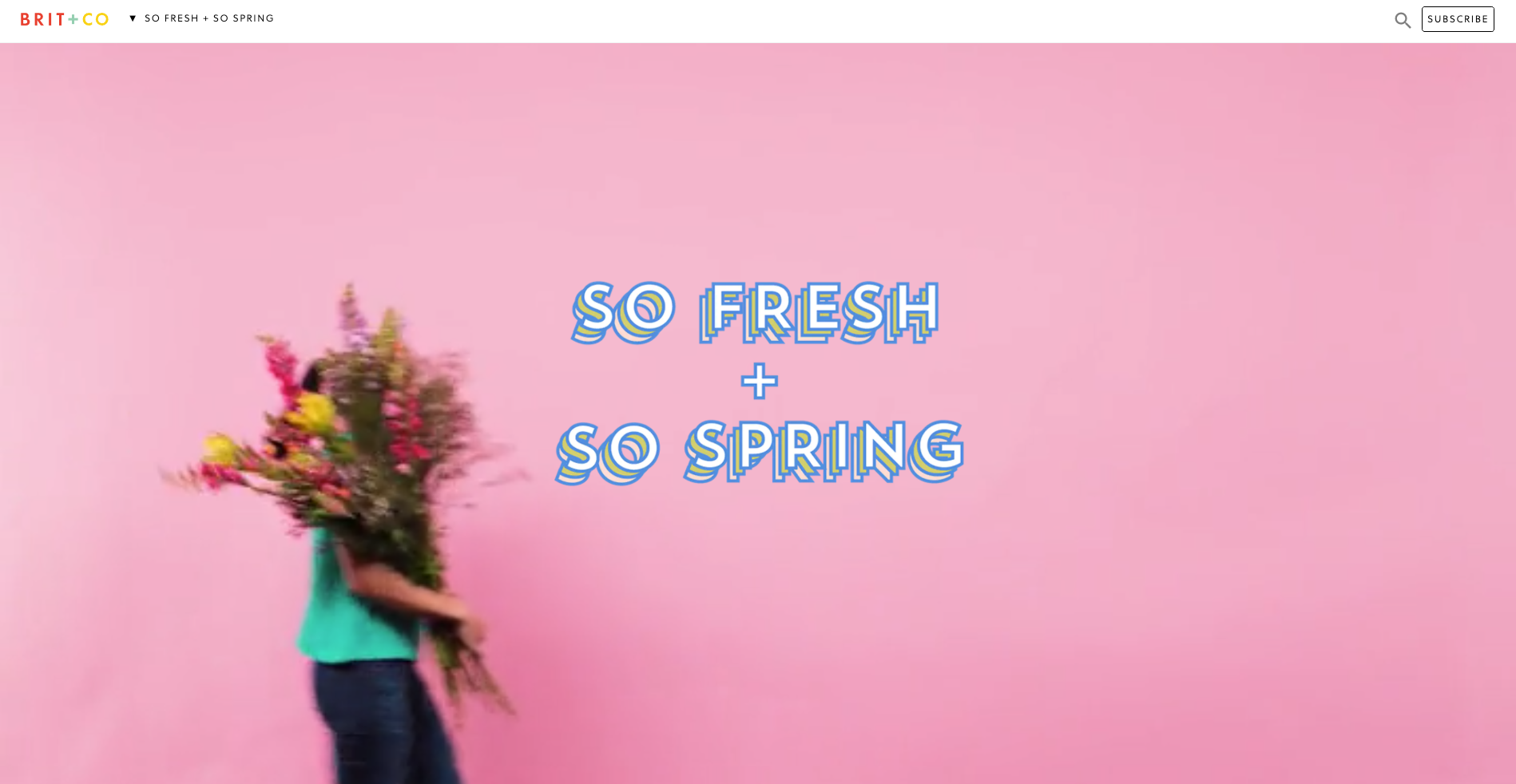
Brit + Co is a media company and the thing I really love about their website navigation is what happens when a website visitor clicks into an area called ‘So Spring’. It’s a single page space with seasonal specific content where the main website top navigation bar is replaced by a single label in the header. It feels like a website within a website — it’s connected to the main website which is easily accessed through the link on the logo and the subscribe call to action (CTA) is still there, but it definitely has its own architecture and navigation style.
When first opened (see below image), the label at the top says ‘So fresh + So Spring’ and the visitor is presented with a gorgeous wide, animated banner with a woman walking across the page and turning around while carrying an enormous bunch of flowers.
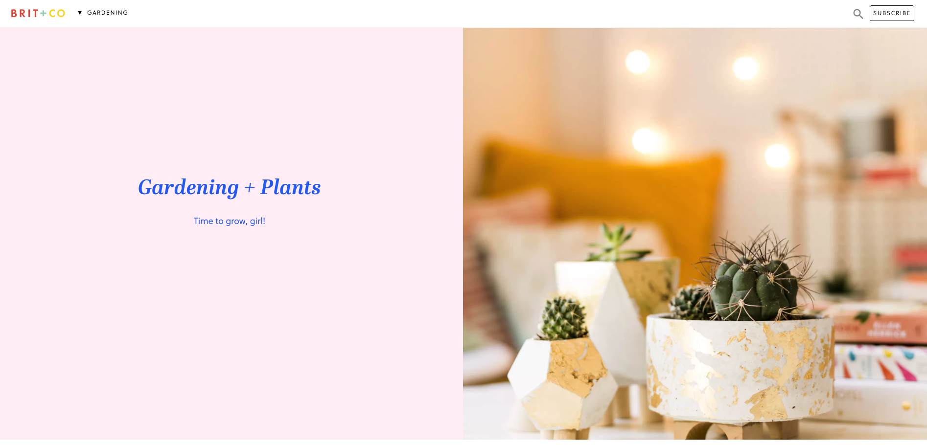
Then, when the website visitor scrolls down the page to the next content section, the header automatically changes to show them where they are in this mini website as shown in the below image when I scrolled down to the ‘Gardening’ section — awesome!
This dynamic navigation feature also contains a dropdown menu allowing website visitors to see all the other topics at a glance and directly navigate between them (see below image).

I feel that these navigation choices make this presumably temporary online space even more immersive and really well thought out.
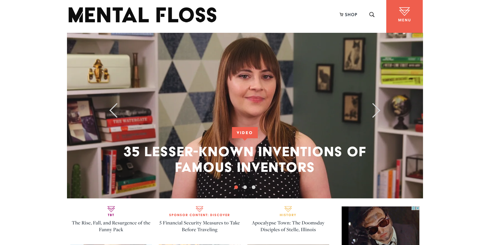
Mental Floss is a long time favourite website of mine. In addition to its fun articles, quizzes and amazing facts generator — did you know that the national animal of Scotland is the unicorn?! — it also has a super cool transforming navigation menu. It starts out as shown in the image above with a big orange square in the top right hand corner that’s simply labelled ‘Menu’ that when clicked, opens a large, full page menu as shown in the image below.
When a website visitor scrolls down the very long home page, the header transforms into a sticky top navigation bar (see below image). The original menu tile is still present and produces the same menu shown above when clicked, but has been shrunk down and attached to the newly transformed sticky navigation bar.
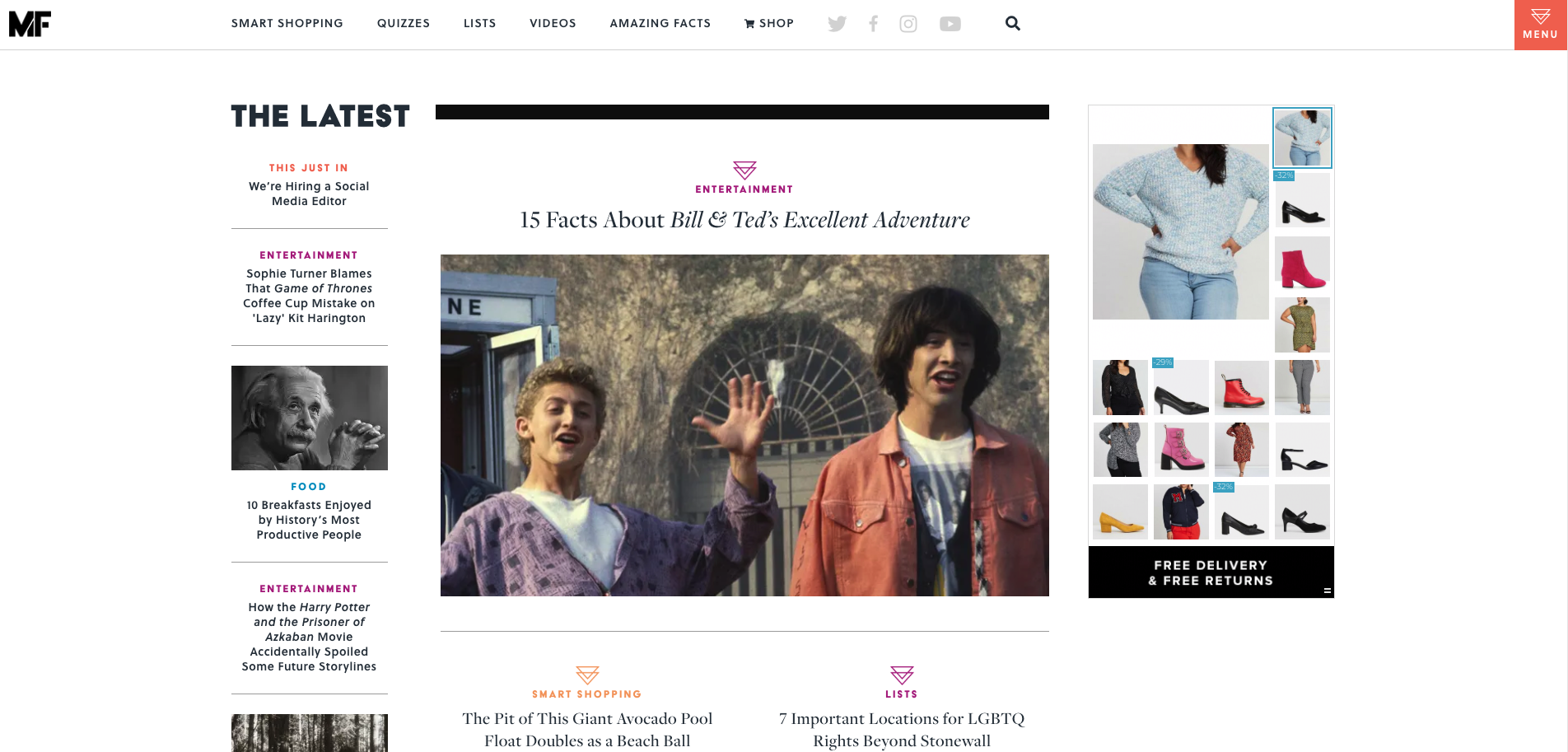
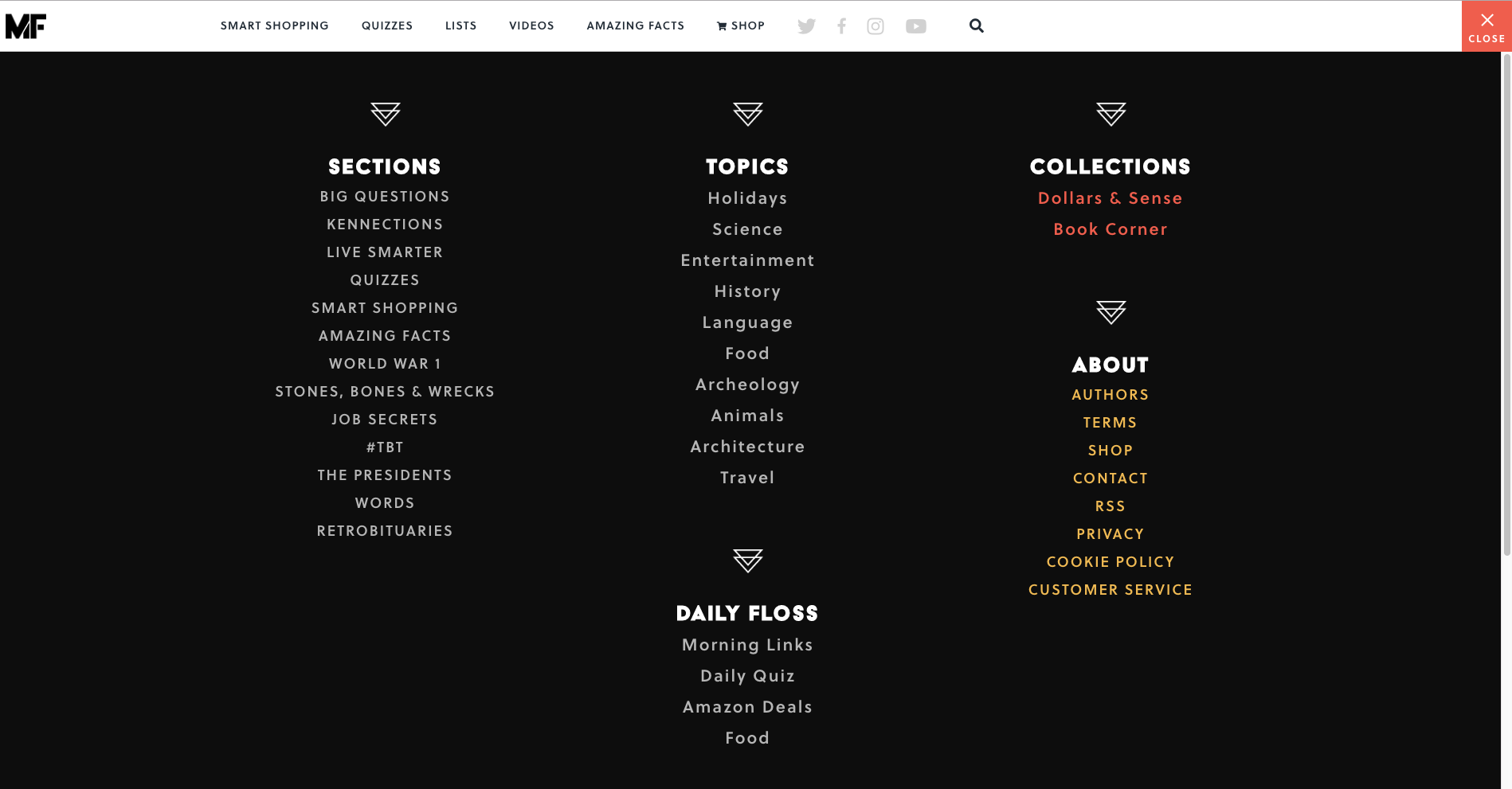
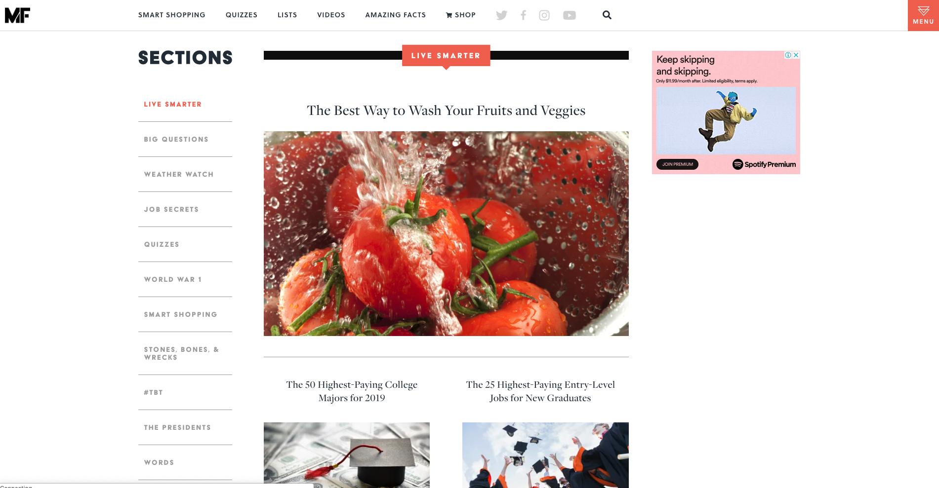
As the website visitor’s journey progresses further down the home page, clearly sectioned groups of content with their own micro navigation menus start to emerge — funnily enough, there’s one called ‘Sections’ that has a mini vertical side navigation (see below image) and this group of content also appears under the menu tile we saw a few moments ago.
Mental Floss is like a rabbit hole in the best possible and most immersive way. Its transforming and intricately connected navigation works because it’s completely consistent with the experience of having a place to go and just get lost in interesting content. I love it.
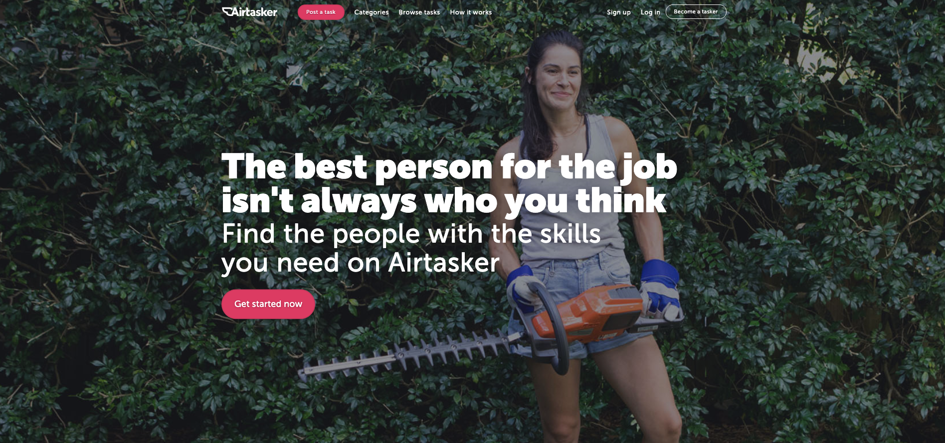
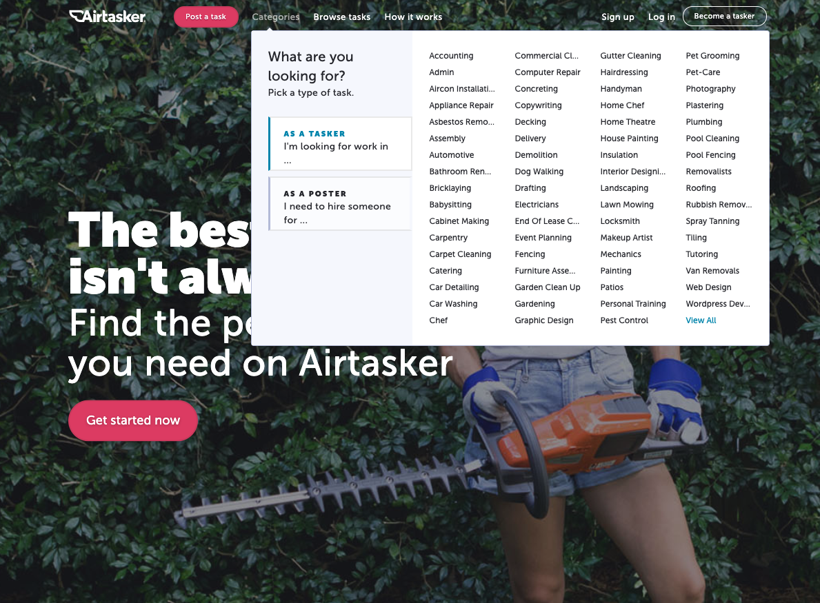
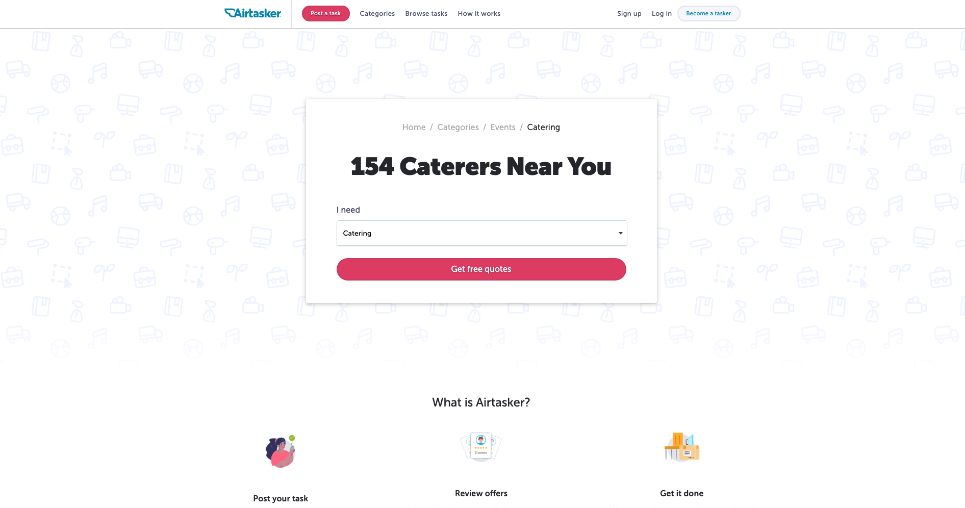
The category section on Airtasker’s website is — as expected — quite the mega menu. The overall website navigation is fairly simple with a fixed header running along the top of the page and the ‘Categories’ label does not lead to a landing page — it exists purely to launch that mega menu. What I really like about this navigation example is the way a website visitor can filter the category content at that very high level of the IA through the mega menu with one click by indicating if they are looking for work or looking to hire someone (see below image).
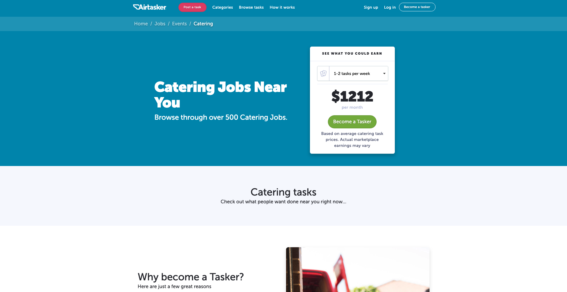
The categories themselves don’t reduce, increase or change in any way at this level, but the content below them is filtered to match the selected view so that when a visitor clicks into their category of choice, they’re only shown the perspective that matters to them. For example, if a website visitor selects ‘I’m a poster’ and then selects the ‘Catering’ category, they will be taken to the below screen.
And for the same scenario in reverse where ‘I’m a tasker’ is selected before selecting ‘Catering’, this is the screen that appears (see below image).
I think it’s a really cool way to chart that navigation course upfront and completely avoid content that holds no relevance in that moment.
Note: We recently updated this post after receiving some feedback from our community.
There’s a long-held myth in the world of web design that search solves all problems. That, instead of needing to build out useful navigation that makes sense, you only need navigation that’s ‘good enough’ as people will just tend to use search anyway.
This isn’t actually true.
Back in 1997, Jakob Nielsen ran a series of usability studies and found that over 50 percent of users were “search-dominant”. Basically, these people would go straight for the search button on a website without paying much attention to the navigation. This was a by-product of the time. The internet was really just starting to grow, and search was the best way to cut through much of the chaff of early websites.
But times have changed. In this article, we’re going to take another look at the search versus navigation argument through the fresh perspective of another year, and then dive into some of the ways you can improve your own website’s navigation
As we saw in the example from Jakob Nielsen, users were largely search-dominant at one point, but this was over 20 years ago. A lot has changed since then, especially in the way that people seek information.
In 2003, Katz & Byrne found that most users preferred navigation over search, although this depended on "the layout of the home page and the site’s information structure". Gerry McGovern found something similar, with his team running task tests with a technical audience. The result? 70 percent started the task by clicking on a link, and 30 percent started with search. He noted that people use navigation first because it’s both easier and faster to click on a link than to use the search box.
Interestingly, even Jakob Nielsen acknowledged in 1997 that, despite the obvious tendency for users to head straight for a search button, navigation was still key: “Despite the primacy of search, web design still needs to [be] grounded in a strong sense of structure and navigation support: all pages must make it clear where they fit in the larger scheme of the site”. He noted that there were a couple of primary reasons behind this thinking. Firstly, web design still needed to account for those people who didn’t use search, and secondly, users who arrive on a page still need structure in order to understand how the page fits into the rest of the website.
Of course, if the navigation in place is poorly organized or doesn’t accurately reflect the content of the website, you’re likely going to see an uptick in search usage or just lose users entirely. In other words, if the navigation isn’t up to standard, people will be pushed away from using links. In Gerry McGovern’s article, he states that: “Clear menus and links are the foundations upon which all great websites are built”.
Other research supports the view that while in-website search is still a popular option for many users, the navigation cannot be an afterthought. An article from Kissmetrics points out that, in a survey of over 100 survey respondents, over half preferred to use navigation over search. Interestingly, 47 percent of respondents said they preferred to filter down to specific product details rather than use search functionality on the website.
Much of how people use websites comes down to the purpose of the site itself. With retail websites, for example, you’ll likely have a large subset of users who know exactly what they’re looking for and will subsequently use the search function to quickly find their item. Using the example of a website that sells books, a user looking for a particular book is far more likely to use the search functionality than go through pages of titles.
There’s really no easy answer to the question of search versus navigation – but there also shouldn’t be. In 2019, website design needs to account for different user journeys and information-seeking approaches. You need to account for the search user and the navigation user – as well as the different ways they’re likely to use these 2 approaches together.
For many designers, the idea of a website with multiple, deep levels may run counter to the idea of a website that’s easy to navigate – but this isn’t the case. It’s true that broad-and-shallow architecture makes it easier for users to find content, but a significant portion of Google’s visits are via a mobile device – meaning there’s real value in migrating to a narrow-and-deep architecture. If you’re wondering how to go about this, a closed card sort is the most relevant testing approach.
The key thing to keep in mind here is that there’s nothing wrong with having multiple levels, even multiple deep levels, as long as the navigation (supplemental and contextual) is suitable.
The website footer is an often overlooked part of a website’s design, thought of as merely an afterthought to drop at the bottom of the page. Despite just how underrated they are, footers are an essential part of a usable, accessible website. For people scanning your website, a footer is a great place to showcase other interesting pages, and it’s also a useful way to point people to pages they may not know they’re looking for.
If you’re looking to improve an existing website, you should start by looking at your information architecture (IA). Your IA informs the navigation on your website, so if you want to address navigation issues, it's best to start there. As for actually fixing your IA, it's best to start with a tree testing tool like Treejack, which can identify bottlenecks and other issues. Then, you can use a card sorting tool to brainstorm possible fixes and then run the tests again to measure any improvements.
Keep in mind that tree testing works best the more you do it. You should test, make changes, test again and keep repeating the cycle for best results.
If you’re interested in diving into more navigation resources, Nielsen Norman Group has a great section here.
Summary: In this article, we’re going to take a look at what labeling is and why it’s important, go over some examples and show you how you can improve the labels on your own website.
Generally speaking, the modern web is a far more user-friendly place than it was 10 years ago. Growing consensus around things like accessibility and user experience has led to a web that’s easier to use, faster and more useful for more people. One of the areas that’s really helping to push things along in this regard is efforts around website architecture, and more specifically information architecture (IA). There's a lot to talk about when it comes to IA, so we recommend checking out our getting started guide if you're completely new to the field.
IA is largely made up of 4 components or systems. There are:
We’ve talked a lot about the organization, navigation and search side of IA before, now we’re going to take a look at what labeling is and why it’s important, go over some examples of good labeling and bad labeling and show you how you can improve the labels on your own website.
Let’s get started!
Labeling, in the most basic sense, is a type of representation. On the web, we use labels to represent larger chunks of information simply because we can’t crowd every page with all of the information on the entire website – it’s just not practical and it doesn’t look very nice. Take an ‘About us’ label that you might find on an organization’s homepage as an example. For most users, this label should mean that by clicking on or interacting with it, they’ll find information about the organization – office locations, staff, company history, etc. Because we can’t list all of this detail on the homepage, we use the label ‘About us’ to trigger the right association in the user’s mind.
We can use all sorts of labels for this purpose throughout a website, which in turn means we can keep our pages as clear and understandable as possible, making it easier for users to find what they’re actually looking for.
People spend huge amounts of energy decoding the meaning behind certain words in books, lyrics music and dialogue in films – but that’s not the case with the web. The web has evolved in an entirely different way. Given that people generally want to access the information they’re after as quickly and with as little hassle as possible, you can’t use unclear or difficult labels and expect users to sit there decoding the intended meaning. Chances are if they can’t find what they’re looking for, they’re going to leave and look for it somewhere else.
Labeling systems are also a way of identifying websites where it’s clear that the organization does not place a heavy emphasis on the needs of its users. Commonly, you’ll see this on websites where labels aren’t clear, but instead, use internal terminology that only people who work at the organization will understand.
Let’s now take a look at 2 examples of labeling systems, one planned and the other unplanned. For the purposes of this exercise, imagine that the following labels are represented as a navigation bar on a website.
Imagine you’ve just arrived on the website of the unplanned system for the first time. Chances are, you have little idea of what the labels are referring to. It’s clear that they've been designed based on the assumption that users will already know what they mean.
We can probably determine that these labels have something to do with a government body, whether that’s at a state or federal level, with some labels being quite clear like “Community issues board” and “Report a fault”, but others are just entirely confusing like “1752 overpass project” and “Small business”. As a result, we’re left sitting here wondering what each label is actually pointing to.
The planned system paints a much clearer picture. It’s not perfect, but we have more of an idea about what we’re likely to find behind each label. What’s more, we can see by looking at all of the labels that they’re related. Sure, there are outliers like “Support center” and “Account information”, but it’s not hard to see how these relate to the others. They’re also clear labels in their own right.
Importantly, this isn’t an entirely new labeling system – there’s a near-global precedent for this arrangement of labels and so we’re not asking our users to take on the substantial cognitive task of learning a new system.
Effective labels are simple and focused. Ideally, the labels on your website should be written using language that’s easily understandable to your users and reflects the content that’s behind them. After all, labels are designed to trigger associations in your users’ minds, allowing them to make their way through your website as quickly and with as little trouble as possible.
Let’s look at a real example of a website with poor labeling.

This is the website of Motorix International. Imagine you’ve just landed on the homepage and this top navigation bar is the first thing you see. Certain labels make sense immediately because we’ve seen them so many times before. We can probably assume that ‘Home’ takes us back to the homepage, ‘Products’ will show us a list of this company’s products and ‘News’ will be some sort of press release or blog page. But there are fundamental problems with the rest of the labels. ‘President’, ‘Access’, ‘Sales Agents’, ‘Inquiring’ and ‘Banks’ are all essentially open to interpretation.
Now, let’s move on and look at an example of a website with good labeling.

This is the sidebar of the AccorHotels group website. As you can see, nearly all of the labels here are clear and easily understandable – even without the context of the rest of the page. In addition to the usual items you’d expect to see on a hotel website (pointing you to information about hotel sub-brands and related facilities), AccorHotels has added icons to the four labels at the bottom of the list to provide additional guidance. ‘Professional Solutions’, ‘Loyalty Program’, ‘My bookings’ and ‘Support’ are all likely things that AccorHotels users regularly look for or return to on a regular basis, and the added icons help to anchor these labels in the sidebar.
With an understanding of why labeling is so important, how should you go and effect these changes on your own website? In general, you should be able to base the majority of your labeling decisions on best practice, whether that’s web best-practice or industry best practice. Labeling depends on user association, so it’s a good idea to follow good examples of what’s come before.
Here’s some more guidance for improving your labeling:

Within the UX industry, there are myriad terms and concepts you’ll need to understand in order to get your job done. One of the most common you’ll come across is information architecture (IA).
What is it? How do you find it? How do you research it? And how do you create it?
We’ve compiled an extensive directory where you can find authoritative content from information architects all over the world.
Read on to learn all the ins and outs of IA including topics for beginners, those with an intermediate skill level, and some bonus stuff for you experts out there.
Information architecture is the system and structure you use to organize and label content on your website, app or product. It’s the foundation on top of which you provide the design.
Every successful design project involves a good dose of user research. You need to be able to understand the behavior, thoughts, and feelings of people.
Here’s an overview of the different types of user research you can conduct for information architecture projects.

“Dear Optimal Workshop,I want to test the structure of a university website (well certain sections anyway). My gut instinct is that it's pretty 'broken'. Lots of sections feel like they're in the wrong place. I want to test my hypotheses before proposing a new structure. I'm definitely going to do some card sorting, and was planning a mixture of online and offline. My question is about when to bring in tree testing. Should I do this first to test the existing IA? Or is card sorting sufficient? I do intend to tree test my new proposed IA in order to validate it, but is it worth doing it upfront too?" — Matt
Dear Matt,
Ah, the classic chicken or the egg scenario: Which should come first — tree testing or card sorting?
It’s a question that many researchers often ask themselves, but I’m here to help clear the air!You should always use both methods when changing up your information architecture (IA) in order to capture the most information.
Tree testing and card sorting, when used together, can give you fantastic insight into the way your users interact with your site. First of all, I’ll run through some of the benefits of each testing method.
Card sorting is a great method to gauge the way in which your users organize the content on your site. It helps you figure out which things go together and which things don’t. There are two main types of card sorting: open and closed.
Closed card sorting involves providing participants with pre-defined categories into which they sort their cards. For example, you might be reorganizing the categories for your online clothing store for women. Your cards would have all the names of your products (e.g., “socks”, “skirts” and “singlets”) and you also provide the categories (e.g.,“outerwear”, “tops” and “bottoms”).
Open card sorting involves providing participants with cards and leaving them to organize the content in a way that makes sense to them. It’s the opposite to closed card sorting, in that participants dictate the categories themselves and also label them. This means you’d provide them with the cards only — no categories.
Card sorting, whether open or closed, is very user focused. It involves a lot of thought, input, and evaluation from each participant, helping you to form the structure of your new IA.
Tree testing is a fantastic way to determine how your users are navigating your site and how they’re finding information. Your site is organised into a tree structure, sorted into topics and subtopics, and participants are provided with some tasks that they need to perform. The results will show you how your participants performed those tasks, if they were successful or unsuccessful, and which route they took to complete the tasks. This data is extremely useful for creating a new and improved IA.
Tree testing is an activity that requires participants to seek information, which is quite the contrast to card sorting — an activity that requires participants to sort and organize information. Each activity requires users to behave in different ways, so each method will give its own valuable results.
In this scenario, I’d recommend running a tree test first in order to find out how your existing IA currently performs. You said your gut instinct is telling you that your existing IA is pretty “broken”, but it’s good to have the data that proves this and shows you where your users get lost.
An initial tree test will give you a benchmark to work with — after all, how will you know your shiny, new IA is performing better if you don’t have any stats to compare it with? Your results from your first tree test will also show you which parts of your current IA are the biggest pain points and from there you can work on fixing them. Make sure you keep these tasks on hand — you’ll need them later!
Once your initial tree test is done, you can start your card sort, based on the results from your tree test. Here, I recommend conducting an open card sort so you can understand how your users organize the content in a way that makes sense to them. This will also show you the language your participants use to name categories, which will help you when you’re creating your new IA.
Finally, once your card sort is done you can conduct another tree test on your new, proposed IA. By using the same (or very similar) tasks from your initial tree test, you will be able to see that any changes in the results can be directly attributed to your new and improved IA.
Once your test has concluded, you can use this data to compare the performance from the tree test for your original information architecture — hopefully it is much better now!
