Subscribe to OW blog for an instantly better inbox
Oops! Something went wrong while submitting the form.

Note: We’re gradually rolling out this feature, so it may not appear for you straight away.
We’ve made a few changes to our navigation header in-app to make it easier and more intuitive to use. In this blog post, we’ll explore the changes you’re going to see, why we made these changes and take a look at some of the testing that took place behind the scenes.
Let’s dive in!
We’ve shuffled most tabs in the header around, but you’ll see the most obvious change when you create a study. You’ll now land directly on the ‘New Study’ screen, instead of being dropped in ‘Settings’ and then having to find your way to ‘Create Study’.
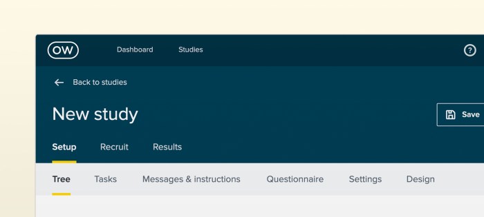
We’ve also made some changes to the ‘Create’, ‘Recruit’ and ‘Results’ tabs. These are now set in the header so you can easily navigate between creating, recruiting and reviewing results, instead of having to go back to ‘Settings’ to manage recruitment.
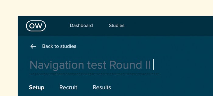
When you click ‘Back to studies’, you’ll now be taken back to the folder you’re currently working in. Previously you’d be taken back to the ‘All studies’ dashboard, so no more scrolling through the dashboard to find the folder you’re looking for. You can also rename your study in the header now, instead of having to navigate back to ‘Setup’.
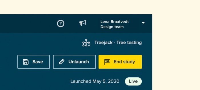
Finally, you can now end your study by clicking the ‘End study’ button in the header. We’d discovered that some people had trouble ending their studies in the past, now you can just click the button with the tiny checkered flag.
Our goal is to create the world’s best user research platform – and a big part of that is ensuring that our tools are easy to use. Through testing, we found that our old navigation header had usability, consistency and design issues. Specifically, usability testing and tree testing showed that simplifying our information architecture (IA) would drastically improve the user experience and flow.
We asked the question: “How might we improve the flow of our tool without affecting customers that currently use our tools?”
This led us down a research rabbit hole, but we came to the conclusion that we’d need to redesign the navigation header across all of our tools and adjust the IA to match the user journey. In other words, we needed to redesign the navigation to match how people were using our tools.
User research and testing inform all of the changes that we make to our tools, and this project was no different.
We ran 3 tree tests using Treejack, testing 3 different IAs with 97 participants (30 per test). We also ran a first-click test using Chalkmark to validate what we were doing in Treejack.
The 3 IA’s we tested were:
Note: A caveat of the results is that we used the phrase ‘Set up’ in many questions which would bias the second test in favor of any question where ‘Setup’ is the correct answer.
We found that the third tree performed the best during our test. On average, it required a little less backtracking and was less direct than the first 2 tests, but had a higher chance of completion simply because there were fewer options available.
So that’s our new in-app header navigation – we hope you like it. Got a question? Feedback? Click the yellow Intercom circle in the bottom right-hand corner to get in touch with our support team.
Happy testing!

Think about the last time you were visiting a friend or family member’s house and needed to find something. Like a spoon, for example. You start in the kitchen because that’s where we’ve all been trained to find things like spoons. But where do you look next? Some may look in the drawer near the dishwasher, while others may look to the drawer that’s by the cabinet that holds dishes and bowls. Point is, people use context clues and other points of reference (like familiarity and habits) to find things that they’re looking for.
The same goes for navigating a webpage.
However, unlike the spoon example, there’s much more variation in website structure than kitchen layout. Websites vary from industry to industry, ranging in purpose from ecommerce to digital portfolios and everything in between. So when someone lands on your website to find something or complete a task, is it obvious where they should go to get things done?
Your gut might tell you that it is. The people on your design team might tell you that it is too. But what really matters is what happens with actual users. Whenever you’re building a new website or optimizing an existing one, it’s important that you build it with quality user insights. That starts with user experience (UX) research.
And before you ask if we mean qualitative or quantitative research – the answer is both. Let’s explore a particular user research method that’s essential for gathering the information needed to build intuitive site navigation. It’s called tree testing.
For anyone unfamiliar with tree testing (sometimes referred to as ‘reverse card sorting’ or ‘card-based classification’), it’s a series of tests that help you understand where and why people get lost in your content.
It works by taking text-based versions of websites and stripping the influence of navigation aids or design elements to build a study. Participants are shown the text-only version of your website or app and are asked to indicate where they would find specific items or topics.
By removing everything but the labels and how they’re organized, you can work out just how effective your website structure is at enabling people to find what they need. If test participants consistently struggle to locate specific items, you’ll know there are issues with your structure. It can also help you visualize what paths participants take to get to specific site information.
Another point worth mentioning is that tree testing not only uncovers site navigation flaws, but it reveals word choice and microcopy that may not be clear to users. To reference back to the initial analogy, one person might say “where would I find your spoons,” while another may ask, “where do you keep your utensils?” So, tree testing can also be helpful for understanding which words work best in your site structure.
While it’s best to conduct a tree test early in the research phase of a project, there’s never a wrong time. (Unless that time is not at all). And if you have an existing website, this is a good time to establish a base of your existing site structure. The results you gather here can help to highlight any issues with your site’s structure and provide the data needed to compare to any improvements.
If you’re starting from scratch with a new website, you can run tree tests on different versions of your proposed site structure and then compare the results to determine which makes the most sense to your users.
Running a tree test is simple. You can use an online tool (like TreeJack) to collect all of the necessary quantitative data you need to ensure successful site navigation.

But what about the qualitative side of it all? We’re so glad you asked.
Running tree tests is a great way to gather quantitative data about your site navigation and topic findability, but it's not so good at providing you with qualitative insights, or why people are looking for information the way that they are.
Traditionally, you could get your gift cards ready and set up an in-person study where you watch people perform the tasks laid out in your tree test, and subsequently ask why they searched for things the way they did. But that takes a lot of time, coordination, and compensation. Alternatively, you could set up a remote usability test using a platform designed to record users as they complete your tree test.
This way, you’ll get the quantitative results you need to make decisions, backed by qualitative insights from real people. You’ll be able to set up your test to get answers to questions like:
Teams that solely rely on quantitative data are only getting half the story. By pairing tree testing tools, like Optimal Workshop’s Treejack, with UserTesting’s Human Insight Platform, researchers are able to not only see how people search for information on a website but get to the bottom of why. When used together, quantitative and qualitative data reveal the most valuable insights for tree testing.
Information architecture (IA) isn’t the easiest space for a newcomer. The myriad terms and technologies can often be quite tricky to understand on their own – not to mention how they all fit together.
We wanted to help, so we’ve put together a comprehensive cheat sheet/glossary that you can use whenever the topic of IA comes up.
Information architecture is the structure used to organize and label content on websites, mobile applications and other digital environments. At a very basic level, IA determines the paths people take to get to the content they’re looking for and where they might get lost.
IA isn’t actually one “thing”, but a number of different elements:
It’s also the layer upon which you build the design. This means that for your users, they’ll never likely see the IA – but they will feel the effects of the decisions you make when designing it. Your IA should help people find what they’re looking for, regardless of where the IA exists. It’s as important for desktop users as it is for mobile.
The term ‘experience architecture’ refers to a wider set of practices or terms that includes information architecture. Experience architecture covers IA, interaction design and experience design. It’s similar to how user experience (UX) is just one element under the wider customer experience (CX) umbrella.
Note that just as the field of information architecture has information architects, experience architecture has experience architects; people responsible for planning and executing experience architecture deliverables. Typically, the experience architecture role is quite varied in that it requires expertise in user-centered design, human behavior and interaction design.
A user journey is basically what it sounds like – the experiences someone has when they interact with something. It’s also most commonly used to describe these experiences and interactions in a software context.
User journeys describe the steps users take to complete a task when interacting with a website or other digital service. For example, for a photo storage app, the user journey may look something like this:
Typically, you’d create a user journey in the discovery phase of a project, as you can use this tool to visualize what the users need and to influence wireframe and information architecture development.
Depending on your needs, your user journey may be quite a bit more detailed, with overarching categories ‘before’, ‘during’ and ‘after’ to show where the user is with regards to using the product. You can also add in ideal emotions at each stage.

Chances are if you’re using a website or mobile app, it was a wireframe at some point in the past. Wireframing is essentially a way to design digital applications at a structural level, a way to map out broadly where different elements like content and functionality sit before adding in visual design.
Wireframing is to websites, apps and other digital applications what the rough first sketch of a building is to a finished skyscraper. It’s foundational, yet entirely important to nail down broad strokes ideas before investing more heavily in design.
Why might you produce a wireframe? In addition to using it as a way to prototype ideas prior to the visual design process, wireframes are an important method of getting stakeholders and other teams onboard.

In the world of information architecture, labels represent a relationship between your users and content. The idea behind labels is to communicate information to users without using too much space or requiring much work on the user’s part.
Let’s take a look at an example. ‘About us’ is a label that represents a larger chunk of information. On a website, this could be information about the people who work at the organization, what the office space is like and the work that the organization does. You wouldn’t want to present all of this information to a user on the homepage, so instead, you use a label like ‘About us’ to trigger the user’s association with that term. Once they’ve seen the label, a user can decide whether they want to proceed. In a nutshell, a label should be used to communicate information clearly and efficiently.
Labels are understandably important, and things can go awry when the people designing websites and other digital applications don’t adequately consider the importance of correct labeling. Perhaps more than most other parts of a website, poor labeling is an easy way to spot websites where user needs haven’t been appropriately considered.
Search is how your users go about looking for the information they require, whereas a search system is essentially a search engine: a way to sidestep the act of navigating through a website and search directly for information. One of the biggest misconceptions when it comes to designing digital applications is that search is the answer to all navigation problems. Search systems are often seen as a way to avoid developing user-focused navigation systems, as the common thinking is that users know what they’re looking for and so will just plug terms into a search bar.
This isn’t actually true, and there’s a great quote from Larry Page that neatly summarizes this argument: “The ultimate search engine would basically understand everything in the world, and it would always give you the right thing. And we’re a long, long way from that”.
Search engines often become bandages for websites with inadequate browsing systems. When considering adding a search engine to a website, consider how much content you actually have. The last thing you want to do is have to maintain a search engine when the browsing experience meets user needs.
When a search engine is appropriate:
In the world of information architecture, 2 terms that get thrown around and mixed up more than most others are taxonomy and metadata. Here’s a breakdown of what both of them mean, and how they relate to each other.
Metadata makes content findable and understandable for users and computer systems, it’s data about data. Rachel Lovinger describes it as “information about the content that provides structure, context, and meaning”. Photos typically have significant quantities of metadata attached to them, information like where the photo was taken, the date the photo was taken and the device the photo was taken on. Metadata is particularly important to search engines, helping to surface the right content based on what the user is searching for.
Taxonomies, on the other hand, refer to structures that organize information. Unlike metadata which applies to individual pieces of content, taxonomies help to organize content into hierarchical relationships.
So how do metadata and taxonomies work together? Well, if a taxonomy’s goal is to organize content, it needs terms to be stored as metadata. Christine Benson notes that “a taxonomy organizes information, and metadata describes it”. They’re really 2 parts of the same whole.
Hopefully, we’ve given you a clear idea of some of the more important information architecture terms and how they relate to each other. If you want to start rethinking your own website’s information architecture, there’s no better place to start than with a comprehensive understanding of how your users think the information on your website should be structured. You can read more about one of the best methods for this process, card sorting, right here on our blog.

Take a look at the navigation menu at the top of our blog. Mouse over the ‘Explore by topic’ menu and browse through the different elements.
If you’re new to the world of website architecture and UX, developing something like this may seem quite trivial – surely it’s just a matter of picking 'popular' areas of your website and dropping them in, right?
Not exactly.

When it comes to website design, navigation should sit at the top of the priority list. After all, it’s what sits between your user and their goal. It’s the critical link that’s usually the deciding factor in whether or not they’ll continue to use your website.
In this article, we’re going to cover off some of the key things that make for a good website navigation experience. But first, it’s important to dispel some confusion.
According to Wikipedia, “web navigation refers to the process of navigating a network of information resources [like content]”. This is key. Website navigation isn’t the design of a website, it’s the bones of a website – the core structure that sits beneath the design. It can be helpful to think of it like a freeway system linking drivers (users) to destinations (content). Without a navigation, or, as is more often the case, with a poor navigation, the experience of using a website falls over. And in real terms, this is going to impact whatever it is that your organization does.
There’s no shortage of elements that play into the user experience of a website. Everything from font, color, imagery, headlines, call to actions, page load time and form design have a bearing on the end user experience. But navigation is really the most important consideration of all. If people can’t find what they’re looking for within the structure of your website, they’ll likely leave and look for that same content elsewhere.
If you run an ecommerce website selling cosmetics, a frustrating navigation experience could mean your customers simply get fed up and try one of your competitors instead.
When looking at what separates merely functional website navigation experiences from great ones, there are a number of key considerations:
Website navigation bars have a habit of either including far too many links or not enough – it’s important to strike the right balance. You may find it helpful to consider the following 2 factors when designing your own navigation:
The difference in a user’s goals and your own is important. While your users may want to find information about your company history, you’ll have your own goals of getting users to product pages or perhaps signing up for accounts.

We’re not going to get into the specifics of structuring a brand tone and style here, but we’ll just note the following: Clear is kind. Unclear is unkind. This is an important rule to keep in mind when designing the labels/UX copy for your navigation items. You want people to immediately understand what they’re reading or about to click on – there should never be any confusion. When your confusing labels send users on a mission to find something that should be easily discoverable, there’s a good chance they won’t return to your website.
So what does this look like? Here are a couple of examples:
Web conventions exist for a reason – they’re based on ideas that work and are understood by the majority of web users. In many cases, these conventions work so well that most people will be able to navigate websites in entirely different languages simply because the functions are located in places that make sense.
When we redeveloped the Optimal Workshop blog at the beginning of 2019, we ran a series of usability tests on our website to work out how our users navigated their way through different types of content. The results were pretty interesting. When we asked people to find a link to our blog, many didn’t go for the ‘Learn’ menu in our navigation bar but instead went straight down to the footer at the bottom of the page.
Often overlooked, the footer forms a key function in your website’s navigation experience, for a few key reasons:
Building a navigation system that’s intuitive and understandable by the majority of your users isn't easy – but it’s not impossible. The first step on the path to creating such a navigation begins with an understanding of how your users think. Or, more specifically, how your users think the information on your website should be arranged.
One of the methods that we use to figure this out is called card sorting. With card sorting, you can work out how people understand and categorize information. In a typical card sort, you task participants with sorting cards containing different items into groups. You can then use the results to figure out how to group and label the information on your website in a way that makes the most sense to the people using.
The other technique that proves invaluable during the website design process is called tree testing. It’s best-suited to help you assess the findability of topics on a website. You run a tree test on a text-based frame of your website – there are no navigation aids or design elements to give any hints. By removing everything but the labels and how they’re, you can work out how effective your navigation is at getting people to the content they’re looking for. If you find that test participants consistently struggle to locate specific items, you’ll know there are issues with your structure.
These are 2 methods that can help you with website navigation design, but they make great starting points. You can use card sorting to get an idea of how people think information should be grouped, turn this into a rough structure of your website, test it, and then iterate. If you’d like to give card sorting and tree testing a try, give our UX platform a go.

The footer of a website sits at the very bottom of every single web page and contains links to various types of content on your website. It’s an often overlooked component of a website, but it plays several important roles in your information architecture (IA) — it’s not just some extra thing that gets plonked at the bottom of every page.
Getting your website footer right matters!
The footer communicates to your website visitors that they’ve reached the bottom of the page and it’s also a great place to position important content links that don’t belong anywhere else — within reason. A website footer is not a dumping ground for random content links that you couldn’t find a home for, however there are some content types that are conventionally accessed via the footer e.g., privacy policies and copyright information just to name a few.
Lastly, from a usability and navigation perspective, website footers can serve as a bit of a safety net for lost website visitors. Users might be scrolling and scrolling trying to find something and the footer might be what catches them and guides them back to safety before they give up on your website and go elsewhere. Footers are a functional and important part of your overall IA, but also have their own architecture too.
Read on to learn about the types of content links that might be found in a footer, see some real life examples and discuss some approaches that you might take when testing your footer to ensure that your website is supporting your visitors from top to bottom.
Deciding which content links belong in your footer depends entirely on your website. The type of footer, its intent and content depends on its audience of your customers, potential customers and more — ie your website visitors. Every website is different, but here’s a list of links to content types that might typically be found in a footer.
Let’s take a look at three diverse real life examples of website footers.
IKEA’s US website has an interesting double barrelled footer that is also large and complex — a ‘fat footer’ as it’s often called — and its structure changes as you travel deeper into the IA. The below image taken from the IKEA US home page shows two clear blocks of text separated by a blue horizontal line. Above the line we have the heading of ‘All Departments’ with four columns showing product categories and below the line there are seven clear groups of content links covering a broad range of topics including customer service information, links that appear in the top navigation menu and careers. At the very bottom of the footer there are social media links and the copyright information for the website.

As expected, IKEA’s overall website IA is quite large — and as a website visitor clicks deeper into the IA, the footer starts to change. On the product category landing pages, the footer is mostly the same but with a new addition of some handy breadcrumbs to aid navigation (see below image).

When a website visitor travels all the way down to the individual product page level, the footer changes again. In the below image found on the product page for a bath mat, while the blue line and everything below it is still there, the ‘All Departments’ section of the footer has been removed and replaced with non-clickable text on the left hand side that reads as ‘More Bath mats’ and a link on the right hand side that says ‘Go to Bath mats’. Clicking on that link takes the website visitor back to the page above.

Overall, evolving the footer content as the website visitor progresses deeper into the IA is an interesting approach - as the main page content becomes more focussed as does the footer while still maintaining multiple supportive safety net features.
The footer for the US website of this well known cosmetics brand has a four part footer. At first it appears to just have three parts as shown in the image below: a wide section with seven content link categories covering a broad range of content types as the main part with a narrow black strip on either end of it making up the second and third parts. The strip above has loyalty program and live chat links and the strip below contains mostly links to legal content.

When a website visitor hovers over the ‘Join our loyalty program’ call to action (CTA) in that top narrow strip, the hidden fourth part of the footer which is slightly translucent pulls up like a drawer and sits directly above the strip capping off the top of the main section (as shown in the below image). This section contains more information about the loyalty program and contains further CTAs to join or sign in. It disappears when the cursor is moved away from the hover CTA or it can be collapsed manually via the arrow in the top right hand corner of this fourth part. It’s an interesting and unexpected interaction to have with a footer, but it adds to the overall consistent and cohesive experience of this website because it feels like the footer is an active participant in that experience.

Domino’s Pizza’s US website has a reasonably flat footer in terms of architecture but it occupies as much space as a more complex or deeper footer. As shown in the image below, its content links are presented horizontally over three rows on the left hand side of the footer and these links are visually separated by forward slashes. It also displays social media links and some advertising content on the right hand side. The most interesting feature of this footer is the large paragraph of text titled ‘Legal Stuff’ below the links. Delightfully it uses direct, clear and plain language and even includes a note about delivery charges not including tips and to ‘Please reward your driver for awesomeness’.

Like every other part of your website, the only way you’re going to know if your footer is supporting your website visitors is if you test it with them. When testing a website’s IA overall, the footer is often excluded. This might be because we want to focus on other areas first or maybe it’s because testing everything at once has the potential to be overwhelming for our research participants.
Testing a footer is fairly easy thing to do and there’s no right or wrong approach — it really does depend on where you are up to in your project, the resources you have available to you and the size and complexity of the footer itself!
If you’re designing a footer for a new website there’s a few ways you might approach ensuring your footer is best supporting your website visitors. If you’re planning to include a large and complex footer, it’s a good idea to start by running an open card sort just on those footer links with OptimalSort. An open card sort will help you understand how your website visitors expect those content links in your footer to be grouped and what they think those groups should be called.
If you’re redesigning an existing website, you might first run a tree test in Treejack on the existing footer to benchmark test it and to pinpoint the exact issues. You might tree test just the footer in the study or you might test the whole website including the footer. Treejack is really flexible and you can tree test just a small section of an IA or you can do the whole thing in one go to find out where people are getting lost in the structure. Your approach will depend on your project and what you already know so far. If you suspect there may be issues with the website’s footer — for example, if no one is visiting it and/or you’ve been receiving customer service requests from visitors to help them find content that only lives in the footer — it would be a good idea to consider isolating it for testing. This will help you avoid any competition between the footer and the rest of your IA as well as any potential confusion that may arise from duplicated tree branches (i.e. when your footer contains duplicate labels).
If you’re short on time and there aren’t any known issues with the footer prior to a redesign, you might tree test the entire IA in your benchmark study, iterate your design and then along with everything else, include testing activities for your footer in your moderated usability testing plan. You might include a usability testing scenario or question that requires your participants to complete a task that involves finding content that can only be found in the footer (e.g., shipping information if it’s an ecommerce website). Also keep a close eye on how your participants are moving around the page in general and see if/when the footer comes into play — is it helping people when they’re lost and scrolling? Or is it going unnoticed? If so, why and so on. Talk to your research participants like you would about any other aspect of your website to find out what’s going on there. When resources are tight, use your best judgement and choose the research approach that’s best for your situation — we’ve all had moments where we’ve had to be pragmatic and do our best with what we have.
When you’re at a stage in your design process where you have a visual design or concept for your footer, you could also run a first-click test on it using Chalkmark. First-click tests are quick and easy and will help you determine how your website visitors are faring once they reach your footer and if they can identify the correct content link to complete their task. Chalkmark studies can be run remotely or in person and just like the rest of the tools in the Optimal Workshop suite, are super quick to run and great for reaching website visitors all over the world simply by sharing a link to the study.
For further reading on testing website footers, be sure to check out the case study review we ran on the footer of Sephora’s US website!
Note: This is part 2 of our series on great website navigation. You can read part 1 here.
Early on in my career, a wonderful mentor of mine shared what I consider to be my all time favourite analogy for describing the difference and relationship between information architecture (IA) and navigation. She called it the warehouse and the department store.
A department store is a beautiful space with many different product category based departments joined by clear, wide and well lit pathways. These pathways are lined with featured products highlighting the best each department has to offer and the order and placement of each department makes perfect sense to customers.
Women’s clothing is the largest department and adjacent to it, you will find the women’s shoe department and a little bit further down, women’s handbags and accessories. It flows intuitively allowing customers to find everything they need without having to hunt for it.
As for the warehouse, it’s out the back of the store but it’s also hidden in pockets throughout it supporting the department store experience every step of the way by making it easy for staff to access extra stock or store special orders for customers. It’s not that nice to look at it, but without it there wouldn’t be a beautiful department store to shop in. The warehouse is the IA and the department store is the navigation.
I’ve written about and have worked with IAs a lot throughout my career and today I am especially excited to step out into the department store and share some examples of great website navigation. I’ve trawled the internet and have pulled together (in no particular order) what I think are some great website navigation examples, so let’s take a look at them and why they’re awesome.
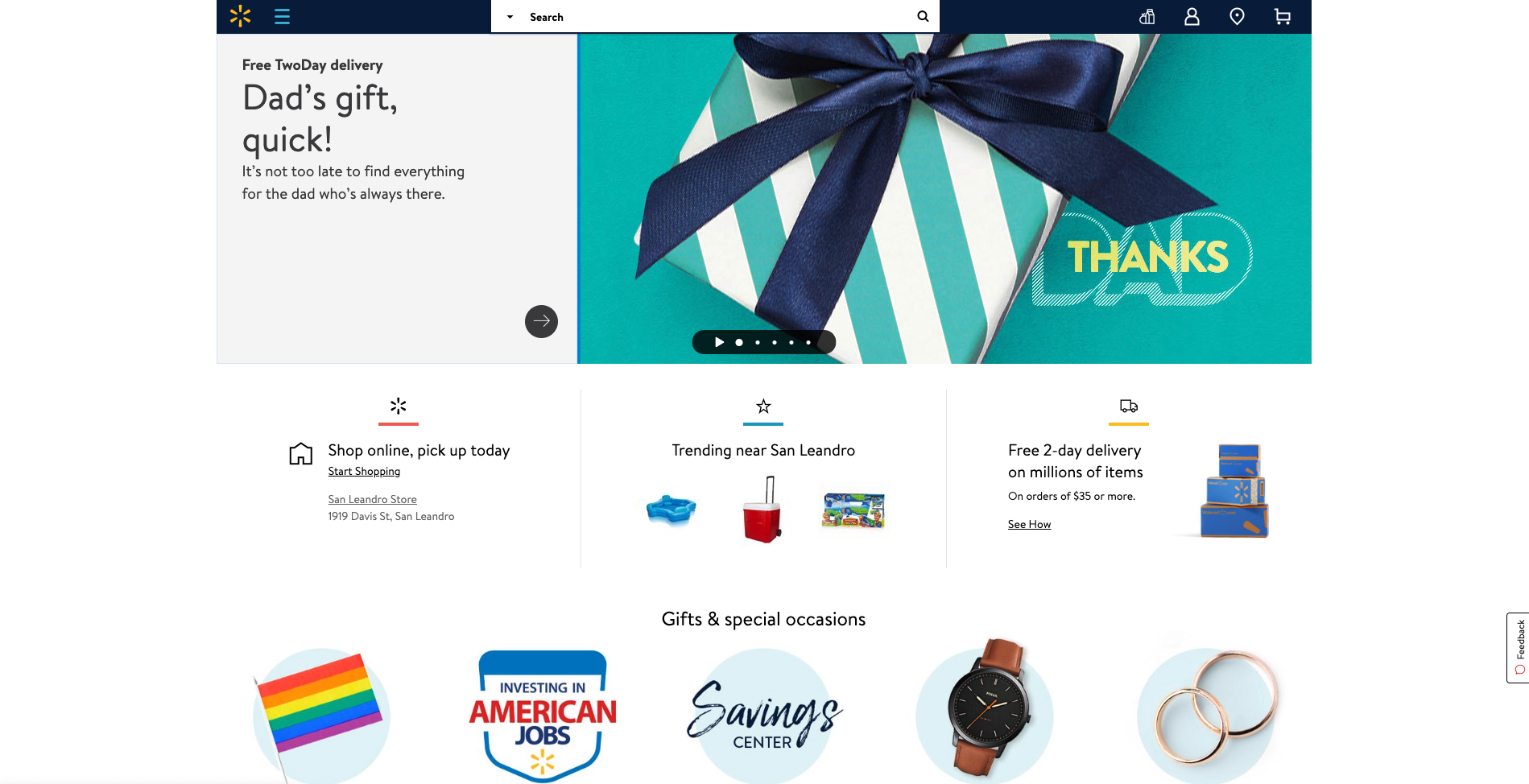
Speaking of mega menus, Walmart’s approach to guiding website visitors through its gigantic IA is quite clever. Hidden neatly away under a hamburger menu, Walmart’s mega menu uses vertical navigation instead of a horizontal dropdown that many websites with large IAs use (see below image).
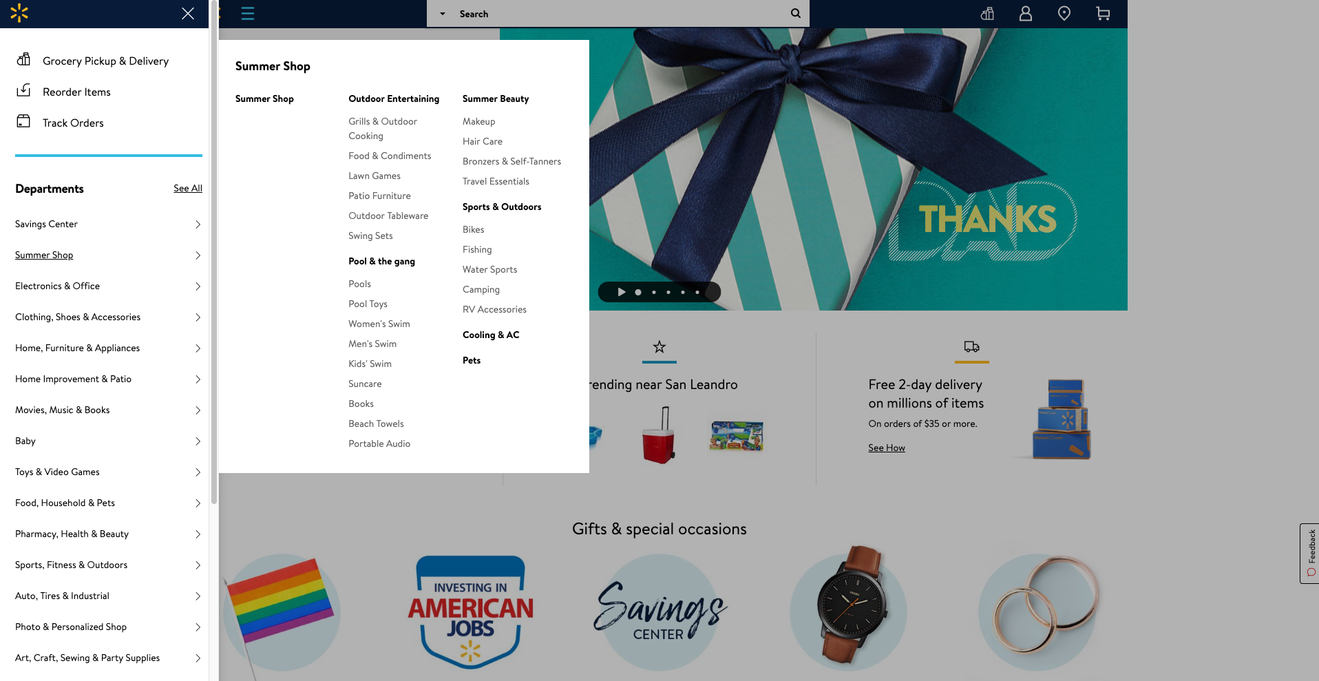
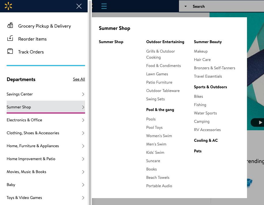
A website visitor can easily see all the categories and all the content labels below either by hovering over the level 1 labels or by clicking on them — clicking results in a pink line appearing under the label (see below image) making it easy to see where you are in the menu.
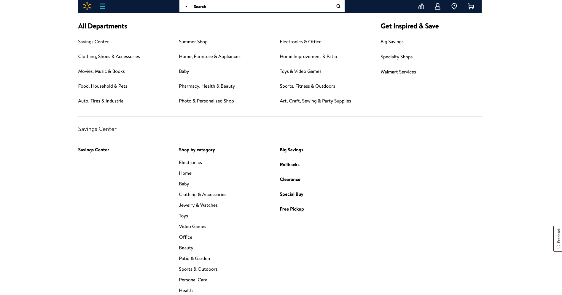
Selecting ‘See All’ next to ‘Departments’ takes the website visitor to a clear and simple site map-like page allowing them to see the whole IA on one page with no visual distractions at all (see below image).
Overall, Walmart’s simple and structured approach to surfacing a mega menu through vertical navigation is pretty awesome.
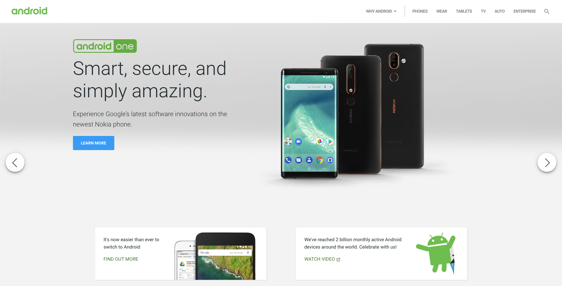
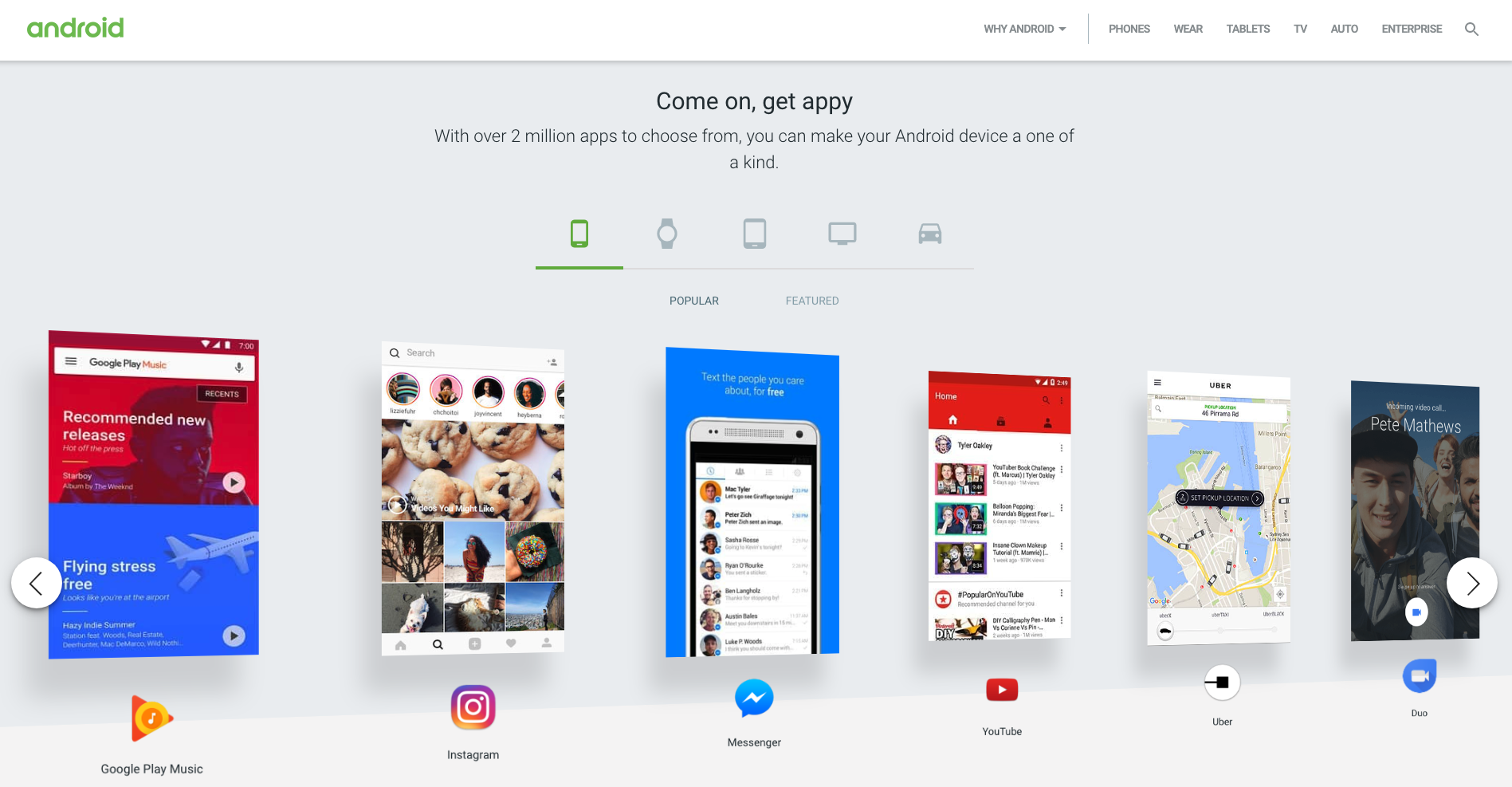
Android’s website has quite a few great navigational elements. Like a lot of technology websites, the home page is clean and simple and has a top navigation bar that hides when a website visitor scrolls down and reappears when they scroll up. The content carousel that sits at the top of the home page on opening is manually driven by the website visitor and doesn’t autoplay which is an awesome thing to see from an experience and accessibility perspective for all users. The rest of the content on the home page is sectioned off into clear horizontal groups and each one features its own manually driven carousel and filtered navigation by device type which is consistent, easy to understand and visually engaging (see below image).
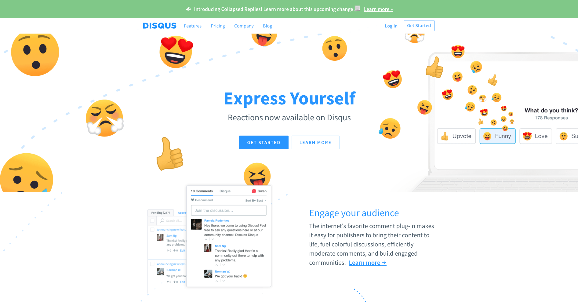
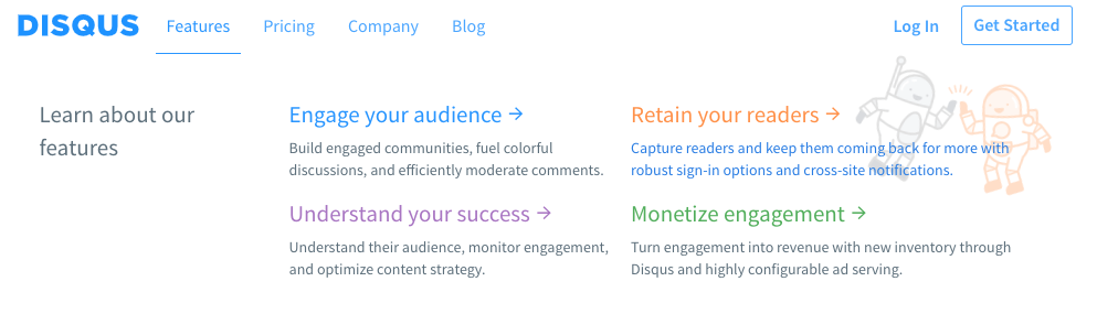
Disqus’s navigation menu is simple and flat. It has a universal top navigation bar with just four labels and only one of them (‘Features’) has suboptions to choose from. It works well because there’s nothing that doesn’t belong there and the labels clearly indicate what lies beneath. The dropdown menu that appears on ‘Features’ is quite interesting. If a website visitor hovers over it, the menu showing four suboptions appears and stays in place until the cursor is moved away from that space and then it hides. If ‘Features’ is clicked, the menu stays dropped down in place regardless of where a website visitor moves their cursor to until another link (that could be anywhere on the page) is clicked on. This is great because it responds to two different types of visitor behaviors where hovering might temporary and clicking might be ‘I want to take a closer look’ — it doesn’t matter what the visitor does, the menu is presented in a natural and intuitive way. And it’s worth taking a closer look because regardless of whether ‘Features’ has been hovered over or clicked on, when a website visitor hovers over those four options underneath, cute and friendly colour coded illustrations appear providing a nice human touch to the navigation experience (see below images).
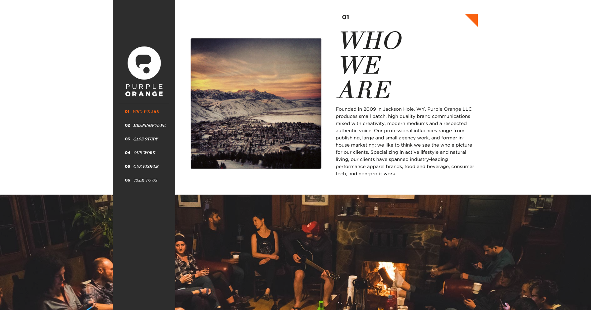
Purple Orange is a creative agency with a single page website that has a fixed vertical navigation menu that works really well. When a website visitor scrolls down the page, the text labels in that menu which is designed like a table of contents are highlighted in orange to show them where they are on the page (see below image). Website visitors can also navigate the content by clicking on the menu labels.
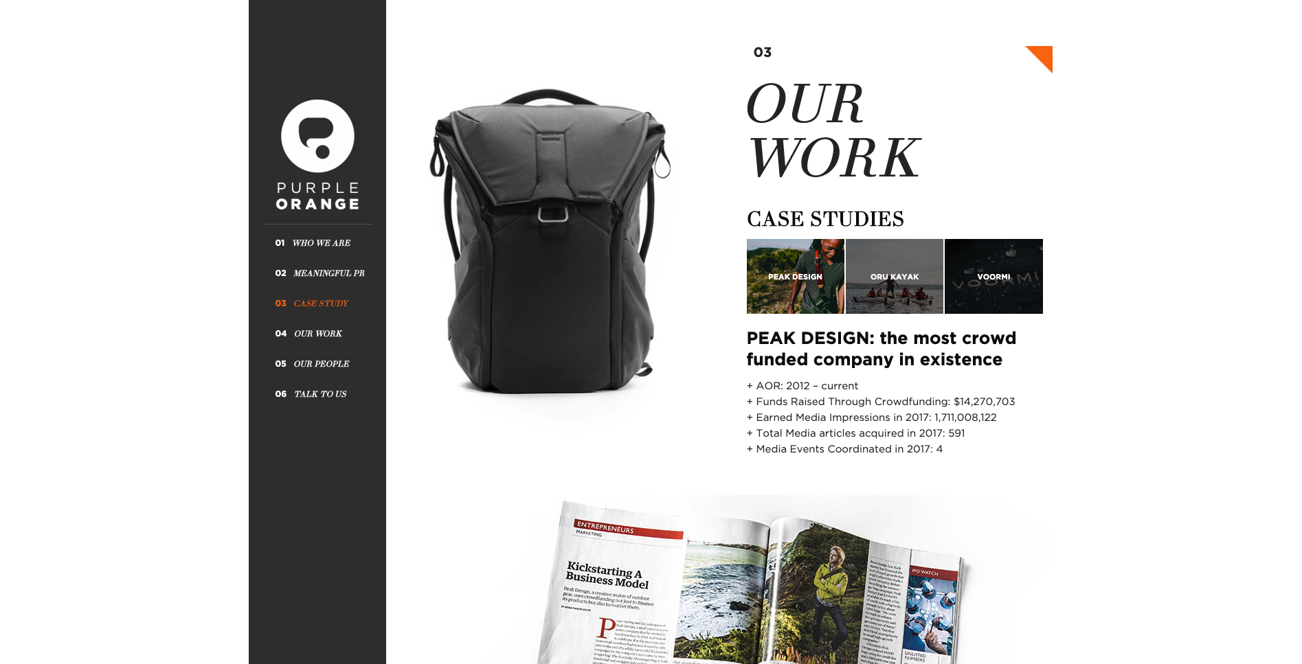
The thing I really love about this navigation experience is the layered approach to the visual design of the page. The content sections are visually divided by full width image banners and the fixed vertical navigation bar sits at the very foreground of the page. As a website visitor scrolls, all the content just passes behind it. It’s really beautiful. Navigation on single page websites can be tricky and many often end up just being a long scrolling page. This example highlights a great way to maintain that nice flat and uncomplicated one page feeling and add in an intuitive handrail to guide visitors.

For our tenth and final example this time around, another single page agency website, Angry Bear, caught my interest due to its wonderful use of visual storytelling in its navigation experience. Upon arrival at the website, the visitor is presented with the image above. They land on the page standing at the top of a waterfall with a sign warning them to ‘beware of cliff falls’ as a howling bear shaped rock looms in the distance. The visual illustrations that form the backbone of this website make for an intriguing experience that transports the visitor to a far away forest - it doesn’t feel like a website and it’s awesome! The navigation menu is hidden under a dark red pull out tab with the logo on it on the left hand side of the screen and can be opened either by clicking on it or by scrolling down the waterfall (AKA the page). Once opened (see below image) the visitor is delighted with cleverly worded labels that clearly indicate the type and intent of the content but keep the story and the bear theme going. Instead of ‘Contact us’ it says ‘Yell for help’ and ‘Awards’ are ‘Trophies’.

The further the visitor scrolls down the page, the deeper they descend down the waterfall and into the darkness of the forest below. Angry Bear’s portfolio of work with the label name of ‘Public Works’ has a really interesting filtered tile navigation system (see below image).
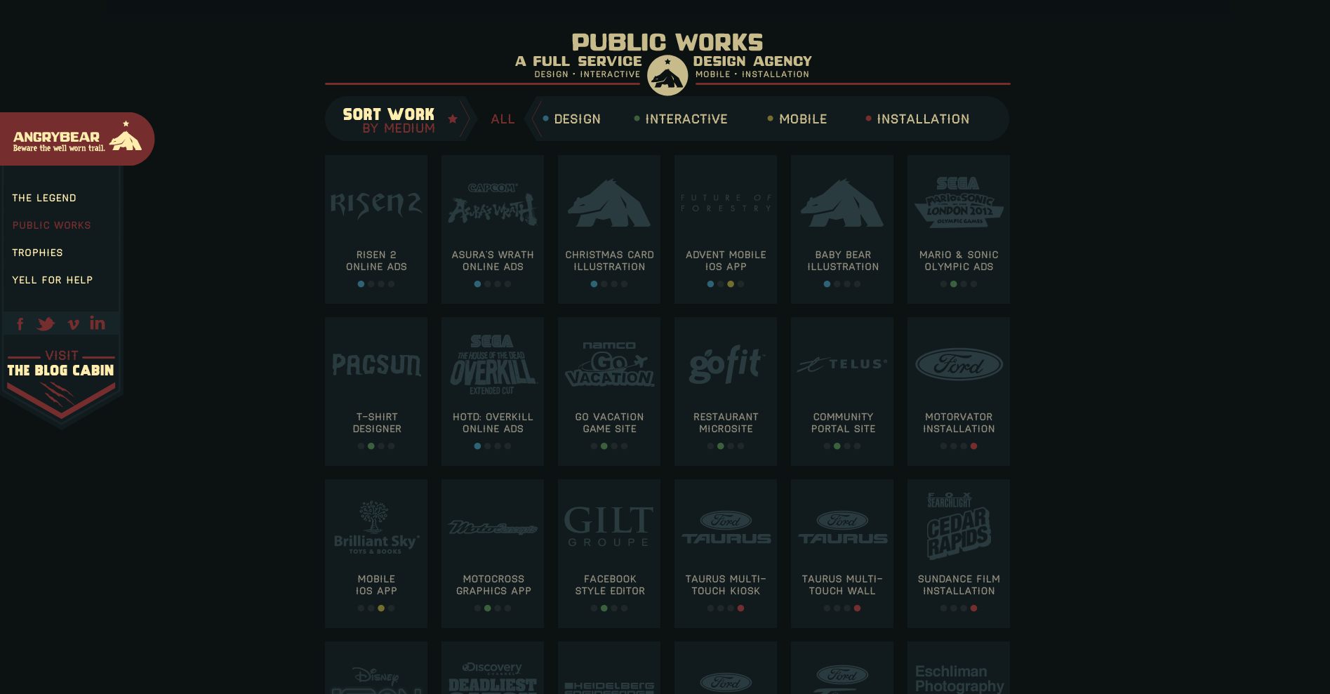
A website visitor can view all or can filter by type which eliminates all the tiles that don’t match the selection and clearly shows what has been selected by the animated filter which removes the background behind the label and has two arrow shapes pointing at it from either side (see below image showing the ‘Design’ filter in action).

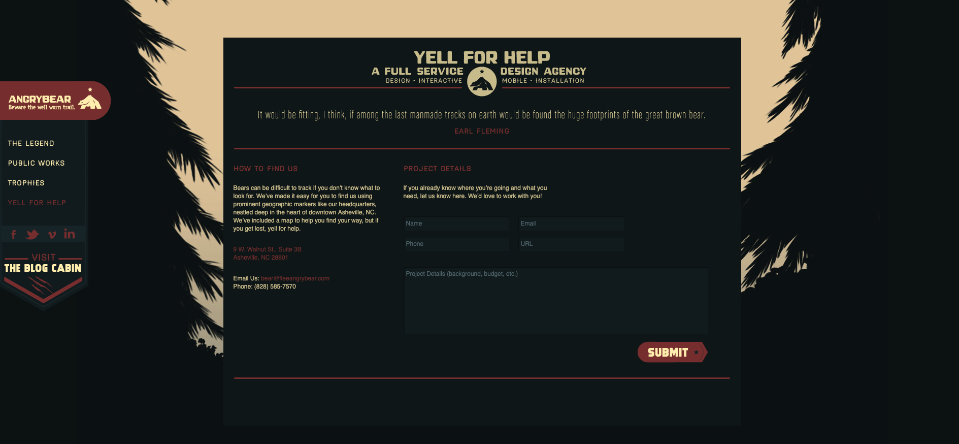
Finally, as the website visitor scrolls all the way down to the bottom of this one page website, the waterfall has become a tree lined stream trickling across the forest floor and the ‘Yell for help’ contact form does not disappoint with its note about how ‘bears can be difficult to track’ (see below image).
There’s just ten examples of great website navigation — what are your favourite examples?
