Subscribe to OW blog for an instantly better inbox
Oops! Something went wrong while submitting the form.
Articles and Podcasts on Customer Service, AI and Automation, Product, and more

In our Value of UX Research report, nearly 70% of participants identified analysis and synthesis as the area where AI could make the biggest impact.
At Optimal, we're all about cutting the busywork so you can spend more time on meaningful insights and action. That’s why we’ve built automated Insights, powered by AI, to instantly surface key themes from your survey responses.
No extra tools. No manual review. Just faster insights to help you make quicker, data-backed decisions.
Automated Insights are just one part of our ever-growing AI toolkit at Optimal. We're making it easier (and faster) to go from raw data to real impact, such as our AI Simplify tool to help you write better survey questions, effortlessly. Our AI assistant suggests clearer, more effective wording to help you engage participants and get higher-quality data.
Ready to level up your UX research? Log into your account to get started with these newest capabilities or sign up for a free trial to experience them for yourselves.
Note: This is part 2 of our series on great website navigation. You can read part 1 here.
Early on in my career, a wonderful mentor of mine shared what I consider to be my all time favourite analogy for describing the difference and relationship between information architecture (IA) and navigation. She called it the warehouse and the department store.
A department store is a beautiful space with many different product category based departments joined by clear, wide and well lit pathways. These pathways are lined with featured products highlighting the best each department has to offer and the order and placement of each department makes perfect sense to customers.
Women’s clothing is the largest department and adjacent to it, you will find the women’s shoe department and a little bit further down, women’s handbags and accessories. It flows intuitively allowing customers to find everything they need without having to hunt for it.
As for the warehouse, it’s out the back of the store but it’s also hidden in pockets throughout it supporting the department store experience every step of the way by making it easy for staff to access extra stock or store special orders for customers. It’s not that nice to look at it, but without it there wouldn’t be a beautiful department store to shop in. The warehouse is the IA and the department store is the navigation.
I’ve written about and have worked with IAs a lot throughout my career and today I am especially excited to step out into the department store and share some examples of great website navigation. I’ve trawled the internet and have pulled together (in no particular order) what I think are some great website navigation examples, so let’s take a look at them and why they’re awesome.
Speaking of mega menus, Walmart’s approach to guiding website visitors through its gigantic IA is quite clever. Hidden neatly away under a hamburger menu, Walmart’s mega menu uses vertical navigation instead of a horizontal dropdown that many websites with large IAs use (see below image).
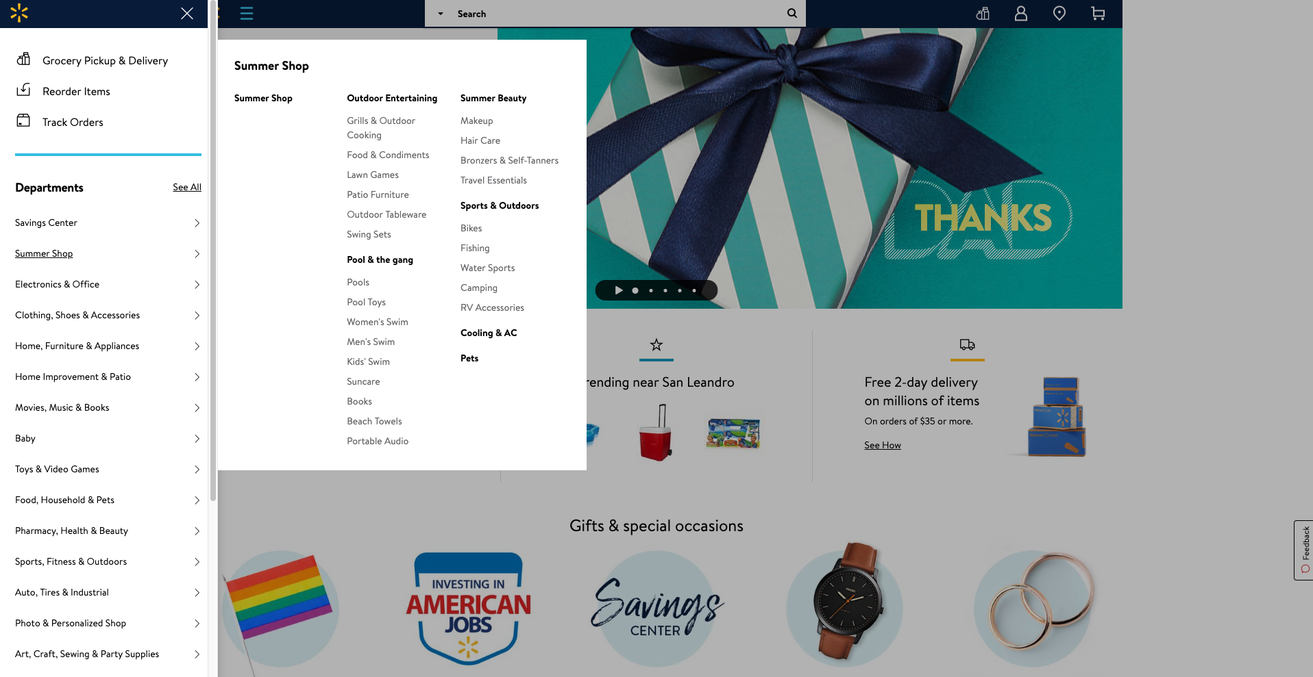
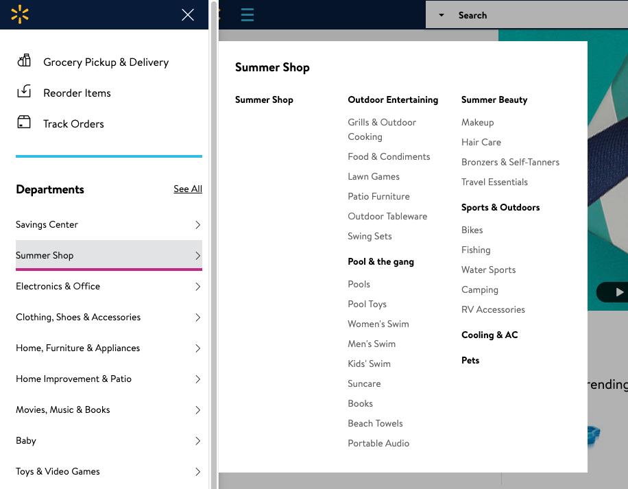
A website visitor can easily see all the categories and all the content labels below either by hovering over the level 1 labels or by clicking on them — clicking results in a pink line appearing under the label (see below image) making it easy to see where you are in the menu.
Selecting ‘See All’ next to ‘Departments’ takes the website visitor to a clear and simple site map-like page allowing them to see the whole IA on one page with no visual distractions at all (see below image).
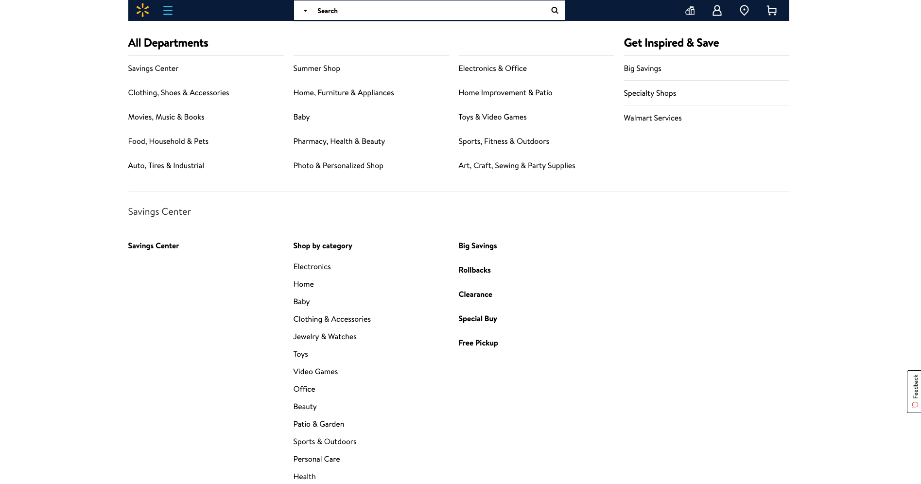
Overall, Walmart’s simple and structured approach to surfacing a mega menu through vertical navigation is pretty awesome.
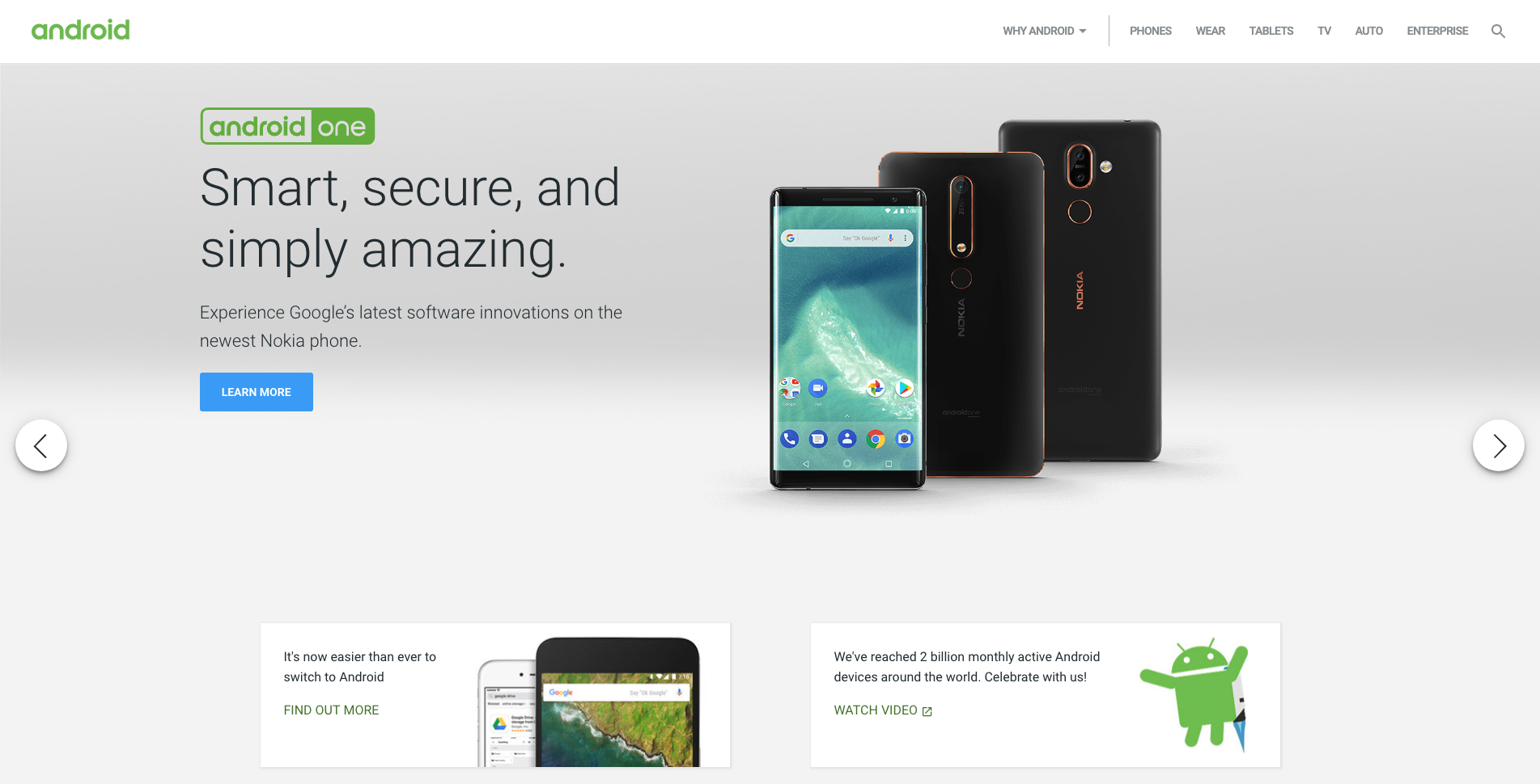
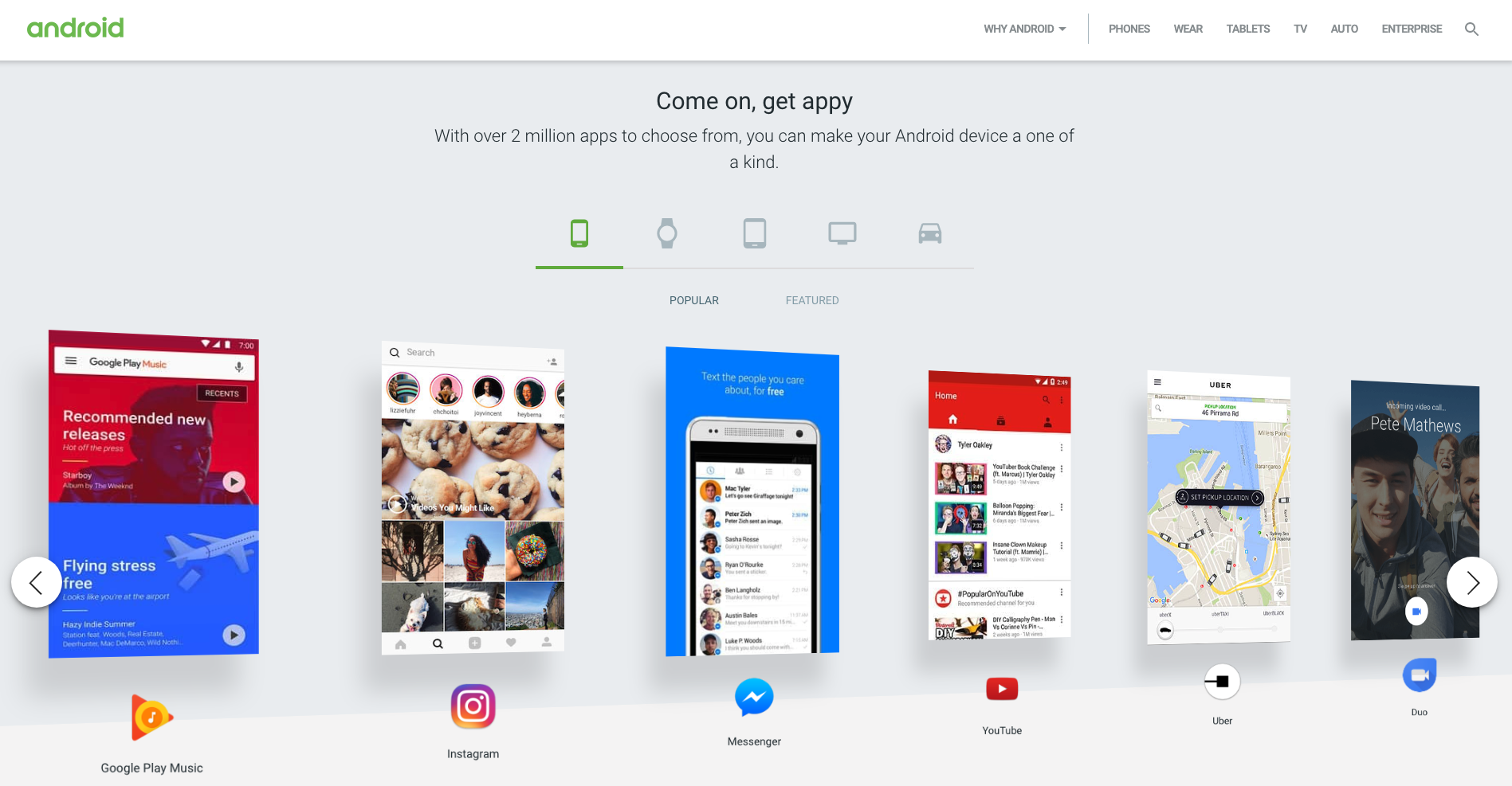
Android’s website has quite a few great navigational elements. Like a lot of technology websites, the home page is clean and simple and has a top navigation bar that hides when a website visitor scrolls down and reappears when they scroll up. The content carousel that sits at the top of the home page on opening is manually driven by the website visitor and doesn’t autoplay which is an awesome thing to see from an experience and accessibility perspective for all users. The rest of the content on the home page is sectioned off into clear horizontal groups and each one features its own manually driven carousel and filtered navigation by device type which is consistent, easy to understand and visually engaging (see below image).
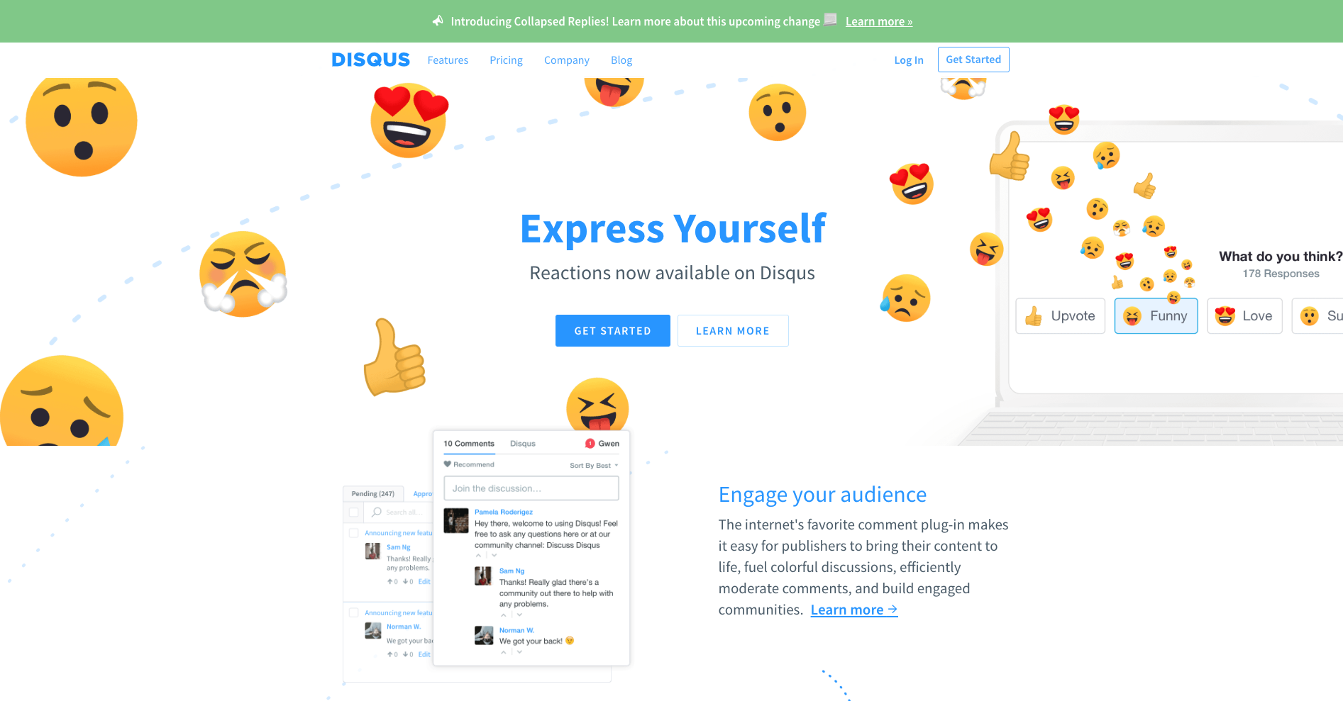
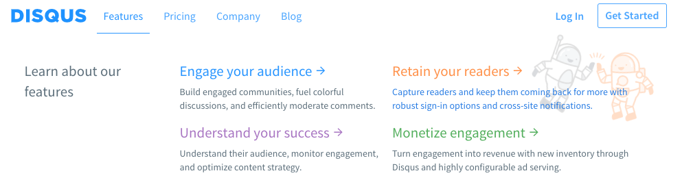
Disqus’s navigation menu is simple and flat. It has a universal top navigation bar with just four labels and only one of them (‘Features’) has suboptions to choose from. It works well because there’s nothing that doesn’t belong there and the labels clearly indicate what lies beneath. The dropdown menu that appears on ‘Features’ is quite interesting. If a website visitor hovers over it, the menu showing four suboptions appears and stays in place until the cursor is moved away from that space and then it hides. If ‘Features’ is clicked, the menu stays dropped down in place regardless of where a website visitor moves their cursor to until another link (that could be anywhere on the page) is clicked on. This is great because it responds to two different types of visitor behaviors where hovering might temporary and clicking might be ‘I want to take a closer look’ — it doesn’t matter what the visitor does, the menu is presented in a natural and intuitive way. And it’s worth taking a closer look because regardless of whether ‘Features’ has been hovered over or clicked on, when a website visitor hovers over those four options underneath, cute and friendly colour coded illustrations appear providing a nice human touch to the navigation experience (see below images).
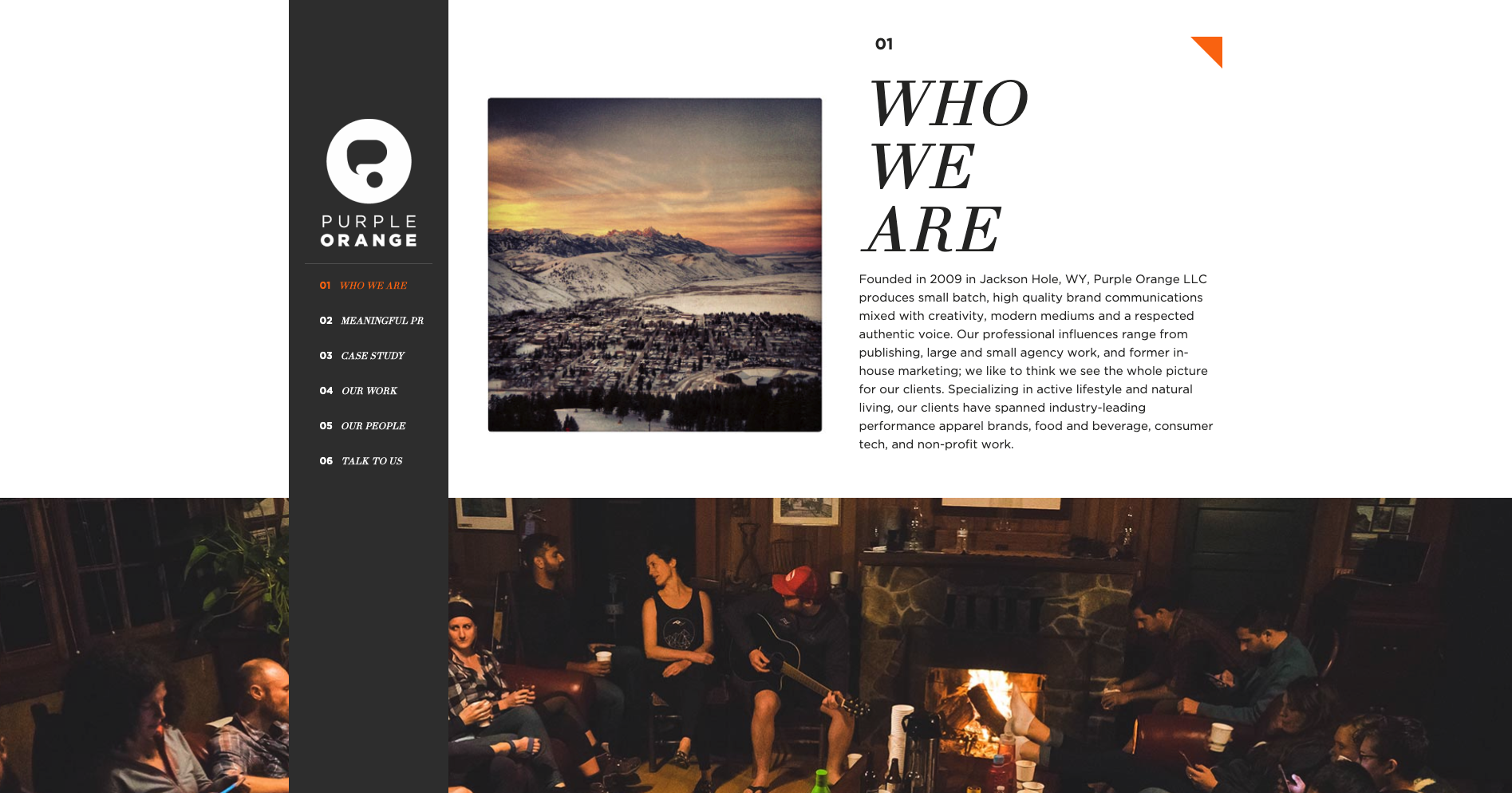
Purple Orange is a creative agency with a single page website that has a fixed vertical navigation menu that works really well. When a website visitor scrolls down the page, the text labels in that menu which is designed like a table of contents are highlighted in orange to show them where they are on the page (see below image). Website visitors can also navigate the content by clicking on the menu labels.
The thing I really love about this navigation experience is the layered approach to the visual design of the page. The content sections are visually divided by full width image banners and the fixed vertical navigation bar sits at the very foreground of the page. As a website visitor scrolls, all the content just passes behind it. It’s really beautiful. Navigation on single page websites can be tricky and many often end up just being a long scrolling page. This example highlights a great way to maintain that nice flat and uncomplicated one page feeling and add in an intuitive handrail to guide visitors.

For our tenth and final example this time around, another single page agency website, Angry Bear, caught my interest due to its wonderful use of visual storytelling in its navigation experience. Upon arrival at the website, the visitor is presented with the image above. They land on the page standing at the top of a waterfall with a sign warning them to ‘beware of cliff falls’ as a howling bear shaped rock looms in the distance. The visual illustrations that form the backbone of this website make for an intriguing experience that transports the visitor to a far away forest - it doesn’t feel like a website and it’s awesome! The navigation menu is hidden under a dark red pull out tab with the logo on it on the left hand side of the screen and can be opened either by clicking on it or by scrolling down the waterfall (AKA the page). Once opened (see below image) the visitor is delighted with cleverly worded labels that clearly indicate the type and intent of the content but keep the story and the bear theme going. Instead of ‘Contact us’ it says ‘Yell for help’ and ‘Awards’ are ‘Trophies’.

The further the visitor scrolls down the page, the deeper they descend down the waterfall and into the darkness of the forest below. Angry Bear’s portfolio of work with the label name of ‘Public Works’ has a really interesting filtered tile navigation system (see below image).
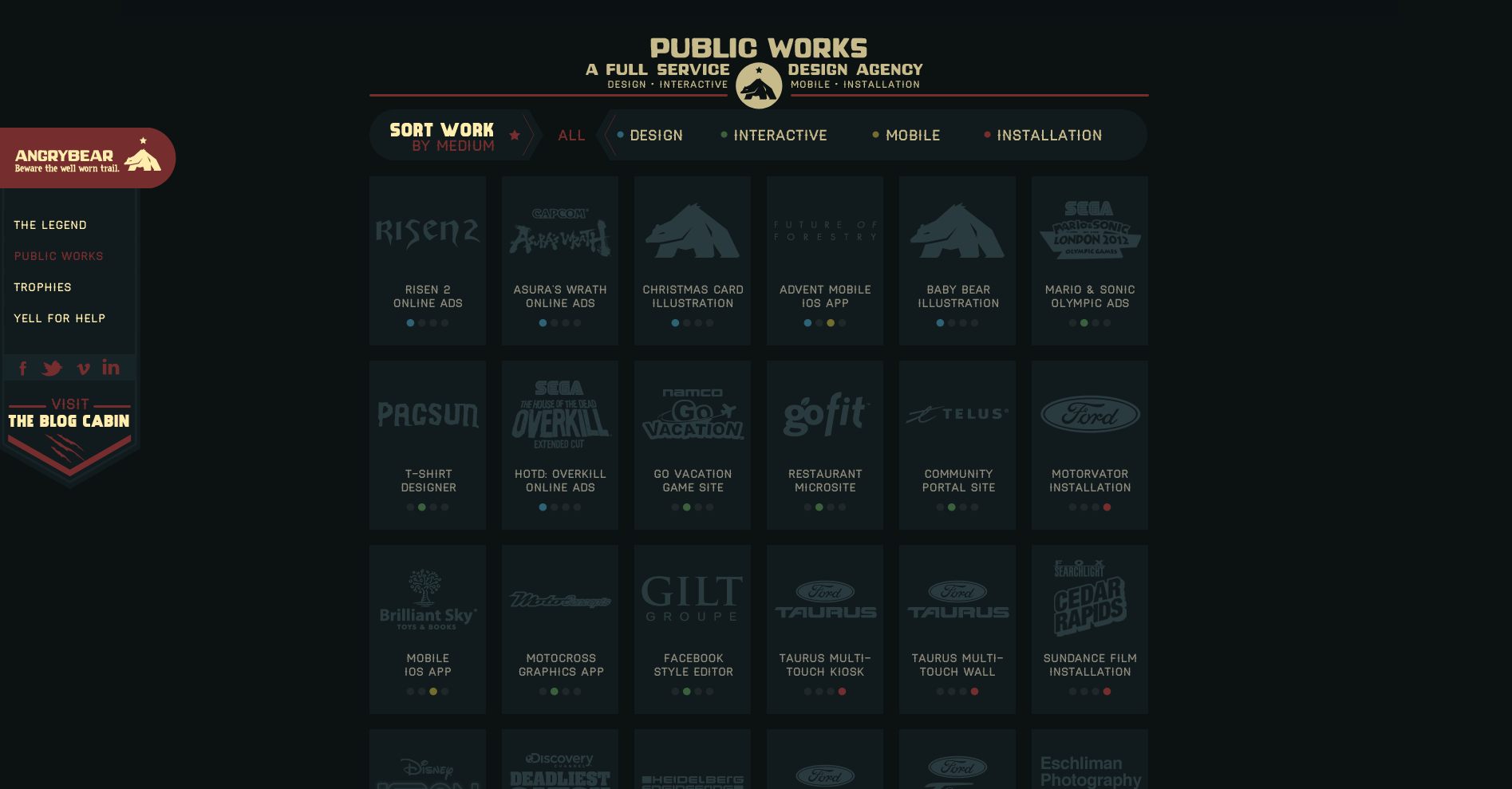
A website visitor can view all or can filter by type which eliminates all the tiles that don’t match the selection and clearly shows what has been selected by the animated filter which removes the background behind the label and has two arrow shapes pointing at it from either side (see below image showing the ‘Design’ filter in action).

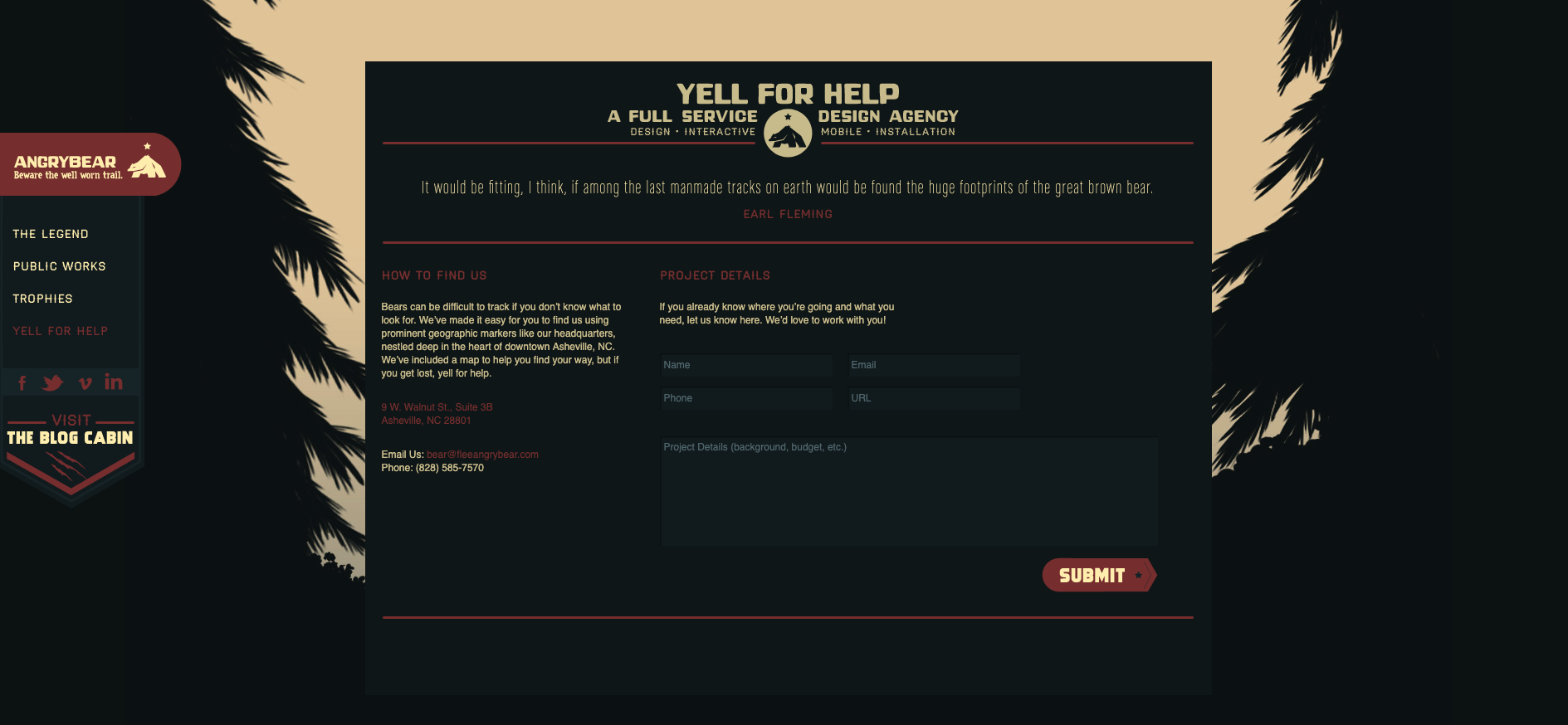
Finally, as the website visitor scrolls all the way down to the bottom of this one page website, the waterfall has become a tree lined stream trickling across the forest floor and the ‘Yell for help’ contact form does not disappoint with its note about how ‘bears can be difficult to track’ (see below image).
There’s just ten examples of great website navigation — what are your favourite examples?
At Optimal Workshop, we're always looking to further the practice of user research. That's why we developed a powerful set of user research tools focused on quantitative and qualitative user testing.
This past year was a big one for us. We attended UX conferences all over the globe and met with researchers and designers in all sorts of organizations. We also continued to build up a solid list of best-practice tips from our community.
That’s what this article is all about – sharing our top user research tips. Some of these are as time-tested and true as the practice of user research itself, and others are starting to take off. Let’s dive right in, but if you’ve got any of your own, feel free to let us know!
In an ideal world, user research would sit at the heart of every organization. It’s a practice that benefits other teams and specializations and improves itself thanks to outside input. But, building those bridges isn’t always easy – especially if the practice of user research is still quite new within a company.
So what’s the best approach? It’s as simple as extending an olive branch to relevant areas of the organization. Typically, this means product, marketing, sales and data science teams. At Optimal Workshop, we’ve found that a great way to break these inter-team barriers down is simply by going out for a coffee and talking about the ways in which your two disciplines can collaborate.
If you’re interested in learning how to explain the value of user research, check out this article we wrote here.
Research and data science are often siloed within organizations, but this is a missed opportunity. Data allows you to identify problems and dismiss assumptions, helping you to figure out what to do next. Sound familiar? User research and data science use different methodologies to answer the same questions, and when combined together the outputs can be much more fruitful. As speaker Mila Dymnikova said at UX New Zealand this year: “Data science can add a competitive edge to your UX team”.
We don’t have an actionable point for this research tip, other than to head over to your colleagues in data science and start up a conversation. If you don’t have any data scientists, think about the areas of your organization where people are utilizing data on a regular basis and start there.
Before you even think about running a usability test, it’s important to establish your research questions. Creating these at the beginning of your project will help you identify which methods to use, what you’ll discuss with stakeholders and where you’ll be able to uncover existing data.
As for example research questions, here are 2 to get you thinking. Remember: research questions should be both actionable and specific.

Whether you’re having a discussion with a stakeholder, a designer or a user, it’s all too easy to interpret opinion as fact. Steve Krug, in a 2005 interview with BoxesAndArrows, explained this quite well: “One of the problems web teams face is that we all have a lot of personal experience as web users, so we all think we know what makes a site good”.
“As a result, most design discussions are full of strong personal opinions, usually disguised as facts… it’s very appealing to have someone you can turn to for definitive answers”.
Being able to discern between a fact and an opinion isn’t always easy, and it's something that takes time to master. Before you head into your next stakeholder consultation, try to recognize when someone may be voicing a personal opinion instead of an impartial statement.
Before you start an in-person user test, one of the best things you can do for your participants is to make sure they’re comfortable. You can do this by explaining what’s expected of them, that you’re not testing them (you’re testing the design/product) and to ask questions if they need to. After all, the user testing process is a two-way street.
This is partly why we recommend all user researchers take a turn in the
participant seat and go along to a user testing session.
This is a great video from Google Ventures on the user interview process.
Before you book a meeting room for your next usability test, consider the importance of location. You may not want to book a quiet meeting room if the thing you’re testing is often used in a loud or otherwise distracting environment. Take an app for construction workers as an example. You may find that you get much more useful data by carrying out your usability test on a loud construction site, so you can see what your users will typically have to deal with when using your app.
There’s no overstating the importance of card sorting when building an IA or testing first impressions when reviewing designs. That's why OptimalSort and Chalkmark are so useful. But, did you know you can use these tools together too?
Here are 3 of the ways you can combine OptimalSort and Chalkmark:
Check out the expanded article here where we explain each of the above approaches.
Most qualitative research is, by its very nature, messy. Unlike the relatively clean, number-focused world of quantitative research, the world of qualitative research is all about the ‘why’. It’s exploratory, focused on reasons, opinions, behaviors and motivations. So how do you make sense of all this ‘messy’ data? Our qualitative research tool Reframer is one of the easiest ways.
Here’s how it works: When running a user test, store your observations in Reframer. Then, add tags to classify each observation. Tags might be things like sentiment (happy, sad, frustrated, etc) or based on actions or progress (succeeded or failed).
Forget about lengthy presentations to your organization. Bringing people into your user testing sessions as observers (or notetakers) is one of the best ways to show the value of user research to others. Think about it. You’re able to:
Getting these people into your research sessions is as easy as asking. The next time you come across someone from sales, marketing or your product teams, ask if they’d like to come along to your next user test.
Research for research’s sake is only viable in certain organizations – typically institutions like universities and colleges. In most other instances, research should be socialized with the wider organization.
Of course, it’s also worth noting that research should be carried out with the support of other teams from the outset. That is to say, you don’t want to turn up to a meeting and drop 3 months’ worth of research on your marketing team. Ideally, you’d work with those other teams to figure out their needs, carry out the research, then communicate it back to them.

A user interview is an opportunity to hear real peoples' thoughts on your product or service or a particular problem you’re studying. To that end, listen! Of course you’ll need to ask your questions, but remember to sit back and let them speak as much as they need to. Jumping in whenever there’s a lull in the conversation will only mean you’re potentially cutting them off when they may have more to say.
It’s always a good idea to recruit a diverse range of participants when you’re running your user tests. Try and get a good spread of jobs or roles, experience with what you’re testing, ethnicity and gender. You may also want to consider recruiting people whose native language is not what you’re using in your product or service. Using recruitment services is a good way to capture a spread of people if you’re struggling within your traditional circles.
Once you’ve wrapped up a testing session, take the data back to your team and unpack it as a group. Analyzing the results of your test in a roundtable format will mean you’re more likely to pick up on more themes and patterns than you would alone. Of course, this can be a hard thing to do, especially if you’re used to working through your results alone.
We find it’s helpful to ask a range of different people within your organization, such as data scientists, sales staff and designers, in addition to user researchers.
User research is often about turning outwards to gather opinions from the people using your product – but it’s also a useful internal tool. Use the same methods and processes you practice on your users to gather internal data. For example, run a survey about the way research functions within your organization, with a focus on how other people think research should operate.
It’s all too easy to get caught up in the moment during a research session and forget to take notes. But don’t rely on your memory for anything! Whenever you hear an interesting point or think of a good next step, note it down. This is partly why we recommend bringing along a guest notetaker to take over this job for you.
Instead of asking your users direct questions, get them to tell you a story. This is a great way to learn about how they think about something from start to finish. It’s quite a simple concept. For example, imagine you want to better understand how your users buy projects from your online store. Instead of asking them a direct question about the checkout process, ask to explain how they go about purchasing a product online. Besides learning more about the area you’re interested in, you’ll find that they give you useful background information on the process that you can use as part of your research.
This isn’t a user research-specific tip, but it’s one that’s worth mentioning all the same. Getting a mentor is one of the best ways to progress your career, as they’ll be able to help you figure out where you want to go and how to get there. A good mentor will also be able to point out development opportunities and even keep an ear to the ground for potential new jobs that might suit you. In a nutshell, a mentor will help you to improve.
On the flip side, it’s also a good idea to consider taking a mentee under your wing. This type of relationship can be fruitful for both parties, with mentees able to gain much of what we discussed above, and mentors able to reinforce their own learnings by teaching them to someone else.
Back in 2010, in the early growth days of social media, Google launched a new product called Google Buzz. Everything seemed set for a great launch. The product had gone through internal testing 20,000 Google employees and it had significant buy-in. Unfortunately, Google Buzz launched with a feature that generated a number of complaints and had to be quickly taken out. Shortly after that, Google Buzz was shut down entirely.
There’s a key lesson here for anyone involved in product development: You are not your user! Also known as the false-consensus effect, Raluca Budiu explained it best writing for Nielsen Norman Group: “Designers, developers, and even UX researchers fall prey to the false-consensus effect, projecting their behaviors and reactions onto users.”
Avoiding this bias isn’t too difficult. Always keep your users front of mind, involve them in the design process and make a point to interact with them regularly.
Understanding the importance of user research is just the first step. To get usable insights that you can use to make decisions you need the right set of tools – and that’s why we’ve developed a suite of 5. OptimalSort can show you how people think the pages on your website should be grouped, and Treejack can show you where people are getting lost. Try them all for free here.
Early on in my career, a wonderful mentor of mine shared what I consider to be my all time favourite analogy for describing the difference and relationship between information architecture (IA) and navigation. She called it the warehouse and the department store. A department store is a beautiful space with many different product category based departments joined by clear, wide and well lit pathways. These pathways are lined with featured products highlighting the best each department has to offer and the order and placement of each department makes perfect sense to customers. Women’s clothing is the largest department and adjacent to it, you will find the women’s shoe department and a little bit further down, women’s handbags and accessories. It flows intuitively allowing customers to find everything they need without having to hunt for it. As for the warehouse, it’s out the back of the store but it’s also hidden in pockets throughout it supporting the department store experience every step of the way by making it easy for staff to access extra stock or store special orders for customers. It’s not that nice to look at it, but without it there wouldn’t be a beautiful department store to shop in. The warehouse is the IA and the department store is the navigation. I’ve written about and have worked with IA's a lot throughout my career and today I am especially excited to step out into the department store and share some examples of great website navigation. I’ve trawled the internet and have pulled together (in no particular order) what I think are some great website navigation examples, so let’s take a look at them and why they’re awesome.
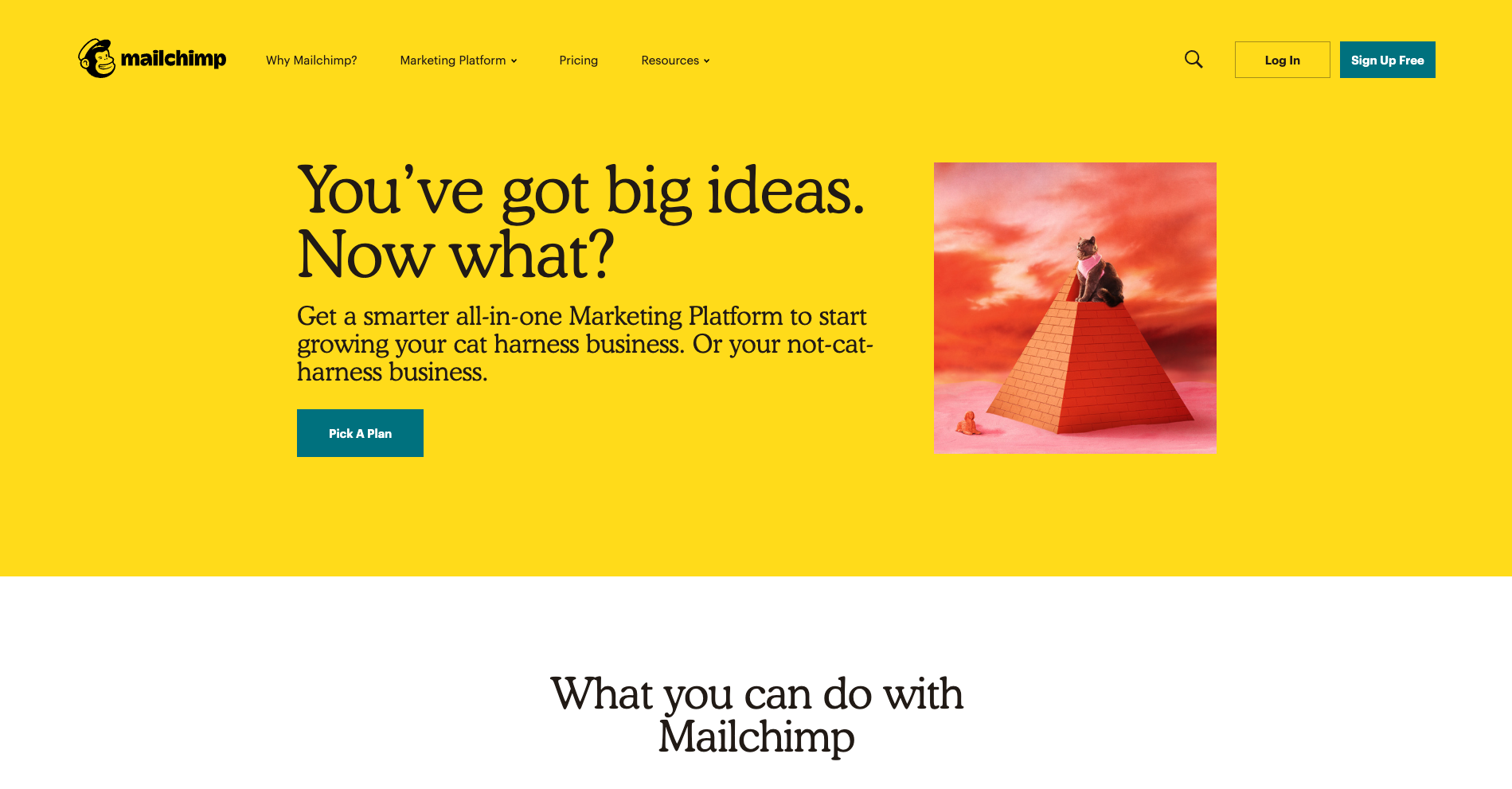
There’s a lot to love about Mailchimp’s website navigation. The overall navigation experience is simple and clean with beautiful illustrations accompanying each content category which makes them all feel just that little bit more human. The unexpected animation that appears on hover on the logo is a nice touch that engages visitors and winks at them as if to say “Yes, this will take you back to the home page”.
The universal navigation bar at the top of the page hides when a website visitor scrolls down the page and reappears when they hover over the top of the page or scroll back up. It hides when you’re moving away from it and it reappears when you’re moving back towards it. I also find Mailchimp’s take on a fat footer (see below) especially interesting — it fills an entire page view and works quite well.
A footer has many jobs including: communicating to website visitors that they’ve reached the bottom of the page, housing content that doesn’t belong anywhere else (e.g., privacy policies, social media links etc) and it serves as a safety net for people who might be feeling a bit lost. Mailchimp’s fat footer has five sections that are not overwhelming at all and is consistent with the rest of the website through its clear and simple content groupings and functionality.

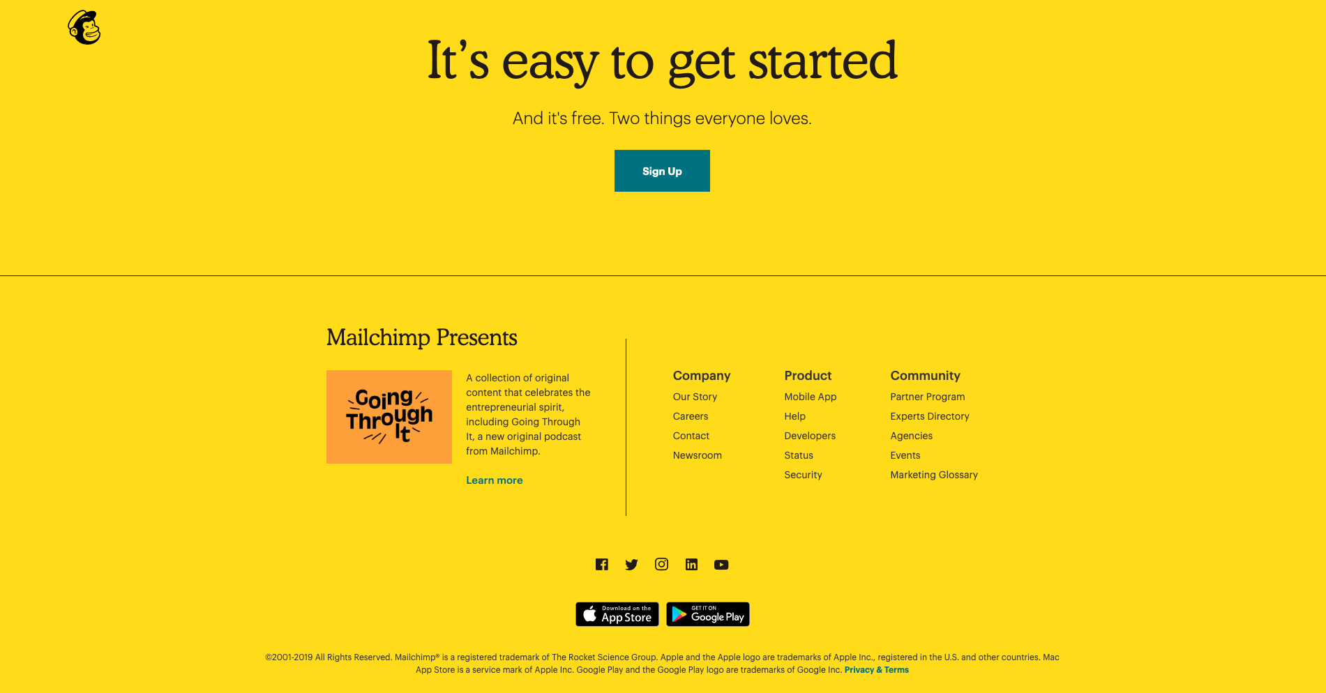
With a riot of colour and delightfully animated illustrations, Mosster Studio’s website is amazing to look at. It also takes that animation one step further through a really cool navigational feature that helps orient website visitors. The top navigation bar is sticky on scroll and the building block-like shapes for each page are animated — on hover they push out and on click they push in as shown in the below image for the ‘Info’ page.
This is a really nice way to show people where they are on this website and it’s definitely consistent with the overall experience. This website also has a sticky minimal non-footer footer that can be seen at the bottom of both the images above. It works because it only has two items in it — copyright information and the privacy policy — and no matter where you are on the website, it’s always there within easy viewing and reach. I feel that it’s just right for this particular website. The IA is quite shallow and the sticky top navigation menu ensures that the footer safety net isn’t really needed in this case.
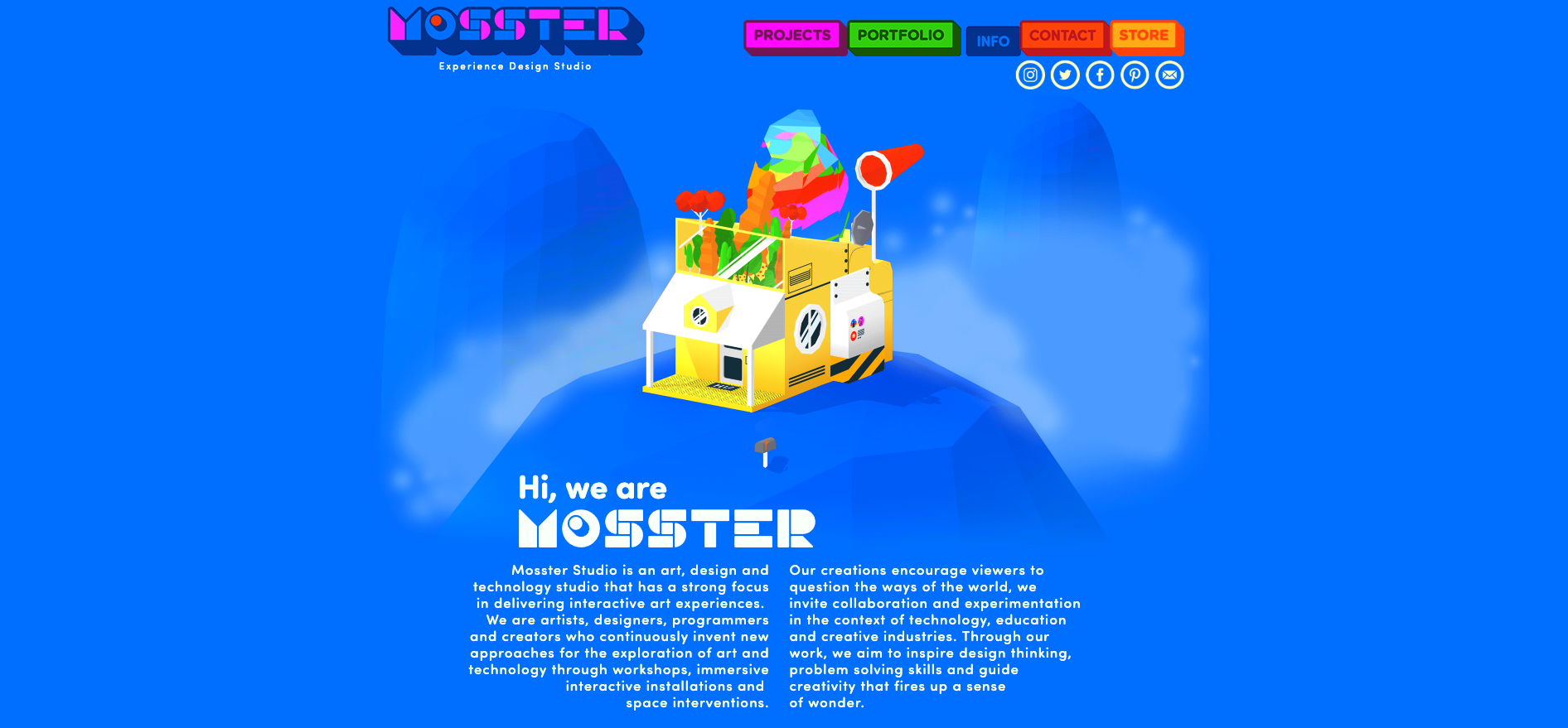
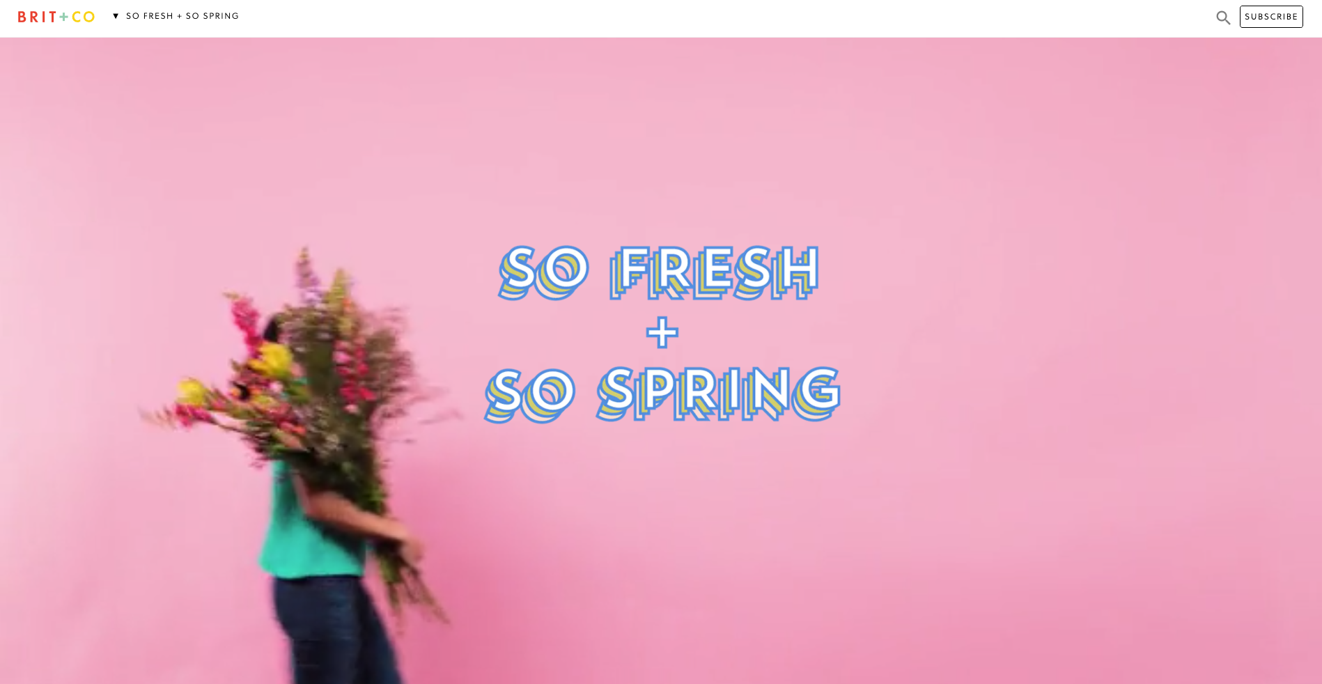
Brit + Co is a media company and the thing I really love about their website navigation is what happens when a website visitor clicks into an area called ‘So Spring’. It’s a single page space with seasonal specific content where the main website top navigation bar is replaced by a single label in the header. It feels like a website within a website — it’s connected to the main website which is easily accessed through the link on the logo and the subscribe call to action (CTA) is still there, but it definitely has its own architecture and navigation style.
When first opened (see below image), the label at the top says ‘So fresh + So Spring’ and the visitor is presented with a gorgeous wide, animated banner with a woman walking across the page and turning around while carrying an enormous bunch of flowers.
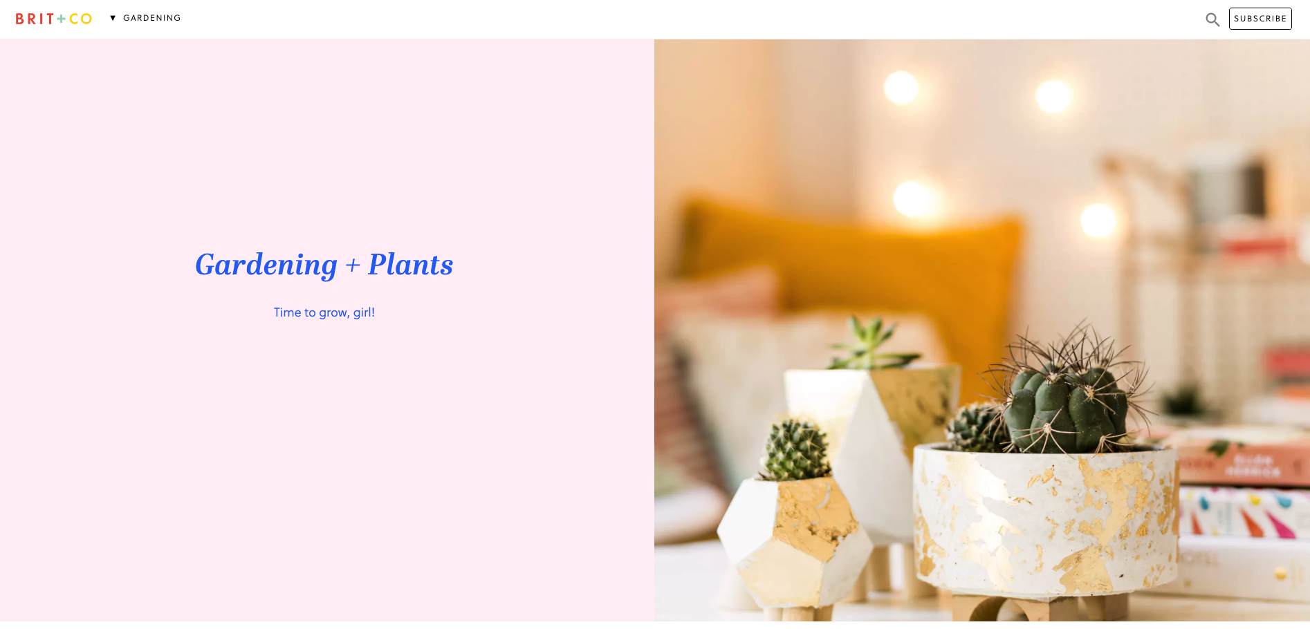
Then, when the website visitor scrolls down the page to the next content section, the header automatically changes to show them where they are in this mini website as shown in the below image when I scrolled down to the ‘Gardening’ section — awesome!
This dynamic navigation feature also contains a dropdown menu allowing website visitors to see all the other topics at a glance and directly navigate between them (see below image).

I feel that these navigation choices make this presumably temporary online space even more immersive and really well thought out.
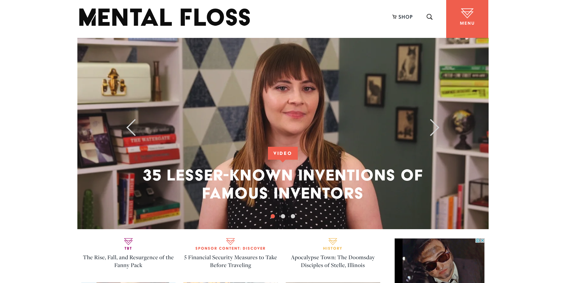
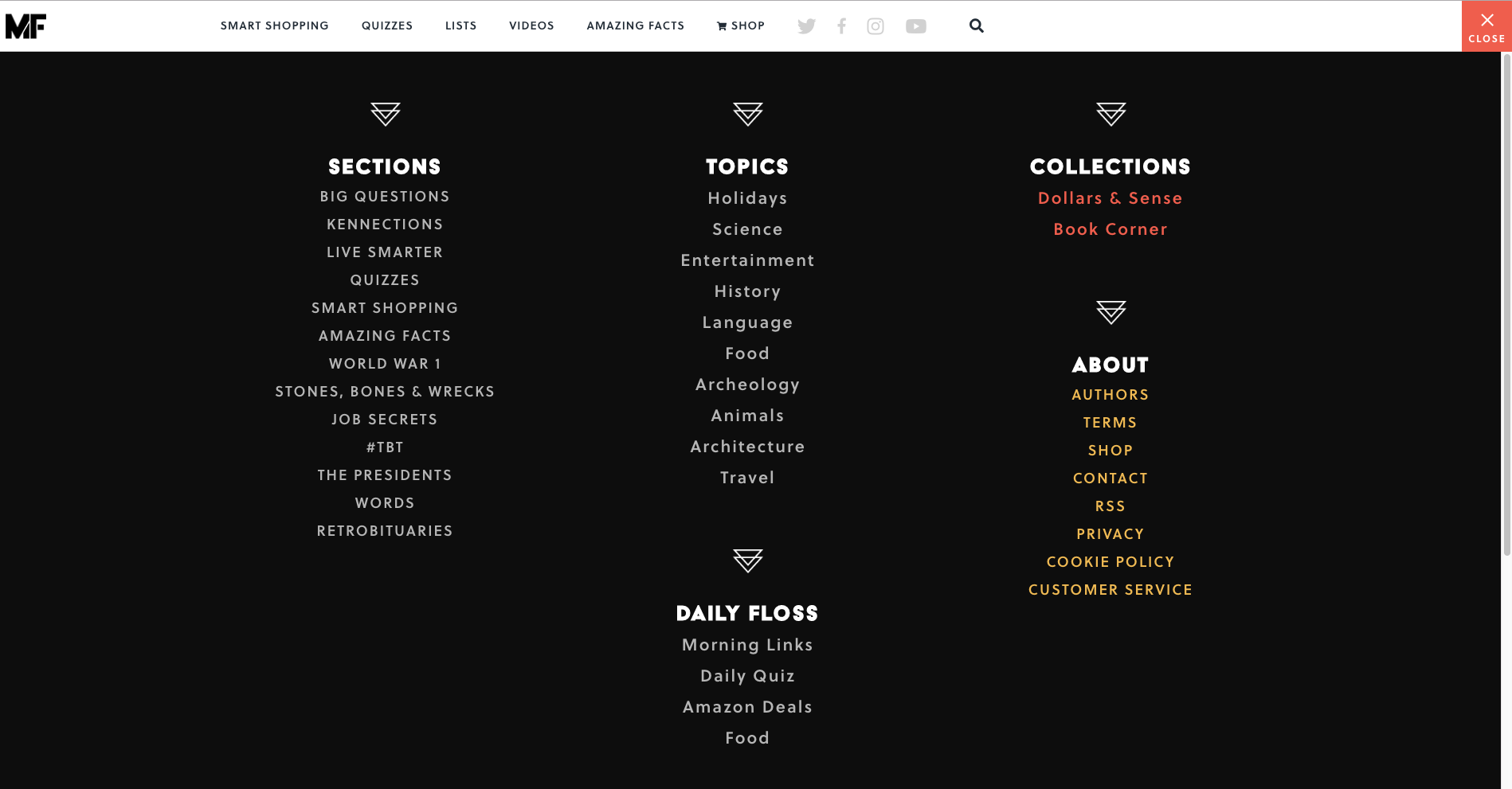
Mental Floss is a long time favourite website of mine. In addition to its fun articles, quizzes and amazing facts generator — did you know that the national animal of Scotland is the unicorn?! — it also has a super cool transforming navigation menu. It starts out as shown in the image above with a big orange square in the top right hand corner that’s simply labelled ‘Menu’ that when clicked, opens a large, full page menu as shown in the image below.
When a website visitor scrolls down the very long home page, the header transforms into a sticky top navigation bar (see below image). The original menu tile is still present and produces the same menu shown above when clicked, but has been shrunk down and attached to the newly transformed sticky navigation bar.
As the website visitor’s journey progresses further down the home page, clearly sectioned groups of content with their own micro navigation menus start to emerge — funnily enough, there’s one called ‘Sections’ that has a mini vertical side navigation (see below image) and this group of content also appears under the menu tile we saw a few moments ago.
Mental Floss is like a rabbit hole in the best possible and most immersive way. Its transforming and intricately connected navigation works because it’s completely consistent with the experience of having a place to go and just get lost in interesting content. I love it.
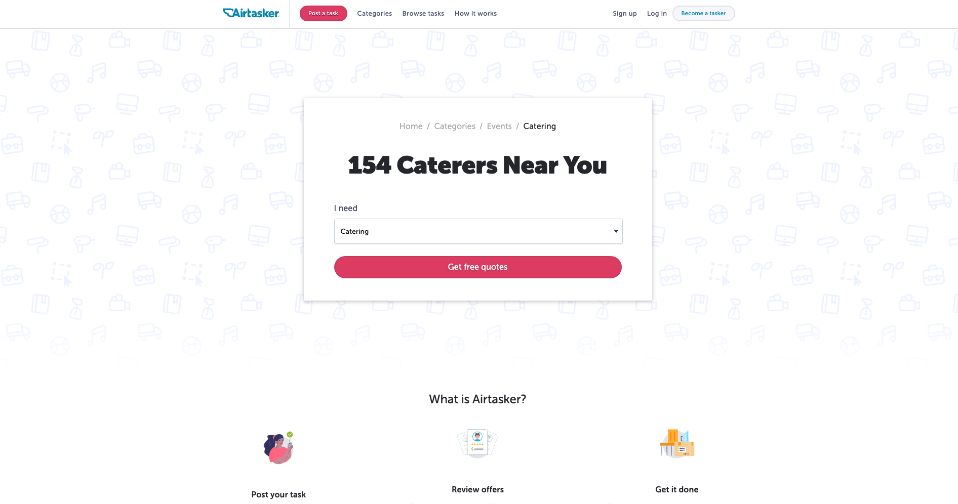
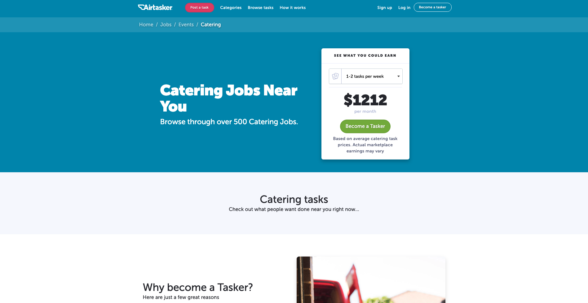
The category section on Airtasker’s website is — as expected — quite the mega menu. The overall website navigation is fairly simple with a fixed header running along the top of the page and the ‘Categories’ label does not lead to a landing page — it exists purely to launch that mega menu. What I really like about this navigation example is the way a website visitor can filter the category content at that very high level of the IA through the mega menu with one click by indicating if they are looking for work or looking to hire someone (see below image).
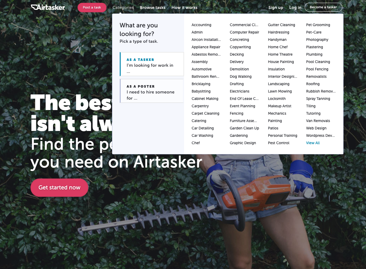
The categories themselves don’t reduce, increase or change in any way at this level, but the content below them is filtered to match the selected view so that when a visitor clicks into their category of choice, they’re only shown the perspective that matters to them. For example, if a website visitor selects ‘I’m a poster’ and then selects the ‘Catering’ category, they will be taken to the below screen.
And for the same scenario in reverse where ‘I’m a tasker’ is selected before selecting ‘Catering’, this is the screen that appears (see below image).
I think it’s a really cool way to chart that navigation course upfront and completely avoid content that holds no relevance in that moment.
Note: We recently updated this post after receiving some feedback from our community.
There’s a long-held myth in the world of web design that search solves all problems. That, instead of needing to build out useful navigation that makes sense, you only need navigation that’s ‘good enough’ as people will just tend to use search anyway.
This isn’t actually true.
Back in 1997, Jakob Nielsen ran a series of usability studies and found that over 50 percent of users were “search-dominant”. Basically, these people would go straight for the search button on a website without paying much attention to the navigation. This was a by-product of the time. The internet was really just starting to grow, and search was the best way to cut through much of the chaff of early websites.
But times have changed. In this article, we’re going to take another look at the search versus navigation argument through the fresh perspective of another year, and then dive into some of the ways you can improve your own website’s navigation
As we saw in the example from Jakob Nielsen, users were largely search-dominant at one point, but this was over 20 years ago. A lot has changed since then, especially in the way that people seek information.
In 2003, Katz & Byrne found that most users preferred navigation over search, although this depended on "the layout of the home page and the site’s information structure". Gerry McGovern found something similar, with his team running task tests with a technical audience. The result? 70 percent started the task by clicking on a link, and 30 percent started with search. He noted that people use navigation first because it’s both easier and faster to click on a link than to use the search box.
Interestingly, even Jakob Nielsen acknowledged in 1997 that, despite the obvious tendency for users to head straight for a search button, navigation was still key: “Despite the primacy of search, web design still needs to [be] grounded in a strong sense of structure and navigation support: all pages must make it clear where they fit in the larger scheme of the site”. He noted that there were a couple of primary reasons behind this thinking. Firstly, web design still needed to account for those people who didn’t use search, and secondly, users who arrive on a page still need structure in order to understand how the page fits into the rest of the website.
Of course, if the navigation in place is poorly organized or doesn’t accurately reflect the content of the website, you’re likely going to see an uptick in search usage or just lose users entirely. In other words, if the navigation isn’t up to standard, people will be pushed away from using links. In Gerry McGovern’s article, he states that: “Clear menus and links are the foundations upon which all great websites are built”.
Other research supports the view that while in-website search is still a popular option for many users, the navigation cannot be an afterthought. An article from Kissmetrics points out that, in a survey of over 100 survey respondents, over half preferred to use navigation over search. Interestingly, 47 percent of respondents said they preferred to filter down to specific product details rather than use search functionality on the website.
Much of how people use websites comes down to the purpose of the site itself. With retail websites, for example, you’ll likely have a large subset of users who know exactly what they’re looking for and will subsequently use the search function to quickly find their item. Using the example of a website that sells books, a user looking for a particular book is far more likely to use the search functionality than go through pages of titles.
There’s really no easy answer to the question of search versus navigation – but there also shouldn’t be. In 2019, website design needs to account for different user journeys and information-seeking approaches. You need to account for the search user and the navigation user – as well as the different ways they’re likely to use these 2 approaches together.
For many designers, the idea of a website with multiple, deep levels may run counter to the idea of a website that’s easy to navigate – but this isn’t the case. It’s true that broad-and-shallow architecture makes it easier for users to find content, but a significant portion of Google’s visits are via a mobile device – meaning there’s real value in migrating to a narrow-and-deep architecture. If you’re wondering how to go about this, a closed card sort is the most relevant testing approach.
The key thing to keep in mind here is that there’s nothing wrong with having multiple levels, even multiple deep levels, as long as the navigation (supplemental and contextual) is suitable.
The website footer is an often overlooked part of a website’s design, thought of as merely an afterthought to drop at the bottom of the page. Despite just how underrated they are, footers are an essential part of a usable, accessible website. For people scanning your website, a footer is a great place to showcase other interesting pages, and it’s also a useful way to point people to pages they may not know they’re looking for.
If you’re looking to improve an existing website, you should start by looking at your information architecture (IA). Your IA informs the navigation on your website, so if you want to address navigation issues, it's best to start there. As for actually fixing your IA, it's best to start with a tree testing tool like Treejack, which can identify bottlenecks and other issues. Then, you can use a card sorting tool to brainstorm possible fixes and then run the tests again to measure any improvements.
Keep in mind that tree testing works best the more you do it. You should test, make changes, test again and keep repeating the cycle for best results.
If you’re interested in diving into more navigation resources, Nielsen Norman Group has a great section here.
Welcome to another UX New Zealand 2019 speaker interview. In the lead up to the conference (which is just around the corner!), we’re catching up with the people who’ll be sharing their stories with you in October.
Today, we chat to product design managers Sophie Taylor (ST) and Julie Jeon (JJ).
JJ: It was a surprise! Throughout my time at university, I was gearing up to become a book/publication designer. After a sequence of unanticipated events, I found myself working at Trade Me on the mobile apps. I had a pretty solid plan around what I’d do after my studies at the time but it was the first unplanned decision I made, probably in my whole life, and I’m really glad I took this path. In hindsight, a lot of things I’d think about when designing a book (like how a reader would interact and navigate through the book and presenting the information clearly) were all very relevant to product design. I was also a big stats nerd during school, and I was happy I could revive that through the measure and learn approach you’d take working in product.
ST: My pathway to design was via some pretty nasty homemade cards. You know the ones; all three primary colors and too much glitter? As a kid, I couldn't get enough of the stuff, and despite the questionable taste of my creations, I was captivated by the process of making things. As I grew up this stuck with me. When I landed at university I still wasn't sure what I wanted to do and it was in the design department where I found I could learn about an endless range of topics while solving problems and making things. That in combination with a computer science paper landed me squarely in the digital world and that is where I have been ever since.
ST and JJ: As the company has grown, so has the size and number of teams we are working with. Going from collaborating with a few people to a whole room of people has changed our approach. We’ve adapted and made new ways to share knowledge and work together as a bigger team, from plain old documentation, to sessions that focus on improving the design process and how to best work with development teams as designers.
JJ: For me, it’s been about spending time with people to encourage but mainly to listen. It goes for the talented and smart designers I’ve had the pleasure of working with, but also with the development teams and product people. I don’t think I approach people with an intent to ‘coach’ them, it’s more about working and getting better together as a team or discipline.
JJ: In my spare time I exchange letters to my pen pals who are scattered all around the world from Tokyo, San Francisco to Toronto and more. It’s a privilege to be able to be a part of and get a glimpse into the various life stages that my friends are at. I’m also very much obsessed with my small indoor garden and making sure my kitten doesn’t eat any of it.
ST: I think the main thing is the subject matter, both were fascinating dives into domains with very different users. It was such an amazing opportunity at Trade Me to work on a local product that so many of our family and friends use and care about. At Xero it has been a real treat getting work on a global product and all of the challenges that come along with that.
ST: I like a good project, anything from our vege garden, house renovations through to a fiber optic light dress my friend Lisa and I made for the LUX light festival a few years back.
ST and JJ: Finding productive ways to solve problems together from start to finish is a big challenge which requires a lot of thinking ahead and preparation. But when it happens, it’s well worth the effort. Coming to agreement around what’s most valuable to solve first, making sure everyone is getting the opportunity to be part of the process to define the solution, deciding what to ship and evaluating if it actually solves the problem are some of the things that benefit from teams working together on. All of these steps need to be done in a way that’s right for the team to get the best outcome.
ST and JJ: It can be really difficult for a team if they don’t have a shared purpose. When a team is clear on the problem they are faced with, they can figure out a way to solve it that makes the best use of the strengths of the team, as well as the individuals within it. If a shared purpose is the foundation, a team with diverse perspectives ensures there are a wide range of ideas, approaches and risks identified during the process. This is more than just different disciplines too – this could be things like personality and working style as well as gender, age, and ethnicity.
JJ: The easy access to nature is my favourite thing about Wellington. There’s always a hilly walk nearby, whether you’re in the city or out in the suburbs. I live near Wrights Hill out in Karori, so we’re always in the company of tūī and kākā out in our garden.
ST: Mine too! We are so lucky to live in a city where just down the road there are a number of beautiful walks to choose from. I am also a big fan of food and here in Wellington we are spoilt for choice.
UX New Zealand is just around the corner. Whether you're new to UX or a seasoned professional, you'll gain valuable insights and inspiration - and have fun along the way! Learn more on the UXNZ website.
Welcome to our third speaker interview for UX New Zealand 2019 (check out our other interviews with Gregg Bernstein and Nate Foulds). In the lead up to the conference, we’re catching up with the people who’ll be sharing their stories with you at the conference in October. Today, we chat with Torrey Podmajersky, a UX Writer at Google and the author of Strategic Writing for UX.
Torrey: It's funny, I did not start in anything like a normal way, because UX writing was so difficult to hire for in 2010, when I was hired to do that at Xbox. They already had a very small writing team at the time that they had inherited as a result of technical writing needs, and the writing manager knew that he needed to hire another. But it's funny – the title of UX writer/content designer or anything like that just didn't exist.
At the time, I was looking to transition from doing internal communications at Microsoft into more of product-oriented work. So it seemed to be a great fit. And actually, that writing manager talked me into it, because he knew that I had been a high school teacher. I taught high school science for nine years, and he said, "Perfect. You can explain difficult abstract concepts to teenagers, and have them not hate you at the end and probably have them pass a test."
Torrey: So it’s worth mentioning that every part of Microsoft is separate from every other part, or at least that was the case when I was there.
It was the various products people were working on or even the teams inside those products that really defined what that culture was. And that culture when I was working at Xbox was incredibly collaborative and incredibly user-focused because we knew who our audience was and we knew how we wanted to expand that audience. So we knew about the core gamer and the people who were already Xbox enthusiasts at that point because we had shipped the Xbox 360 several years before.
We knew that for every household with an Xbox, there was usually one person in that house that knew how to use it and was excited about it. But we also knew that they lived with other people who could potentially also be excited about it. So focusing on the core user and that core user's family made it really easy to make product decisions and UX decisions. It kept everybody on the same page.
Torrey: Absolutely. It's important as soon as the people turn the Xbox on and are looking at the UX for the first time themselves. There’s a clear transition from marketing copy, like, "What does the box say? What do the ads say? What does the flyer say or the poster?". And then people set it up, they're turning it on. How does it greet them? How do they, or if their family member has set it up, how does it include them or exclude them when a new person wants to play for the first time? That is a UX problem, in the sense of a design problem that needs to be solved.
Torrey: I actually don't think it's very different anywhere else. Not just at Microsoft, but anytime you've got a team that understands their user. No matter if they are inside Microsoft or making a consumer app or an enterprise app. If they know who their users are and who they want to target next, every experience maker is looking to grow the audience and the appeal of their product.
Torrey: When I'm generally presenting to my teams, or talking about what I do or what I've done, people get this surprised look on their face. Because they say, "Well, how did you have time to work on all of those things? How did you ship those nine different features?" And the problem with UX writing is that it is endemic to everything. The writing, the words in any experience are probably about half of what a person experiences. People need to use those words for navigation, and control, and all of the functions, all of those user experience interactions. And there are very, very few UX writers to go around.
So whether I am consulting on those features, or engaged with the design process, or just editing them as a last minute thing, the context switching for a UX writer is pretty intense. Because I'll be talking about one feature with one team, and then my next meeting will be a different feature with a different team, sometimes with a totally different audience.
So that’s something that I think every professional UX writer is working hard at right now. I mean maybe not every writer, but a large majority of UX writers are working on how they manage their time and energy so that they can be most effective? And, how do they prioritize the work to be done so that the most important work is getting done well, and the rest of the work is pointed out to say, "That can't be done with the staffing and resources we have right now".
Torrey: There's a diagram I put in the first chapter of my book that talks about the entire life cycle of getting customers into a business or interested in a product. Getting them onboarded, engaged into that product, supporting them if anything goes wrong, and hopefully transforming them into repeat customers or fans of the experience. And hopefully then they also bring along their friends and family or coworkers, or whatever's appropriate for that experience.
What happened then is the first part of that cycle really is the domain of core marketing and copywriting, the descriptions of the app, the positioning in the marketplace. The social media engagement that uses that brand voice extremely well, and differently than the UX writer does. That's where to entice and engage and make things that are snappy lines, and very memorable taglines, for example.
And then that person really cares about the funnel, and getting people to the point of purchasing and engagement in that first moment of using the experience. And sometimes that that moment is bridged by a different person entirely, doing sales. So we have the marketing motion, the sales motion, and then when people are in the experience: that's when the UX text really needs to shine.
Interestingly, and this is especially true for enterprise apps, the people who need to be engaged with the marketing and the advertising and who are committed to the sale are not the people who are going to use the experience every day. For example, in an education environment, it's school boards and administrators that choose the software for the school district. And then it's teachers and students who end up using it.
So it's very different audiences there for the two groups. But even when they're the same group, if the copywriting before the moment of sale and the UX text after the sale are not aligned, if they don't feel like the same product, that's a big problem. So there needs to be a lot of alignment there.
Torrey: This is something that plenty of companies are still struggling with. Whether that's Microsoft, or Google, or even Facebook. I mean, Facebook has a bunch of content strategists, Google has a bunch of UX writers. Microsoft has a content developers and content designers and UX writers. Part of the problem here is the difference in titles and also the widespread title differences. But trying to make the case for, "Why should we have this person or somebody in charge of this?" is a tough thing to do, until you start saying, "Hey, if we took out all the words on this screen that we're designing, nobody could use it at all. If we took out all the labels and the titles and descriptions, it's unusable."
In fact, for most of the experiences we design, the text is half or more of what people interact with. That text creates a story and creates a sense of the brand. We can build people's confidence, we can hint at what's coming next.
So when the value of UX writing is made clear, people tend to get it pretty fast. But it's making that case and finding different approaches that is difficult. It helps that there's more books coming out about it, it helps that it’s becoming more widely recognized, "Hey, these people are great at that." Well, they have somebody full-time, writing those words. Turns out, that’s an area that makes sense to invest in.
Torrey: I like to ask people, "Are you shipping things with words on it?" If you are shipping experiences that have letters next to each other that form words, or characters in non-letter-based languages, then you have UX writers. Are those the UX writers that should be doing it? Or is it everybody doing a little bit of it? What are you doing to keep them consistent? What are you doing to make sure that you have only hired people to do the UX writing, who have capability in the language that you're shipping in?
If you're shipping in say, American English as we generally do in the US, are you only hiring people that have English as their first language? Whether it's the engineers or the product owners or the support personnel, do you look at their writing samples before you hire them?
It'd be pretty silly to do that, but at the same time, it's also pretty silly that we have historically not been paying much attention to the language skills of the people who are putting all of this language in front of our customers. People spend a lot more time with the UI text than they do with any single piece of marketing text, and that marketing text I know gets a lot more scrutiny.
Torrey: Sure! The School of Visual Concepts is a Seattle-based independent school. I developed the UX writing curriculum there several years ago with Elly Searle, and have been teaching sections of it ever since. It’s a 5 week class, so classes once a week for 3 hours each week. We go through the very fundamentals of what it is it to be a writer.
This means everything from defining voice to creating and editing text to be conversational, clear, purposeful and concise. We also go through critique of that in class, and eventually come out the other end with portfolio pieces. This means that these students, some of whom are already designers, some of whom are looking to get into UX design, have some of these fundamental UX writing skills so that they can make their designs really sing.
Torrey: I am so excited! I've never been to New Zealand before. I have heard amazing things about Kiwis in general. So I’m really excited to just breathe new air and see the ocean from a different perspective. I’m also there to learn a little bit about the culture. I'm taking a few days before the conference to just enjoy Wellington a little bit. And then at UX New Zealand, similarly soaking up the UX culture of a new place. We’re are all making this up as we go along, and we make it up better when we do that together and when we learn from each other.
We're all still struggling with the same fundamental curiosities of figuring out how we interact with humans at scale. Whether it's to delight them, or inform them, or enable them or empower them, whatever it is we are doing with those humans, we’re trying to work out the right ways to do it. What are the ethical ways to do it? What are the effective ways to do it? I’m looking forward to having those conversations at the conference.
