Subscribe to OW blog for an instantly better inbox
Oops! Something went wrong while submitting the form.
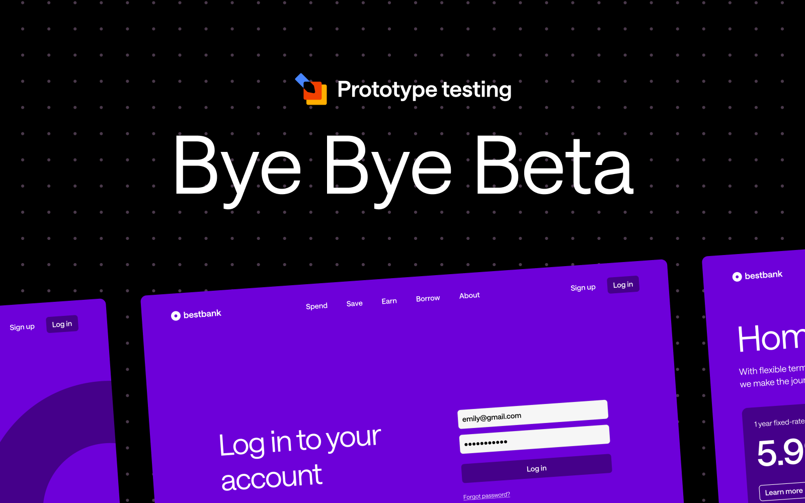
After months of invaluable collaboration with our incredible community, we're thrilled to announce that Prototype Testing has officially graduated from beta and is now available to everyone on the Individual+, Team, and Enterprise plans!
The Prototype Testing Beta was launched with a singular mission: to gather feedback from our community to help shape the future of the tool. Over the past few months, we've been privileged to work alongside a diverse group of customers and UX leaders— who provided invaluable feedback, completed many Usability Tests, and helped us refine the tool.
From the initial rollout to the most recent updates, your input has shaped our decisions, from design tweaks to functional improvements. Together, we’ve tackled challenges, explored creative solutions, and built something that truly aligns with user needs.
We're thrilled to announce our most requested feature is coming to Prototype Testing: seamless video recording that captures the full depth of user experiences.
Video recording transforms your research by:
Your feedback during the beta has shaped an exciting roadmap for 2025 and beyond. While we can't reveal everything just yet, know that every feature and enhancement planned has been inspired by your needs and suggestions.
To our incredible beta participants: your partnership has been invaluable. You've shared your expertise, challenged our assumptions, and helped us build something truly special. Every piece of feedback, every suggestion, and every bug report has contributed to making Prototype Testing a tool that truly serves the UX research community.
This is just the beginning of our mission to make expert research accessible to all. Stay tuned for regular updates as we continue to evolve Prototype Testing based on your needs and feedback. Here's to the next chapter of creating exceptional digital experiences together!

What happens when you mix New Zealand's finest chocolate with 870 of Europe's brightest UX minds? Pure magic, as we discovered at UXDX Dublin 2024!
Our UXDX journey began with pre-event drinks (courtesy of yours truly, Optimal Workshop) and a special treat from down under - a truckload of Whittaker's chocolate that quickly became the talk of the conference. Our impromptu card sorting exercise with different Whittaker's flavors revealed some interesting preferences, with Coconut Slab emerging as the clear favorite among attendees!
The conference's core theme of breaking down silos between design, product, and engineering teams resonated deeply with our mission at Optimal Workshop. Andrew Birgiolas from Sephora delivered what I call a "magical performance" on collaboration as a product, complete with an unforgettable moment where he used his shoe to demonstrate communication scenarios (now that's what we call thinking on your feet!).
Frank Gaine's session on organizational purpose was a standout moment, emphasizing the importance of alignment at three crucial levels:
- Company purpose
- Team purpose
- Individual purpose
This multi-layered approach to purpose struck a chord with attendees, reminding us that effective UX research and design must be anchored in clear, meaningful objectives at every level.
One of the most practical takeaways came from Kelle Link's session on navigating enterprise ecosystems. Her candid discussion about the necessity of becoming proficient in deck creation sparked knowing laughter from the audience. As our CEO noted, it's a crucial skill for communicating with senior leadership, board members, and investors - even if it means becoming a "deck ninja" (to use a more family-friendly term).
Chris Grant's insights on standardization hit home: "You need to standardize everything so things are predictable for a team." This seemingly counterintuitive approach to fostering innovation resonated with our own experience at Optimal Workshop - when the basics are predictable, teams have more bandwidth for tackling the unpredictable challenges that drive real innovation.
Matt Fenby-Taylor's discussion of the "pirate vs. worker bee" persona balance was particularly illuminating. Finding team members who can maintain that delicate equilibrium between creative disruption and methodical execution is crucial for building truly impactful product teams.
A key thread throughout the conference was the evolution of UX research methods. Nadine Piecha's "Beyond Interviews" session emphasized that research is truly a team sport, requiring involvement from designers, PMs, and other stakeholders. This aligns perfectly with our mission at Optimal Workshop to make research more accessible and actionable for everyone.
The debate on AI's role in design and research between John Cleere and Kevin Hawkins sparked intense discussions. The consensus? AI will augment rather than replace human researchers, allowing us to focus more on strategic thinking and deeper insights - a perspective that aligns with our own approach to integrating AI capabilities.
As we reflect on UXDX 2024, a few things are clear:
Perhaps the most valuable aspect of UXDX wasn't just the formal sessions, but the connections made over coffee (which we were happy to provide!) and, yes, New Zealand chocolate. The mix of workshops, forums, and networking opportunities created an environment where ideas could flow freely and partnerships could form naturally.
As we look forward to UXDX 2025, we're excited to see how these conversations evolve. Will AI transform how we approach UX research? How will cross-functional collaboration continue to develop? And most importantly, which Whittaker's chocolate flavor will reign supreme next year?
One thing's for certain - the UX community is more vibrant and collaborative than ever, and we're proud to be part of its evolution. I’ve said it before and I’ll say it again, the industry has a very bright future.
See you next year! We’ll remember to bring more Coconut Slab chocolate next time - it seems we've created quite a demand!
.png)
If you missed our recent live training on Prototype Testing, don’t worry—we’ve got everything you need right here! You can catch up at your convenience, so grab a cup of tea, put your feet up, and enjoy the show.
In the session, we explored the powerful new features of our Prototype Testing tool, offering a step-by-step guide to setting up, running, and analyzing your tests like a seasoned pro. This tool is a game-changer for your design workflow, helping you identify usability issues and gather real user feedback before committing significant resources to development.
We walked through how to create a prototype test from scratch using static images. This method is perfect for early-stage design concepts, where you want to quickly test user flows without a fully interactive prototype.
Figma users, we’ve got you covered! We discussed how to prepare your Figma prototype for the smoothest possible testing experience. From setting up interactions to ensuring proper navigation, these tips ensure participants have an intuitive experience during the test. For more detailed instructions, check out our help article
One of the standout features of the tool is its seamless integration with Figma. We showed how easy it is to import your designs directly from Figma into Optimal, streamlining the setup process. You can bring your working files straight in, and resync when you need to with one click of a button.
We explored how to analyze the usability metrics, and walked through what the results can indicate on click maps and paths. These visual tools allow you to see exactly how participants navigate your design, making it easier to spot pain points, dead ends, or areas of friction. By understanding user behavior, you can rapidly iterate and refine your prototypes for optimal user experience.

As artificial intelligence (AI) continues to advance and permeate various industries, the field of user experience (UX) research is no exception.
At Optimal Workshop, our recent Value of UX report revealed that 68% of UX professionals believe AI will have the greatest impact on analysis and synthesis in the research project lifecycle. In this article, we'll explore the current and potential applications of AI in UXR, its limitations, and how the role of UX researchers may evolve alongside these technological advancements.
AI is already making inroads in UX research, primarily in tasks that involve processing large amounts of data, such as
As AI technology continues to evolve, its role in UX research is poised to expand, offering even more sophisticated tools and capabilities. While AI will undoubtedly enhance efficiency and uncover deeper insights, it's important to recognize that human expertise remains crucial in interpreting context, understanding nuanced user needs, and making strategic decisions.
The future of UX research lies in the synergy between AI's analytical power and human creativity and empathy, promising a new era of user-centered design that is both data-driven and deeply insightful.
As AI capabilities advance, the potential to accelerate UX research processes grows exponentially. We anticipate AI revolutionizing UXR by enabling rapid synthesis of qualitative data, offering predictive analysis to guide research focus, automating initial reporting, and providing real-time insights during user testing sessions.
These advancements could dramatically enhance the efficiency and depth of UX research, allowing researchers to process larger datasets, uncover hidden patterns, and generate insights faster than ever before. As we continue to develop our platform, we're exploring ways to harness these AI capabilities, aiming to empower UX professionals with tools that amplify their expertise and drive more impactful, data-driven design decisions.
While AI shows great promise in accelerating certain aspects of UX research, it's important to recognize its limitations, particularly when it comes to understanding the nuances of human experience. AI may struggle to grasp the full context of user responses, missing subtle cues or cultural nuances that human researchers would pick up on. Moreover, the ability to truly empathize with users and understand their emotional responses is a uniquely human trait that AI cannot fully replicate. These limitations underscore the continued importance of human expertise in UX research, especially when dealing with complex, emotionally-charged user experiences.
Furthermore, the creative problem-solving aspect of UX research remains firmly in the human domain. While AI can identify patterns and trends with remarkable efficiency, the creative leap from insight to innovative solution still requires human ingenuity. UX research often deals with ambiguous or conflicting user feedback, and human researchers are better equipped to navigate these complexities and make nuanced judgment calls. As we move forward, the most effective UX research strategies will likely involve a symbiotic relationship between AI and human researchers, leveraging the strengths of both to create more comprehensive, nuanced, and actionable insights.
As AI becomes more integrated into UX research processes, several ethical considerations come to the forefront. Data security emerges as a paramount concern, with our report highlighting it as a significant factor when adopting new UX research tools. Ensuring the privacy and protection of user data becomes even more critical as AI systems process increasingly sensitive information. Additionally, we must remain vigilant about potential biases in AI algorithms that could skew research results or perpetuate existing inequalities, potentially leading to flawed design decisions that could negatively impact user experiences.
Transparency and informed consent also take on new dimensions in the age of AI-driven UX research. It's crucial to maintain clarity about which insights are derived from AI analysis versus human interpretation, ensuring that stakeholders understand the origins and potential limitations of research findings. As AI capabilities expand, we may need to revisit and refine informed consent processes, ensuring that users fully comprehend how their data might be analyzed by AI systems. These ethical considerations underscore the need for ongoing dialogue and evolving best practices in the UX research community as we navigate the integration of AI into our workflows.
As AI technologies advance, the role of UX researchers is not being replaced but rather evolving and expanding in crucial ways. Our Value of UX report reveals that while 35% of organizations consider their UXR practice to be "strategic" or "leading," there's significant room for growth. This evolution presents an opportunity for researchers to focus on higher-level strategic thinking and problem-solving, as AI takes on more of the data processing and initial analysis tasks.
The future of UX research lies in a symbiotic relationship between human expertise and AI capabilities. Researchers will need to develop skills in AI collaboration, guiding and interpreting AI-driven analyses to extract meaningful insights. Moreover, they will play a vital role in ensuring the ethical use of AI in research processes and critically evaluating AI-generated insights. As AI becomes more prevalent, UX researchers will be instrumental in bridging the gap between technological capabilities and genuine human needs and experiences.
The integration of AI into UX research processes holds immense potential for democratizing the field, making advanced research techniques more accessible to a broader range of organizations and professionals. Our report indicates that while 68% believe AI will impact analysis and synthesis, only 18% think it will affect co-presenting findings, highlighting the enduring value of human interpretation and communication of insights.
At Optimal Workshop, we're excited about the possibilities AI brings to UX research. We envision a future where AI-powered tools can lower the barriers to entry for conducting comprehensive UX research, allowing smaller teams and organizations to gain deeper insights into their users' needs and behaviors. This democratization could lead to more user-centered products and services across various industries, ultimately benefiting end-users.
However, as we embrace these technological advancements, it's crucial to remember that the core of UX research remains fundamentally human. The unique skills of empathy, contextual understanding, and creative problem-solving that human researchers bring to the table will continue to be invaluable. As we move forward, UX researchers must stay informed about AI advancements, critically evaluate their application in research processes, and continue to advocate for the human-centered approach that is at the heart of our field.
By leveraging AI to handle time-consuming tasks and uncover patterns in large datasets, researchers can focus more on strategic interpretation, ethical considerations, and translating insights into impactful design decisions. This shift not only enhances the value of UX research within organizations but also opens up new possibilities for innovation and user-centric design.
As we continue to develop our platform at Optimal Workshop, we're committed to exploring how AI can complement and amplify human expertise in UX research, always with the goal of creating better user experiences.
The future of UX research is bright, with AI serving as a powerful tool to enhance our capabilities, democratize our practices, and ultimately create more intuitive, efficient, and delightful user experiences for people around the world.

In today's fast-paced product development landscape, the ability to quickly gather and act on user insights is more critical than ever. While dedicated UX researchers play a crucial role, there's a growing trend towards democratizing UX research – empowering team members across various functions to contribute to and benefit from user insights. Let's explore how this approach can transform your organization's approach to user-centered design.
Democratizing UX research is a transformative approach that empowers organizations to unlock the full potential of user insights. By breaking down traditional barriers and involving a broader range of team members in the research process, companies can foster a culture of user-centricity, accelerate decision-making, and drive innovation. This inclusive strategy not only enhances the depth and breadth of user understanding but also aligns diverse perspectives to create more impactful, user-friendly products and services. Here are a few of the benefits of this movement:
By enabling more team members to conduct basic research, organizations can gather insights more frequently and rapidly. This means that instead of waiting for dedicated UX researchers to be available, product managers, designers, or marketers can quickly run simple surveys or usability tests. For example, a product manager could use a user-friendly tool to get quick feedback on a new feature idea, allowing the team to iterate faster. This increased velocity helps organizations stay agile and responsive to user needs in a fast-paced market.
Cross-functional participation brings diverse viewpoints to research, potentially uncovering insights that might be missed by specialized researchers alone. A developer might ask questions from a technical feasibility standpoint, while a marketer might focus on brand perception. This diversity in approach can lead to richer, more comprehensive insights. For instance, during a user interview, a sales team member might pick up on specific pain points related to competitor products that a UX researcher might not have thought to explore.
When more team members engage directly with users, it fosters a culture of user-centricity across the organization. This direct exposure to user feedback and behaviors helps all team members develop empathy for the user. As a result, user needs and preferences become a central consideration in all decision-making processes, not just in UX design. For example, seeing users struggle with a feature firsthand might motivate a developer to champion user-friendly improvements in future sprints.
Team members who participate in research are more likely to understand and act on the insights generated. When people are involved in gathering data, they have a deeper understanding of the context and nuances of the findings. This personal investment leads to greater buy-in and increases the likelihood that research insights will be applied in practical ways. For instance, a product manager who conducts user interviews is more likely to prioritize features based on actual user needs rather than assumptions.
Democratization allows dedicated researchers to focus on more complex, high-value research initiatives. By offloading simpler research tasks to other team members, professional UX researchers can dedicate their expertise to more challenging projects, such as longitudinal studies, complex usability evaluations, or strategic research initiatives. This optimization ensures that specialized skills are applied where they can have the most significant impact.
Our survey revealed that organizations with a more democratized approach to UXR tend to have higher levels of research maturity and integration into product development processes. This correlation suggests that democratization not only increases the quantity of research conducted but also enhances its quality and impact. Organizations that empower cross-functional teams to participate in UXR often develop more sophisticated research practices over time.
For example, these organizations might:
By democratizing UXR, organizations can create a virtuous cycle where increased participation leads to better research practices, which in turn drives more value from UXR activities. This approach helps to embed user-centricity deeply into the organizational culture, leading to better products and services that truly meet user needs.
To successfully democratize UXR, it's crucial to provide proper training and support:
Offer regular training sessions on fundamental research methods and best practices. These workshops should cover a range of topics, including:
For example, a monthly "UXR 101" workshop could be organized, where different aspects of UX research are covered in depth. These sessions could be led by experienced researchers and include practical exercises to reinforce learning.
Pair non-researchers with experienced UX researchers for guidance and support. This one-on-one relationship allows for personalized learning and hands-on guidance.
Mentors can:
A formal mentorship program could be established with clear goals, regular check-ins, and a defined duration (e.g., 6 months), after which mentees could become mentors themselves, scaling the program.
Develop standardized templates and guidelines for common research activities. These playbooks serve as go-to resources for non-researchers, ensuring consistency and quality across studies.
They might include:
For instance, a "Usability Testing Playbook" could walk a product manager through the entire process of planning, conducting, and reporting on a usability test.
Involve non-researchers in studies led by experienced UX professionals to provide hands-on learning opportunities.
This approach allows non-researchers to:
For example, a designer could assist in a series of user interviews, gradually taking on more responsibility with each session under the researcher's supervision.
Provide access to online courses, webinars, and industry events to foster ongoing skill development. This could include:
An internal UX research resource hub could be created, curating relevant articles, videos, and courses for easy access by team members.
As one UX leader in our study noted, "It's been exciting to see [UXR] evolve as a discipline and see where it is today, and to see the various backgrounds and research specialisms that [user] researchers have today is not something I'd have expected."
This quote highlights the dynamic nature of UX research and the diversity it now encompasses. The field has evolved to welcome practitioners from various backgrounds, each bringing unique perspectives and skills. This diversity enriches the discipline and makes it more adaptable to different organizational contexts.
For example:
By embracing this diversity and providing comprehensive support for skill development, organizations can create a rich ecosystem of UX research capabilities. This not only democratizes the practice but also elevates its overall quality and impact.
The key to successful democratization lies in balancing accessibility with rigor. While making UX research more widely practiced, it's crucial to maintain high standards and ethical practices. The strategies outlined above help achieve this balance by providing structure, guidance, and ongoing support to those new to UX research, while leveraging the expertise of experienced researchers to ensure quality and depth in the organization's overall research efforts.
The democratization of UXR has been greatly facilitated by comprehensive, user-friendly research platforms like Optimal Workshop. Our all-in-one solution offers a suite of tools designed to empower both seasoned researchers and non-researchers alike:
Our intuitive survey creation tool allows anyone in your organization to quickly design and distribute surveys. With customizable templates and an easy-to-use interface, gathering user feedback has never been simpler.
These powerful tools simplify the process of conducting information architecture and card sorting studies. Non-researchers can easily set up and run tests to validate navigation structures and content organization.
Our powerful qualitative analysis tool enables team members across your organization to efficiently analyze and synthesize user interview data. With its user-friendly interface, our Qualitative Insights tool makes deriving meaningful insights from qualitative research accessible to researchers and non-researchers alike.
This easy-to-use first-click testing tool empowers anyone in your team to quickly set up and run tests to evaluate the effectiveness of their designs. First-click Testing simplifies the process of gathering initial user impressions, allowing for rapid iteration and improvement of user interfaces.
These tools, integrated into a single, user-friendly platform, make it possible for non-researchers to conduct basic studies and contribute to the overall research effort without extensive training. The intuitive design of the Optimal Workshop UXR and insights platform ensures that team members across different functions can easily engage in user research activities, from planning and execution to analysis and sharing of insights.
By providing a comprehensive, accessible platform, Optimal Workshop plays a crucial role in democratizing UX research, enabling organizations to build a more user-centric culture and make data-driven decisions at all levels.
While democratizing UXR offers numerous benefits, it's crucial to strike a balance with professional expertise. This balance involves establishing quality control measures, reserving complex research initiatives for trained professionals, maintaining strategic oversight by experienced researchers, providing clear guidelines on research ethics and data privacy, and leveraging dedicated researchers' expertise for insight synthesis.
Our survey revealed that organizations successfully balancing democratization with expertise tend to see the highest impact from their UXR efforts. The goal of democratization is not to replace dedicated researchers but to expand the organization's capacity for generating user insights. By empowering cross-functional teams to participate in UXR, companies can foster a more user-centric culture, increase the velocity of insight generation, and ultimately create products that better meet user needs.
As we look to the future, the trend towards democratization is likely to continue, and organizations that can effectively balance broad participation with professional expertise will be best positioned to thrive in an increasingly user-centric business landscape.
Ready to democratize your UX research? Optimal Workshop's platform empowers your entire team to contribute to user insights while maintaining professional quality. Our intuitive tools accelerate research velocity and foster a user-centric culture.
Start your free trial today and transform your UXR practice.

One of our key priorities in 2024 is making Optimal Workshop easier for large organizations to manage teams and collaborate more effectively on delivering optimal digital experiences. Workspaces is going live this week, which replaces teams, and introduces projects and folders for improved organization and privacy controls. Our latest release lays the foundations to provide more control over managing users, licenses, and user roles in the app in the near future.
Private projects allow greater flexibility on who can see what in your workspace, with the ability to make projects public or private and manage who can access a project. Find out more about how to set up private projects in this help article.
Customers on either a Professional or Team plan will notice the studies tab will now be called Workspace. We have introduced another layer of organization called projects, and there is a new-look sidebar on the left to create projects, folders, and studies.
This new release is an essential step towards improving how we manage users, licenses, and different role types in Optimal Workshop. We hope to deliver more updates, such as the ability to move studies between workspaces, in the near future. If you have any feedback or ideas you want to share on workspaces or Optimal Workshop, please email product@optimalworkshop.com; we'd love to hear from you.
