Subscribe to OW blog for an instantly better inbox
Oops! Something went wrong while submitting the form.

Pressure on budgets, deadlines, and constantly shifting goalposts can mean that our projects sometimes become familiar, impersonal, and “blah”. How can we evolve from our obsession with status quo content engagement and instead, using our raised awareness, help to usher culture and society’s changing demands into our digital products?
Ebony Kenney, UX Analyst at Ripefruit Creative, Ripefruit Foundation, and a Federal Government Agency, recently spoke at UX New Zealand, the leading UX and IA conference in New Zealand hosted by Optimal Workshop, on how social justice can permeate our work as Usability professionals.
In her talk, Ebony takes us on a journey beyond the status quo to deliver digital products that are equitable and champion social justice.
Ebony L. Kenney is a Graphic Design, Market Research, and Usability veteran, excelling at the art of inquiry. She is said to be a "clear wifi signal” with her finger on the pulse, and insights to elevate any conversation. She draws from a scientific approach which yields itself to facilitating discussions that inspire thought and action. She holds a BA in English and MA in Design. She has most recently served as a User Experience Product Lead for applications, and Data Analyst for workforce morale efforts at a federal agency.
She is also the founder of Ripefruit Foundation, a non-profit effort dedicated to identifying and strengthening peripheral skills as they appear along the spectrum of neurodiversity, and Ripefruit Creative, a design agency dedicated to the realm of education and equity.
Contact Details:
Email address: ekenney11@gmail.com
LinkedIn URL: https://www.linkedin.com/in/ebonylkenney/
Ebony’s talk explores how Usability professionals often focus too much on the details, for example, the elements of a page, or a specific user path. As a result, it’s easy to forget the bigger picture - the potential for the project to make a difference, to be welcoming, and to be an accessible experience for a diverse set of users. Additionally, constraints on timelines, uninformed or unwilling product owners, and the endless loop of shifting requirements distract us from even a hint of a higher purpose. Throughout our projects, things that are important, like designing a nurturing, protective, and supportive environment that encourages engagement start to get deprioritized.
Ebony challenges us to work in ways that ensure we don’t leave behind equity and social justice in our digital products.
Her talk introduces the concept of "third space," which is a hybrid space that combines different realities. Combining the concepts of “safe space” and “third space”, she arrives at the “safe third space”, which has embedded social justice and is the pinnacle of product design.
Ebony asks us to think about social justice as rungs on a ladder, starting with “reality” and finishing on “justice” as we climb the ladder.
When discussing equity, Ebony highlights the difference between need-based and strength-based equity. Need-based equity identifies everyone's needs, while strength-based equity goes further by identifying the different strengths of the people involved.
Essentially, everyone has a unique lens through which they view and experience the world. Teams and organizations should value their employee's unique lenses and should encourage employees to feel comfortable speaking their minds. Additionally, teams and organizations should nurture safe spaces so that these views can be shared and therefore add value to a project or product achieving equity and social justice.
When we think about our users, we should climb the social justice ladder and think about people on the “fringes” of our user base. In other words, don’t just cater to the most valuable user, or the most engaged user, as often happens when we start delivering projects. We should challenge status quo processes and assumptions in an attempt to better reflect society in our digital products.
Bringing social justice into the UX design process can be done by marrying the basic UX design process with the social justice ladder.
Ebony suggests a few ways that UX professionals can adopt social justice practices in our day-to-day work. These practices help to foster diverse thinking within project teams, which in turn helps us to get closer to achieving equity and social justice when designing digital products.
In these ways, organizations and teams can keep social justice front and center when designing a digital product, rather than letting it slip by the wayside. If you can create safe spaces for your team to thrive and share unique points of view (or at least look for them), you are much more likely to design products that nurture engagement, create a welcoming environment, and ultimately meet the needs of diverse user groups.


Working in a multi-disciplined product team can be daunting, but how can those relationships be built, and what does that mean for your team, your stakeholders, and the users of the product?
Kate Keep, Product Owner, and Brad Millen, UX Designer, both work in the Digital team at the Accident Compensation Corporation (ACC). They recently spoke at UX New Zealand, the leading UX and IA conference in New Zealand hosted by Optimal Workshop, about their experience working on a large project within an organization that was new to continuous improvement and digital product delivery.
In their talk, Kate and Brad discuss how they were able to pull a team together around a common vision, and three key principles they found useful along the way.
Kate is a Product Owner working in the Digital team at ACC, and her team currently look after ACC’s Injury Prevention websites. Kate is also a Photographer, which keeps her eye for detail sharp and her passion for excellence alive. She comes from a Contact Centre background which drives her dedication to continuously search for the optimal customer experience. Kate and the team are passionate about accessibility and building websites that are inclusive for all of Aotearoa.
Contact Details:
Email address: kate.keep@acc.co.nz
LinkedIn URL: Not provided
Brad is a Digital UX Designer in Digital team at ACC. Before launching into the world of UX, Brad studied game design which sparked his interest in the way people interact, engage and perceive products. This helped to inform his ethos that you’re always designing with others in mind.
Brad and Kate preface their talk by acknowledging that they were both new to their roles and came from different career backgrounds when this project began, which presented a significant challenge. Kate was a Product Owner with no previous delivery experience, while Brad, was a UX designer. To overcome these challenges, they needed to quickly figure out how to work together effectively.
Their talk focuses on three key principles that they believe are essential when building a digital product in a large, multi-disciplined team.
The first principle emphasizes the importance of building trust-based relationships. They highlight the need to understand each other's perspectives and work together towards a common vision for the customer. This can only be achieved by building a strong sense of trust with everyone on the team. They stress the value of open and honest communication - both within the team and with stakeholders.
Kate, as Product Owner, identified her role as being one of “setting the vision and getting the hell out of the way”. In this way, she avoided putting Brad and his team of designers in a state of paralysis by critiquing decisions all of the time. Additionally, she was clear from the outset with Brad that she needed “ruthless honesty” in order to build a strong relationship.
The second principle revolves around creating an environment of psychological safety. Kate explains that team members should feel comfortable challenging the status quo and working through disagreements without fear of ridicule. This type of safety improves communication and fast-tracks the project by allowing the team to raise issues without feeling they need to hide and wait for something to break.
They also advocate for a flat hierarchy where everyone has an equal say in decision-making. This approach empowers team members and encourages autonomy. It also means that decisions don’t need to wait for meetings, where juniors are scheduled to report issues or progress to seniors. Instead, all team members should feel comfortable walking up to a manager and, having built a relationship with them, flag what’s on their mind without having to wait.
This combination of psychological safety and flat hierarchy, coupled with building trust, means that the team dynamic is efficient and productive.
The third principle centers on keeping the customer's voice at the forefront of the product development process. Brad and Kate recommend regularly surfacing customer feedback and involving the entire team in understanding customer needs and goals. They also highlight the importance of making customer feedback tangible and visible to all team members and stakeholders.
Kate and Brad’s talk sets a firm foundation for building positive and efficient team dynamics. The principles that they discuss champion empowerment and autonomy, which ultimately help multi-disciplined teams to gel when developing digital products. In practice, these principles set the stage for several key advantages.
They stress that building trust is key, not only for the immediate project team but for organizational stakeholders too. It’s just as crucial for the success of the product that all key stakeholders buy into the same way of thinking i.e. trusting the expertise of the product design and development teams. Kate stresses that sometimes Product Owners need to absorb stakeholder pressure and take failures on the chin so that they to let design teams do what they do best.
That being said, Kate also realizes that sometimes difficult decisions need to be made when disagreements arise within the project team. This is when the value of building trust works both ways. In other words, Kate, as Product Owner, needed to make decisions in the best interest of the team to keep the project moving.
Psychological safety, in practice, means leading by example and providing a safe environment for people to be honest and feel comfortable enough to speak up when necessary. This can even mean being honest about what scares you. People tend to value this type of honesty, and it establishes common ground by encouraging team members (and key stakeholders) to be upfront with each other.
Finally, keeping the customer's voice front and center is important, not just as design best practice, but also as a way of keeping the project team grounded. Whenever the project experiences a bump in the road, or a breakdown in team communication, Kate and Brad suggest always coming back to the question, “What’s most important to the customer?”. Allow user feedback to be accessible to everyone in the team. This means that the customer's voice can be present throughout the whole project, and everyone, including key stakeholders, never lose sight of the real-life application of the product. In this way, teams are consistently able to work with facts and insights rather than making assumptions that they think are best for the product.
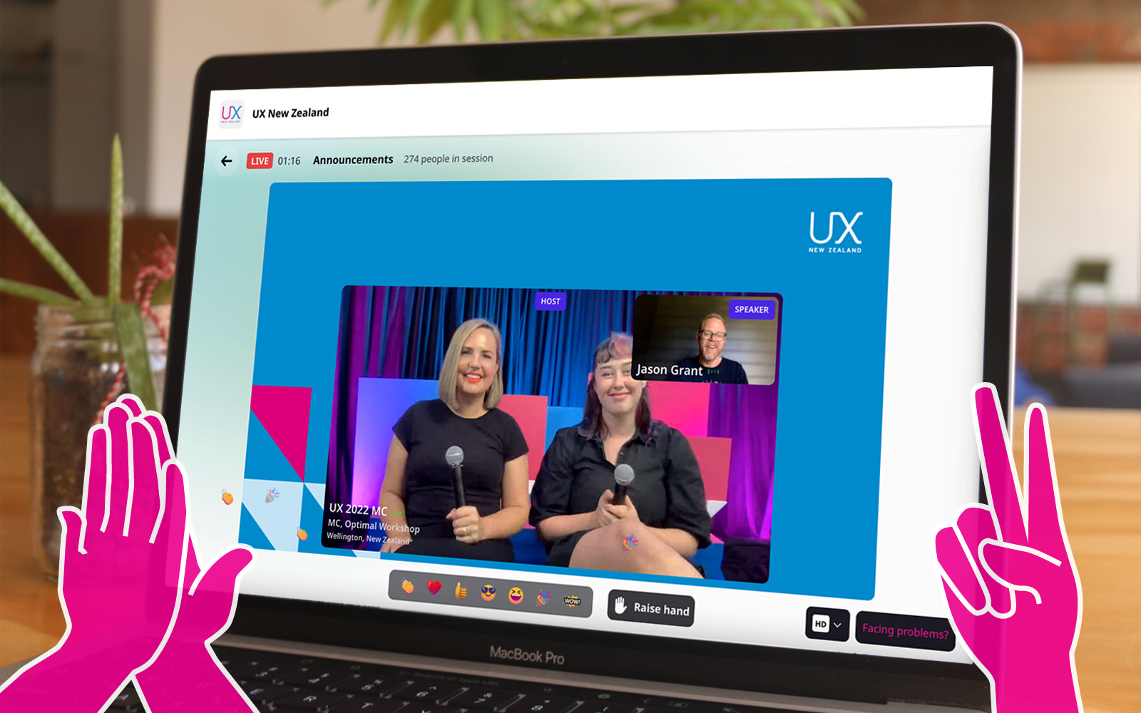
UX New Zealand is a leading UX and IA conference hosted by Optimal Workshop, that brings together industry professionals for three days of thought leadership, meaningful networking and immersive workshops.
At UX New Zealand 2023, we featured some of the best and brightest in the fields of user experience, research and design. A raft of local and international speakers touched on the most important aspects of UX in today’s climate for service designers, marketers, UX writers and user researchers.
These speakers are some of the pioneers leading the way and pushing the standard for user experience today. Their experience and perspectives are invaluable for those working at the coalface of UX, and together, there’s a tonne of valuable insight on offer.

In 2020, over 64,200,000,000,000 gigabytes of data was produced online. This would take 1.8 billion years to download! With so much data at our fingertips, how can UX Researchers leverage it to better understand their business and user needs? This talk uses real-life examples of how the discipline of data science can (and should!) complement UX research to create better user experiences.
Grishma Jena, Data Scientist with the UX Research Operations team for IBM Software in San Francisco, USA, recently spoke at UXNZ, the leading UX and IA conference in New Zealand hosted by Optimal Workshop, on how Data Scientists can work in synergy with UX researchers.
In her talk, Grishma uncovers the benefits of bridging the gap between quantitative and qualitative perspectives in the pursuit of creating better, more user-centric products.
Grishma is a Data Scientist with the UX Research Operations team for IBM Software. As the only Data Scientist in the organization, she supports 100+ user researchers and designers and uses data to understand user struggles and opportunities to enhance user experiences. She earned her Masters in Computer Science at the University of Pennsylvania. Her research interests are in Machine Learning and Natural Language Processing. She has spoken and facilitated workshops at multiple conferences including PyCon US (the largest Python conference in the world). She has also taught Python at the San Francisco Public Library.
She enjoys introducing new technical concepts to people and helping them use data and code to drive change. In her free time, Grishma enjoys traveling, cooking, writing, and acting.
Contact Details:
Email: grishma.jena@gmail.com
Grishma highlights the beneficial and often necessary synergy between data science and user experience research. She first explains how data science fits into UX, and then briefly provides an overview of the data science process. Through this process, valuable insights can be shared with user research teams who can then interpret and share them with designers, developers, and product managers to create better user experiences.
Data science in user research involves using data-driven techniques to gain insights from user behavior and interactions, ultimately improving the user experience. Examples of data science in user research include:
Data Scientists generally start off with a question and a set of data, followed by a process of ‘data wrangling’, cleaning, exploring/modeling, and evaluating. Data Scientists use various processes, algorithms, and machine learning techniques, for example, to extract patterns and insights.
Generally, the process is as follows:
The goal of the data science pipeline is to transform raw data into actionable insights that drive decision-making and lead to improved user experiences. The process involves iteratively refining the analysis based on feedback from users and other teams, and revisiting earlier stages as needed, to ensure the quality and relevance of the insights generated.
Generally, data scientists are more quantitative, whereas user researchers are more qualitative. But what if we were to combine the two? Grishma goes on to explain real-life examples of how these disciplines can work in harmony to achieve exceptional user experience.
Data scientists delve deep into the numerical aspects of user behavior and product performance, while user researchers typically focus on understanding user preferences, motivations, and behaviors through direct interaction and observation. These two roles approach the same challenge – improving products and user experiences – from different angles, each offering unique insights into user behavior and product performance.
By combining the quantitative rigor of data science with the empathetic understanding of user researchers, a synergy emerges that can unlock a deeper, more holistic understanding of user needs, behaviors, and pain points. This collaboration has the potential to not only reveal blind spots in product development but also drive innovation and enhance the overall user experience.
To illustrate the power of this collaboration, Grishma describes real-life case studies from Airbnb, Google, Spotify, and ABN Amro. Below is a high-level summary of each case study:
In summary, data scientists and user researchers have different perspectives, strengths, and weaknesses. Collaborating allows the two disciplines to:
The synergy between data science and user research ultimately leads to a more comprehensive understanding of user needs, better product design, and improved user experiences. It ensures that both the quantitative and qualitative aspects of user behavior are considered, creating a more empathetic and user-centric approach to product development.

They say a picture is worth a thousand words. So what does it mean when that picture is forced to live in a predefined category?
Q Walker, Experience Lead at PaperKite, a digital product/tech agency based in Wellington, recently spoke at UX New Zealand, the leading UX and IA conference in New Zealand hosted by Optimal Workshop, about Information Architecture (IA) and the world of emojis.
In their talk, Q discusses how emoji IA reflects how humans make sense of a nuanced world. Through painstaking manual analysis of emojis across platforms, Q discovered the limitations of neatly defined categories. When it comes to IA, should one-size-fit-all?
Q Walker (they/them) is the Experience Lead at PaperKite, a digital product/tech agency based in Wellington. Q passionately specializes in UX research and strategy and has never quite let go of their graphic design roots - which is a good thing, because they also lead a cross-disciplinary team of researchers, designers, and marketers. Q is also a musician, actor, public speaker, horror movie aficionado, tightwire walker, and avid gardener, and has been described as a walking exclamation point.
Contact details
Email address: q@paperkite.co.nz
Emoji, those tiny digital icons that have become ubiquitous in our online conversations, play a significant role in enhancing our written communication. They add humor, nuance, clarity, and even a touch of mischief to our messages. However, behind the scenes, there is a complex system of information architecture (IA) that helps us navigate and utilize the vast array of over 3600 different emojis available today, each with its own variations in skin tone, gender, color, and more. In this exploration of emoji organization, Q Walker delves into the world of IA to understand how these expressive icons are categorized, and why it matters.
This journey into emoji IA began as a personal curiosity for Q, initially observing how certain emojis seemed to shift between categories on different platforms, while others remained stable. For instance, emojis like the ‘lobster’ and ‘heart’ were found in various categories. This initial research aimed to understand why this inconsistency occurred across different platforms, whether it posed a problem for emoji IA, and whether it could (or should) be fixed.
The research evolved over time, incorporating emojis across platforms like Unicode, Apple, Slack, and others, which have slight variations in style and categorization. Emojis from each platform were organized and sorted (manually!) on a spreadsheet.
The core finding of the research revolved around two prevailing emoji frameworks or categories: explicit and implicit. “Explicit” categorization is utilitarian, describing precisely what an emoji represents based on its visual elements. In contrast, “Implicit” categorization highlights the symbolic and contextual meanings of emojis, reflecting what they represent beyond their visual appearance.
Two methods emerged to identify which framework, explicit or implicit, emoji fell into:
Even within these two prevailing frameworks, disagreements persist. For instance, the lobster emoji is categorized as "food" by some platforms and as "animal" or "nature" by others, showcasing discrepancies in explicit categorization.
Emoji design is important, as it influences how users perceive and interpret them. For instance, the choice to depict a red lobster implies that lobster is categorized as “food” because lobsters are typically not red unless cooked. Another example is the “syringe” emoji, which is undergoing an evolution from a blood-filled needle, to something more generic with clear or no liquid. In this way, the syringe emoji has broader application to things like vaccination.
This lack of standardization between platforms can be the cause of serious and unfortunate miscommunication! For example, the transformation of the gun emoji into a toy water pistol, despite its innocent appearance, still carries its historical baggage, as seen in its categorization within Apple’s IA near other weapons and dangerous objects. This highlights the messy and non-standard nature of emoji IA.
So, what do emojis teach us about information architecture?
Firstly, it teaches us to be flexible with how we navigate a multitude of data. With thousands of emojis and limited categories, finding the right emoji can be challenging. Platforms have adopted various approaches to address this issue:
Secondly, it may be that a fully standardized framework for emoji categorization isn’t feasible or even desirable. Where IA would like us to neatly categorize an emoji as one thing, the reality is that they are nuanced and can have multiple meanings, making them difficult to fit into rigid categories - just as ballet shoes can represent “shoes” (Unicode) and “art/entertainment” (Apple) simultaneously. Instead, we have the flexibility to categorize emojis based on what is most meaningful to their users. A standardized framework may not capture this complexity, and embracing the diversity of categorization enriches our understanding of human expression.
The lobster emoji serves as a poignant example of how emoji can take on new meaning and human expression. A Unicode approval of the lobster emoji over the trans pride flag a few years ago highlighted issues of representation. This decision led to the adaptation of the lobster emoji as a symbol within the trans community, further demonstrating how meaning is adapted and attributed to emoji in many ways.
Emoji IA is a testament to the diverse ways we make sense of our world and a reminder that often there are no limits to interpretation and creativity. As designers we should ask ourselves - how do we ensure that our IA and products cater to our diverse reality?
Making a difference through UX was a shared passion among an impressive line-up of 7 researchers, strategists, and designers from the global UX community at this year’s 100% virtual 3-day UX New Zealand conference.
These days Darya Pilram, Senior Researcher at Twitter, spends her days trying to understand the motivation and techniques of groups who ‘hire’ technology to spread harmful narratives. The desert of Mogadishu and the urban conflicts of South Africa are just some of the unlikely places she’s leveraged the power of frontline research to create change.
"I realized the only way to influence change was by bringing folks along with me - and so I did. I bought them right into the field with me."
Experience Designer Beth McPhail refuses to buy into the mindset that ‘accessibility is a creativity killer’. She challenges her peers to view accessibility as an opportunity to grow creatively while making technology more inclusive.
“Accessibility is making it possible for someone to attend the party…and lose themselves in the music.”
Kelsey Gee is back challenging designers across all levels to think differently about how design can be used across different mediums and constraints to generate meaningful experiences and meaningful change. In this session, she explores design’s role in creating empowering experiences that break both cycles of crime and institutional racism. (If you missed Part 1 from Mini Con head over here)
"I truly believe that our superpower lies in our ability to redesign society, especially for our whanau and our most vulnerable communities…and once again explore design’s role in creating equal opportunities across safe, seamless, and healing public services."
In 1985, a researcher botched an interview question which led to a new understanding of trauma and its long-term effects. It grew awareness of the need to be trauma-informed in your work but what’s it actually mean? UX Researcher Melissa Eggleston explores what it means to be trauma-informed and shares practical advice on how to achieve it.
"Trauma is everywhere and something for us to think about…regardless of whether we’re working with people we know are dealing with traumatic events…it’s really all over the place."
One in five people experiences “mental illness or significant mental distress” in New Zealand. It’s a problem the Government knows needs to be addressed but how? In her powerful presentation, Rachael Reeves reveals what’s involved in balancing the complexities of Government with the need to rethink the way we design health products.
"Be warned you can’t please everyone and it can be tough to keep product vision aligned when you’re talking about serious consequences for people."
One billion new internet users (NIU) will come online for the first time over the next 5 years. These NIU's are using their first smartphones, with most of their online activities focused on communication, maintaining social connections, and entertainment. Tiane Lee, UX Research Lead at Google outlines the challenges and considerations behind adapting research for varying levels of digital literacy, including practical ideas for planning and conducting remote research with NIU.
"NIU’s are typically less digitally literate, they may show lower confidence in digital capability, and they may perceive lower value of the internet for things like chatting and entertainment.”
Michael Tam introduces us to the niche field of conditions design and cites a purpose built high diving board on Wellington city’s busy waterfront in New Zealand as a good example of conditions design. Find out why in this fascinating talk.
"What really impressed me here…hats off to the council because they didn’t design an experience that would discourage people from doing it. It’s designed for people to have fun (vs Hong Kong where public spaces are designed for Tai Chi not fun like this). The design allows it to happen by influencing human behavior to stay safe but encouraging fun and exploration.”
For a taste of what even more speakers from UX New Zealand 2022 had to share, head over to our highlights reel
An impressive line-up of researchers, strategists, and designers from the global UX community shared their ideas, experiences, insights, and approaches to effective ways of working at this year’s 100% virtual 3-day UX New Zealand conference.
We introduce 7 speakers, highlight what they had to say, and share their full video presentations.
Designers focus on creating great experiences for customers but who’s looking out for the designers themselves? Marine Bucher, Service Designer at Humankind shared how a Design Ops approach is creating and maintaining a healthy environment for 170+ designers globally and 40+ locally in New Zealand, to thrive at ANZ bank.
“The goal of Design Ops is to remove all operational headaches so designers can focus on designing and researching.”
An impressive trio from Deloitte Digital: Carol Yung, Georgia Chetwynd-Talbot, and Matt Cobham took us through what it was like to be part of the agile team tasked with designing and piloting a core service of the UK’s pandemic response in just weeks, and delivering it at scale in just 2-3 months.
"Our lifecycle from design, to build, to deployment was extremely quick, learning as we went. We had to think and act like a start-up’."
Have you ever had a stakeholder ask you to present the findings of your study one hour before a meeting? Michael Ryan, User Research Director at Liberty Mutual Insurances shared his solution to this and other challenges researchers face presenting their work in a practical and entertaining talk.
“Can you present the findings from last week’s study now? Scenarios like that used to stress me out as a UX researcher so I came up with 1-pagers.”
Sarah Goforth, Senior UX Researcher at Trade Me considers herself and her fellow researchers, Kaitiaki, 'guardians of our people'. Sarah shared the challenges and wins of building their particular type of UX research operations (ReOPs) at Trade Me which includes everyone, (researchers and non-researchers), in the process.
"Not having an impact with your research really sucks as a researcher…and should not be wasted."
Phil Balagtas, President, and Founder of Futures Thinking believes designers have a responsibility to design better futures and policies for generations to come by embedding a future-thinking mindset into the products and services they design. He referenced the confusing, often intelligible world of Terms and Conditions to illustrate the need for designers to take a more human-centered approach.
"Policies are not always designed as a dialogue. Yet it's a gateway to using a service."
After introducing the four-day week at Perpetual Guardian, Andrew Barnes, Founder of 4 Day Week Global, actively advocates for its adoption by others as part of the future of work. He talks through the issues, challenges, and opportunities of embracing a 4 day working week in the digital age.
“When we started back in 2018 we were a pretty lone voice…The 4 day week has been given rocket fuel by Covid-19.”
While many avoid or despair when faced with UX complexity, Sophia Prater, Founder & Lead UX Designer at Rewired UX embraces complexity, untangling it with an approach she calls Object-Oriented UX. She shared four tough questions to ask early on to help wrangle complexity to benefit the user.
"I see portfolio pieces like this a lot. I can tell complexity has been completely swept under the rug and the end-user ends up handling it.”
For a taste of what even more speakers from UX New Zealand 2022 had to share, head over to our highlights reel.
