November 4, 2025
5 mins

Top User Research Platforms 2025

User research software isn't what it used to be. The days of insights being locked away in specialist UX research teams are fading fast, replaced by a world where product managers, designers, and even marketers are running their own usability testing, prototype validation, and user interviews. The best UX research platforms powering this shift have evolved from complex enterprise software into tools that genuinely enable teams to test with users, analyze results, and share insights faster.

This isn't just about better software, it's about a fundamental transformation in how organizations make decisions. Let's explore the top user research tools in 2025, what makes each one worth considering, and how they're changing the research landscape.


What Makes a UX Research Platform All-in-One?


The shift toward all-in-one UX research platforms reflects a deeper need: teams want to move from idea to insight without juggling multiple tools, logins, or data silos. A truly comprehensive research platform combines several key capabilities within a unified workflow.

The best all-in-one platforms integrate study design, participant recruitment, multiple research methods (from usability testing to surveys to interviews to navigation testing to prototype testing), AI-powered analysis, and insight management in one cohesive experience. This isn't just about feature breadth, it's about eliminating the friction that prevents research from influencing decisions. When your entire research workflow lives in one platform, insights move faster from discovery to action.

What separates genuine all-in-one solutions from feature-heavy tools is thoughtful integration. The best platforms ensure that data flows seamlessly between methods, participants can be recruited consistently across study types, and insights build upon each other rather than existing in isolation. This integrated approach enables both quick validation studies and comprehensive strategic research within the same environment.

1. Optimal: Best End-to-End UX Research Platform


Optimal has carved out a unique position in the UX research landscape: it’s powerful enough for enterprise teams at Netflix, HSBC, Lego, and Toyota, yet intuitive enough that anyone, product managers, designers, even marketers, can confidently run usability studies. That balance between depth and accessibility is hard to achieve, and it's where Optimal shines.

Unlike fragmented tool stacks, Optimal is a complete User Insights Platform that supports the full research workflow. It covers everything from study design and participant recruitment to usability testing, prototype validation, AI-assisted interviews, and a research repository. You don't need multiple logins or wonder where your data lives, it's all in one place.

Two recent features push the platform even further:

  • Live Site Testing: Run usability studies on your actual live product, capturing real user behavior in production environments.

  • Interviews: AI-assisted analysis dramatically cuts down time-to-insight from moderated sessions, without losing the nuance that makes qualitative research valuable.


One of Optimal's biggest advantages is its pricing model. There are no per-seat fees, no participant caps, and no limits on the number of users. Pricing is usage-based, so anyone on your team can run a study without needing a separate license or blowing your budget. It's a model built to support research at scale, not gate it behind permissioning.

Reviews on G2 reflect this balance between power and ease. Users consistently highlight Optimal's intuitive interface, responsive customer support, and fast turnaround from study to insight. Many reviewers also call out its AI-powered features, which help teams synthesize findings and communicate insights more effectively. These reviews reinforce Optimal's position as an all-in-one platform that supports research from everyday usability checks to strategic deep dives.

The bottom line? Optimal isn't just a suite of user research tools. It's a system that enables anyone in your organization to participate in user-centered decision-making, while giving researchers the advanced features they need to go deeper.

2. UserTesting: Remote Usability Testing


UserTesting built its reputation on one thing: remote usability testing with real-time video feedback. Watch people interact with your product, hear them think aloud, see where they get confused. It's immediate and visceral in a way that heat maps and analytics can't match.

The platform excels at both moderated and unmoderated usability testing, with strong user panel access that enables quick turnaround. Large teams particularly appreciate how fast they can gather sentiment data across UX research studies, marketing campaigns, and product launches. If you need authentic user reactions captured on video, UserTesting delivers consistently.

That said, reviews on G2 and Capterra note that while video feedback is excellent, teams often need to supplement UserTesting with additional tools for deeper analysis and insight management. The platform's strength is capturing reactions, though some users mention the analysis capabilities and data export features could be more robust for teams running comprehensive research programs.

A significant consideration: UserTesting operates on a high-cost model with per-user annual fees plus additional session-based charges. This pricing structure can create unpredictable costs that escalate as your research volume grows, teams often report budget surprises when conducting longer studies or more frequent research. For organizations scaling their research practice, transparent and predictable pricing becomes increasingly important.

3. Maze: Rapid Prototype Testing


Maze understands that speed matters. Design teams working in agile environments don't have weeks to wait for findings, they need answers now. The platform leans into this reality with rapid prototype testing and continuous discovery research, making it particularly appealing to individual designers and small product teams.

Its Figma integration is convenient for quick prototype tests. However, the platform's focus on speed involves trade-offs in flexibility as users note rigid question structures and limited test customization options compared to more comprehensive platforms. For straightforward usability tests, this works fine. For complex research requiring custom flows or advanced interactions, the constraints become more apparent.

User feedback suggests Maze excels at directional insights and quick design validation. However, researchers looking for deep qualitative analysis or longitudinal studies may find the platform limited. As one G2 reviewer noted, "perfect for quick design validation, less so for strategic research." The reporting tends toward surface-level metrics rather than the layered, strategic insights enterprise teams often need for major product decisions.

For teams scaling their research practice, some considerations emerge. Lower-tier plans limit the number of studies you can run per month, and full access to card sorting, tree testing, and advanced prototype testing requires higher-tier plans. For teams running continuous research or multiple studies weekly, these study caps and feature gates can become restrictive. Users also report prototype stability issues, particularly on mobile devices and with complex design systems, which can disrupt testing sessions. Originally built for individual designers, Maze works well for smaller teams but may lack the enterprise features, security protocols, and dedicated support that large organizations require for comprehensive research programs.

4. Dovetail: Research Centralization Hub

Dovetail has positioned itself as the research repository and analysis platform that helps teams make sense of their growing body of insights. Rather than conducting tests directly, Dovetail shines as a centralization hub where research from various sources can be tagged, analyzed, and shared across the organization. Its collaboration features ensure that insights don't get buried in individual files but become organizational knowledge.

Many teams use Dovetail alongside testing platforms like Optimal, creating a powerful combination where studies are conducted in dedicated research tools and then synthesized in Dovetail's collaborative environment. For organizations struggling with insight fragmentation or research accessibility, Dovetail offers a compelling solution to ensure research actually influences decisions.

6. Lookback: Moderated User Interviews


Lookback specializes in moderated user interviews and remote testing, offering a clean, focused interface that stays out of the way of genuine human conversation. The platform is designed specifically for qualitative UX work, where the goal is deep understanding rather than statistical significance. Its streamlined approach to session recording and collaboration makes it easy for teams to conduct and share interview findings.

For researchers who prioritize depth over breadth and want a tool that facilitates genuine conversation without overwhelming complexity, Lookback delivers a refined experience. It's particularly popular among UX researchers who spend significant time in one-on-one sessions and value tools that respect the craft of qualitative inquiry.

7. Lyssna: Quick and lite design feedback


Lyssna (formerly UsabilityHub) positions itself as a straightforward, budget-friendly option for teams needing quick feedback on designs. The platform emphasizes simplicity and fast turnaround, making it accessible for smaller teams or those just starting their research practice.

The interface is deliberately simple, which reduces the learning curve for new users. For basic preference tests, first-click tests, and simple prototype validation, Lyssna's streamlined approach gets you answers quickly without overwhelming complexity.

However, this simplicity involves significant trade-offs. The platform operates primarily as a self-service testing tool rather than a comprehensive research platform. Teams report that Lyssna lacks AI-powered analysis, you're working with raw data and manual interpretation rather than automated insight generation. The participant panel is notably smaller (around 530,000 participants) with limited geographic reach compared to enterprise platforms, and users mention quality control issues where participants don't consistently match requested criteria.

For organizations scaling beyond basic validation, the limitations become more apparent. There's no managed recruitment service for complex targeting needs, no enterprise security certifications, and limited support infrastructure. The reporting stays at a basic metrics level without the layered analysis or strategic insights that inform major product decisions. Lyssna works well for simple, low-stakes testing on limited budgets, but teams with strategic research needs, global requirements, or quality-critical studies typically require more robust capabilities.

Emerging Trends in User Research for 2025


The UX and user research industry is shifting in important ways:

Live environment usability testing is growing. Insights from real users on live sites are proving more reliable than artificial prototype studies. Optimal is leading this shift with dedicated Live Site Testing capabilities that capture authentic behavior where it matters most.

AI-powered research tools are finally delivering on their promise, speeding up analysis while preserving depth. The best implementations, like Optimal's Interviews, handle time-consuming synthesis without losing the nuanced context that makes qualitative research valuable.

Research democratization means UX research is no longer locked in specialist teams. Product managers, designers, and marketers are now empowered to run studies. This doesn't replace research expertise; it amplifies it by letting specialists focus on complex strategic questions while teams self-serve for straightforward validation.

Inclusive, global recruitment is now non-negotiable. Platforms that support accessibility testing and global participant diversity are gaining serious traction. Understanding users across geographies, abilities, and contexts has moved from nice-to-have to essential for building products that truly serve everyone.

How to Choose the Right Platform for Your Team


Forget feature checklists. Instead, ask:

Do you need qualitative vs. quantitative UX research? Some platforms excel at one, while others like Optimal provide robust capabilities for both within a single workflow.

Will non-researchers be running studies (making ease of use critical)? If this is your goal, prioritize intuitive interfaces that don't require extensive training.

Do you need global user panels, compliance features, or AI-powered analysis? Consider whether your industry requires specific certifications or if AI-assisted synthesis would meaningfully accelerate your workflow.

How important is integration with Figma, Slack, Jira, or Notion? The best platform fits naturally into your existing stack, reducing friction and increasing adoption across teams.


Evaluating All-in-One Research Capabilities

When assessing comprehensive research platforms, look beyond the feature list to understand how well different capabilities work together. The best all-in-one solutions excel at data continuity, participants recruited for one study can seamlessly participate in follow-up research, and insights from usability tests can inform survey design or interview discussion guides.

Consider your team's research maturity and growth trajectory. Platforms like Optimal that combine ease of use with advanced capabilities allow teams to start simple and scale sophisticated research methods as their needs evolve, all within the same environment. This approach prevents the costly platform migrations that often occur when teams outgrow point solutions.

Pay particular attention to analysis and reporting integration. All-in-one platforms should synthesize findings across research methods, not just collect them. The ability to compare prototype testing results with interview insights, or track user sentiment across multiple touchpoints, transforms isolated data points into strategic intelligence.

Most importantly, the best platform is the one your team will actually use. Trial multiple options, involve stakeholders from different disciplines, and evaluate not just features but how well each tool fits your team's natural workflow.

The Bottom Line: Powering Better Decisions Through Research


Each of these platforms brings strengths. But Optimal stands out for a rare combination: end-to-end research capabilities, AI-powered insights, and usability testing at scale in an all-in-one interface designed for all teams, not just specialists.

With the additions of Live Site Testing capturing authentic user behavior in production environments, and Interviews delivering rapid qualitative synthesis, Optimal helps teams make faster, better product decisions. The platform removes the friction that typically prevents research from influencing decisions, whether you're running quick usability tests or comprehensive mixed-methods studies.

The right UX research platform doesn't just collect data. It ensures user insights shape every product decision your team makes, building experiences that genuinely serve the people using them. That's the transformation happening at the moment; Research is becoming central to how we build, not an afterthought.

Share this article
Author
Optimal
Workshop

Related articles

View all blog articles
Learn more
1 min read

When AI Meets UX: How to Navigate the Ethical Tightrope

As AI takes on a bigger role in product decision-making and user experience design, ethical concerns are becoming more pressing for product teams. From privacy risks to unintended biases and manipulation, AI raises important questions: How do we balance automation with human responsibility? When should AI make decisions, and when should humans stay in control?

These aren't just theoretical questions they have real consequences for users, businesses, and society. A chatbot that misunderstands cultural nuances, a recommendation engine that reinforces harmful stereotypes, or an AI assistant that collects too much personal data can all cause genuine harm while appearing to improve user experience.

The Ethical Challenges of AI

Privacy & Data Ethics

AI needs personal data to work effectively, which raises serious concerns about transparency, consent, and data stewardship:

  • Data Collection Boundaries – What information is reasonable to collect? Just because we can gather certain data doesn't mean we should.
  • Informed Consent – Do users really understand how their data powers AI experiences? Traditional privacy policies often don't do the job.
  • Data Longevity – How long should AI systems keep user data, and what rights should users have to control or delete this information?
  • Unexpected Insights – AI can draw sensitive conclusions about users that they never explicitly shared, creating privacy concerns beyond traditional data collection.

A 2023 study by the Baymard Institute found that 78% of users were uncomfortable with how much personal data was used for personalized experiences once they understood the full extent of the data collection. Yet only 12% felt adequately informed about these practices through standard disclosures.

Bias & Fairness

AI can amplify existing inequalities if it's not carefully designed and tested with diverse users:

  • Representation Gaps – AI trained on limited datasets often performs poorly for underrepresented groups.
  • Algorithmic Discrimination – Systems might unintentionally discriminate based on protected characteristics like race, gender, or disability status.
  • Performance Disparities – AI-powered interfaces may work well for some users while creating significant barriers for others.
  • Reinforcement of Stereotypes – Recommendation systems can reinforce harmful stereotypes or create echo chambers.

Recent research from Stanford's Human-Centered AI Institute revealed that AI-driven interfaces created 2.6 times more usability issues for older adults and 3.2 times more issues for users with disabilities compared to general populations, a gap that often goes undetected without specific testing for these groups.

User Autonomy & Agency

Over-reliance on AI-driven suggestions may limit user freedom and sense of control:

  • Choice Architecture – AI systems can nudge users toward certain decisions, raising questions about manipulation versus assistance.
  • Dependency Concerns – As users rely more on AI recommendations, they may lose skills or confidence in making independent judgments.
  • Transparency of Influence – Users often don't recognize when their choices are being shaped by algorithms.
  • Right to Human Interaction – In critical situations, users may prefer or need human support rather than AI assistance.

A longitudinal study by the University of Amsterdam found that users of AI-powered decision-making tools showed decreased confidence in their own judgment over time, especially in areas where they had limited expertise.

Accessibility & Digital Divide

AI-powered interfaces may create new barriers:

  • Technology Requirements – Advanced AI features often require newer devices or faster internet connections.
  • Learning Curves – Novel AI interfaces may be particularly challenging for certain user groups to learn.
  • Voice and Language Barriers – Voice-based AI often struggles with accents, dialects, and non-native speakers.
  • Cognitive Load – AI that behaves unpredictably can increase cognitive burden for users.

Accountability & Transparency

Who's responsible when AI makes mistakes or causes harm?

  • Explainability – Can users understand why an AI system made a particular recommendation or decision?
  • Appeal Mechanisms – Do users have recourse when AI systems make errors?
  • Responsibility Attribution – Is it the designer, developer, or organization that bears responsibility for AI outcomes?
  • Audit Trails – How can we verify that AI systems are functioning as intended?

How Product Owners Can Champion Ethical AI Through UX

At Optimal, we advocate for research-driven AI development that puts human needs and ethical considerations at the center of the design process. Here's how UX research can help:

User-Centered Testing for AI Systems

AI-powered experiences must be tested with real users to identify potential ethical issues:

  • Longitudinal Studies – Track how AI influences user behavior and autonomy over time.
  • Diverse Testing Scenarios – Test AI under various conditions to identify edge cases where ethical issues might emerge.
  • Multi-Method Approaches – Combine quantitative metrics with qualitative insights to understand the full impact of AI features.
  • Ethical Impact Assessment – Develop frameworks specifically designed to evaluate the ethical dimensions of AI experiences.

Inclusive Research Practices

Ensuring diverse user participation helps prevent bias and ensures AI works for everyone:

  • Representation in Research Panels – Include participants from various demographic groups, ability levels, and socioeconomic backgrounds.
  • Contextual Research – Study how AI interfaces perform in real-world environments, not just controlled settings.
  • Cultural Sensitivity – Test AI across different cultural contexts to identify potential misalignments.
  • Intersectional Analysis – Consider how various aspects of identity might interact to create unique challenges for certain users.

Transparency in AI Decision-Making

UX teams should investigate how users perceive AI-driven recommendations:

  • Mental Model Testing – Do users understand how and why AI is making certain recommendations?
  • Disclosure Design – Develop and test effective ways to communicate how AI is using data and making decisions.
  • Trust Research – Investigate what factors influence user trust in AI systems and how this affects experience.
  • Control Mechanisms – Design and test interfaces that give users appropriate control over AI behavior.

The Path Forward: Responsible Innovation

As AI becomes more sophisticated and pervasive in UX design, the ethical stakes will only increase. However, this doesn't mean we should abandon AI-powered innovations. Instead, we need to embrace responsible innovation that considers ethical implications from the start rather than as an afterthought.

AI should enhance human decision-making, not replace it. Through continuous UX research focused not just on usability but on broader human impact, we can ensure AI-driven experiences remain ethical, inclusive, user-friendly, and truly beneficial.

The most successful AI implementations will be those that augment human capabilities while respecting human autonomy, providing assistance without creating dependency, offering personalization without compromising privacy, and enhancing experiences without reinforcing biases.

A Product Owner's Responsibility: Leading the Charge for Ethical AI

As UX professionals, we have both the opportunity and responsibility to shape how AI is integrated into the products people use daily. This requires us to:

  • Advocate for ethical considerations in product requirements and design processes
  • Develop new research methods specifically designed to evaluate AI ethics
  • Collaborate across disciplines with data scientists, ethicists, and domain experts
  • Educate stakeholders about the importance of ethical AI design
  • Amplify diverse perspectives in all stages of AI development

By embracing these responsibilities, we can help ensure that AI serves as a force for positive change in user experience enhancing human capabilities while respecting human values, autonomy, and diversity.

The future of AI in UX isn't just about what's technologically possible; it's about what's ethically responsible. Through thoughtful research, inclusive design practices, and a commitment to human-centered values, we can navigate this complex landscape and create AI experiences that truly benefit everyone.

Learn more
1 min read

Unlocking UX excellence: Practical use cases for Optimal's UX research platform

In today's digital landscape, delivering exceptional user experiences is no longer optional – it's essential for success. At Optimal, we're committed to empowering UX professionals and organizations with the best-in-class tools and methodologies to create outstanding digital products and experiences. 

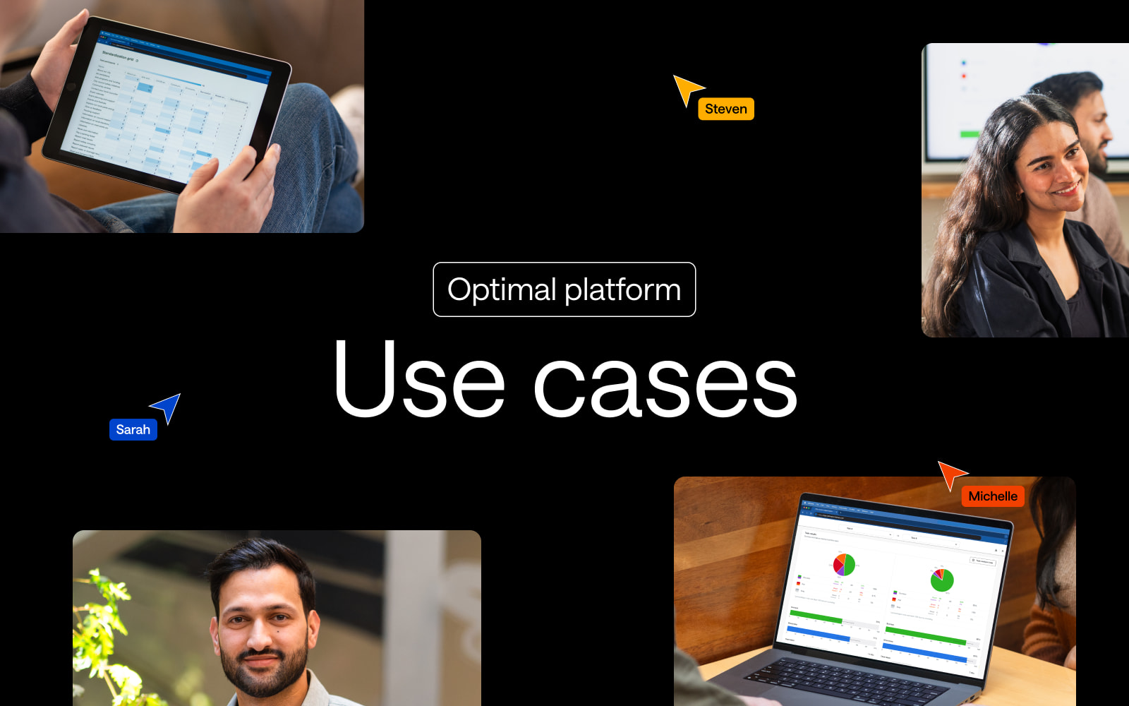
In this blog post, we'll explore practical use cases that demonstrate how Optimal's research platform can drive meaningful improvements across various UX scenarios.

Use case 1: Make Collaborative Design Decisions or A/B Test a Design

Refining an existing product? Launching a new website? Rebranding? Optimal's user research platform empowers your team to make informed, collaborative decisions. Here's how to leverage our tools for impactful results:

1. Qualitative Insights: Establish organizational priorities

  • Use Qualitative Insights to develop a comprehensive list of top tasks or goals from your organization's perspective.
  • Engage stakeholders across departments to ensure alignment on key objectives.

2. Surveys: Validate user priorities and pain points

  • Deploy a targeted survey to confirm users' top tasks and identify existing issues.
  • Gather quantitative data to support or challenge organizational assumptions about user needs.

3. First-click Testing: Conduct preference testing

  • Use First-Click Testing to evaluate the effectiveness of different design options.
  • This method provides valuable insights for A/B testing decisions, ensuring designs resonate with your target audience.

4. Qualitative Insights: Deep dive into user preferences

  • Conduct follow-up interviews or focus groups using our Qualitative Insights to gain a deeper understanding of user preferences and experiences with different design options.
  • Explore the 'why' behind user choices to inform more nuanced design decisions.

5. Prototype Testing: Validate interaction flows and usability


  • Use Prototype Testing to observe how users interact with early-stage designs.
  • Test navigation, UI components, and task flows to ensure your prototypes align with user expectations—before costly development begins.

6. Interviews: Capture rich, contextual feedback


  • Conduct live, moderated Interviews directly within Optimal to explore user reactions and behaviors.
  • Use screen recordings and notes to uncover deeper insights behind user choices and refine design decisions with confidence.

By embedding user insights at every stage, your team can confidently design experiences that don’t just look good but work for real people. Optimal empowers you to make faster, more informed decisions that drive meaningful outcomes across your organization.

Use case 2: Developing effective content strategies

Developing a robust content strategy is crucial for intranets, help documents, websites, and product copy. Optimal's user research and insights platform empowers you to create content that resonates with your audience and drives engagement. Here's how to leverage our tools for effective content strategy development:

1. Card Sorting: Organize content intuitively

  • Use Card Sorting to understand how users naturally categorize and group your content.
  • Gain insights into users' mental models to inform your content hierarchy and organization.
  • Apply findings to create a content structure that aligns with user expectations, enhancing findability and engagement.

2. Tree Testing: Validate information architecture

  • Employ Tree Testing to confirm whether information placed within your proposed hierarchy is findable and understandable.
  • Identify areas where users struggle to locate content, enabling you to refine your structure for optimal user experience.
  • Iterate on your information architecture based on concrete user data, ensuring your content is easily accessible.
  • Test different content structures and then compare them with each other using the task comparison tool available in Optimal to understand which structure is most likely to drive users to perform the targeted actions.

3. Qualitative Insights: Analyze language perceptions

  • Leverage Qualitative Insights to conduct in-depth interviews or focus groups.
  • Explore user perceptions of terminology, language style, and content tone.
  • Gather rich insights to inform your content voice and style guide, ensuring your messaging resonates with your target audience.

4. Additional Applications of Qualitative Insights

   Expand your content strategy research by using Qualitative Insights to:

  • Review internal tools and processes to streamline content creation workflows.
  • Compare content experiences across desktop and mobile devices for consistency.
  • Gather event feedback to inform content for future marketing materials.
  • Analyze customer service and support interactions to identify common issues and FAQs.
  • Conduct usability testing on existing content to identify areas for improvement.

   Key questions to explore:

  • What's working well in your current content?
  • What's not resonating with users?
  • What are users' first impressions of your content?
  • How do users typically interact with your content?
  • How well does your content foster empathy and connection with your audience?

By systematically applying these research methods, you'll develop a content strategy that not only meets your organizational goals but also deeply resonates with your audience. Remember, content strategy is an ongoing process. Regularly use Optimal's tools to assess the effectiveness of your content, gather user feedback, and iteratively improve your approach for continued success.

Use case 3: Increase website conversion

Empower your team to boost conversion rates by leveraging Optimal's best-in-class user research and insights platform. Here's how you can unlock meaningful improvements:

1. Qualitative Insights & Surveys: Uncover user motivations

  • Conduct in-depth interviews or targeted surveys to gather rich, qualitative feedback about user experiences, motivations, and pain points on your site.
  • Add an intercept snippet to your existing website to survey users as they come to your website to get a clear understanding of user motivations in context.
  • Analyze responses to identify key themes and opportunities for optimization.

2. Tree Testing: Optimize navigation structure

  • Use our Tree Testing tool to evaluate the effectiveness of your site's navigation structure.
  • Identify areas where users struggle to find information, enabling you to streamline pathways to conversion.

3. Card Sorting: Enhance information architecture

  • Leverage Card Sorting tool to understand how users naturally categorize your site's information.
  • Apply insights to refine the layout of product features or benefits on your landing pages, aligning with user expectations.

4. Prototype Testing: Validate Design Changes

  • Develop prototypes of new landing pages or key conversion elements (like CTAs) using our Prototype Testing tool.
  • Conduct first-click tests to ensure your design changes resonate with users and drive desired actions.

5. Follow-up Qualitative Insights: Iterate and improve

  • After implementing changes, conduct follow-up interviews or surveys to gauge the impact of your optimizations.
  • Gather feedback on the improved user experience and identify any remaining pain points.

By systematically applying these research methods, you'll gain the actionable insights needed to create a more intuitive, engaging, and conversion-friendly website. Optimal empowers you to make data-driven decisions that not only boost conversions but also enhance overall user satisfaction.

Embracing mixed methods research

To truly unlock the power of user research, we recommend a mixed methods approach. By combining quantitative data from surveys and usability tests with qualitative insights from interviews and open-ended responses, you can gain a comprehensive understanding of your users' needs and behaviors.

For more information on mixed methods research and how it can enhance your UX strategy, check out our detailed guide: What is mixed methods research?

And that’s a wrap

Optimal's user research and insights platform provides the tools and methodologies you need to deliver exceptional digital experiences. By leveraging these use cases and adopting a mixed methods approach, you can make data-driven decisions that resonate with your users and drive business success.

Remember, great UX is an ongoing journey. Regularly employ these research methods to stay attuned to your users' evolving needs and preferences. With Optimal as your partner, you're equipped to create digital products and experiences that truly stand out in today's competitive landscape.

Ready to elevate your UX research? Explore Optimal's platform and start unlocking actionable insights today!

Learn more
1 min read

Anatomy of a Website Footer: Key Elements, UX Best Practices, and Examples

Definition of a website footer

The footer of a website sits at the very bottom of every single web page and contains links to various types of content on your website. It’s an often overlooked component of a website, but it plays several important roles in your information architecture (IA) – it’s not just some extra thing that gets plonked at the bottom of every page.

Getting your website footer right matters!

The footer communicates to your website visitors that they’ve reached the bottom of the page and it’s also a great place to position important content links that don’t belong anywhere else – within reason. A website footer is not a dumping ground for random content links that you couldn’t find a home for, however there are some content types that are conventionally accessed via the footer e.g., privacy policies and copyright information just to name a few.

Lastly, from a usability and navigation perspective, website footers can serve as a bit of a safety net for lost website visitors. Users might be scrolling and scrolling trying to find something and the footer might be what catches them and guides them back to safety before they give up on your website and go elsewhere. Footers are a functional and important part of your overall IA, but also have their own architecture too.

Read on to learn about the types of content links that might be found in a footer, see some real life examples and discuss some approaches that you might take when testing your footer to ensure that your website is supporting your visitors from top to bottom.

What belongs in a website footer

Deciding which content links belong in your footer depends entirely on your website. The type of footer, its intent and content depends on its audience of your customers, potential customers and more — ie your website visitors. Every website is different, but here’s a list of links to content types that might typically be found in a footer.

  • Legal content that may include: Copyright information, disclaimer, privacy policy, terms or use or terms of service – always seek appropriate advice on legal content and where to place it!
  • Your site map
  • Contact details including social media links and live chat or chat bot access
  • Customer service content that may include: shipping and delivery details, order tracking, returns, size guides, pricing if you’re a service and product recall information.
  • Website accessibility details and ways to provide feedback 
  • ‘About Us’ type content that may include: company history, team or leadership team details, the careers page and more 
  • Key navigational links that also appear in the main navigation menu that is presented to website visitors when they first land on the page (e.g. at the top or the side)

Website footer examples

Let’s take a look at three diverse real life examples of website footers.


IKEA US

IKEA’s US website has an interesting double barrelled footer that is also large and complex – a ‘fat footer’ as it’s often called – and its structure changes as you travel deeper into the IA. The below image taken from the IKEA US home page shows two clear blocks of text separated by a blue horizontal line. Above the line we have the heading of ‘All Departments’ with four columns showing product categories and below the line there are seven clear groups of content links covering a broad range of topics including customer service information, links that appear in the top navigation menu and careers. At the very bottom of the footer there are social media links and the copyright information for the website.

An image of IKEA US home page footer on their website, from 2019.
IKEA US home page footer (accessed May 2019)

As expected, IKEA’s overall website IA is quite large, and as a website visitor clicks deeper into the IA, the footer starts to change. On the product category landing pages, the footer is mostly the same but with a new addition of some handy breadcrumbs to aid navigation (see below image).

An image of IKEA US product page footer on their website, from 2019.
IKEA US website footer as it appears on the product category landing page for Textiles & Rugs (accessed May 2019).

When a website visitor travels all the way down to the individual product page level, the footer changes again. In the below image found on the product page for a bath mat, while the blue line and everything below it is still there, the ‘All Departments’ section of the footer has been removed and replaced with non-clickable text on the left hand side that reads as ‘More Bath mats’ and a link on the right hand side that says ‘Go to Bath mats’. Clicking on that link takes the website visitor back to the page above.

IKEA US website footer as it appears on the product page for a bath mat, from 2019.
IKEA US website footer as it appears on the product page for a bath mat (accessed May 2019).

Overall, evolving the footer content as the website visitor progresses deeper into the IA is an interesting approach - as the main page content becomes more focussed as does the footer while still maintaining multiple supportive safety net features.

M.A.C Cosmetics US

The footer for the US website of this well known cosmetics brand has a four part footer. At first it appears to just have three parts as shown in the image below: a wide section with seven content link categories covering a broad range of content types as the main part with a narrow black strip on either end of it making up the second and third parts. The strip above has loyalty program and live chat links and the strip below contains mostly links to legal content.

MAC Cosmetics US website footer with three parts as it appears on the home page upon first glance, from 2019.
MAC Cosmetics US website footer with three parts as it appears on the home page upon first glance (accessed May 2019).


When a website visitor hovers over the ‘Join our loyalty program’ call to action (CTA) in that top narrow strip, the hidden fourth part of the footer which is slightly translucent pulls up like a drawer and sits directly above the strip capping off the top of the main section (as shown in the below image). This section contains more information about the loyalty program and contains further CTAs to join or sign in. It disappears when the cursor is moved away from the hover CTA or it can be collapsed manually via the arrow in the top right hand corner of this fourth part. It’s an interesting and unexpected interaction to have with a footer, but it adds to the overall consistent and cohesive experience of this website because it feels like the footer is an active participant in that experience.

MAC Cosmetics US website footer as it appears on the home page with all four parts visible, from 2019.

MAC Cosmetics US website footer as it appears on the home page with all four parts visible (accessed May 2019).


Domino’s Pizza US

Domino’s Pizza’s US website has a reasonably flat footer in terms of architecture but it occupies as much space as a more complex or deeper footer. As shown in the image below, its content links are presented horizontally over three rows on the left hand side of the footer and these links are visually separated by forward slashes. It also displays social media links and some advertising content on the right hand side. The most interesting feature of this footer is the large paragraph of text titled ‘Legal Stuff’ below the links. Delightfully it uses direct, clear and plain language and even includes a note about delivery charges not including tips and to ‘Please reward your driver for awesomeness’.

Domino’s Pizza US website footer as it appears on the home page, from 2019.

Domino’s Pizza US website footer as it appears on the home page (accessed May 2019).

How to test a website footer

Like every other part of your website, the only way you’re going to know if your footer is supporting your website visitors is if you test it with them. When testing a website’s IA overall, the footer is often excluded. This might be because we want to focus on other areas first or maybe it’s because testing everything at once has the potential to be overwhelming for our research participants.

Testing a footer is fairly easy thing to do and there’s no right or wrong approach – it really does depend on where you are up to in your project, the resources you have available to you and the size and complexity of the footer itself!

If you’re designing a footer for a new website there’s a few ways you might approach ensuring your footer is best supporting your website visitors. If you’re planning to include a large and complex footer, it’s a good idea to start by running an open card sort just on those footer links. An open card sort will help you understand how your website visitors expect those content links in your footer to be grouped and what they think those groups should be called.

If you’re redesigning an existing website, you might first run a tree test on the existing footer to benchmark test it and to pinpoint the exact issues. You might tree test just the footer in the study or you might test the whole website including the footer. Optimal's tree testing is really flexible and you can tree test just a small section of an IA or you can do the whole thing in one go to find out where people are getting lost in the structure. Your approach will depend on your project and what you already know so far. If you suspect there may be issues with the website’s footer, for example, if no one is visiting it and/or you’ve been receiving customer service requests from visitors to help them find content that only lives in the footer,  it would be a good idea to consider isolating it for testing. This will help you avoid any competition between the footer and the rest of your IA as well as any potential confusion that may arise from duplicated tree branches (i.e. when your footer contains duplicate labels).

If you’re short on time and there aren’t any known issues with the footer prior to a redesign, you might tree test the entire IA in your benchmark study, iterate your design and then along with everything else, include testing activities for your footer in your moderated usability testing plan. You might include a usability testing scenario or question that requires your participants to complete a task that involves finding content that can only be found in the footer (e.g., shipping information if it’s an ecommerce website). Also keep a close eye on how your participants are moving around the page in general and see if/when the footer comes into play – is it helping people when they’re lost and scrolling? Or is it going unnoticed? If so, why and so on. Talk to your research participants like you would about any other aspect of your website to find out what’s going on there. When resources are tight, use your best judgement and choose the research approach that’s best for your situation, we’ve all had moments where we’ve had to be pragmatic and do our best with what we have.

When you’re at a stage in your design process where you have a visual design or concept for your footer, you could also run a first-click test. First-click tests are quick and easy and will help you determine how your website visitors are faring once they reach your footer and if they can identify the correct content link to complete their task. Studies can be run remotely or in person and just like the rest of the tools in Optimal's user research platform, are super quick to run and great for reaching website visitors all over the world simply by sharing a link to the study.

Seeing is believing

Explore our tools and see how Optimal makes gathering insights simple, powerful, and impactful.