November 18, 2022
4 min

Moderated vs unmoderated research: which approach is best?

Knowing and understanding why and how your users use your product is invaluable for getting to the nitty gritty of usability. Delving deep with probing questions into motivation or skimming over looking for issues can equally be informative. 

Put super simply, usability testing literally is testing how usable your product is for your users. If your product isn’t usable users often won’t complete their task, let alone come back for more. No one wants to lose users before they even get started. Usability testing gets under their skin and really into the how, why and what they want (and equally what they don’t).

As we have been getting used to video calling regularly and using the internet for interactions, usability testing has followed suit. Being able to access participants remotely has allowed us to diversify the participant pool by not being restricted to those that are close enough to be in-person. This has also allowed an increase in the number of participants per test, as it becomes more cost-effective to perform remote usability testing.

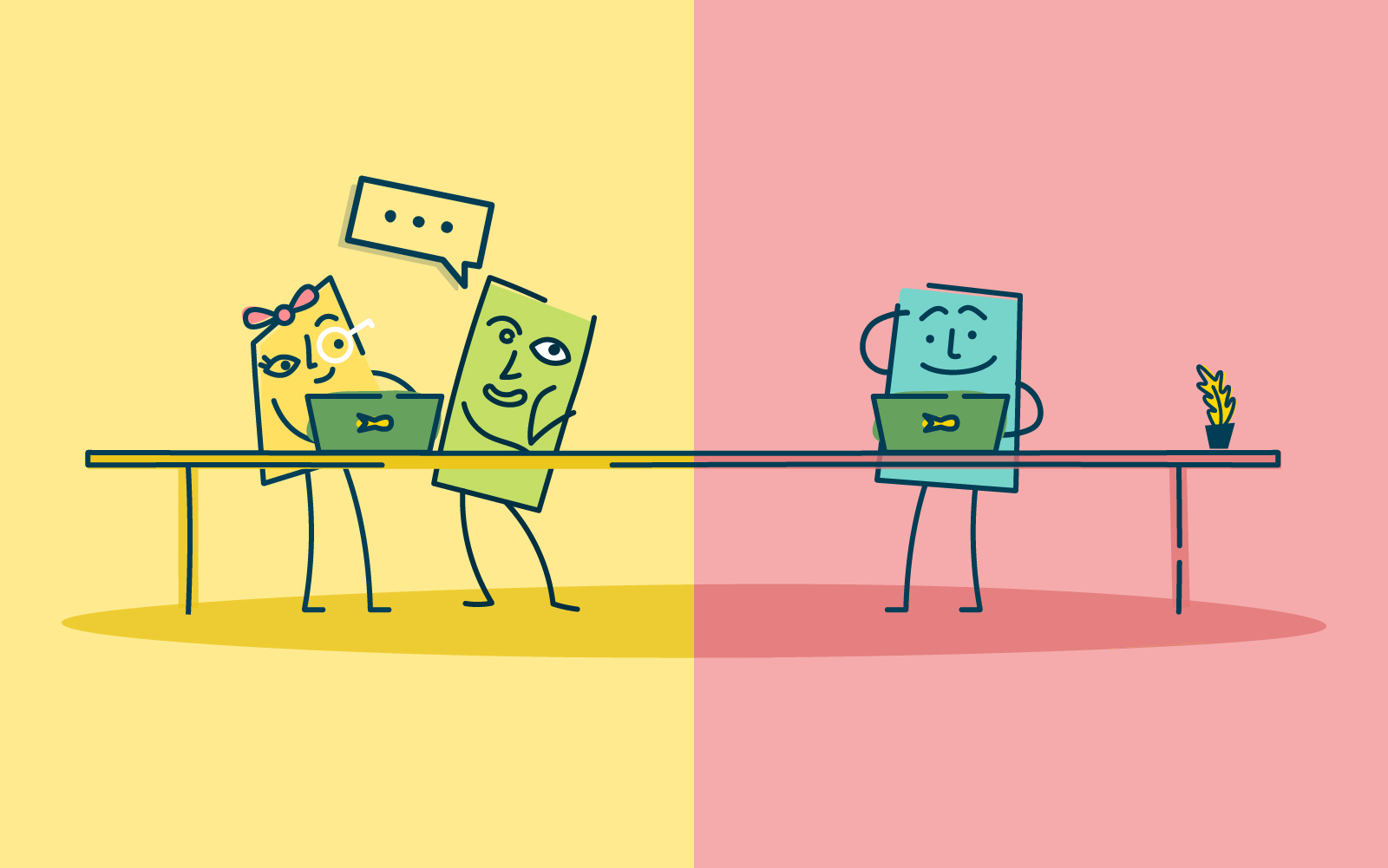
But if we’re remote, does this mean it can’t be moderated? No - remote testing, along with modern technology, can mean that remote testing can be facilitated and moderated. But what is the best method - moderated or unmoderated?

What is moderated remote research testing?

In traditional usability testing, moderated research is done in person. With the moderator and the participant in the same physical space. This, of course, allows for conversation and observational behavioral monitoring. Meaning the moderator can note not only what the participant answers but how and even make note of the body language, surroundings, and other influencing factors. 

This has also meant that traditionally, the participant pool has been limited to those that can be available (and close enough) to make it into a facility for testing. And being in person has meant it takes time (and money) to perform these tests.

As technology has moved along and the speed of internet connections and video calling has increased, this has opened up a world of opportunities for usability testing. Allowing usability testing to be done remotely. Moderators can now set up testing remotely and ‘dial in’ to observe participants anywhere they are. And potentially even running focus groups or other testing in a group format across the internet. 

Pros of moderated remote research testing:

- In-depth gathering of insights through a back-and-forth conversation and observing of the participants.

- Follow-up questions don’t underestimate the value of being available to ask questions throughout the testing. And following up in the moment.

- Observational monitoring noticing and noting the environment and how the participants are behaving, can give more insight into how or why they choose to make a decision.

- Quick remote testing can be quicker to start, find participants, and complete than in-person. This is because you only need to set up a time to connect via the internet, rather than coordinating travel times, etc.

- Location (local and/or international) Testing online removes reliance on participants being physically present for the testing. This broadens your ability to broaden the pool, and participants can be either within your country or global. 

Cons of moderated remote research testing:

- Time-consuming having to be present at each test takes time. As does analyzing the data and insights generated. But remember, this is quality data.

- Limited interactions with any remote testing there is only so much you can observe or understand across the window of a computer screen. It can be difficult to have a grasp on all the factors that might be influencing your participants.

What is unmoderated remote research testing?

In its most simple sense, unmoderated user testing removes the ‘moderated’ part of the equation. Instead of having a facilitator guide participants through the test, participants are left to complete the testing by themselves and in their own time. For the most part, everything else stays the same. 

Removing the moderator, means that there isn’t anyone to respond to queries or issues in the moment. This can either delay, influence, or even potentially force participants to not complete or maybe not be as engaged as you may like. Unmoderated research testing suits a very simple and direct type of test. With clear instructions and no room for inference. 

Pros of unmoderated remote research testing:

- Speed and turnaround,  as there is no need to schedule meetings with each and every participant. Unmoderated usability testing is usually much faster to initiate and complete.

- Size of study (participant numbers) unmoderated usability testing allows you to collect feedback from dozens or even hundreds of users at the same time. 


- Location (local and/or international) Testing online removes reliance on participants being physically present for the testing, which broadens your participant pool.  And unmoderated testing means that it literally can be anywhere while participants complete the test in their own time.

Cons of unmoderated remote research testing:

- Follow-up questions as your participants are working on their own and in their own time, you can’t facilitate and ask questions in the moment. You may be able to ask limited follow-up questions.

- Products need to be simple to use unmoderated testing does not allow for prototypes or any product or site that needs guidance. 

- Low participant support without the moderator any issues with the test or the product can’t be picked up immediately and could influence the output of the test.

When should you do moderated vs unmoderated remote usability testing?

Each moderated and unmoderated remote usability testing have its use and place in user research. It really depends on the question you are asking and what you are wanting to know.

Moderated testing allows you to gather in-depth insights, follow up with questions, and engage the participants in the moment. The facilitator has the ability to guide participants to what they want to know, to dig deeper, or even ask why at certain points. This method doesn’t need as much careful setup as the participants aren’t on their own. While this is all done online, it does still allow connection and conversation. This method allows for more investigative research. Looking at why users might prefer one prototype to another. Or possibly tree testing a new website navigation to understand where they might get lost and querying why the participant made certain choices.

Unmoderated testing, on the other hand, is literally leaving the participants to it. This method needs very careful planning and explaining upfront. The test needs to be able to be set and run without a moderator. This lends itself more to wanting to know a direct answer to a query. Such as a card sort on a website to understand how your users might sort information. Or a first click to see how/where users will click on a new website.

Planning your next user test? Here’s how to choose the right method

With the ability to expand our pool of participants across the globe with all of the advances (and acceptance of) technology and video calling etc, the ability to expand our understanding of users’ experiences is growing. Remote usability testing is a great option when you want to gather information from users in the real world. Depending on your query, moderated or unmoderated usability testing will suit your study. As with all user testing, being prepared and planning ahead will allow you to make the most of your test.

Share this article
Author
Optimal
Workshop

Related articles

View all blog articles
Learn more
1 min read

The Evolution of UX Research: Digital Twins and the Future of User Insight

Introduction

User Experience (UX) research has always been about people. How they think, how they behave, what they need, and—just as importantly—what they don’t yet realise they need. Traditional UX methodologies have long relied on direct human input: interviews, usability testing, surveys, and behavioral observation. The assumption was clear—if you want to understand people, you have to engage with real humans.

But in 2025, that assumption is being challenged.

The emergence of digital twins and synthetic users—AI-powered simulations of human behavior—is changing how researchers approach user insights. These technologies claim to solve persistent UX research problems: slow participant recruitment, small sample sizes, high costs, and research timelines that struggle to keep pace with product development. The promise is enticing: instantly accessible, infinitely scalable users who can test, interact, and generate feedback without the logistical headaches of working with real participants.

Yet, as with any new technology, there are trade-offs. While digital twins may unlock efficiencies, they also raise important questions: Can they truly replicate human complexity? Where do they fit within existing research practices? What risks do they introduce?

This article explores the evolving role of digital twins in UX research—where they excel, where they fall short, and what their rise means for the future of human-centered design.

The Traditional UX Research Model: Why Change?

For decades, UX research has been grounded in methodologies that involve direct human participation. The core methods—usability testing, user interviews, ethnographic research, and behavioral analytics—have been refined to account for the unpredictability of human nature.

This approach works well, but it has challenges:

  1. Participant recruitment is time-consuming. Finding the right users—especially niche audiences—can be a logistical hurdle, often requiring specialised panels, incentives, and scheduling gymnastics.
  2. Research is expensive. Incentives, moderation, analysis, and recruitment all add to the cost. A single usability study can run into tens of thousands of dollars.
  3. Small sample sizes create risk. Budget and timeline constraints often mean testing with small groups, leaving room for blind spots and bias.
  4. Long feedback loops slow decision-making. By the time research is completed, product teams may have already moved on, limiting its impact.

In short: traditional UX research provides depth and authenticity, but it’s not always fast or scalable.

Digital twins and synthetic users aim to change that.

What Are Digital Twins and Synthetic Users?

While the terms digital twins and synthetic users are sometimes used interchangeably, they are distinct concepts.

Digital Twins: Simulating Real-World Behavior

A digital twin is a data-driven virtual representation of a real-world entity. Originally developed for industrial applications, digital twins replicate machines, environments, and human behavior in a digital space. They can be updated in real time using live data, allowing organisations to analyse scenarios, predict outcomes, and optimise performance.

In UX research, human digital twins attempt to replicate real users' behavioral patterns, decision-making processes, and interactions. They draw on existing datasets to mirror real-world users dynamically, adapting based on real-time inputs.

Synthetic Users: AI-Generated Research Participants

While a digital twin is a mirror of a real entity, a synthetic user is a fabricated research participant—a simulation that mimics human decision-making, behaviors, and responses. These AI-generated personas can be used in research scenarios to interact with products, answer questions, and simulate user journeys.

Unlike traditional user personas (which are static profiles based on aggregated research), synthetic users are interactive and capable of generating dynamic feedback. They aren’t modeled after a specific real-world person, but rather a combination of user behaviors drawn from large datasets.

Think of it this way:

  • A digital twin is a highly detailed, data-driven clone of a specific person, customer segment, or process.
  • A synthetic user is a fictional but realistic simulation of a potential user, generated based on behavioral patterns and demographic characteristics.

Both approaches are still evolving, but their potential applications in UX research are already taking shape.

Where Digital Twins and Synthetic Users Fit into UX Research

The appeal of AI-generated users is undeniable. They can:

  • Scale instantly – Test designs with thousands of simulated users, rather than just a handful of real participants.
  • Eliminate recruitment bottlenecks – No need to chase down participants or schedule interviews.
  • Reduce costs – No incentives, no travel, no last-minute no-shows.
  • Enable rapid iteration – Get user insights in real time and adjust designs on the fly.
  • Generate insights on sensitive topics – Synthetic users can explore scenarios that real participants might find too personal or intrusive.

These capabilities make digital twins particularly useful for:

  • Early-stage concept validation – Rapidly test ideas before committing to development.
  • Edge case identification – Run simulations to explore rare but critical user scenarios.
  • Pre-testing before live usability sessions – Identify glaring issues before investing in human research.

However, digital twins and synthetic users are not a replacement for human research. Their effectiveness is limited in areas where emotional, cultural, and contextual factors play a major role.

The Risks and Limitations of AI-Driven UX Research

For all their promise, digital twins and synthetic users introduce new challenges.

  1. They lack genuine emotional responses.
    AI can analyse sentiment, but it doesn’t feel frustration, delight, or confusion the way a human does. UX is often about unexpected moments—the frustrations, workarounds, and “aha” realisations that define real-world use.
  2. Bias is a real problem.
    AI models are trained on existing datasets, meaning they inherit and amplify biases in those datasets. If synthetic users are based on an incomplete or non-diverse dataset, the research insights they generate will be skewed.
  3. They struggle with novelty.
    Humans are unpredictable. They find unexpected uses for products, misunderstand instructions, and behave irrationally. AI models, no matter how advanced, can only predict behavior based on past patterns—not the unexpected ways real users might engage with a product.
  4. They require careful validation.
    How do we know that insights from digital twins align with real-world user behavior? Without rigorous validation against human data, there’s a risk of over-reliance on synthetic feedback that doesn’t reflect reality.

A Hybrid Future: AI + Human UX Research

Rather than viewing digital twins as a replacement for human research, the best UX teams will integrate them as a complementary tool.

Where AI Can Lead:

  • Large-scale pattern identification
  • Early-stage usability evaluations
  • Speeding up research cycles
  • Automating repetitive testing

Where Humans Remain Essential:

  • Understanding emotion, frustration, and delight
  • Detecting unexpected behaviors
  • Validating insights with real-world context
  • Ethical considerations and cultural nuance

The future of UX research is not about choosing between AI and human research—it’s about blending the strengths of both.

Final Thoughts: Proceeding With Caution and Curiosity

Digital twins and synthetic users are exciting, but they are not a magic bullet. They cannot fully replace human users, and relying on them exclusively could lead to false confidence in flawed insights.

Instead, UX researchers should view these technologies as powerful, but imperfect tools—best used in combination with traditional research methods.

As with any new technology, thoughtful implementation is key. The real opportunity lies in designing research methodologies that harness the speed and scale of AI without losing the depth, nuance, and humanity that make UX research truly valuable.

The challenge ahead isn’t about choosing between human or synthetic research. It’s about finding the right balance—one that keeps user experience truly human-centered, even in an AI-driven world.

This article was researched with the help of Perplexity.ai. 

Learn more
1 min read

5 key areas for effective ResearchOPs

Simply put, ResearchOps is about making sure your research operations are robust, thought through and managed. 

Having systems and processes around your UX research and your team keep everyone (and everything) organized. Making user research projects quicker to get started and more streamlined to run. And robust sharing, socializing, and knowledge storage means that everyone can understand the research insights and findings and put these to use - across the organization. And even better, find these when they need them. 

Using the same tools across the team allows the research team to learn from each other, and previous research projects and be able to compare apples with apples, with everyone included. Bringing the team together across tools, research and results.

We go into more detail in our ebook ResearchOps Checklist about exactly what you can do to make sure your research team is running at its best. Let’s take a quick look at 5 way to ensure you have the grounding for a successful ResearchOps team.

1. Knowledge management 📚

What do you do with all of the insights and findings of a user research project? How do you store them, how do you manage the insights, and how do you share and socialize?

Having processes in place that manage this knowledge is important to the longevity of your research. From filing to sharing across platforms, it all needs to be standardized so everyone can search, find and share.

2. Guidelines and process templates 📝

Providing a framework for how to run research projects is are important. Building on the knowledge base from previous research can improve research efficiencies and cut down on groundwork and administration. Making research projects quicker and more streamlined to get underway.

3. Governance 🏛

User research is all about people, real people. It is incredibly important that any research be legal, safe, and ethical. Having effective governance covered is vital.

4. Tool stack 🛠

Every research team needs a ‘toolbox’ that they can use whenever they need to run card sorts, tree tests, usability tests, user interviews, and more. But which software and tools to use?

Making sure that the team is using the same tools also helps with future research projects, learning from previous projects, and ensuring that the information is owned and run by the organization (rather than whichever individuals prefer). Reduce logins and password shares, and improve security with organization-wide tools and platforms. 

5. Recruitment 👱🏻👩👩🏻👧🏽👧🏾

Key to great UX research is the ability to recruit quality participants - fast! Having strong processes in place for screening, scheduling, sampling, incentivizing, and managing participants needs to be top of the list when organizing the team.

Wrap Up 💥

Each of these ResearchOps processes are not independent of the other. And neither do they flow from one to the other. They are part of a total wrap around for the research team, creating processes, systems and tools that are built to serve the team. Allowing them to focus on the job of doing great research and generating insights and findings that develop the very best user experience. 

Afterall, we are creating user experiences that keep our users engaged and coming back. Why not look at the teams user experience and make the most of that. Freeing time and space to socialize and share the findings with the organization. 

Learn more
1 min read

Using paper prototypes in UX

In UX research we are told again and again that to ensure truly user-centered design, it’s important to test ideas with real users as early as possible. There are many benefits that come from introducing the voice of the people you are designing for in the early stages of the design process. The more feedback you have to work with, the more you can inform your design to align with real needs and expectations. In turn, this leads to better experiences that are more likely to succeed in the real world.It is not surprising then that paper prototypes have become a popular tool used among researchers. They allow ideas to be tested as they emerge, and can inform initial designs before putting in the hard yards of building the real thing. It would seem that they’re almost a no-brainer for researchers, but just like anything out there, along with all the praise, they have also received a fair share of criticism, so let’s explore paper prototypes a little further.

What’s a paper prototype anyway? 🧐📖

Paper prototyping is a simple usability testing technique designed to test interfaces quickly and cheaply. A paper prototype is nothing more than a visual representation of what an interface could look like on a piece of paper (or even a whiteboard or chalkboard). Unlike high-fidelity prototypes that allow for digital interactions to take place, paper prototypes are considered to be low-fidelity, in that they don’t allow direct user interaction. They can also range in sophistication, from a simple sketch using a pen and paper to simulate an interface, through to using designing or publishing software to create a more polished experience with additional visual elements.

Screen Shot 2016-04-15 at 9.26.30 AM
Different ways of designing paper prototypes, using OptimalSort as an example

Showing a research participant a paper prototype is far from the real deal, but it can provide useful insights into how users may expect to interact with specific features and what makes sense to them from a basic, user-centered perspective. There are some mixed attitudes towards paper prototypes among the UX community, so before we make any distinct judgements, let's weigh up their pros and cons.

Advantages 🏆

  • They’re cheap and fastPen and paper, a basic word document, Photoshop. With a paper prototype, you can take an idea and transform it into a low-fidelity (but workable) testing solution very quickly, without having to write code or use sophisticated tools. This is especially beneficial to researchers who work with tight budgets, and don’t have the time or resources to design an elaborate user testing plan.
  • Anyone can do itPaper prototypes allow you to test designs without having to involve multiple roles in building them. Developers can take a back seat as you test initial ideas, before any code work begins.
  • They encourage creativityFrom both the product teams participating in their design, but also from the users. They require the user to employ their imagination, and give them the opportunity express their thoughts and ideas on what improvements can be made. Because they look unfinished, they naturally invite constructive criticism and feedback.
  • They help minimize your chances of failurePaper prototypes and user-centered design go hand in hand. Introducing real people into your design as early as possible can help verify whether you are on the right track, and generate feedback that may give you a good idea of whether your idea is likely to succeed or not.

Disadvantages 😬

  • They’re not as polished as interactive prototypesIf executed poorly, paper prototypes can appear unprofessional and haphazard. They lack the richness of an interactive experience, and if our users are not well informed when coming in for a testing session, they may be surprised to be testing digital experiences on pieces of paper.
  • The interaction is limitedDigital experiences can contain animations and interactions that can’t be replicated on paper. It can be difficult for a user to fully understand an interface when these elements are absent, and of course, the closer the interaction mimics the final product, the more reliable our findings will be.
  • They require facilitationWith an interactive prototype you can assign your user tasks to complete and observe how they interact with the interface. Paper prototypes, however, require continuous guidance from a moderator in communicating next steps and ensuring participants understand the task at hand.
  • Their results have to be interpreted carefullyPaper prototypes can’t emulate the final experience entirely. It is important to interpret their findings while keeping their limitations in mind. Although they can help minimize your chances of failure, they can’t guarantee that your final product will be a success. There are factors that determine success that cannot be captured on a piece of paper, and positive feedback at the prototyping stage does not necessarily equate to a well-received product further down the track.

Improving the interface of card sorting, one prototype at a time 💡

We recently embarked on a research project looking at the user interface of our card-sorting tool, OptimalSort. Our research has two main objectives — first of all to benchmark the current experience on laptops and tablets and identify ways in which we can improve the current interface. The second objective is to look at how we can improve the experience of card sorting on a mobile phone.

Rather than replicating the desktop experience on a smaller screen, we want to create an intuitive experience for mobiles, ensuring we maintain the quality of data collected across devices.Our current mobile experience is a scaled down version of the desktop and still has room for improvement, but despite that, 9 per cent of our users utilize the app. We decided to start from the ground up and test an entirely new design using paper prototypes. In the spirit of testing early and often, we decided to jump right into testing sessions with real users. In our first testing sprint, we asked participants to take part in two tasks. The first was to perform an open or closed card sort on a laptop or tablet. The second task involved using paper prototypes to see how people would respond to the same experience on a mobile phone.

blog_artwork_01-03

Context is everything 🎯

What did we find? In the context of our research project, paper prototypes worked remarkably well. We were somewhat apprehensive at first, trying to figure out the exact flow of the experience and whether the people coming into our office would get it. As it turns out, people are clever, and even those with limited experience using a smartphone were able to navigate and identify areas for improvement just as easily as anyone else. Some participants even said they prefered the experience of testing paper prototypes over a laptop. In an effort to make our prototype-based tasks easy to understand and easy to explain to our participants, we reduced the full card sort to a few key interactions, minimizing the number of branches in the UI flow.

This could explain a preference for the mobile task, where we only asked participants to sort through a handful of cards, as opposed to a whole set.The main thing we found was that no matter how well you plan your test, paper prototypes require you to be flexible in adapting the flow of your session to however your user responds. We accepted that deviating from our original plan was something we had to embrace, and in the end these additional conversations with our participants helped us generate insights above and beyond the basics we aimed to address. We now have a whole range of feedback that we can utilize in making more sophisticated, interactive prototypes.

Whether our success with using paper prototypes was determined by the specific setup of our testing sessions, or simply by their pure usefulness as a research technique is hard to tell. By first performing a card sorting task on a laptop or tablet, our participants approached the paper prototype with an understanding of what exactly a card sort required. Therefore there is no guarantee that we would have achieved the same level of success in testing paper prototypes on their own. What this does demonstrate, however, is that paper prototyping is heavily dependent on the context of your assessment.

Final thoughts 💬

Paper prototypes are not guaranteed to work for everybody. If you’re designing an entirely new experience and trying to describe something complex in an abstracted form on paper, people may struggle to comprehend your idea. Even a careful explanation doesn’t guarantee that it will be fully understood by the user. Should this stop you from testing out the usefulness of paper prototypes in the context of your project? Absolutely not.

In a perfect world we’d test high fidelity interactive prototypes that resemble the real deal as closely as possible, every step of the way. However, if we look at testing from a practical perspective, before we can fully test sophisticated designs, paper prototypes provide a great solution for generating initial feedback.In his article criticizing the use of paper prototypes, Jake Knapp makes the point that when we show customers a paper prototype we’re inviting feedback, not reactions. What we found in our research however, was quite the opposite.

In our sessions, participants voiced their expectations and understanding of what actions were possible at each stage, without us having to probe specifically for feedback. Sure we also received general comments on icon or colour preferences, but for the most part our users gave us insights into what they felt throughout the experience, in addition to what they thought.

Further reading 🧠

Seeing is believing

Explore our tools and see how Optimal makes gathering insights simple, powerful, and impactful.