
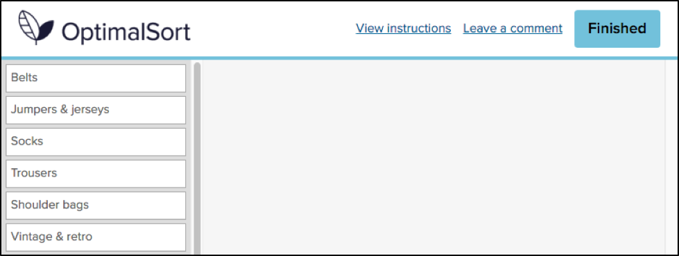
Card sorting is an invaluable tool for understanding how people organize information in their minds, making websites more intuitive and content easier to navigate. It’s a useful method outside of information architecture and UX research, too. It can be a useful prioritization technique, or used in a more traditional sense. For example, it’s handy in psychology, sociology or anthropology to inform research and deepen our understanding of how people conceptualize information.
The introduction of remote card sorting has provided many advantages, making it easier than ever to conduct your own research. Tools such as our very own OptimalSort allow you to quickly and easily gather findings from a large number of participants from all around the world. Not having to organize moderated, face-to-face sessions gives researchers more time to focus on their work, and easier access to larger data sets.
One of the main disadvantages of remote card sorting is that it eliminates the opportunity to dive deeper into the choices made by your participants. Human conversation is a great thing, and when conducting a remote card sort with users who could potentially be on the other side of the world, opportunities for our participants to provide direct feedback and voice their opinions are severely limited.Your survey design may not be perfect.
The labels you provide your participants may be incorrect, confusing or redundant. Your users may have their own ideas of how you could improve your products or services beyond what you are trying to capture in your card sort. People may be more willing to provide their feedback than you realize, and limiting their insights to a simple card sort may not capture all that they have to offer.So, how can you run an unmoderated, remote card sort, but do your best to mitigate this potential loss of insight?
A quick look into the data
In an effort to evaluate the usefulness of the existing “Leave a comment” feature in OptimalSort, I recently asked our development team to pull out some data.You might be asking “There’s a comment box in OptimalSort?”If you’ve never noticed this feature, I can’t exactly blame you. It’s relatively hidden away as an unassuming hyperlink in the top right corner of your card sort.

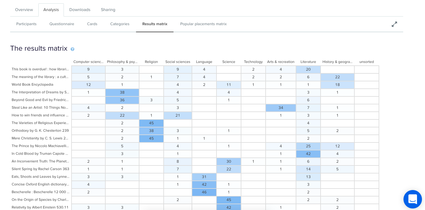
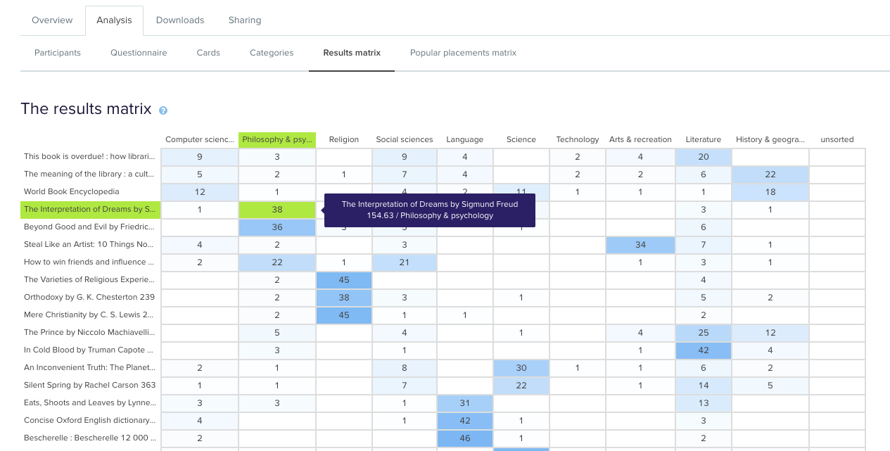
Comments left by your participants can be viewed in the “Participants” tab in your results section, and are indicated by a grey speech bubble.

The history of the button is unknown even to long-time Optimal Workshop team members. The purpose of the button is also unspecified. “Why would anyone leave a comment while participating in a card sort?”, I found myself wondering.As it turns out, 133,303 comments have been left by participants. This means 133,303 insights, opinions, critiques or frustrations. Additionally, these numbers only represent the participants who noticed the feature in the first place. Considering the current button can easily be missed when focusing on the task at hand, I can’t help but wonder how this number might change if we drew more attention to the feature.
Breaking down the comments
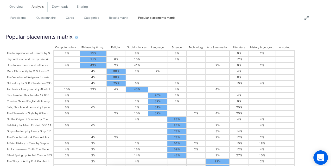
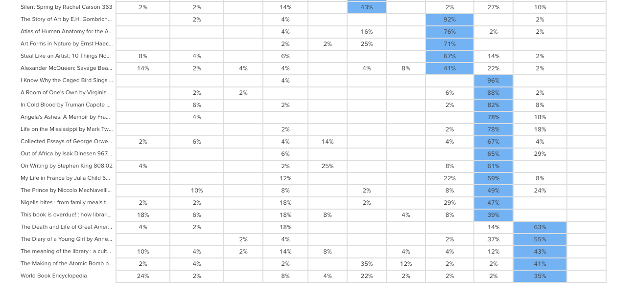
To avoid having to manually analyze and code 133,303 open text fields, I decided to only spend enough time to decipher any obvious patterns. Luckily for me, this didn’t take very long. After looking at only a hundred or so random entries, four distinct types of comments started to emerge.
- This card/group doesn’t make sense.Comments related to cards and groups dominate. This is a great thing, as it means that the majority of comments made by participants relate specifically to the task they are completing. For closed and hybrid sorts, comments frequently relate to the predefined categories available, and since the participants most likely to leave a comment are those experiencing issues, the majority of the feedback relates to issues with category names themselves. Many comments are related to card labels and offer suggestions for improving naming conventions, while many others draw attention to some terms being confusing, unclear or jargony. Comments on task length can also be found, along with reasons for why certain cards may be left ungrouped, e.g., “I’ve left behind items I think the site could do without”.
- Your organization is awesome for doing this/you’re doing it all wrong. A substantial number of participants used the comment box as an opportunity to voice their general feedback on the organization or company running the study. Some of the more positive comments include an appreciation for seeing private companies or public sector organizations conducting research with real users in an effort to improve their services. It’s also nice to see many comments related to general enjoyment in completing the task.On the other hand, some participants used the comment box as an opportunity to comment on what other areas of their services should be improved, or what features they would like to see implemented that may otherwise be missed in a card sort, e.g., “Increased, accurate search functionality is imperative in a new system”.
- This isn’t working for me. Taking a closer look at some of the comments reveals some useful feedback for us at Optimal Workshop, too. Some of the comments relate specifically to UI and usability issues. The majority of these issues are things we are already working to improve or have dealt with. However, for researchers, comments that relate to challenges in using the tool or completing the survey itself may help explain some instances of data variability.
- #YOLO, hello, ;) And of course, the unrelated. As you may expect, when you provide people with the opportunity to leave a comment online, you can expect just about anything in return.
How to make the most of your user insights in OptimalSort
If you’re running a card sort, chances are you already place a lot of value in the voice of your users. To ensure you capture any additional insights, it’s best to ensure your participants are aware of the opportunity to do so. Here are two ways you may like to ensure your participants have a space to voice their feedback:
Adding more context to the “Leave a comment” feature
One way to encourage your participants to leave comments is to promote the use of the this feature in your card sort instructions. OptimalSort gives you flexibility to customize your instructions every time you run a survey. By making your participants aware of the feature, or offering ideas around what kinds of comments you may be looking for, you not only make them more likely to use the feature, but also open yourself up to a whole range of additional feedback. An advantage of using this feature is that comments can be added in real time during a card sort, so any remarks can be made as soon as they arise.
Making use of post-survey questions
Adding targeted post-survey questions is the best way to ensure your participants are able to voice any thoughts or concerns that emerged during the activity. Here, you can ask specific questions that touch upon different aspects of your card sort, such as length, labels, categories or any other comments your participants may have. This can not only help you generate useful insights but also inform the design of your surveys in the future.
Make your remote card sorts more human
Card sorts are exploratory by nature. Avoid forcing your participants into choices that may not accurately reflect their thinking by giving them the space to voice their opinions. Providing opportunities to capture feedback opens up the conversation between you and your users, and can lead to surprising insights from unexpected places.
Further reading
- "Moderated card sorts vs online card sorts — why you need both" - An article on our blog that explains some of the differences between these two methods and how to use both for great results.
- "The hidden benefits of remote research" - Kathleen Asjes writes for UX Booth and explains when to use remote research and some of its many benefits.
- "Remote research: real users, real time, real research" - A book by Nate Bolt and Tony Tulathimutte on how to design and conduct remote research studies.