A great information architecture (IA) is essential for a great user experience (UX). And testing your website or app’s information architecture is necessary to get it right.
Card sorting and tree testing are the very best UX research methods for exactly this. But the big question is always: which one should you use, and when? Very possibly you need both. Let’s find out with this quick summary.
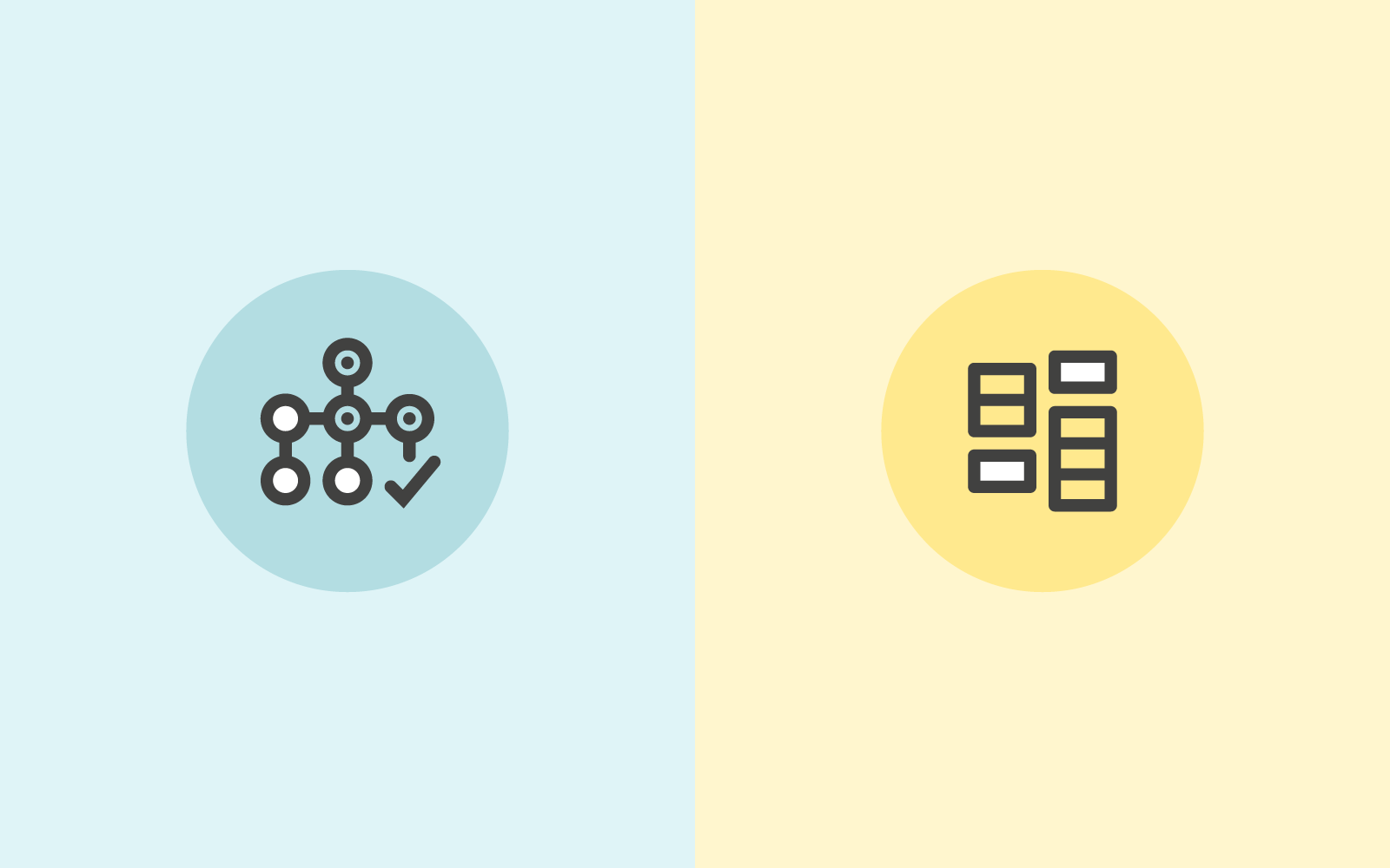
What is card sorting and tree testing? 🧐
Card sorting is used to test the information architecture of a website or app. Participants group individual labels (cards) into different categories according to criteria that makes best sense to them. Each label represents an item that needs to be categorized. The results provide deep insights to guide decisions needed to create an intuitive navigation, comprehensive labeling and content that is organized in a user-friendly way.
Tree testing is also used to test the information architecture of a website or app. When using tree testing participants are presented with a site structure and a set of tasks they need to complete. The goal for participants is to find their way through the site and complete their task. The test shows whether the structure of your website corresponds to what users expect and how easily (or not) they can navigate and complete their tasks.
What are the differences? 🂱 👉🌴
Card sorting is a UX research method which helps to gather insights about your content categorization. It focuses on creating an information architecture that responds intuitively to the users’ expectations. Things like which items go best together, the best options for labeling, what categories users expect to find on each menu.
Doing a simple card sort can give you all those pieces of information and so much more. You start understanding your user’s thoughts and expectations. Gathering enough insights and information to enable you to develop several information architecture options.
Tree testing is a UX research method that is almost a card sort in reverse. Tree testing is used to evaluate an information architecture structure and simply allows you to see what works and what doesn’t.
Using tree testing will provide insights around whether your information architecture is intuitive to navigate, the labels easy to follow and ultimately if your items are categorized in a place that makes sense. Conversely it will also show where your users get lost and how.
What method should you use? 🤷
You’ve got this far and fine-tuning your information architecture should be a priority. An intuitive IA is an integral component of a user-friendly product. Creating a product that is usable and an experience users will come back for.
If you are still wondering which method you should use - tree testing or card sorting. The answer is pretty simple - use both.
Just like many great things, these methods work best together. They complement each other, allowing you to get much deeper insights and a rounded view of how your IA performs and where to make improvements than when used separately. We cover more reasons why card sorting loves tree testing in our article which dives deeper into why to use both.
Ok, I'm using both, but which comes first? 🐓🥚
Wanting full, rounded insights into your information architecture is great. And we know that tree testing and card sorting work well together. But is there an order you should do the testing in? It really depends on the particular context of your research - what you’re trying to achieve and your situation.
Tree testing is a great tool to use when you have a product that is already up and running. By running a tree test first you can quickly establish where there may be issues, or snags. Places where users get caught and need help. From there you can try and solve potential issues by moving on to a card sort.
Card sorting is a super useful method that can be instigated at any stage of the design process, from planning to development and beyond. As long as there is an IA structure that can be tested again. Testing against an already existing website navigation can be informative. Or testing a reorganization of items (new or existing) can ensure the organization can align with what users expect.
However, when you decide to implement both of the methods in your research, where possible, tree testing should come before card sorting. If you want a little more on the issue have a read of our article here.
Check out our OptimalSort and Treejack tools - we can help you with your research and the best way forward. Wherever you might be in the process.