

There’s not much a parent won’t do to ensure their child has the best chance of succeeding in life. Unsurprisingly, things are much the same in product development. Whether it’s a designer, manager, developer or copywriter, everyone wants to see the product reach its full potential.
Key to a product’s success (even though it’s still not widely practiced) is UX research. Without research focused on learning user pain points and behaviors, development basically happens in the dark. Feeding direct insights from customers and users into the development of a product means teams can flick the light on and make more informed design decisions.
While the benefits of user research are obvious to anyone working in the field, it can be a real challenge to convince others of just how important and useful it is. We thought we’d help.
Define user research
If you want to sell the importance of UX research within your organization, you’ve got to ensure stakeholders have a clear understanding of what user research is and what they stand to gain from backing it.
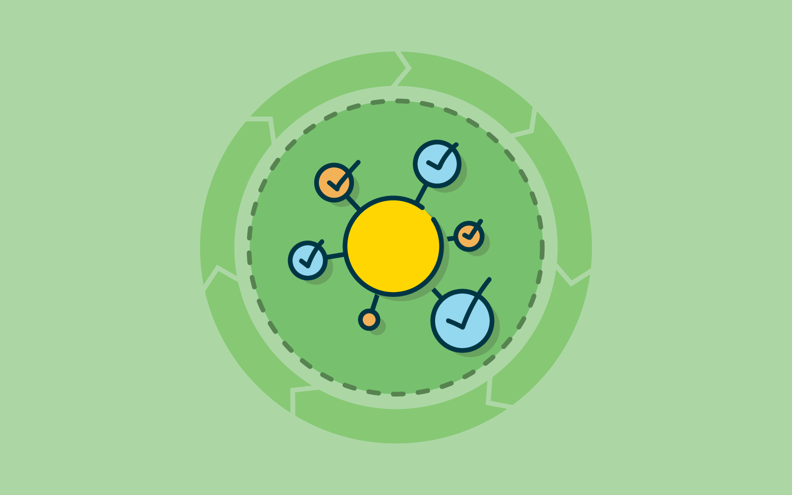
In general, there are a few key things worth focusing on when you’re trying to explain the benefits of research:
- More informed design decisions: Companies make major design decisions far too often without considering users. User research provides the data needed to make informed decisions.
- Less uncertainty and risk: Similarly, research reduces risk and uncertainty simply by giving companies more clarity around how a particular product or service is used.
- Retention and conversion benefits: Research means you’ll be more aligned with the needs of your customers and prospective customers.
Use the language of the people you’re trying to convince. A capable UX research practice will almost always improve key business metrics, namely sales and retention.
The early stages
When embarking on a project, book in some time early in the process to answer questions, explain your research approach and what you hope to gain from it. Here are some of the key things to go over:
- Your objectives: What are you trying to achieve? This is a good time to cover your research questions.
- Your research methods: Which methods will you be using to carry out your research? Cover the advantages of these methods and the information you’re likely to get from using them.
- Constraints: Do you see any major obstacles? Any issues with resources?
- Provide examples: Nothing shows the value of doing research quite like a case study. If you can’t find an example of research within your own organization, see what you can find online.
Involve others in your research
When trying to convince someone of the validity of what you’re doing, it’s often best to just show them. There are a couple of effective ways you can do this – at a team or individual level and at an organizational level.
We’ll explain the best way to approach this below, but there’s another important reason to bring others into your research. UX research can’t exist in a vacuum – it thrives on integration and collaboration with other teams. Importantly, this also means working with other teams to define the problems they’re trying to solve and the scope of their projects. Once you’ve got an understanding of what they’re trying to achieve, you’ll be in a better position to help them through research.
Educate others on what research is
Education sessions (lunch-and-learns) are one of the best ways to get a particular team or group together and run through the what and why of user research. You can work with them to work out what they’d like to see from you, and how you can help each other.
Tailor what you’re saying to different teams, especially if you’re talking to people with vastly different skill sets. For example, developers and designers are likely to see entirely different value in research.
Collect user insights across the organization
Putting together a comprehensive internal repository focused specifically on user research is another excellent way to grow awareness. It can also help to quantify things that may otherwise fall by the wayside. For example, you can measure the magnitude of certain pain points or observe patterns in feature requests. Using a platform like Notion or Confluence (or even Google Drive if you don’t want a dedicated platform), log all of your study notes, insights and research information that you find useful.
Whenever someone wants to learn more about research within the organization, they’ll be able to find everything easily.
Bring stakeholders along to research sessions
Getting a stakeholder along to a research session (usability tests and user interviews are great starting points) will help to show them the value that face-to-face sessions with users can provide.
To really involve an observer in your UX research, assign them a specific role. Note taker, for example. With a short briefing on best-practices for note taking, they can get a feel for what’s like to do some of the work you do.
You may also want to consider bringing anyone who’s interested along to a research session, even if they’re just there to observe.
Share your findings – consistently
Research is about more than just testing a hypothesis, it’s important to actually take your research back to the people who can action the data.
By sharing your research findings with teams and stakeholders regularly, your organization will start to build up an understanding of the value that ongoing research can provide, meaning getting approval to pursue research in future becomes easier. This is a bit of a chicken and egg situation, but it’s a practice that all researchers need to get into – especially those embedded in large teams or organizations.
Anything else you think is worth mentioning? Let us know in the comments.
Read more
- Selling your design recommendations to clients and colleagues – Guest writer Jeff Tang outlines some of his techniques for presenting UX recommendations and answering objections.
- Quantifying the ROI of UX – Ashlea McKay delves into one of the toughest UX questions to answer: “What do we get for our money?”
- How to lead a UX team – With user-centered design growing in organizations around the world, we’ll need capable leaders to run UX teams.
- How do I explain what UX is? – Ashlea McKay covers how you can explain UX to people who may not necessarily have familiarity with the field.