


The accuracy of your data collection is crucial in qualitative research. It is vital that nothing is lost in translation or simply missed from the point of collection to analysis, and our latest release makes this even easier to achieve. You can now directly import interview transcripts into Qualitative Insights (previously known as Reframer), allowing you and your team to capture and tag observations effortlessly while maintaining the integrity of the information. Get ready to experience a new level of efficiency in your qualitative research!
The importance of transcription ✍🏽
Whether you are conducting interviews alone or with the support of your team, it’s important to prioritize building connections with participants rather than struggling to take notes and ask the right questions. Transcripts ensure you avoid losing crucial insights and context as you move from data collection to analysis and reduce the likelihood of human errors and missed observations that sometimes occur during live note-taking sessions.
It also enables smooth collaboration among team members by allowing them to review interviews and contribute to the analysis, even if they weren't present.
How to import a transcript to Qualitative Insights
You can add a transcript to a new or existing study in Qualitative Insights with just a few clicks. After recording an interview or user testing session, open your Qualitative Insights study and click ‘Sessions’ then ‘+ Transcript.’

Add a session title, any session information or a link to the video for future reference in the session information box. If you have created segments, choose which ones apply to this participant; you can update these later at any time. Then click ‘import transcript.’

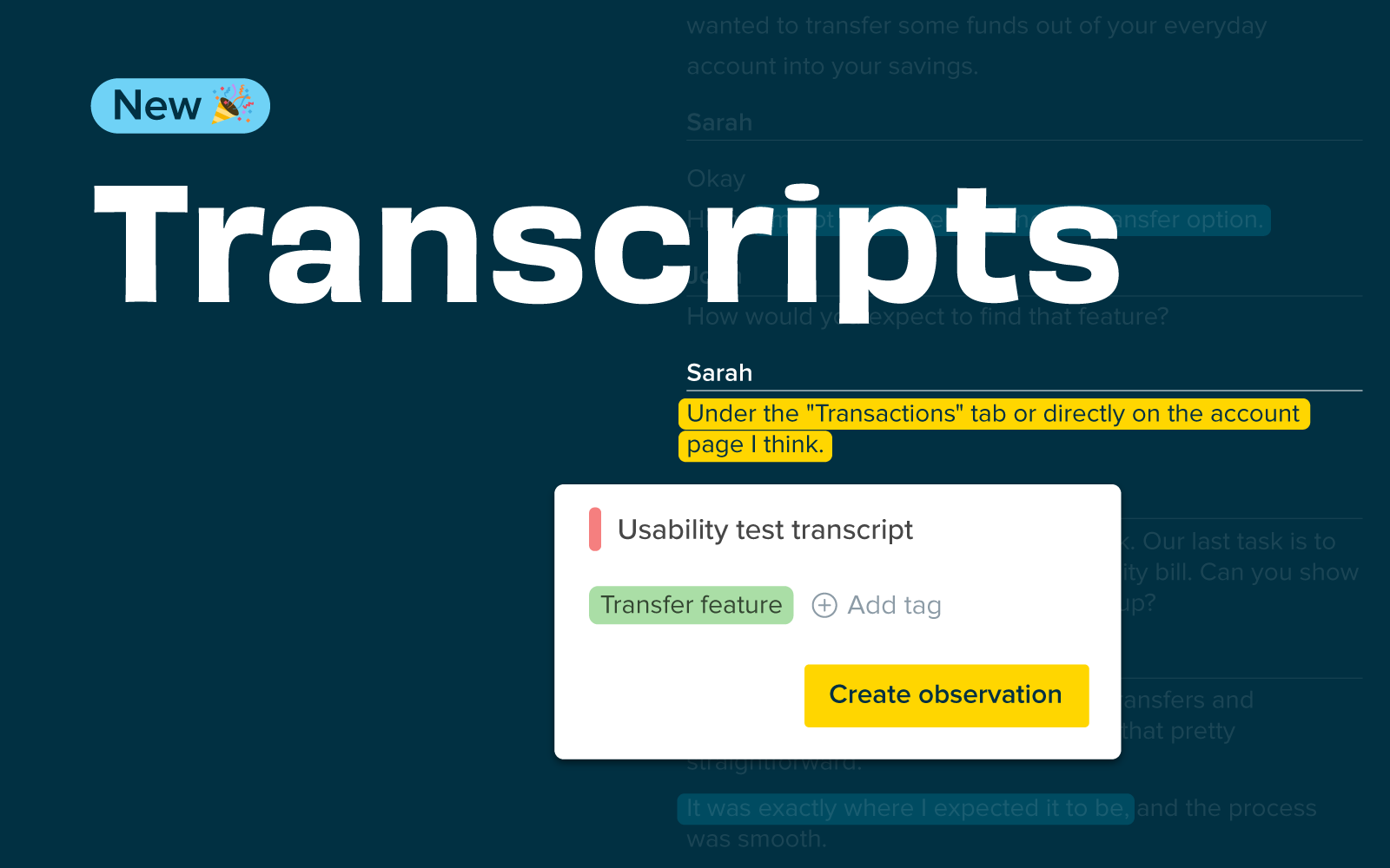
Click ‘Select transcript’ and ensure you made any edits before importing it. This feature supports .vtt, .srt, or .txt files. Now, click Capture observations’ to complete the import and create and tag your observations.
You will see your transcript displayed. If you use a .vtt or .srt file, you will see the speaker names have been identified. You can update the speaker names by clicking on configure speakers.
How to create observations
To create observations from your transcript, simply highlight text, enter a new tag or select an existing one, then click create an observation.
There is no limit to how many transcripts you can import. This means you can import all your past and future interviews, ensuring all your research data is in one place for easy access and analysis.
