May 1, 2024
4 min

Accelerate insights with transcripts in Qualitative Insights

The accuracy of your data collection is crucial in qualitative research. It is vital that nothing is lost in translation or simply missed from the point of collection to analysis, and our latest release makes this even easier to achieve. You can now directly import interview transcripts into Qualitative Insights (previously known as Reframer), allowing you and your team to capture and tag observations effortlessly while maintaining the integrity of the information. Get ready to experience a new level of efficiency in your qualitative research!

The importance of transcription ✍🏽

Whether you are conducting interviews alone or with the support of your team, it’s important to prioritize building connections with participants rather than struggling to take notes and ask the right questions. Transcripts ensure you avoid losing crucial insights and context as you move from data collection to analysis and reduce the likelihood of human errors and missed observations that sometimes occur during live note-taking sessions. 

It also enables smooth collaboration among team members by allowing them to review interviews and contribute to the analysis, even if they weren't present.

How to import a transcript to Qualitative Insights

Watch the video 📽️ 👀

You can add a transcript to a new or existing study in Qualitative Insights with just a few clicks. After recording an interview or user testing session, open your Qualitative Insights study and click ‘Sessions’ then ‘+ Transcript.’

Add a session title, any session information or a link to the video for future reference in the session information box. If you have created segments, choose which ones apply to this participant; you can update these later at any time. Then click ‘import transcript.’

Click ‘Select transcript’ and ensure you made any edits before importing it. This feature supports .vtt, .srt, or .txt files. Now, click Capture observations’ to complete the import and create and tag your observations.

You will see your transcript displayed. If you use a .vtt or .srt file, you will see the speaker names have been identified. You can update the speaker names by clicking on configure speakers.

How to create observations

To create observations from your transcript, simply highlight text, enter a new tag or select an existing one, then click create an observation.

There is no limit to how many transcripts you can import. This means you can import all your past and future interviews, ensuring all your research data is in one place for easy access and analysis.

Take the Qualitative Insights Academy Course 📚

Qualitative Insights supports your entire qualitative research workflow, from conducting interviews and capturing observations to tagging and visualizing your data.   It keeps all your valuable user interviews and usability testing metadata in one place.


To learn more about how to get the most out of Qualitative Insights, take the Qualitative Insights course at the Optimal Academy. In this short course, you'll learn how to set yourself and your team up to capture, tag, and group your observations to get to the insights faster.

Related articles

View all blog articles
Learn more
1 min read

Live training: How to win at qualitative analysis with Reframer

In our latest live training session product experts, Pete and Caitlin, take us on a deep dive into the new and improved qualitative analysis tool Reframer.

The session is loaded with tips and demo’s on how to save time and streamline your qualitative research all within one tool.  They also discuss best practices for setting up and conducting user interviews, and how to get the most out of your analysis.

Learn more
1 min read

Lunch n' Learn: Holistic Design - A Framework For Collective Sense-making

Every month we have fun and informative “bite sized” presentations to add some inspiration to your lunch break.  These virtual events allow us to partner with amazing speakers, community groups and organizations to share their insights and hot takes on a variety of topics impacting our industry. 

Join us at the end of every month for Lunch n' Learn.
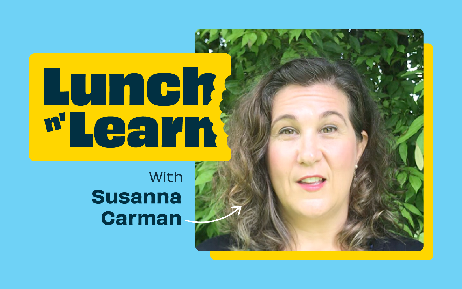
Susanna Carman

Leading design processes amidst a world in transition requires all practitioners to continuously invest in their own development. One aspect worth investing in, is an ability to integrate holistic thinking into our design leadership practice. This includes re-evaluating our own biases and how that bias is reflected in the tools we choose to work with when understanding and designing for/within complex systems.

Recently our guest Susanna Carman, Strategic Designer and founder of Transition Leadership LAB, introduced us to a holistic approach to qualitative design research using Ken Wilber’s 4 Quadrant Model. Susanna explained the fundamental principles underpinning the framework, and showed how it can be used to ensure a multi-perspectival harvest of critical qualitative and quantitative data on any design project.  

Speaker bio

Susanna Carman is a Strategic Designer and research-practitioner who helps people solve complex problems, the types of problems that have to do with services, systems and human interactions. Specialising in design, leadership and learning, Susanna brings a high value toolkit and herself as Thinking Partner to design, leadership and change practitioners who are tasked with delivering sustainable solutions amidst disruptive conditions. 

Susanna holds a Masters of Design Futures degree from RMIT University, and has over a decade of combined experience delivering business performance, cultural alignment and leadership development outcomes to the education, health, community development and financial services sectors. She is also the founder and host of Transition Leadership Lab, a 9-week learning lab for design, leadership and change practitioners who already have a sophisticated set of tools and mindsets, but still feel these are insufficient to meet the challenge of leading change in a rapidly transforming world.

Grab your lunch, invite your colleagues and we hope to see you at our next Lunch n' Learn 🌯🍱🍜🍲

Learn more
1 min read

Are small links more attractive to people as icons or text?

"Dear Optimal Workshop
How do you make a small link attractive to people (icon vs. text)?"
— Cassie

Dear Cassie,

I'm going to dive straight into this interesting question with a good old game of Pros and Cons, and then offer a resolution of sorts, with a meandering thought or two along the way. Let's kick things off with Team Icon.

The good side of icons: A picture is worth a 1000 words

When shopping online, the number above the little shopping trolley icon tells me how badly behaved I’ve been, and if I click on it, I know I’ll get to gleefully review all the shoes I've selected so far. There’s a whole heap of icons out there like this that people have absorbed and can use without thinking twice. Marli Mesibov wrote a fantastic article on the use of icons for UX Booth on the use of icons that is well worth a look. Marli discusses how they work well on small screens, which is a definite bonus when you’re on the go! Young children who aren’t yet literate can easily figure out how to open and play Angry Birds on their parent’s smartphones thanks to icons. And icons also have a great capacity for bridging language barriers.

The not so good side of icons: We’re too old for guessing games

On the flipside, there are some issues that may huff and puff and blow that cute little home icon down. Starting with there being no consistent standard for them. Sure, there are a handful that are universal like home and print, but beyond that it seems to be a free-for-all. Icons are very much in the hands of the designer and this leaves a lot of room for confusion to grow like bacteria in a badly maintained office refrigerator. Difficult to understand icons can also seriously hinder a user’s ability to learn how to use your website or application. When icons don't communicate what they intend, well, you can guess what happens. In a great piece advocating for text over icons, Joshua Porter writes about an experience he had:

"I have used this UI now for a week and I still have do a double-take each time I want to navigate. I’m not learning what the icons mean. The folder icon represents 'Projects', which I can usually remember (but I think I remember it because it’s simply the first and default option). The second icon, a factory, is actually a link to the 'Manage' screen, where you manage people and projects. This trips me up every time."

If people can't pick up the meaning of your icons quickly and intuitively, they may just stop trying altogether. And now, over to Team Label.

The good side of text: What you see is what you get

Sometimes language really is the fastest vehicle you've got for delivering a message. If you choose the right words to label your links, you'll leave the user with very little doubt as to what lies beneath. It’s that simple. Carefully-considered and well-written labels can cut through the noise and leave minimal ambiguity in their wake. Quoting Joshua Porter again: "Nothing says 'manage' like 'manage'. In other words, in the battle of clarity between icons and labels, labels always win."

The not so good side of text: Your flat shoe is my ballet pump

Text labels can get messy and be just as confusing as unfamiliar icons! Words and phrases sometimes don’t mean the same thing to different people. One person’s flat enclosed shoe may be another person’s ballet pump, and the next person may be left scratching their head because they thought pumps were heels and all they wanted was a ballet flat! Text only labels can also become problematic if there isn’t a clear hierarchy of information, and if you have multiple links on one page or screen.  Bombarding people with a page of short text links may make it difficult for them to find a starting point. And text may also hold back people who speak other languages.

The compromise: Pair icons up with text labels

Because things are always better when we work together! Capitalise on the combined force of text and icons to solve the dilemma. And I don’t mean you should rely on hovers — make both text and icon visible at all times. Two great examples are Google Apps (because nothing says storage like a weird geometric shape...) and the iPhone App store (because the compass and magnifying glass would pose an interesting challenge without text...):

When text and icons wins

So what comes next? (You can probably guess what I'm going to say)

Whatever you decide to run with, test it. Use whatever techniques you have on hand to test all three possibilities — icons only, text only, and icons and text — on real people. No Pros and Cons list, however wonderful, can beat that. And you know, the results will probably surprise you. I ran a quick study recently using Chalkmark to find out where people on the ASOS women's shoes page would click to get to the homepage (and yes, I can alway find ways to make shoe shopping an integral part of my job). 28 people responded, and...

Chalkmark first click text

...a whopping 89% of them clicked the logo, just 7% clicked the home icon, and just one person (the remaining 4%) clicked the label 'Home'. Enough said. Thanks for your question Cassie. To finish, here's some on-topic (and well-earned) comic relief (via @TechnicallyRon)

When icons go wrong

Seeing is believing

Explore our tools and see how Optimal makes gathering insights simple, powerful, and impactful.