New release: Transform videos into powerful insights with Interviews!
Learn more
The Results Matrix shows you the number of times each card was sorted into your pre-set categories. The darker the blue, the more times a card appears in the corresponding category. The number of participants is also displayed (not the percentages).
The Results Matrix tells you pretty quickly which cards had the highest and lowest agreement between participants on where the cards were best placed.
The stand-out dark blue boxes on this matrix tell us straight away that we have high agreement between participants on where cards belong – for example, ‘Art exhibitions’ and ‘Arts programs and funding’ in the ‘Arts and culture’ category.
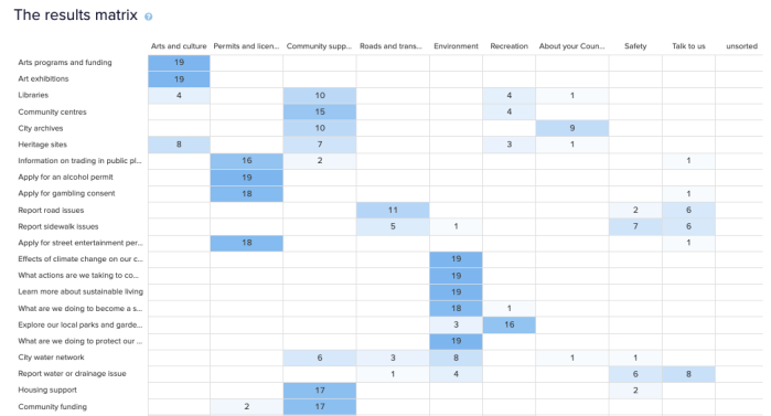
When a card is placed in one category significantly more than any other, you can be confident that the information should be in that category in your eventual IA.
When a card is placed in one category more than others, but still appears, say, at least five times in any other category, your decision about where to include the information on your actual website will be less straightforward. It will be up to you what your number thresholds are. Remember that being an information architect is a blend of science and art. As Donna Spencer says: ‘…Follow your instincts, take some risks, and try new approaches.’
Sometimes you’ll see a card row that contains numbers in every column and not much blue shading. When you see this, there’s not much agreement between your participants about where the information belongs.
It may be that the card label is quite general, and could logically belong in many of the categories. Or that the card is ambiguous, and so people had to guess about where it belonged. It will be up to you to establish why this might be.