New release: Transform videos into powerful insights with Interviews!
Learn more
Affinity mapping is a flexible and visual way to quickly group, organize and make sense of your data. Think in-person post-its and whiteboards, or digital whiteboard tools.
All your observations are stored post-session, you can group similar ones in the affinity map and give them labels, and easily see your tags and titles of your groups, or ‘themes’.
When you first land on the affinity map, the canvas will be blank and all your observations and their metadata (tags, segments) will be in the list on the left hand side.

How to read, edit and group observations
Your observations are shown in detail on the card list, allowing you to read and review all your observations one-by-one. As you go through them, you can move them from the card list to the board to form groups.
To edit an observation, simply click into it and make changes.
To make sense of your data, move observations that relate to a similar concept into the same group. This will create a visual representation of different themes within your data.
You don’t have to get everything perfect in one go. Affinity mapping is a very flexible method, and we encourage you to go through the grouping and refinement in iterations.
You can start by creating a few groups first, and then splitting them or combining a few of them later. However, tidying up the groups by adding titles and aligning them neatly as you go makes it easier for you to revisit your groups further down the track.

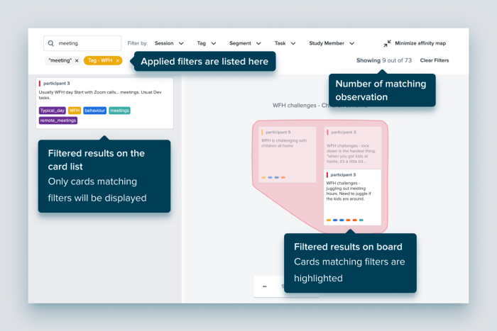
Use search and filter to narrow down relevant observations
Use the search functionality to quickly narrow down observations based on keywords and use filters to help you look at small sets of data. You can filter by segments, research questions/tasks, participants, or tags.
When filters are applied:
Collaborating with team members
The affinity map was built to support collaborative analysis. Your team members can edit, group, label and comment on all observations alongside you in real-time.
When there are multiple people in the affinity map, you’ll each see where the other’s cursor is and if you’re working on a particular group or observation, it will be locked until you finish with it, ensuring that there’s no double ups.
What is the table view?
Once you’ve grouped your observations on the affinity map, you can view them all on the Affinity map groups table to get a clear view of all the groups and sort them by relevant stats. The numbers under the ‘Sessions’, ‘Observations’ and ‘Tags’ columns help you quickly gauge how significant each group is, based on the frequency of unique sessions referenced, as well as total observations included.
You can click on an observation group to view more details, including the observations, sessions (usually the participants), tags and tasks that are associated with this group.
This makes it really easy for you to review the groups, and decide if the title reflects the observations they contain. It also makes it faster for you to retrieve an observation or quote related to a group.

Ordering groups and using filters
Affinity map groups are listed alphabetically by default, if you want to see how frequent a group was referenced by different participants, you can order the list of groups with the number of sessions/participants. Simply click on the arrows next to the Sessions label.
You can also sort them by other associated metadata, such as the number of observations, and number of tags as well.
You can use filters to narrow down groups to find the ones that are associated with certain attributes, such as a specific tag or segment.
