Introduction to card sorting

Remember that you are the one who is doing the thinking, not the technique… you are the one who puts it all together into a great solution. Follow your instincts, take some risks, and try new approaches.
Donna Spencer (the creator of the card sorting methodology


Card sorting is a research technique that helps you discover how people understand and categorize information, and ensures you create an information architecture that matches users’ expectations. In a card sort, participants sort labeled cards into groups. You can then use the results of your participants’ card sorts to give you ideas about how to group and label the information on your website* in a way that makes the most sense to your audience.

Card sorting is useful when you want to:

  • design a new website or section of a website, or improve an existing website
  • find out how your customers expect to see information or content grouped on your website
  • discover and compare how people understand different concepts or ideas
  • get people to rank or arrange items based on set criteria.

*We’ve used the word ‘website’ here and throughout this guide, but you could be organizing information in an app, an intranet, a TV program guide, a form, a board game or anything where information might be organized in a structure to make sense.

What does card sorting look like?

Card sorting involves creating a set of cards that each represent a concept or item, and asking people to group the cards in a way that makes sense to them.

Let’s say you’re working on redesigning a city council website and you want to understand how your users categorize the different content and information that will be on the site. You’ll add in a bunch of cards (these could be text or images, but more on that later) which will look like this in setup:

And look like this to your study participants:

What kinds of card sorting are there?

There are three approaches to card sorting: open, closed and hybrid. Which approach you use will depend on what you want to find out. We’ll go into further detail on each method below, but here’s a high-level introduction to how they work:

  • Open card sort: Participants sort cards into groups that make sense to them, and label each group themselves
  • Closed card sort: Participants sort cards into groups you give them
  • Hybrid card sort: Participants sort cards into groups you give them, and can create their own groups as well.

When should I do a card sort?

Card sorting is most useful when you’ve already got the information or content you need to organize, but you’re just not sure exactly how to organize it.

Using the city council website as an example, you want to redesign how information is grouped together across the entire site. Card sorting will help you discover where people would commonly expect to find a category on your website.

You simply present them with a list of cards containing the names of items, concepts or labels and have users sort them into groups that make sense to them.

While card sorting is typically used in the early stages of the design process, when there’s no fixed information architecture (IA), it’s also common to use the technique to make changes to an  IA, later down the line.

Card sorting techniques and when to use them

The three card sorting techniques — open, closed, and hybrid — will each tell you something different about how people understand and group your information. Choosing the right technique at the right time is key to gathering high-quality, relevant data to inform your design decisions.

It’s also the best place to start. Let’s take a deep dive into each of the card sorting methods…

Tree testing overview

Tree testing is a fast and powerful means to test the navigation tree of your website or app, or even test new tree structures you are trying out. A tree test can tell you how easy key information is to find in your website or app and even where people get lost.

Visitors to your website or app rely on your information architecture (IA) — how you label and organize your content — to get things done. So for them to be successful in finding what they’re looking for, your IA needs to work the way they expect it to.

Tree testing can answer questions like:

  • Do my labels make sense to people?
  • Is the way my content is grouped logical to people?
  • Can people find the information they want easily and quickly? If not, what’s stopping them?

What does tree testing look like?

Tree testing has two main elements: your tree, and your tasks.

The tree is a text-only version of your app/website structure (similar to a sitemap). You create a series of tasks for your participants to complete that have them nominating locations in the tree where they expect to find the answer to the task (‘I’d find it here.’) The participant’s success rate and the time taken to reach the destination are recorded and analyzed to identify any issues with the site or app’s structure and navigation.

You’ll learn:

  • how many people reached the right destination, and how many didn’t
  • how many people got lost along the way
  • the paths people took before they landed on their intended destination
  • how long it took people to complete the task.

Let’s say you work for a bank and you’re testing out the website experience for customers. You want to make sure they can easily find the things they need when accessing the site.

Your tree might look like this:

Which in Treejack will look like this:

You might write a task like this:

Your credit card has gone missing. What do you do?

Participants will be presented with the task, and see the top level of the tree:
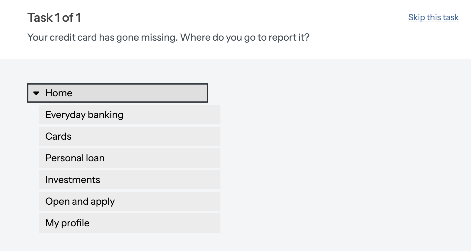
They will click through the tree until they think they’ve completed the task:

Once your participants have completed the tree test, you’ll have a bunch of data from which you can pull valuable insights. You can use these insights to confirm all, or part of, your current IA, or give you ideas about how to restructure your IA to better support users.

When should I conduct a tree test?

Tree testing is useful whenever you want to find out if the labels and structure of the information on your website, intranet, or app are easy to understand. You can get valuable insights at all stages in the design process, whether you’re starting from scratch or making a few tweaks to a current website.

You can test large website structures (with 10+ levels and 1000s of labels, for example), small structures (with three levels and 20 or so labels, for example), and any size in between. You can set up one or two large studies, or you can run multiple smaller studies at the same time. You can write one task, or more. You can recruit fewer people, or more. The potential to gain useful insights from tree testing is endless.

Regular and often


One thing that we hear from customers is that over time, an IA can go ‘stale’. This is particularly the case as links are added or existing links are amended, but can also be the result of customers’ understanding changing with prevailing knowledge and understanding. Regular benchmark tree testing is a ‘non-invasive’ and simple to run means to check the health of your IA.

Plan your study

Before you get started on building out your tree test, It’s a good idea to set up your study objectives. The clearer you are about your reasons and goals for the study, the more relevant and effective your results will be.

Establish what you want to test and improve

Be specific about the information architecture you want to test.

Do you want to test and improve a whole website, or just parts of it? Do you have one structure to test, or four variations to compare? Do you want to test your whole website in one go, or create a separate test for each part? Are you working on a complete overhaul, or just tweaking the information in one category?

Be clear and specific about exactly what you want to uncover with tree testing.

Establish who you’re improving your IA for, and why

Ultimately, it’s your users who will benefit from all the work you’ve put into testing your IA. So it’s crucial you establish who your intended users are before you get started. You’ll also find it easier to recruit suitable participants if you have a specific audience in mind before you start.

Perhaps you have access to a collection of customer personas, or data on the exact demographics of the people who visit your website or use your product. You might have a vague idea of who you’re designing for, and a few questions as well. The more you can find out before you build your tree test, the better.

As well as knowing your audience, knowing why you’re improving your website or product will give you confidence in building out a successful study. You’ll get answers to your ‘why’ from things like analytics, repeated support queries, customer support tickets, customer studies, user interviews, stakeholder feedback, client specifications, and so on. Think of the ‘why’ as your evidence — your justification for why tree testing is necessary.

Incorporate tree testing into your project plan

Think about when tree testing would be the most useful for you as part of the wider design project you’re working on. Running tree tests at critical stages of your project will give you a whole series of results visualizations and benchmarked data to compare, use to make informed design decisions, and present as progress and return-on-investment reports to stakeholders.

If you’re improving a website that already exists, running a tree test to start with will give you insight into what works and what needs work. Furthermore, starting with a tree test will also give you a clear, quantifiable benchmark for you to improve on in your iterations. If you test your first tree with eight tasks, and then test your revised tree with the same eight tasks, you’ll be able to pinpoint exactly if or how your changes have improved the findability of your information.

If you’re creating a new design, run an open card sort first to generate ideas for categorizing your content and labeling these categories. Use the results of the card sort and your site requirements to build out a draft information architecture. Then run a tree test to see how it performs based on common user tasks.

If you have more than one potential design, test them all with tree testing instead of putting all your effort into trying to perfect just one. We always recommend testing more than one version of your tree when starting out; you’ll get ideas and inspiration from each tree that you test that can help you craft the ‘best of all’ trees, removing or refining the labels and groupings that might confuse people.

Introduction to card sorting

Remember that you are the one who is doing the thinking, not the technique… you are the one who puts it all together into a great solution. Follow your instincts, take some risks, and try new approaches.
Donna Spencer (the creator of the card sorting methodology


Card sorting is a research technique that helps you discover how people understand and categorize information, and ensures you create an information architecture that matches users’ expectations. In a card sort, participants sort labeled cards into groups. You can then use the results of your participants’ card sorts to give you ideas about how to group and label the information on your website* in a way that makes the most sense to your audience.

Card sorting is useful when you want to:

  • design a new website or section of a website, or improve an existing website
  • find out how your customers expect to see information or content grouped on your website
  • discover and compare how people understand different concepts or ideas
  • get people to rank or arrange items based on set criteria.

*We’ve used the word ‘website’ here and throughout this guide, but you could be organizing information in an app, an intranet, a TV program guide, a form, a board game or anything where information might be organized in a structure to make sense.

What does card sorting look like?

Card sorting involves creating a set of cards that each represent a concept or item, and asking people to group the cards in a way that makes sense to them.

Let’s say you’re working on redesigning a city council website and you want to understand how your users categorize the different content and information that will be on the site. You’ll add in a bunch of cards (these could be text or images, but more on that later) which will look like this in setup:

And look like this to your study participants:

What kinds of card sorting are there?

There are three approaches to card sorting: open, closed and hybrid. Which approach you use will depend on what you want to find out. We’ll go into further detail on each method below, but here’s a high-level introduction to how they work:

  • Open card sort: Participants sort cards into groups that make sense to them, and label each group themselves
  • Closed card sort: Participants sort cards into groups you give them
  • Hybrid card sort: Participants sort cards into groups you give them, and can create their own groups as well.

When should I do a card sort?

Card sorting is most useful when you’ve already got the information or content you need to organize, but you’re just not sure exactly how to organize it.

Using the city council website as an example, you want to redesign how information is grouped together across the entire site. Card sorting will help you discover where people would commonly expect to find a category on your website.

You simply present them with a list of cards containing the names of items, concepts or labels and have users sort them into groups that make sense to them.

While card sorting is typically used in the early stages of the design process, when there’s no fixed information architecture (IA), it’s also common to use the technique to make changes to an  IA, later down the line.

Card sorting techniques and when to use them

The three card sorting techniques — open, closed, and hybrid — will each tell you something different about how people understand and group your information. Choosing the right technique at the right time is key to gathering high-quality, relevant data to inform your design decisions.

It’s also the best place to start. Let’s take a deep dive into each of the card sorting methods…

Build your tree

As noted, your tree is a text-only version of your app/website structure. Your category labels (first level, second level, and so on) are known as ‘parent nodes’, and your information labels – the bottom leaves of your tree –  are known as ‘child nodes’. In this example, ‘Meal options’ and ‘Home meal packs’ are parent nodes and ‘Meals for 2 People’ is a child node.

If you don’t already have access to a sitemap, you can build the tree from the labels and structure of your website. Either way, here are some top tips for getting your tree right.

Decide what to test

A tree test will give you data on a specific section of your website. If you want to test your whole website, your first label might say ‘Home’, and the next level labels will represent the links on your homepage:

And if you want to test one particular section of your website instead of everything, your first label will act as your ‘homepage’, and your next level labels will represent the main links on that page.

For example, below we only wanted to test the labels and categories within the ‘Open and apply’ selection. So ‘Open and apply’ would act as your homepage in this instance.

Create or import your tree

There are two ways you can build your tree in Treejack: create it in a spreadsheet then import it into the tool or build it directly in Treejack.

Creating your tree in a spreadsheet and then importing it to Treejack is a simple way to build the tree you want to test. You may already have access to a spreadsheet sitemap if you’re improving an existing website. Having your tree on a spreadsheet will make testing different versions of the same tree quick and simple. Read more about importing a spreadsheet here.

You can also easily build your tree straight into Treejack. You might find this useful if you’re creating a brand new structure to test, or making small changes to a tree you’ve already built. You can then download a CSV file from Treejack so you have a spreadsheet copy of your tree as well. To retest the same tree, simply duplicate the first test and make any changes in the new study before relaunching.

Running multiple tests at once

As noted, if you are improving your tree, we recommend running more than one tree test at a time. The two trees should contain navigation differences that reflect different hunches that you have. How your users respond to each of the trees will give you valuable insights into how any final tree should be structured.

The simplest way to run two tests is to create one test, including all of the introductory questions, tasks, branding and so on, and then duplicate that test, replacing the tree with the second tree that you wish to test. Both tests now have identical tasks and set-ups so you know that you are legitimately testing the differences between the two trees.

There’s an answer for everything


Tree testing assesses how easily people can find information on your tree, so each task you ask participants to complete will need a correct destination. This destination will be a ‘child node’, and will represent the information you want your website visitors to be able to find easily.

As Dave O’Brien, a key player in creating Treejack points out, “any implicit in-page content should be turned into explicit topics in the tree, so that participants can ‘see’ and select those topics.” For example, you might have a long-scrolling page labeled ‘About our company’ that has three types of information on it – ‘Our services, ‘Our clients’, and ‘Our location’.

If someone visited your actual website to find out where your office is, for example, they’d only need to click ‘About our company’ and scroll the page to see the information they wanted under ‘Our location’.

To test this as a task in Treejack, your tree would have ‘About our company’ as a ‘parent’ node, and the three elements of information as ‘children’. You would then select ‘Our location’ as the correct destination. In setup, it would look like this:

And your participants would see it like this:

They would be able to select ‘Our location’ to complete the task successfully:

Exclude labels like ‘Contact us’ and ‘Search’


You want to test the findability of your information, so exclude labels from your tree that participants might select as an easy way out of finding the actual answer. Labels like ‘Contact us’, ‘Help’, and ‘Search’ are useful options for people when they use your actual website, but if people select these in your test you won’t be able to infer anything from the data.

Getting the labeling and hierarchy of your content right will reduce the need for people to contact you or use the search function, so that’s something to keep in mind as well.

What about ‘footer’ links?

One of the key principles of tree testing is that it removes the navigation design detail from your test. Users don’t know whether, in the live site, the link they are seeing in your tree is twice as big as other links and in bright pink text – or not. This is deliberate. Tree testing is testing the findability of content in your tree based upon the labels and their arrangement in a hierarchy. Later on, you can test the relative attractiveness for clicks of elements in the page using a Chalkmark click test.

One issue we often get asked about is how to reflect the difference between footer links and other links. You have some choices here;

  • If the footer links are completely different from the main top level links, you can just have them all appear at the same level in your tree test, probably as the last links in the tree.
  • Often, footers repeat some of the main navigation. Again, you have choices; exclude the repeated links and add the remaining links at the same level as the other top level labels. Alternatively, if you are interested in being more deliberate about these being recognised as footer links, you can create a parent node called ‘Footer’ and then place all of the links below that. This can be useful in identifying if users expect the links to be in the ‘main nav’  or the footer.

Write your tasks

Getting your tasks right is vital for gathering useful data. To select tasks, start with the test objectives that you identified earlier on in the process. These objectives will have determined the tree you are testing and they should likewise determine the tasks you set.

Tasks should cover the breadth of the tree that you present to users. There is a risk that, if you present a broad tree to users but only test a few branches, you risk confusing users, or leading them to false assumptions.

In writing your tasks, you want them to reflect how your users might naturally approach your website. You also want to make sure you don’t give the answer away by using the same language that’s in your tree labels.

How to write a task

Take the evidence you gathered when setting your objectives, and write tasks that enable you to improve each one.

For example, you work for a bank and your contact center has had a lot of calls from customers asking where to find ‘Form X’ on the website. You’d then create a task like ‘You need to complete X application, and you want to know if you can do this online’ to garner the following insights:

  • how many people actually found Form X
  • how long it took them to find it
  • the path they took, and whether or not they had to click back up the tree.

You want your tasks to mimic the thought a person might have when they visit your website. So write in a natural, plain English style, and introduce a hypothetical scenario for people to bring to mind.

So instead of writing ‘Click where you think you’d find our office’ you would write ‘You’ve booked a meeting with one of our staff, and you want to find out where to go.’ Keeping the tone conversational will make the task less ‘Click the thing’ and more ‘Find the right thing’.

Use different phrases or words than your tree


People will take whatever language clues they can get from your task to make it easier for them. So if you have the phrase ‘application form’ in your tree, don’t use that phrase in the corresponding task. Why not?

Two reasons:

  1. People who select the correct destination might just be matching the phrases. Pattern matching is quite easy for humans (we’re good at it) and it doesn’t require interpreting and acting upon the task.  So if this task scores highly, you can’t infer a lot from the data.
  2. It’s very difficult to know exactly what people have in their minds when they arrive on your website and almost impossible for our labels to mimic the language each of our users have when they visit our websites.

An example of #2 would be:

Let’s say you have a link on your website labeled ‘Application form for credit card’. And three people see that link and think ‘Yes, that’s exactly what I need!’. Those three people could have had the following three questions or tasks in their minds:

  • What do I have to do to get approved for a credit card?
  • Can I send them my information online, or do I have to call them?
  • What kind of evidence do I need so I can apply for a credit card?

Therefore express the task you intended, rather than asking users if they can find a link with the same name as the task.

Set a maximum of 10 tasks per tree test


Each task will give you data on a different part of your tree, so match the number of tasks to the parts of your tree you want to test. And, as each task is scored individually, you can have as few as one task if you have one specific part of the tree you want to test.

We recommend a maximum of 10 tasks per tree test for two reasons:

  1. More tasks might mean fewer participants complete the entire test
  2. You run the risk of people becoming too familiar with your tree, which would bias the results for your later tasks.

If you do set more than eight or so tasks, we recommend selecting the option to randomize the order the tree is presented to people. Then for each task, people will see the labels arranged in a different order.

You can also randomize the order in which tasks are presented to participants. Generally, we recommend this option is ticked for most studies as it reduces the effect of learning part of the tree, at least spreading this bias out across the whole tree as presented.

If you want to gather more data from a test on the same tree, you could set up a separate test and either recruit different participants, or ask the same people after some time has passed.

The suggested task limit means that larger trees – for example, government or educational websites, might need to be tested in parts. In order to limit the size of the tree being tested to something appropriate, you can either trim off branches at the top level, or trim off lower branches and leaves.

Selecting correct destinations

Tree testing helps you discover if people can find information in your website structure, so every task needs at least one correct destination. If you’re tree testing a large website, particularly one that’s been updated haphazardly over the years, you’ll probably find that information is repeated on different pages, and so you’ll need to select more than one correct destination. Go through the tree thoroughly to make sure you get them all.

You can’not select category labels (or ‘parent nodes’) as correct destinations because although we do want to know if our category labels make sense, we ultimately want to know if people can navigate the labels to find the right information. You will be able to check if your category labels help or hinder your participants finding the correct destination in the analysis breakdowns , such as ‘First click’. Alternatively, trim the lower branches and leaves off your tree and see if users can correctly identify category labels as being the ‘answers’ for your tasks.

The destinations selected by your participants can give you good insight into the effectiveness of your information architecture and show you areas that need improvement. For example, if you find there’s a high percentage of incorrect destinations it means that participants are feeling confused or unsure of where to find what you’ve asked them to look for.

If there’s a high percentage of correct destinations, that shows that your tasks and tree are well understood.

Recruit participants

The quality of your participants is an important thing to consider when you start recruiting. You want people who are as close to the right demographics as possible, and willing to take the activity seriously.

Recommended number of participants

Ideally you’ll have around 50 participants complete your tree tests so that you can see trends clearly and account for variations and outliers. In Tree testing, the more participants you get, the more confident you can be in the accuracy of your quantitative data.

However, you can still get plenty of useful insights with fewer participants, so even if you only have a limited number of participants, running a tree test is still worthwhile.

How to source participants

You can recruit participants in a bunch of different ways, and how you do so will depend on a few different factors. If you have access to a pool of participants (like employees if you’re working on an internal product, or your customer mailing list) then sending them an email invitation, along with an incentive or chance to win a prize, can be a useful way to get responses. Similarly, you could invite people via your social media channels or add banners to your website.

Keep in mind that if people don’t receive an incentive or are not obligated to participate, you’ll need to invite a whole lot more people than your minimum required.

If you’re recruiting participants via the above sources, we always recommend using a screener survey to make sure you only receive responses from participants that meet your criteria. You can read more about creating a screener survey here.

You can also make use of high-quality recruitment panels, which can be effective if you want fast, pain-free recruits with minimal effort. You can recruit participants from quite specific demographics, and be confident that the participants will take your study seriously (they are getting paid, after all).

After you’ve launched your tree test, you’ll be given the option to recruit participants via our integrated panel from within your Optimal Workshop account. You’ll then enter your required demographics and be presented with a quote based on the types of participants and the complexity of your study. After hitting 'place order’, you can sit back and watch the results come in while you get on with other work.

Write clear instructions and expectations

Tree testing is a new concept and activity for many people, so it’s important your instructions are clear and concise. Treejack comes with default instructions that we’ve found are easy for people to understand, but you can tailor them to suit your own participants or the particular features of your tree test. You can do the same thing with the text you write in your invitation email or social posts.

Managing participant expectations will reduce abandonment rates because people will know what they’re in for before accepting. If you say an activity will take five minutes at the most, people will take that quite literally. Offering an incentive is a good way to let your participants know how much you value their contribution, as well as ensuring they are committed to completing the whole study.

Introduction to card sorting

Remember that you are the one who is doing the thinking, not the technique… you are the one who puts it all together into a great solution. Follow your instincts, take some risks, and try new approaches.
Donna Spencer (the creator of the card sorting methodology


Card sorting is a research technique that helps you discover how people understand and categorize information, and ensures you create an information architecture that matches users’ expectations. In a card sort, participants sort labeled cards into groups. You can then use the results of your participants’ card sorts to give you ideas about how to group and label the information on your website* in a way that makes the most sense to your audience.

Card sorting is useful when you want to:

  • design a new website or section of a website, or improve an existing website
  • find out how your customers expect to see information or content grouped on your website
  • discover and compare how people understand different concepts or ideas
  • get people to rank or arrange items based on set criteria.

*We’ve used the word ‘website’ here and throughout this guide, but you could be organizing information in an app, an intranet, a TV program guide, a form, a board game or anything where information might be organized in a structure to make sense.

What does card sorting look like?

Card sorting involves creating a set of cards that each represent a concept or item, and asking people to group the cards in a way that makes sense to them.

Let’s say you’re working on redesigning a city council website and you want to understand how your users categorize the different content and information that will be on the site. You’ll add in a bunch of cards (these could be text or images, but more on that later) which will look like this in setup:

And look like this to your study participants:

What kinds of card sorting are there?

There are three approaches to card sorting: open, closed and hybrid. Which approach you use will depend on what you want to find out. We’ll go into further detail on each method below, but here’s a high-level introduction to how they work:

  • Open card sort: Participants sort cards into groups that make sense to them, and label each group themselves
  • Closed card sort: Participants sort cards into groups you give them
  • Hybrid card sort: Participants sort cards into groups you give them, and can create their own groups as well.

When should I do a card sort?

Card sorting is most useful when you’ve already got the information or content you need to organize, but you’re just not sure exactly how to organize it.

Using the city council website as an example, you want to redesign how information is grouped together across the entire site. Card sorting will help you discover where people would commonly expect to find a category on your website.

You simply present them with a list of cards containing the names of items, concepts or labels and have users sort them into groups that make sense to them.

While card sorting is typically used in the early stages of the design process, when there’s no fixed information architecture (IA), it’s also common to use the technique to make changes to an  IA, later down the line.

Card sorting techniques and when to use them

The three card sorting techniques — open, closed, and hybrid — will each tell you something different about how people understand and group your information. Choosing the right technique at the right time is key to gathering high-quality, relevant data to inform your design decisions.

It’s also the best place to start. Let’s take a deep dive into each of the card sorting methods…

Results overview

Once your data starts rolling in, you’ll see it presented in a series of tables and visualizations in the Analysis tab. The results are designed to give you quick, actionable insights as well as enabling you to delve deeper into the data.

Tasks are scored individually, so after reviewing the overall results and assessing the validity of your participants, you’ll find it effective to analyze tasks one-by-one.

Under the Results tab, you’ll find the Overview and Analysis tabs.

The Overview tab is a good place to start your analysis. It tells you the high level, need-to-know information about your tree test. It updates in real-time so you and anyone you’ve shared your results with can see progress in terms of participants, scores, and time taken.

Under the tasks section, you’ll see an overview of the overall Success and Directness scores.

The success score shows the average percentage of participants who landed on the correct destination across all tasks. So, in the below example, we can see that an average of 87% of participants ended up at the correct destination for all tasks.

Keep in mind, the success score doesn’t take into account the path users took to get to the correct destination. That’s where the directness score comes into play.

The directness score is the average percentage of participants who selected a destination without backtracking across all tasks. In the image below, we can see that an average of 80% of participants reached the correct destination via the correct path.

Using the success and directness scores together can give you a clear view of how well your tree structure works. If you have a high success score, but a low directness score, that may mean that participants knew what they were looking for but couldn’t find it easily – they may have navigated down a couple of wrong paths before finding the correct one. This means you might want to re-look at your categories or parent and child nodes to make sure that they clearly lead to the correct destination. We’ll go further into this shortly.

Next you’ll move into the Analysis tab which is where you’ll find all of that juicy data.

Participants and Questionnaire

Participants

The Participants table displays useful information about every participant who started your tree test, and can be used to clean and filter your tree test data.

It’s a good idea to take some time to review the table before you start your analysis. This will give you a better understanding of which participants you want to include in your results.

You can sort the table according to ‘time taken’, and exclude participants that you think finished the tree test too quickly – this could mean these participants may not have read the tasks properly and just clicked around the tree without thinking, which will skew your data.

You might also want to sort the table by ‘tasks successful’ to see which (and how many) participants have a success rate of 50% or less in completing the tasks. This will give you insight into patterns of unsuccessful tasks, meaning they’re unclear or your tree needs to be iterated.

Participants who fail to complete all tasks are automatically excluded. However, if you consider their completed or incomplete tasks to be useful, you can still include them. You have control over who to include and exclude.

You can also use this table to select and reload results based on answers to questionnaires, or based on identifiers you’ve requested. You can do this any time during your analysis.

Tip: If you used our in-app recruitment tool, you can easily replace study participants should you need to. Read more about replacing participants in-app and our participant response flagging feature here.

Questionnaire

If you have a screener survey or pre or post-study questions, the results will show up in the Questionnaire tab.

Similar to the Participants tab, this is helpful if you want to filter and view participants by their response to a particular question. This is useful for understanding any patterns of a particular type of participant or demographic.

Task results tab

The Task results tab is where you can pinpoint the most significant results using the task, pietree and task comparison visualizations.

Let’s take a look at how to interpret the different parts of the Task results tab.

Success score

This is the total percentage of participants that navigated to the correct destination.

You can see this in the success score bar on the right hand side and divided into green and purple in the pie chart on the left (we’ll get into the meaning behind the colors soon).The black line with end bars on the success score is called an error bar. The error bar indicates the confidence in the success score. When you have only a handful of participants the error bar will likely be large. Lots of results for a task will reduce the bar to something very short. We use the Adjusted Wald method to calculate the error.

The overall success score is then divided, on the pie chart, into direct success and indirect success.

This is the number and percentage of participants who navigated to the correct destination via the correct path. In the example above, you can see that 71% of participants navigated to ‘Make extra payment’ (the correct destination) via the path we defined as correct (Home > Personal loan > Make extra payment). A high direct success percentage means that your labels are clear and make sense.

Indirect success (purple)
This is the number and percentage of participants that landed on the correct destination, but didn’t get there via the correct path. For example, we can see that 14% of participants ended up on ‘Make extra payment’, but they started down another path before realizing it wasn’t correct and backtracking. If the indirect success percentage is high, it means that participants know more or less what they’re looking for, but they don’t immediately spot a path to get there.

Directness

This is the total percentage of participants who took the correct path to land on the correct destination, i.e. they didn’t move back through the tree at any point.

The higher your directness score, the more confident you can be that your participants were sure of their answers – they knew what you wanted them to find and exactly how (and where) to find it.

Comparing the success and directness scores


Looking at these two scores together can give you good insight into the clarity of your paths and destinations. For example, if you have a high success score but a low directness score, this might mean that your participants know what they’re looking for but are starting down the wrong path to find it. In this case, it’s a good idea to look deeper into the exact paths they’re starting down and where they’re backtracking.

Sometimes we see a particular category attracting lots of wrong clicks. Dave O’Brien, who was one of the creators of Treejack, once described these ‘wrong’ categories as ‘evil attractors’ and the name stuck. No matter what task you set, users seem to assume that the answer is inside the ‘evil’ category. Often these categories have such nebulous, mean-nothing names that users read whatever they want from them and assume what they are looking for must be in there. Work really hard to rid your structures of evil attractors! Conversely, there may be ‘saintly repellers’ – these are the correct categories that users never pick, or pick only after looking in pretty much every other category. In either case, think carefully about the label you have given that category that appears to be attracting the wrong clicks or repelling correct clicks.

Time taken

This is the average amount of time (in seconds) it took participants to complete the task. This is the ‘median’ time and is represented by the line in the middle of the light blue box. Outliers greater than four standard deviations from the mean have been removed for the purposes of these calculations.

Using the ‘time taken’ measurement is helpful when you’re A/B testing. It can clearly show you if it’s taking participants longer to find a destination in one tree or another.

Overall score

This is the weighted average of your success vs. directness score for each task. Basically, if your overall score is less than 7, you might like to dive a little deeper into the success and directness scores to see how they compare to each other. It could be that the success score is high, but the directness score is low, meaning it’s a good idea to go back over your labeling, paths or tasks.

Failure score

This is the percentage of participants who nominated an incorrect destination.

If there are a number of participants who failed to find the correct destination, dive deeper into this data. If they didn’t go to the right place, where did they go? It’ll give you insight into whether or not your IA is confusing for people.

Direct fail (red)
This is the number and percentage of participants who navigated down a direct (or singular) path to an incorrect destination. This could tell you there are multiple places in your tree where participants believe they could find what they’re looking for, or there may be some confusion around labeling.

Indirect fail (orange)
This is the number and percentage of participants who started down a path, backtracked, then navigated down another path and still landed on an incorrect destination. Indirect fails are usually a sign of true confusion – the participant wasn’t really sure what they were looking for or where to find it, even after trying multiple paths.

Skip score

This is the percentage of participants who clicked skip on a task before they selected a destination. When setting up your study, you can disallow participants from skipping tasks (Setup/Tasks/Options)

Direct skip (dark gray)
This is the number and percentage of participants who clicked the ‘skip’ button without even engaging with the tree. This is a good indicator of whether or not your tasks are clear and concise enough. If there are a number of direct skips on a particular task, perhaps people are unsure of what you’re asking of them and don’t feel confident navigating through the tree.

Indirect skip (light gray)
This is the number and percentage of participants who began to navigate through the tree before clicking the ‘skip’ button. This may indicate that once they got into the tree, they felt unsure of where to go next. Perhaps they didn’t see the type of labeling they expected or felt confused by what the tree displayed in comparison to what the task required of them.

Comparing tasks

Testing and comparing multiple variations of trees will help you nail down an effective navigation structure before you implement it, saving time and costly mistakes. Use the task comparison function to compare the same task across two different tree tests. This will show you quickly which tree is more findable and what areas might need to be improved.

Click the ‘Compare tasks’ button on your chosen task. Then select the study and task you want to compare it to. You’ll then get a clear view of which tree performed better.

In the example below, we’ve compared task 2 of two different Treejack iterations. You can see that the second tree test performed better, and participants were more likely to find the correct destination (though there is still room for improvement, as there is a big portion of indirect success).

Interpreting the pietree

The pietree gives you an interactive, holistic view of your participants’ journeys for each task. There’s a lot that pietrees can tell us.

The first thing to do is to review the overall size of the pietree. Is it big and scattered with small circles and lots of lines? Is it small with large circles and not so many lines? Does it look like a many-legged spider or does it look like a stick insect!? Or is it somewhere in between? The overall size of the pietree can provide insight into how long and complex your participants’ pathways to their nominated correct destination were.

Let’s take a look at the pietree below, from our banking website tree test.

The task was: The bank lent you some money a year ago to help you buy a new car. You just got a bonus from work and want to put it towards this debt. Where would you go to do this?

The pietree is fairly small with big circular nodes – these are the parent and child nodes added to the tree when you set your study up. There’s also a thick green line leading from the home page node to the correct destination node. This tells us that participants followed a direct pathway to the correct destination (the one that you set as correct).

You want your participants to be able to reach their goal quickly and directly without navigating down other paths. Using this pietree as an example, we know that most of our participants had no issues navigating to the correct destination, via the correct path. Therefore, we can be confident that our IA for this particular task is clear.

You’ll notice there are some thinner lines branching out to smaller nodes, we’ll talk about that in the example below.

Now let’s look at another pietree.The task was: You’re about to go on holiday and want to make sure you’re covered financially if anything bad happens. How would you start the process of doing this?

This pietree is bigger with paths and nodes scattered off in all directions. It shows us that participants took a lot of indirect or winding paths to end up on both correct and incorrect destinations, as well as starting down a certain path then immediately backtracking.

This can indicate that people felt lost or confused when trying to complete the task. It’s shown with red (an incorrect path), blue (the participant has backtracked) on the nodes of the tree, and gray lines leading to smaller yellow nodes (what they’ve nominated as the correct destination).

We can see that, from the offset, participants were confused about where to go and there were a few false starts. The image below shows us that 59.5% of participants started down the wrong path and either continued down that path and nominated an incorrect destination, or they backtracked to go down the right path.

This tells us that perhaps we need to do a bit of work on our top level labeling to ensure participants can confidently navigate to where they’re meant to go.

Example of a high-scoring task and Pietree

In this example, we can see that 95% of participants selected the correct destination and 75% of them navigated down the correct path to get there. That means most of the participants understood the IA correctly.

However, even when the success score is high, it’s still worth delving into the directness score and looking at the 20% of participants who clicked back through the tree before landing on the correct destination (indirect success). Seeing which paths they started down in the pietree can give you insight into whether or not your node labels are completely clear and understandable.

The green circles (nodes) and lines tell us instantly that most people went directly to the right destinations. In this example, there are two green lines leading to two yellow circles – this is because the task had two correct destinations on the tree.

You can see that the path Home > Open and apply > Bank accounts > Open a joint account was far more popular than the other path. While both destinations are correct, participants obviously felt more confident they’d find the answer to their question down one path more than the other.

There’s also a couple of nodes that aren’t completely green. Take ‘Everyday banking’, this shows us that 4 of the 6 participants that landed on this node clicked back, meaning that they didn’t think they’d be able to open a joint bank account if they kept down that path.

You can see in ‘Bank accounts’ that there’s some red. This means 2 out of 20 participants went down an incorrect path (in this case, ‘Open a checking account’), with one nominating it as the correct destination and one clicking back to ‘Bank accounts’ to right themselves.

This is a good opportunity to delve into why these participants thought they’d be able to open a joint account here and re-look at your labeling or paths.

Example of a low-scoring task and Pietree

We can see that while the success score was 70%, the directness was only 55%, giving an overall score of 5/10. On top of this, it took participants an average of 18.45 seconds to finish the task, which is a long time given the speed with which we generally navigate through a website.

We need to delve into:

  1. Why 30% of participants failed to select the correct destination
  2. Why 25% of the participants who successfully selected the correct destination did so indirectly.

To understand this, we need to look at the paths they took (their first clicks, when they went back up the tree, and so on) and their destinations (the answers they incorrectly nominated as correct). We can find out more about these things on the pietree, as well as the Paths, First click, and Destinations tabs.

The pietree tells us instantly that people nominated multiple different destinations as correct. The branches going out in every direction tell us that people were clicking all over the tree. The gray in the nodes tell us that people got partway down a path before backtracking to go down another path. The small yellow nodes tell us that a number of participants thought they’d find what they were looking for here.

There are two things to look at here. First, is it possible that the task was unclear? The task was meant to encourage them to apply for travel insurance, but looking at some of the nominated correct destinations (‘Manage your cards’ and ‘Report card lost or stolen’), we can infer that some people perhaps thought the task was more along the lines of losing your card or money on  holiday.

Second, despite the potential confusion of the task, there’s still a number of potential starting points for improving this IA. Keep it simple and start with the big numbers. Looking at the red in the ‘Home’ node, we can see that 58.3% of people started down the wrong path.

This indicates that, for this task, people were confused by our second-level labels. If we look back at our tree (and the options that caused so much confusion for people), we can see the exact labels that need work.

Take what you’ve learnt from this task result and pietree and use it to iterate on your second-level labels before testing again.

First click tab

The first click table tells you if the first node your participants selected was on the correct path to a destination. This can be useful to gauge how clear your top-level labels are to participants and how clearly they communicate a potential correct path in relation to the task. A high percentage of correct clicks here would mean the top-level labels are clear, given the tasks.

The “visited during” percentage indicates if the node was clicked on at some point in the task. A low percentage here for a correct path would correlate with an unclear top-level label, as participants have possibly come back to the home node after realizing they have gone down the wrong path.

Example of a high-scoring task

You can see in the example below, 100% of participants clicked the correct first node, i.e. the node identified as the first correct click in the correct path when the study was set up.

We can be confident that this label leads people in the right direction.

Example of a low-scoring task

Participants were nowhere near as successful with their first clicks in the example below. They were provided a task that would lead them to applying for travel insurance, and we can see that there was a lot of confusion around which path to start down.

The correct first click was Open and apply. Only 48% of participants clicked on that first, but 71% of them clicked it during the task. So what does this tell us? Over half of the participants thought they’d find information on travel insurance down various incorrect paths. However, while they initially clicked an incorrect first click option, e.g. Everyday banking, the majority of participants were able to realize they were on the wrong path and backtrack to Open and apply (71%). The top-level labels didn’t clearly indicate to participants where to go to complete this task.

This is very useful data when deciding on the most effective label for that part of your website. As you iterate on the labels, A/B test your trees to ensure you’re improving the clarity of your first nodes with each new tree.

Paths tab

The Paths table shows you exactly how people moved through your tree for each task – it tells you the steps they took – whether direct or indirect – to get to their final choice – whether that was correct or incorrect.

By using Paths you’ll get a better understanding of where participants may have gotten confused and, as you are able to view each path in an aggregated format, you will have a more concise picture of the distribution of paths in the tree.

Example of a high-scoring task

This task had two correct paths and destinations. We can see that 77% of participants had direct success (with 67% of those people navigating down the Open and apply > Bank accounts > Joint account, and only 10% going down the other path).

19% of participants got to the correct destination, but through an indirect path, meaning they backtracked part way through their path to go down another path. And we can see that one participant failed to find the correct destination.

Even though this task is fairly high-scoring, it’s worth exploring the indirect paths and failure in more depth. We can see that in both indirect success paths, the participants went back and forth a bit, which perhaps infers that they were confused about where to go to open a joint account. So, which label made them think they were or weren’t on the right track?

Looking at the two direct success paths, it’s clear that more people thought they’d find what they were looking for down the second path. It pays to think about this – is it worthwhile getting rid of the low scoring path? Or is it better to keep both paths, but make the labeling for the low scoring one more explicit?

Example of a low-scoring task

In the task below, we can see that only 48% of participants had direct success navigating down the right path to the correct destination. Then there’s a mixture of indirect success (they landed on the correct destination, but after backtracking), direct failure (they went directly down one path to an incorrect destination), and indirect failure (they backtracked but still ended up on an incorrect destination).

Looking closely at all of the results, apart from direct success, we can see that many of the participants were likely confused. The results for indirect success and indirect failure show us the labels that people clicked and then backtracked from.

Why do we think people may have backtracked from those labels and paths? For those who ended up with indirect failure, why did people choose those final destinations as correct? Now’s a good time to go back and iterate on these labels – and maybe the paths – then retest.

Destinations tab

When you set up your study, you identified a correct destination (or destinations) for each task. This tab shows you how many participants navigated down the correct path to the correct destination, and how many didn’t.

The destinations selected by your participants can give you good insight into the effectiveness of your information architecture and show you areas that need improvement.

Example of a high-scoring task

We can see in the task below that 96% of participants ended up at the correct destination. Only one participant selected an incorrect destination. This tells us that this task was well understood, as was that particular part of the tree.

Example of a low-scoring task

The example below is from a tree test conducted of a food delivery service site. Only 35% of participants ended up at the correct destination, while a whopping 65% ended up at numerous incorrect destinations.

This means that many of these participants felt confused or unsure of where to find what we asked them to look for. The most popular incorrect destination is also labeled ‘Farm to plate process’ which shows that more than half of participants understand that they would associate this with solving the task. However, they may have been confused with the labeling further up the tree. Either First click or the Pietree will show if there was consensus earlier on in people’s navigation journey.