Introduction to card sorting

Remember that you are the one who is doing the thinking, not the technique… you are the one who puts it all together into a great solution. Follow your instincts, take some risks, and try new approaches.
Donna Spencer (the creator of the card sorting methodology


Card sorting is a research technique that helps you discover how people understand and categorize information, and ensures you create an information architecture that matches users’ expectations. In a card sort, participants sort labeled cards into groups. You can then use the results of your participants’ card sorts to give you ideas about how to group and label the information on your website* in a way that makes the most sense to your audience.

Card sorting is useful when you want to:

  • design a new website or section of a website, or improve an existing website
  • find out how your customers expect to see information or content grouped on your website
  • discover and compare how people understand different concepts or ideas
  • get people to rank or arrange items based on set criteria.

*We’ve used the word ‘website’ here and throughout this guide, but you could be organizing information in an app, an intranet, a TV program guide, a form, a board game or anything where information might be organized in a structure to make sense.

What does card sorting look like?

Card sorting involves creating a set of cards that each represent a concept or item, and asking people to group the cards in a way that makes sense to them.

Let’s say you’re working on redesigning a city council website and you want to understand how your users categorize the different content and information that will be on the site. You’ll add in a bunch of cards (these could be text or images, but more on that later) which will look like this in setup:
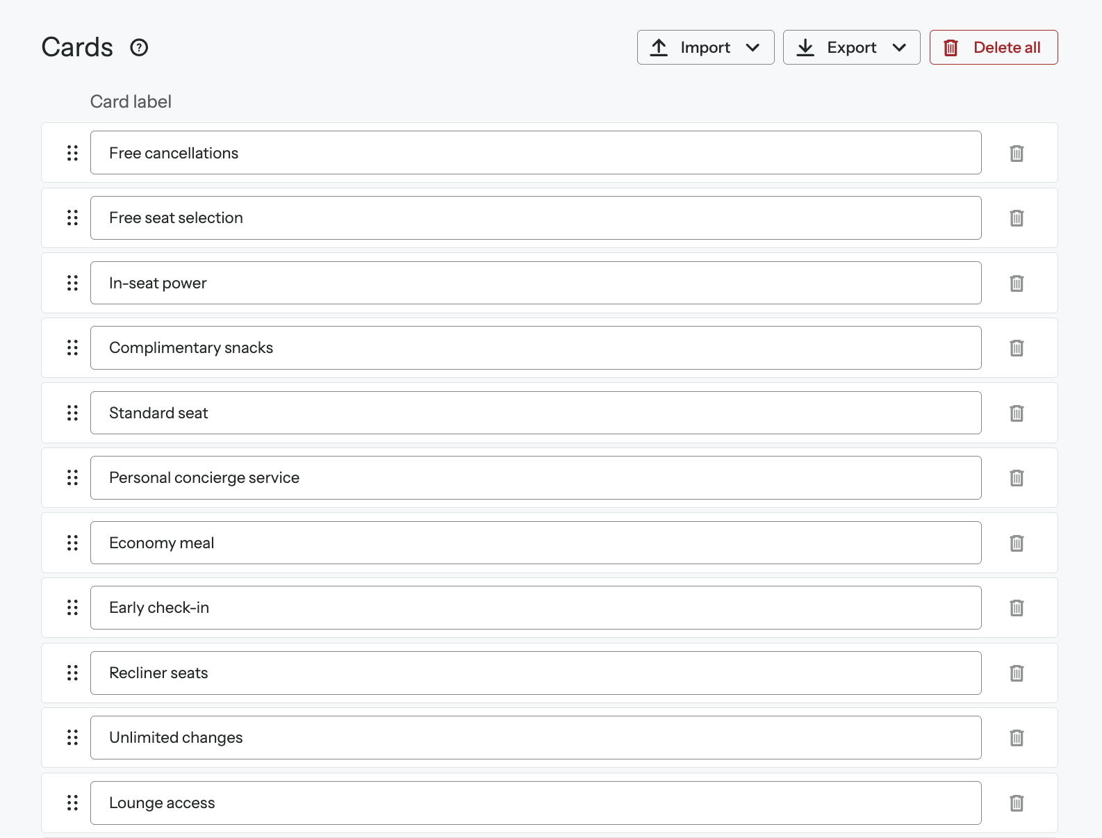
And look like this to your study participants:
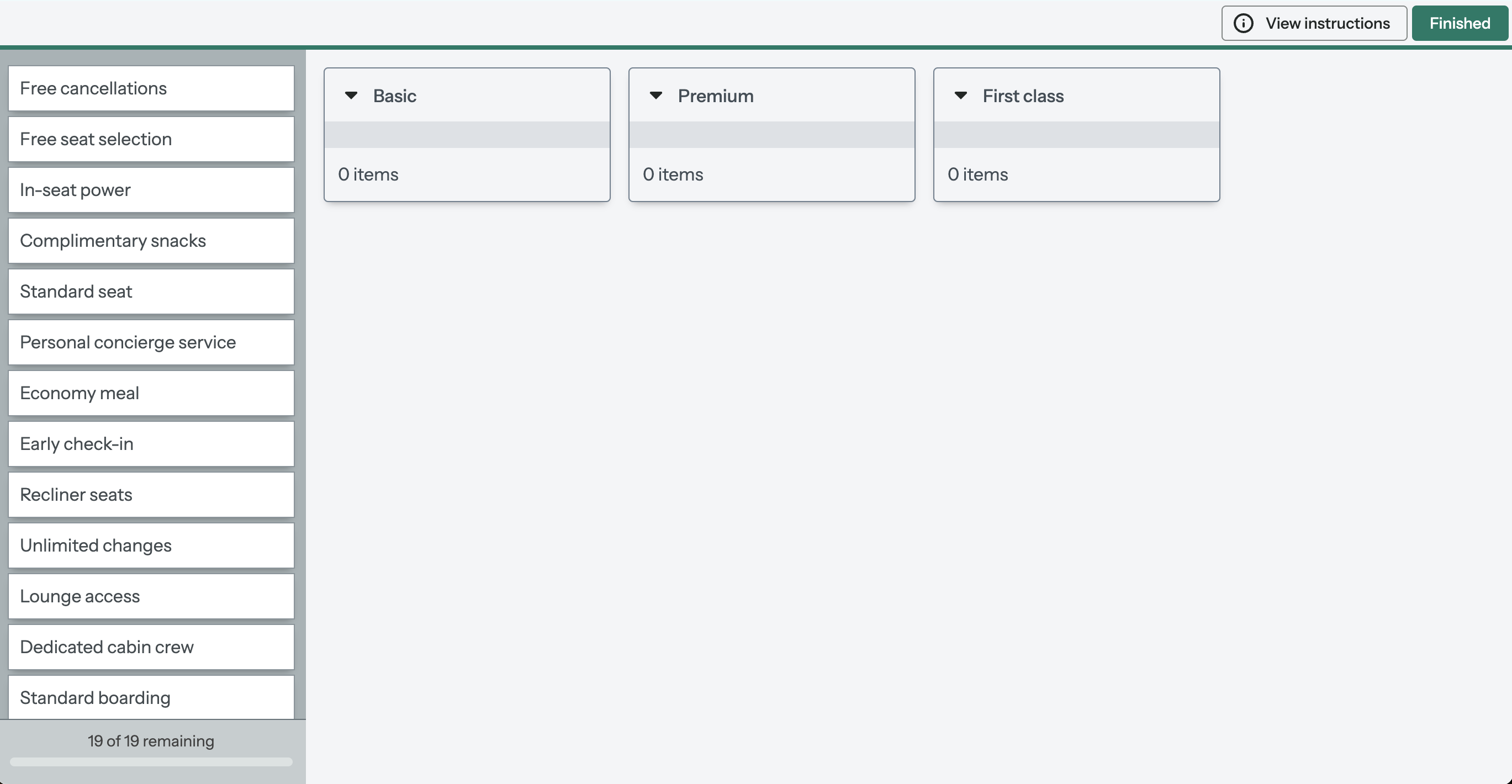
What kinds of card sorting are there?

There are three approaches to card sorting: open, closed and hybrid. Which approach you use will depend on what you want to find out. We’ll go into further detail on each method below, but here’s a high-level introduction to how they work:

  • Open card sort: Participants sort cards into groups that make sense to them, and label each group themselves
  • Closed card sort: Participants sort cards into groups you give them
  • Hybrid card sort: Participants sort cards into groups you give them, and can create their own groups as well.

When should I do a card sort?

Card sorting is most useful when you’ve already got the information or content you need to organize, but you’re just not sure exactly how to organize it.

Using the city council website as an example, you want to redesign how information is grouped together across the entire site. Card sorting will help you discover where people would commonly expect to find a category on your website.

You simply present them with a list of cards containing the names of items, concepts or labels and have users sort them into groups that make sense to them.

While card sorting is typically used in the early stages of the design process, when there’s no fixed information architecture (IA), it’s also common to use the technique to make changes to an  IA, later down the line.

Card sorting techniques and when to use them

The three card sorting techniques — open, closed, and hybrid — will each tell you something different about how people understand and group your information. Choosing the right technique at the right time is key to gathering high-quality, relevant data to inform your design decisions.

It’s also the best place to start. Let’s take a deep dive into each of the card sorting methods…

Introduction to card sorting

Remember that you are the one who is doing the thinking, not the technique… you are the one who puts it all together into a great solution. Follow your instincts, take some risks, and try new approaches.
Donna Spencer (the creator of the card sorting methodology)

Card sorting is a research technique that helps you discover how people understand and categorize information, and ensures you create an information architecture that matches users’ expectations. In a card sort, participants sort labeled cards into groups. You can then use the results of your participants’ card sorts to give you ideas about how to group and label the information on your website* in a way that makes the most sense to your audience.

Card sorting is useful when you want to:

  • design a new website or section of a website, or improve an existing website
  • find out how your customers expect to see information or content grouped on your website
  • discover and compare how people understand different concepts or ideas
  • get people to rank or arrange items based on set criteria.

*We’ve used the word ‘website’ here and throughout this guide, but you could be organizing information in an app, an intranet, a TV program guide, a form, a board game or anything where information might be organized in a structure to make sense.

What does card sorting look like?

Card sorting involves creating a set of cards that each represent a concept or item, and asking people to group the cards in a way that makes sense to them.

Let’s say you’re working on redesigning a city council website and you want to understand how your users categorize the different content and information that will be on the site. You’ll add in a bunch of cards (these could be text or images, but more on that later) which will look like this in setup:

And look like this to your study participants:

What kinds of card sorting are there?

There are three approaches to card sorting: open, closed and hybrid. Which approach you use will depend on what you want to find out. We’ll go into further detail on each method below, but here’s a high-level introduction to how they work:

  • Open card sort: Participants sort cards into groups that make sense to them, and label each group themselves
  • Closed card sort: Participants sort cards into groups you give them
  • Hybrid card sort: Participants sort cards into groups you give them, and can create their own groups as well.

When should I do a card sort?

Card sorting is most useful when you’ve already got the information or content you need to organize, but you’re just not sure exactly how to organize it.

Using the city council website as an example, you want to redesign how information is grouped together across the entire site. Card sorting will help you discover where people would commonly expect to find a category on your website.

You simply present them with a list of cards containing the names of items, concepts or labels and have users sort them into groups that make sense to them.

While card sorting is typically used in the early stages of the design process, when there’s no fixed information architecture (IA), it’s also common to use the technique to make changes to an  IA, later down the line.

Card sorting techniques and when to use them

The three card sorting techniques — open, closed, and hybrid — will each tell you something different about how people understand and group your information. Choosing the right technique at the right time is key to gathering high-quality, relevant data to inform your design decisions.

It’s also the best place to start. Let’s take a deep dive into each of the card sorting methods.

Open card sort

In an open card sort, participants sort your cards into groups that make sense to them, and then label the groups themselves. An open card sort is the equivalent of an open-ended question in a traditional study, in that people can give any answer, and are not confined to one type of response.

An open card sort is helpful when you’re starting to design a new website or starting to improve one you already have.

Conduct an open card sort to:

  • find out how people understand and conceptualize your information
  • find out where people expect to find information when they land on your website
  • generate ideas for how to structure and label your website information
  • establish if your different user groups think in different ways about your information.

Looking at the city council website redesign as an example, you would run an open card sort to find out how visitors would group items or information, and which labels they would use to describe those groups.

The image below shows a participant partway through the open card sort (with four categories and three labeled, so far):

Other use cases for open card sorts

There are a number of different use cases for conducting open card sorts, but here are a few of the most popular ones:

Validate (or find improvements for) your current website structure


Create an open card sort with your current website items or topics and see if people organize the information in the same way you have structured it.

Do your participants’ groupings and categories more or less match your current structure? Great! You probably don’t need to make too many changes, or any at all.

Are their groups and categories different to your current structure? This is a sign that you might need to look at adapting your structure, or you might need to create a brand new one, to better match your users’ mental models.

Discover the best way to categorize your blog content


Create an open card sort with your blog tags to find out how your readers would expect to see your blog content categorized, and how they conceptualize what you publish.

The way you categorize your articles internally might not always match how your readers do, so it’s helpful to understand where they’d expect to find your blog posts.

Get ideas for grouping the products in your online store
Create cards with images of your products, this will show you what products your customers expect to find in the same place on your ecommerce website.

Get ideas on categorizing your help center or intranet
Create an open card sort with the titles of your help articles to find out how your customers expect to see the articles grouped and labeled in your help center. You could also do the same thing for your internal intranet or wiki.

Closed card sort

In a closed card sort, you give people groups to sort the cards into. This time, instead of trying to find out how people conceptualize your information, you want to know where people think information belongs within your conceptual framework.

Conduct a closed card sort to:

  • find out if people agree on where your information is best placed within existing categories
  • pinpoint unclear or misleading category labels based on mixed results and fix them
  • reduce the number of categories you have based on which categories are ignored the most.

Using the city council website as an example, we created a closed card sort to find out if people understood the category labels and agreed on which topics or items belonged where.

The image below is what participants see when they first get into the closed card sort:

They will then move the cards into the categories they think the cards belong in. Below is an image of someone partway through the card sort:

Some researchers have found it useful to add an ‘I’m not sure’ category to capture cards with labels that confuse participants. We’d caution against doing this in all cases as how audiences respond can vary. Some less-engaged audiences may use this as a means to under-think their card sort response. You may be better off employing a hybrid card sort where people are given a full set of categories, but can make an ‘I’m not sure’ category if they need to. (see below for further details.)

Other use cases for closed card sorts

There are so many ways you can use closed card sorts, here are a few use cases to get you thinking about how they could be useful for you:

Find out what content people find most valuable on your site or app


Create cards with topics from your homepage or your search filters, like this restaurant review app, and create categories like ‘Very important’ and ‘Not important’ to find out what people most want to access when they arrive on your site.

Discover how people view your company and its values


Create cards with company values adjectives and set categories like “Our company is” and “Our company is not” to find out how your customers and clients perceive you, and compare it with the data you gather from staff and colleagues.

Get fast feedback on your designs


Create cards with the different versions of a design you’re working on, and ask people to sort them into categories like ‘My favorite design’ and ‘My least favorite design’.

We have even seen our customers use closed card sorts to decide whether photographs or illustrations on cards ‘fit’ the new corporate identity. Respondents drag pictures to groups titled ‘fits  new brand’ ‘doesn’t fit new brand’.

And here are some more ideas…

  • Simplify the content on your landing pages: Get participants to sort topics on your homepage into categories based on how often they use them – at least once a day, once a week, never, etc.
  • Validate what you should work on next: Customers are usually very willing to give feedback on what sort of products or features they want to see. Give them cards based on new features and ask them to group them by “I want this!” to “This isn’t useful”.
  • Find out what actions people take, when: Perhaps you want to sort content according to the time of year they’d do things. You could find out when people are more likely to take vacations, do their taxes, or make big purchases by getting them to group cards into monthly categories.

Hybrid card sort

In a hybrid card sort, you give people categories to sort your cards into and allow them to create their own categories as well.

Though it is distinct enough from open and closed card sorting to warrant its own approach, a hybrid card sort will be ‘more open’ or ‘more closed’, depending on the number and type of categories you create.

When to use hybrid card sorting instead of open card sorting

When you set far fewer categories than people need to sort all the cards, your hybrid card sort will lean towards open. This means people will be less likely to use your categories and more likely to create new categories to complete the card sort.

Run a hybrid card sort like this if you:

  • want to generate ideas for grouping your information and want to give people a category pattern to take inspiration from
  • see high agreement on some categories after an open card sort, but need clarity on some less certain groupings.

When to use hybrid card sorting instead of closed card sorting

When you set enough categories for people to sort all the cards into, your hybrid category will lean towards closed. This means people will be more likely to sort the cards into your categories only, and less likely to create new categories.

Run a hybrid card sort like this if you:

  • are happy with the groupings and labels you have, but want people to have the option to suggest their own just in case
  • want to find out if participants come up with category labels that are better than the ones you have
  • want to avoid the risk of people ‘making do’ with categories they may not wholly agree with.

In our city council example, we wanted to generate ideas for grouping topics, and we chose a hybrid card sort instead of an open card sort because we:

  • had high agreement on some categories that we felt made sense, but were less certain on others
  • wanted people to keep our agreed-upon categories in mind when they created their own.

In this image, you can see the four categories we gave people, and the participant has added three of their own (the ones where the title is underlined):

Hybrid card sorting results are the same as open card sorting results because you’re allowing people to create and name their own categories, but your set categories will be standardized to replicate how they’re analyzed in a closed card sort.

You’ll approach hybrid card sorting results with questions like:

  • How many people agree on where cards belong in your set categories?
  • What new categories did people create, and are they better than yours?
  • Did people create categories similar to the ones we gave them, or did they take a different approach?

Introduction to card sorting

Remember that you are the one who is doing the thinking, not the technique… you are the one who puts it all together into a great solution. Follow your instincts, take some risks, and try new approaches.
Donna Spencer (the creator of the card sorting methodology


Card sorting is a research technique that helps you discover how people understand and categorize information, and ensures you create an information architecture that matches users’ expectations. In a card sort, participants sort labeled cards into groups. You can then use the results of your participants’ card sorts to give you ideas about how to group and label the information on your website* in a way that makes the most sense to your audience.

Card sorting is useful when you want to:

  • design a new website or section of a website, or improve an existing website
  • find out how your customers expect to see information or content grouped on your website
  • discover and compare how people understand different concepts or ideas
  • get people to rank or arrange items based on set criteria.

*We’ve used the word ‘website’ here and throughout this guide, but you could be organizing information in an app, an intranet, a TV program guide, a form, a board game or anything where information might be organized in a structure to make sense.

What does card sorting look like?

Card sorting involves creating a set of cards that each represent a concept or item, and asking people to group the cards in a way that makes sense to them.

Let’s say you’re working on redesigning a city council website and you want to understand how your users categorize the different content and information that will be on the site. You’ll add in a bunch of cards (these could be text or images, but more on that later) which will look like this in setup:

And look like this to your study participants:

What kinds of card sorting are there?

There are three approaches to card sorting: open, closed and hybrid. Which approach you use will depend on what you want to find out. We’ll go into further detail on each method below, but here’s a high-level introduction to how they work:

  • Open card sort: Participants sort cards into groups that make sense to them, and label each group themselves
  • Closed card sort: Participants sort cards into groups you give them
  • Hybrid card sort: Participants sort cards into groups you give them, and can create their own groups as well.

When should I do a card sort?

Card sorting is most useful when you’ve already got the information or content you need to organize, but you’re just not sure exactly how to organize it.

Using the city council website as an example, you want to redesign how information is grouped together across the entire site. Card sorting will help you discover where people would commonly expect to find a category on your website.

You simply present them with a list of cards containing the names of items, concepts or labels and have users sort them into groups that make sense to them.

While card sorting is typically used in the early stages of the design process, when there’s no fixed information architecture (IA), it’s also common to use the technique to make changes to an  IA, later down the line.

Card sorting techniques and when to use them

The three card sorting techniques — open, closed, and hybrid — will each tell you something different about how people understand and group your information. Choosing the right technique at the right time is key to gathering high-quality, relevant data to inform your design decisions.

It’s also the best place to start. Let’s take a deep dive into each of the card sorting methods…

How to create your first-click test

How many cards should I use?

We recommend aiming for between 30 and 60 cards for all card sorts because:

  • you’ll get enough useful data to make informed decisions about your content
  • you’ll only be able to include the most relevant cards, and be forced (nicely) to discard the rest
  • participants will be more likely to complete your card sort.

There are some caveats though…

For an open card sort, 30 to 50 cards will usually account for the complexity of the task and the depth of thought you want from people. You need to balance the need to keep the time commitment to around 10 to 15 minutes with the need to provide sufficient context (enough similar cards) for groups to form.

Closed card sorts with easy grouping options (yes/no/maybe decisions) tend to require less depth of thought and more automatic responses, so going well beyond 60 cards can work really well.

You can create more cards if you’d like to, and set OptimalSort to give a random subset of cards to each participant.

Limiting the number of cards people see in any single card sort

OptimalSort allows you to limit the number of cards from the total set that each person sees when completing a card sort. The temptation is to have lots of cards in your total set and show each person a tiny percentage of the cards. We don’t recommend this because by breaking a sort into a number of smaller sorts, you are in effect conducting many separate sorts. We recommend, if you want to limit the number of cards for participants, ensure that each participant sees 80-90% of the cards. You will also need to increase the number of people who respond.

What should I put on my cards?

The biggest decision to make when creating any card sort is what to put on your cards. Start by opening a spreadsheet or document and collecting all the possible concepts or items you could include in your card sort. Once you have all your ideas on hand, you’ll reduce and refine the possibilities until you’re left with only the most relevant cards.

To come up with your list of possibilities, you could:

  • brainstorm and mind map all the different information you want to include on your website
  • get your hands on documentation, like a sitemap, org chart, or product inventory
  • complete a content audit of your website or knowledge base and only select the most relevant items or article titles
  • get a list from stakeholders telling you exactly what they want to see
  • study your intended customers to find out the kinds of information they’d find useful
  • research what similar organizations (or even competitors) have on their websites.

Create a concept or item that can be grouped  


Card sorting tests concepts, not usability – your goal is to discover how people think about and make sense of your information, not whether or not they can find it quickly on a homepage.

The cards themselves don’t need to be written in the most ‘usable’ format, or exactly as they are on your website. Jakob Nielsen points out that “It’s OK to actually reduce the usability of the cards, because people don’t actually use them in the UI [user interface]”.

The cards need to be on the same conceptual level and similar enough for participants to actually be able to sort them into groups. By conceptual level, we mean that if you want people to sort grocery items, you won’t include the higher level category ‘Vegetables’ as a card at the same time as the lower-level ‘Carrots’:

In her book on card sorting, Donna Spencer is firm on the importance of making sure all cards are actually groupable. She cites the example of a 100-card card sort she tested with a colleague before taking it to a client. Her colleague was unable to create coherent groups because the cards were inconsistent and often unrelated, and therefore the card sort couldn’t “provide much insight into how the content could be grouped on the site”.

The solution? She recommends reviewing your card sort with this in mind to make sure “each item…could have a potential partner (or many partners)”. Ask someone to test it out for you (which you can do by sharing a study preview link with people in your team).

And if you find a card that is difficult to partner with any others, but that you think is valuable to your study, follow Donna’s lead: “On a recent sort, I deliberately included three cards I didn’t really need… so participants would have some cards that were easy to group… [to give] participants the confidence to proceed to more difficult groupings.”

Avoid patterns in words, casing and structures


When you ask people to complete a card sort, you’re asking them to look for and create patterns with your cards. The human mind is so fond of pattern-finding that we use it regularly as a shortcut when making decisions, especially on intellectually-taxing tasks.

For user research, this is one of the great strengths of card sorting, and one of its biggest pitfalls. If you include enough cards with the same opening phrases, casings, and sentence structures, it’s likely that most people will group them together — but instead of them approaching it conceptually, they’ve quickly, and without realizing it, played a simple game of Snap.

Jakob Nielsen illustrates the issue with these example cards, that are written the way they would be on a website, but that offer too-obvious pairings:

To solve this, Nielsen recommends editing your labels using synonyms and non-parallel structures, an approach that doesn’t need to involve extensive rewrites. Instead of ‘Harvesting strawberries’, we could say ‘Picking strawberries’; and instead of two cards that begin with planting, you could make their structures different by labeling one ‘Planting corn’ and another ‘Wheat planting’.

Including images on your cards


Images can be as effective as text for representing concepts and items, and in some cases more so. You can include images to illustrate or clarify the text on your cards, or you can include images on their own.

You might choose to add images to your cards if you:

  • have products your customers will expect to see as images, like clothes, appliances, and furniture
  • design portfolio or photography websites and want ideas for grouping images
  • want to find out what people think of your sketches or designs.

In OptimalSort, you can upload JPEG or PNG files of any size, and each image will be resized to a maximum width of 200px. Resize all your images before you upload them if you want them to be the same size, and preview your card sort to make sure it looks how you want it to. Giving each image a descriptive label will make your analysis easier.

How to create categories for closed or hybrid card sorts

When you’re creating a closed or hybrid card sort, take care to craft categories that help you achieve your objectives.

For closed card sorts, you need to create enough categories that people can find a home for your cards. Try not to add too many categories that match your intentions for your website or research questions. The more categories you create, the more options participants will have, and the more likely it’ll be that you find out which categories are preferred over others.

When you run closed and hybrid card sorts, the categories you set will lead people to think about your cards in a particular way, whether it’s on purpose or not.

For example, if you run an open card sort with 40 cards containing grocery items, you might find that some people group the items by type (vegetables, fruit, dairy) and some by meal (breakfast, lunch, dinner). If you run a hybrid card sort with even just one category, most people will take your lead: Set the category ‘Vegetables’ and most people will create the category ‘Fruit’.

The number and type of categories you set for a hybrid card sort will determine whether the card sort is more open or more closed:

  • When you set fewer categories, participants are more likely to create their own, and thus it will tend towards open.
  • When you set more categories, enough for people to find a home for every card, they’re less likely to create their own categories, and thus it will tend towards closed.

Recruit participants

Since one of the goals of card sorting is to get inside the minds of the people you design for, take time to establish, recruit, and manage participants that will give you the most true-to-life data. For card sorting participants, we recommend:

  • sourcing participants that represent the demographics of your intended users
  • including moderated participants for qualitative data

How to source participants

You can recruit participants in a bunch of different ways, and how you do so will depend on a few different factors. If you have access to a pool of participants (like employees if you’re working on an internal product, or your customer mailing list) then sending them an email invitation, along with an incentive or chance to win a prize, can be a useful way to get responses. Similarly, you could invite people via your social media channels or add banners to your website.

Keep in mind that if people don’t receive an incentive or are not obligated to participate, you’ll need to invite a whole lot more people than your minimum required.

If you’re recruiting participants via the above sources, we always recommend using a screener survey to make sure you only receive responses from participants that meet your criteria. You can read more about creating a screener survey here.

You can also make use of high-quality recruitment panels, which can be effective if you want fast, pain-free options with minimal effort. You can recruit participants from quite specific demographics, and be confident that the participants will take your study seriously (they are getting paid, after all).

After you’ve launched your card sort you’ll be given the option to recruit participants via our integrated panel from within your Optimal Workshop account. You’ll then enter your required demographics and be presented with a quote based on the types of participants and the complexity of your study. After hitting ‘Go’, you can sit back and watch the results come in while you get on with other work.

Recommended number of participants

Running an open card sort with OptimalSort is a generative exercise: the results give you lots of ideas of how you could label and organize your website content. Therefore, the quantitative numbers you need for techniques like tree testing and first-click testing may not be your objective. Instead, you’ll want enough completed card sorts to get ideas and see consensus forming, but not so many that you’re overwhelmed with the data.

Also, keep in mind that the more participants you have completing your card sort, the more complex your analysis might be – it’s a lot easier to narrow your results down to an effective structure from 40 different categorizations than it is from 200 different categorizations.

If you want to gather as many suggested categorizations as you can, though, don’t be afraid to recruit more than 50 participants.

Introduction to card sorting

Remember that you are the one who is doing the thinking, not the technique… you are the one who puts it all together into a great solution. Follow your instincts, take some risks, and try new approaches.
Donna Spencer (the creator of the card sorting methodology


Card sorting is a research technique that helps you discover how people understand and categorize information, and ensures you create an information architecture that matches users’ expectations. In a card sort, participants sort labeled cards into groups. You can then use the results of your participants’ card sorts to give you ideas about how to group and label the information on your website* in a way that makes the most sense to your audience.

Card sorting is useful when you want to:

  • design a new website or section of a website, or improve an existing website
  • find out how your customers expect to see information or content grouped on your website
  • discover and compare how people understand different concepts or ideas
  • get people to rank or arrange items based on set criteria.

*We’ve used the word ‘website’ here and throughout this guide, but you could be organizing information in an app, an intranet, a TV program guide, a form, a board game or anything where information might be organized in a structure to make sense.

What does card sorting look like?

Card sorting involves creating a set of cards that each represent a concept or item, and asking people to group the cards in a way that makes sense to them.

Let’s say you’re working on redesigning a city council website and you want to understand how your users categorize the different content and information that will be on the site. You’ll add in a bunch of cards (these could be text or images, but more on that later) which will look like this in setup:

And look like this to your study participants:

What kinds of card sorting are there?

There are three approaches to card sorting: open, closed and hybrid. Which approach you use will depend on what you want to find out. We’ll go into further detail on each method below, but here’s a high-level introduction to how they work:

  • Open card sort: Participants sort cards into groups that make sense to them, and label each group themselves
  • Closed card sort: Participants sort cards into groups you give them
  • Hybrid card sort: Participants sort cards into groups you give them, and can create their own groups as well.

When should I do a card sort?

Card sorting is most useful when you’ve already got the information or content you need to organize, but you’re just not sure exactly how to organize it.

Using the city council website as an example, you want to redesign how information is grouped together across the entire site. Card sorting will help you discover where people would commonly expect to find a category on your website.

You simply present them with a list of cards containing the names of items, concepts or labels and have users sort them into groups that make sense to them.

While card sorting is typically used in the early stages of the design process, when there’s no fixed information architecture (IA), it’s also common to use the technique to make changes to an  IA, later down the line.

Card sorting techniques and when to use them

The three card sorting techniques — open, closed, and hybrid — will each tell you something different about how people understand and group your information. Choosing the right technique at the right time is key to gathering high-quality, relevant data to inform your design decisions.

It’s also the best place to start. Let’s take a deep dive into each of the card sorting methods…

Analysis Overview and Participants tabs

In her book on card sorting, Donna Spenser helpfully distinguishes between exploratory analysis (when you look through your data to get impressions, pull ideas out, and be intuitive and creative in your approach) and statistical analysis (when it’s all about the numbers).

You’ll get great insights from both.

Overview tab

The Overview tab is a good place to start your analysis. It gives you the big picture information you need about your card sort. It updates in real-time so you and anyone you’ve shared your results with can see progress in terms of participants’ completion rates and the average time it took them to complete the study.

When analyzing open or hybrid card sorts, you’ll see a section called ‘Categories’ down the bottom of the Overview tab. This shows you the range, and median number, of categories created overall by participants. This gives you an idea of the number of groups ‘necessary’ to make sense of your content. If a lot of people are making 10 or more categories, this is a reasonable indication that your cards may have been hard to group. You should explore further analysis options in OptimalSort to see if other evidence backs this up.

Participants tab

The table on the Participants tab displays useful information about every participant who started your card sort, and can be used to filter your data. At any time during your card sort or analysis, you can:

  • review your participants, and include or exclude individuals based on their card sorts
  • segment and reload your results to view only card sorting data from individuals or groups.

Filtering relies upon you having asked survey questions when creating your study. Many researchers will ask some demographic or job role questions or might ask preference questions. They can then slice the data they get back by whether the respondent was ‘a junior developer or a senior developer’, for example.

Cleaning your data

Before you start analysis it is important to review your participants and decide whether any need excluding. This is your chance to remove suspicious responses – and your own test responses if you have left them here (We’ve all done it. Set yourself a reminder to clean your data!) – before you begin the process of analysis. Suspicious responses might have ‘nonsense’ grouping names (if this is an open card sort) or have cards only placed in one group. Suspicious responses might also have been completed in impossibly quick times – less than a minute, for example.

You may decide to exclude incomplete sorts – particularly those that have only one or two cards ‘sorted’.

Cards tab

The Cards tab shows you how each card was interpreted and categorized by your participants. You can see at a glance which cards were most commonly sorted into similar categories and which were split across different categories.

It can also help to identify where your participants agree, where they have different ideas and potentially if there were card labels that they didn’t understand.

Looking at the Frequency column, you’ll get a clear idea of how many times each card was sorted into a particular category.

In the example above, you can see that all participants except one thought they’d find “Effects of climate change on our city” in the Environment category. This means you can be confident that Environment is definitely the right place for this topic to live.

Categories tab and the Standardization grid

Categories tab

The Categories tab is a great doorway into your card sorting results. Spend a few minutes scanning the groups that people came up with and you’ll quickly form an impression of how they are thinking (how they perceived the overall theme or concept of your cards).

In an open card sort, the table displays all groups created by your participants and the cards they placed in each group. For a hybrid card sort, you’ll see the same, but with the addition of the categories you created as well. And in a closed card sort, you’ll obviously see just the categories you

pre-set.

Open and hybrid card sorts

You’ll explore your open and hybrid card sorting results to get ideas for labeling and grouping your information, so kick off your analysis with these questions in your head:

  • What logic do participants follow in the groups they’ve created?
  • What cards do people always put together in the same group?
  • What cards are never put together, and are thus considered conceptually different by all participants?
  • What kinds of labels do people suggest for representing your information?

Standardizing your categories


Standardizing categories means merging similar categories together to turn them into one category.

In the first column of the Categories table, you’ll see a number of different categories that have been created. If it’s an open card sort, all the categories will be ones that your participants have created. If it’s a hybrid card sort, you’ll see the categories you created in bold with a blue line.

When you allow participants to come up with their own category names, there’s a good chance you’ll see similar labels that have variations in wording, spelling, capitalizations, and so on. Furthermore, when you take a closer look at the cards, you can often deduce that different participants mean exactly the same thing by their category labels.

Standardizing your categories is an optional activity;  you don’t have to group all of the similar categories to be able to use the other visualizations that OptimalSort provides. Some researchers find standardizing an important activity to do as it means they actively engage with their users’ decisions. When merging categories they are forced to think about how users have created groups, what they have put in them and what mental models might exist to have driven those decisions.

If you are time-pressured or you prefer to rely on the other analysis visualizations, then not standardizing is an option. Just remember, that to get the best out of your card sort you need to think about how and why your users have sorted cards in the way they have, whichever visualizations you refer to.

Before you eye up a bunch of similar-looking labels and standardize straight away, it’s important to look at the similarities between the categories in more depth.

Here’s what we recommend:

Look for similar words or phrases: The categories table is initially arranged alphabetically, so you’ll be able to see similar categories next to each other by just glancing through the table. You can sort the table and the elements in the table rows, using the sort options at the top of the table columns. You can also use search to display only categories that contain keywords.

In the example below, you can see that there are two categories we could standardize – “City info” and “City information” – as both include some of the same cards.

Establish if participants mean the same thing by their labels: If you find you’ve got a number of categories that have the same or similar labels, make sure you take a closer look before hitting ‘Standardize’. You want to ensure that the distinct categories you’re about to merge are similar enough to become one.

Two options for approaching this are:

  • Looking closely at the group labels people have created and the cards in each category.
    Are the group names that similar? For example it’s likely that ‘Products & services’ and ‘Products’ mean very different things for people who created them.
    Are the cards in the groups you intend to merge congruent? If one of two ‘About us’ groupings contains the contact details, the blogs, newsletters and so on and the other grouping doesn’t then, again, are they the same thing?  
  • Checking the ‘agreement score’ as you are creating a standardized category.
    This essentially achieves the same thing as reviewing the cards in the categories you intend to merge, but uses mathematics and is less subjective.

Both approaches complement each other.

Check the agreement score of your standardized categories: As noted, when we place every category that uses the same words or phrases into a standardized category, we can assess the effectiveness of the category by looking at the agreement score.

The agreement score tells you the agreement level between the cards that participants placed in each category.

In an open card sort, you’ll see a dash in place of an agreement score before standardizing, as each category has only been created by one person.

Once you standardize a category, check the agreement score to get an objective assessment of how similar the groupings are. In the example below, we can see that the agreement score for standardizing “City info” and “City information” is 68%.

Any agreement score of over 60% generally means you’ll find it useful to keep this category standardized for the rest of your analysis.

In the example below, we can see that the agreement score is only 31%.

When you see an agreement score that’s low, it means that participants are probably thinking about the categories in different ways, or may have been less discriminating when making their categories. At this point, we could reassess our merged categories.

Closed card sorts

The Categories table for a closed card sort tells you how many times a card was sorted into each given category. You’ll also find out how many unique cards were sorted into each category, with fewer unique cards (cards in a category with a frequency greater than 1) meaning higher agreement among participants.

You’ll approach closed card sorting results with questions like:

  • How many participants sorted the same cards into each category?
  • What are the cards with the highest agreement on where they belong, and what are the cards with the lowest?
  • Which categories meant different things to different people? (ie. if every card was sorted into one category at least once, then it’s obviously ambiguous).
  • What were the most popular groups?

With the closed card sort categories results, you could:

  • use the top three cards that appear most often in a given category as examples for what belongs there on your actual website
  • pinpoint the categories with the least agreement among participants and reword the labels
  • get quick answers on ranked items if people sorted the cards according to your ranking criteria.

The example below shows us that there is high agreement for the top cards in this category. So it’s clear that the top five topics belong in the same category.

The “Community support and resources” category (below) had 24 cards sorted into it – the highest number of unique cards in one category. This suggests that the label itself was too broad, and therefore too ambiguous for our website.

Looking at the cards in the category, we can see there are a number of cards that were possibly ambiguous to participants. it pays to look into this. Perhaps if you split the group down into two or more groups would you get more agreement? If you have produced your cards by sampling items from your current site, are there cards that you left out that might be paired with the ambiguous cards?

Another possible reason for a high number of cards reported in one category is that you have overrepresented cards from a particular area of your current site or from the IA you are planning.

Standardization grid

If you are conducting an open, or hybrid, card sort, you will see the Standardization grid tab. If you have standardized your groups in the Categories tab, head over there to see the effects of your work in more detail. The grid shows you, at a high level, the number of times a particular card appears in a standardized category.

In the example above, you can clearly see the groups that were popular – the darker the blue, the more times a card appears in the group you have made by combining users’ groups. This means we can be more confident that these groups make sense to people, and they expect to find meaningful topics or content there.

The groups that don’t have much blue in them, for example, ‘Careers’, ‘City info’ and ‘Events’ show us that people may have found these ambiguous or didn’t feel like any of the card topics belonged in these groups.

When you first land on the grid, it will be arranged alphabetically according to the card, but can rearrange it by highest to lowest, or lowest to highest for each group.

By sorting by highest card placing, you’ll get a quick view of which cards are strong contenders for that specific category.

What are the effects of standardizing?

Standardizing can take some time to do, if you have a lot of categories, so understanding the value to you of standardizing is important before you start.

Firstly , as noted above, when you standardize categories you get a clearer idea of the aggregations of cards that people are making. Basically, if the people whose groups you standardize were all sitting together, they’d be likely to say ‘I agree with what they said’. The small differences in opinion – ‘Products’ or ‘Our products’ melt away.

Secondly, when you standardize cards you affect what gets seen in some of the other visualizations – we’ll be talking about them later. If you standardize a lot of similar groupings it’s likely that when you look at the 3D Cluster view that the name you have used for the standardized category will be reported as one with ‘high agreement’. Your standardizing will also affect the category names shown when you mouse-over the Dendrogram on particular ‘branches’. Standardization does not affect the groupings presented in the Similarity Matrix, the Dendrograms, the Participant-centric analysis or the 3D Cluster view. It only affects the names of categories that might get recommended to you in the Dendrogram and 3D Cluster view.

Some of our customers express concern that by standardizing, they are somehow ‘silencing the voices’ of the people completing the card sort, as the researcher is applying their view ‘on top of’ the groupings made. This is a natural fear when conducting any research and emphasizing one fact or insight over another. We conduct research to help us make decisions. We make choices along the way that naturally affect what we learn and subsequently what we do.

Nevertheless, when standardizing groups that people have made, you are in fact amplifying voices that were previously singing alone, bringing those voices into a choir. In any case, should you feel that standardizing wasn’t for you, it can easily be undone through the ‘Unstandardize’ button.

Similarity matrix

The similarity matrix helps you identify strong card pairings and potential groupings in your open and hybrid card sorts.

It shows you the percentage of participants who grouped two cards together, and clusters the most closely related pairings along the right edge of the triangle visualization. The darker the blue and the larger the cluster, the higher the agreement between participants on which cards go together.

You could use the similarity matrix to:

  • draft a potential website structure based on the darkest clusters seen on the right-hand edge
  • quickly see which card pairings are the most common and therefore probably belong together on your website
  • quickly see which cards are very rarely paired together so you don’t need to waste time thinking they might.

To explore the similarity matrix, hover over any square to highlight the two cards and see the exact number of participants who paired them together.

The matrix below shows a number of strong clusters along the right edge, which tells us many people agreed about which cards belong together. A glance tells us this immediately, before we’ve even looked at the detail:

When we look more closely, we can find out which cards are paired together the most often:

And which cards are rarely paired together rarely, if at all:

With agreement levels like the ones in the darkest blue clusters, one option for us is to draft a set of categories based on these. And although this isn’t an exact science, we found this draft incredibly useful:

For cards that don’t have a strong cluster along the right hand side, you might want to look at rewording these topics and running another hybrid or closed card sort to see if there is any clearer clustering.

Competing mental models

Sometimes when you look at a similarity matrix you see dark blue areas along the right hand edge, as expected, but you also see dark blue areas in the body of the triangle for some of the same cards. What this is telling you is that your participants had two, or more, different overall approaches to sorting the cards that were presented: there are probably two competing mental models at play. =

In the example shown here, ‘Community funding’ and ‘Housing support’ have been grouped together a high number of times , but each of the cards has been grouped with other cards, as shown in the lower block of blue.  

Roughly comparing the percentages in the card pairings  – or comparing the shades of blue – will give an indication of how much the grouping on the right-hand edge was more prevalent than the other grouping, but this is not an exact science. Use what you can see here, and by checking the Categories tab and the PCA tab, to see if you can identify the different mental models. What was it about the card labels that led to two different approaches? If you changed the label names would this fix things?

Don’t forget that you can apply filters when viewing the similarity matrix. You might find that the two different approaches to sorting the cards relate to two different user audiences. This is why we’d recommend adding some pre-test survey questions to your study, so that you have something to slice and dice your data by.

Dendrograms

A dendrogram is a type of diagram used to represent hierarchical clustering of objects or data points – it’s a way to quickly spot popular groups of cards, and to get a general sense of how similar (or different) your participants’ card sorts were to each other.

You have two dendrograms to explore, which you’ll find more or less useful depending on the number of completed card sorts you have.

  • Got more than 30 participants? The Actual Agreement Method (AAM) dendrogram gives you the data straight: “X% of participants agree with this exact grouping”.
  • Got fewer than 30 participants? The Best Merge Method (BMM) tells you “X% of participants agree with parts of this grouping”, and so enables you to extract as much as you can from the data.

Help center article

The Actual Agreement Method (AAM)

The AAM dendrogram is best for studies that have more than 30 participants. It depicts only factual relationships – it shows the percentage of participants who agree with the grouping of the cards.

Below you’ll see an example of a study conducted with 72 participants, where we asked them to group items they’d find on a department store website. As you hover and move the mouse along, you can see the different agreement scores for the card grouping.

We can see that 74% of participants agree that Backpack and Duffle Bag belong together in either the “Bags” or “Travel” category – these are labels created by the participants – or by you when you standardized –  who grouped those cards together (they’re just suggestions, but are more accurate the higher the agreement).

This data gives us ideas for how we could group and label that particular content on our website.

Moving out, we can see that 37% of participants agreed that Cooler/Lunch Box, Water Bottle, Backpack, and Duffle Bag belonged together in the categories “On the go”, “Bag to go”, or “Bags”. so , there is less agreement, less surety. Maybe there is a better name you can think of that might aid agreement? Maybe if you remove something, there would be more agreement? What’s the thing that’s less congruent? Think about that.

The Best Merge Method (BMM)

The BMM dendrogram is better for studies with smaller participant numbers (usually less than 30). Unlike the AAM which shows only factual relationships, the BMM makes assumptions about larger clusters based on pair relationships, and tells you the percentage of participants that agree with parts of the grouping. Thus, if I grouped six cards together and you grouped five of them plus another, BMM might say ‘close enough’ and represent these as all grouped together. The algorithm is filling in for the limited number of respondents by making assumptions about clusters.

Essentially, by compromising and extrapolating on the data, it helps you squeeze the most out of small or incomplete responses.

Other than being more appropriate for smaller numbers of responses, the process of using the BMM dendrogram is otherwise the same.

Participant-Centric Analysis (PCA)

At its heart, PCA is a powerful way of seeing trends in your data, based upon the card sorts conducted by individual people in your study. You get to see the card sorts – the IAs – that other IAs are most like. So the ones shown in PCA are the ‘strongest’ in terms of agreement.  

How PCA works

Behind the scenes this is what is happening:

The card parings that one person made are compared with the card pairings that another person made. You can pair a card more than once, of course – if there are three cards in a group you make then there are three parings (AB, AC, CB), so there’s usually a lot of pairings to compare.

When two different people’s card sorts contain 50% or more of the same card pairings, – regardless of the group they’ve placed the cards in – then the two IA ‘support’ each other.

By repeatedly checking these pairing matchings for all the people who did your study we can work out which of the IAs that participants made are the most ‘supported’.

The labels that people apply to their groupings are ignored when comparing the pairings, but they are separately analyzed and offered as suggestions for the categories against the most popular IAs

In the example below, our first IA says ‘Similar IAs 37/50’., This means 37 participants out of a total of 50 paired the same cards together at least 50% of the time. The PCA is showing us this particular IA because it’s the one with the most ‘support’ from the other 36 participants. We could comfortably base our initial draft IAs for our website on a PCA result with this level of agreement. If you want to go and check the full IA of the most supported person, you can see their participant number (#16). Go to the Participants tab and check them out!

The other two IAs shown work in the same way. The three IAs are distinct from each other because they don’t support each other (as in, fewer than 50% of card pairings in one IA matches the card pairings in the other two.) If you have good agreement across each of the IAs, the PCA gives you three different ‘views’ on your data; three ideas of how you could arrange it in your eventual IA. A good way to think of this is; three possible trees to test with a tree test!

The PCA is therefore a very powerful way to get to the most compelling mental models at play and in combination with the similarity matrix can show the strength of opinion on card pairings.

What happens if you see low levels of agreement?

If you see low levels of agreement for the 3 IAs (for example, 1/15 participant sorts were similar to this IA) this shows that none of the participants’ sorts are similar to each other. That is, each of the 15 participants have come up with different categories and grouped their cards in different ways.

To address this, your first approach might be to recruit more participants to get a better sample size and see if more people come up with similar card sorts. Otherwise, you can focus your analysis on the other visualizations, like the similarity matrix and the actual agreement method (AAM) dendrogram, but ultimately a lack of agreement might indicate that your cards were unsortable, i.e. they did not fit any sensible recognisable pattern for users. Remember, an important consideration for any card sort, according to Donna Spencer, is that the cards are sortable!

3D cluster view

Overview

The 3D cluster view (3DCV) visualizes the similarity between cards as three-dimensional spatial relationships. Each point in the visualization represents an individual card. Cards that are closer together were more frequently sorted into the same category. The further apart that any two cards appear, the less frequently they were sorted together.

Polygons are shown over groups of cards that are clustered together. Each of these groups can be interpreted as a potential category within an information architecture. You’ll also see suggested category labels for each group. These are derived from looking at how many participants created similar categories to a particular group and comparing the most common labels that participants gave these categories. If you have standardized your users’ groups, the labels you have applied to the standardized groups will likely be suggested.

The 3DCV combines aspects of both the similarity matrix and the dendrograms by visualizing the similarity between cards and potential groupings of cards. The difference between 3DCV and these analysis approaches is that 3DCV provides a new perspective of card sort results by presenting these relationships in three-dimensional space.

How 3DCV works

The 3D Cluster view is a form of Multidimensional Scaling (MDS). MDS is a technique that translates a table of similarities between pairs of cards into a map where distances between the points match the similarities as much as possible. Similar cards are closer together, dissimilar cards are further apart.

Of course, the relative similarities between all of the cards in a sort do not exist on the same scale; it’s multidimensional. In our case, the distance matrix can be derived from the similarity matrix where each point in the dataset is an individual card. This means that a card sort with 50 cards would generate a 50 by 50 distance matrix, resulting in 50 dimensions (your brain is probably hurting at this point). The trick that MDS pulls off is to present these multitudes of dimensions in a simplified set of dimensions we can view – i.e. in 3D.

In more technical terms, it uses a function minimization algorithm that evaluates different configurations with the goal of maximizing the ‘goodness of fit’. All of those similarity pairings are presented as a set of points in 3D space that are close to, or distant from each other.

Having done this we have lots of dots in a 3D space. Now we want to see if we can spot any clustering groups in those dots.

We then use a hierarchical clustering method to separate the cards into a hierarchy of groups, similar to the structure of a dendrogram. Groups are divided in a way that ensures that the most similar cards are grouped together. Each level of the hierarchy corresponds to the number of groups displayed. At the top level there is one group containing all of the cards, at the second level there are two groups that together contain all of the cards, and so on.

Navigating the hierarchy

The grouping slider on the 3D Cluster view changes the level of the hierarchy that is currently displayed.

Why are 8 groups (in this example) suggested? This is because the median number of categories that your users created was 8. If you remember, you can see that from the Overview tab.

Clicking on a group will show you the cards within that group and also the category labels that are similar to the cluster. These labels are the ones that your users applied to groupings or that you applied when you standardized your users’ groupings.

Merging and splitting

Instead of navigating the hierarchy with the groupings slider, you can select a specific group and ‘split’ it into two. You typically might do this if you think it is too big or spans too great a distance between cards, or because you think this might present a better opportunity for the eventual hierarchy you are going to make.

You can also ‘merge’ clusters. When you ‘merge’, select a group and the algorithm will merge that group with the next-closest group.

Results Matrix for closed card sorts

The Results Matrix shows you the number of times each card was sorted into your pre-set categories. The darker the blue, the more times a card appears in the corresponding category. The number of participants is also displayed (not the percentages).

The Results Matrix tells you pretty quickly which cards had the highest and lowest agreement between participants on where the cards were best placed.

The stand-out dark blue boxes on this matrix tell us straight away that we have high agreement between participants on where cards belong – for example, ‘Art exhibitions’ and ‘Arts programs and funding’ in the ‘Arts and culture’ category.

When a card is placed in one category significantly more than any other, you can be confident that the information should be in that category in your eventual IA.

When a card is placed in one category more than others, but still appears, say, at least five times in any other category, your decision about where to include the information on your actual website will be less straightforward. It will be up to you what your number thresholds are. Remember that being an information architect is a blend of science and art. As Donna Spencer says: ‘…Follow your instincts, take some risks, and try new approaches.’

Sometimes you’ll see a card row that contains numbers in every column and not much blue shading. When you see this, there’s not much agreement between your participants about where the information belongs.

It may be that the card label is quite general, and could logically belong in many of the categories. Or that the card is ambiguous, and so people had to guess about where it belonged. It will be up to you to establish why this might be.

Popular placements matrix for closed card sorts

The popular placements matrix shows the percentage of participants who sorted each card into the corresponding category, and attempts to propose the most popular groups based on each individual card’s highest placement score.

In this matrix, we can see that the clustered groups contain cards with very high agreements between participants, which gives a good indication that the groupings are a good place for us to start when coming up with our initial draft IA.

Note that ‘Art exhibitions’ card has been placed in ‘Art and culture’ 100% of the time. This is probably correct, but an observant information architect might suspect that participants are simply matching the ‘Art – ‘ card with the ‘Art – ‘ category, in other words, pattern matching.

It is always good to apply this level of critical thinking when reviewing the results of a card sort – and when creating your study in the first place, so that you can avoid these kinds of ‘gotchas’.

Remember that you are the one who is doing the thinking, not the technique… you are the one who puts it all together into a great solution. Follow your instincts, take some risks, and try new approaches.
Donna Spencer

PreviousNext