Subscribe to OW blog for an instantly better inbox
Oops! Something went wrong while submitting the form.
Articles and Podcasts on Customer Service, AI and Automation, Product, and more

In our Value of UX Research report, nearly 70% of participants identified analysis and synthesis as the area where AI could make the biggest impact.
At Optimal, we're all about cutting the busywork so you can spend more time on meaningful insights and action. That’s why we’ve built automated Insights, powered by AI, to instantly surface key themes from your survey responses.
No extra tools. No manual review. Just faster insights to help you make quicker, data-backed decisions.
Automated Insights are just one part of our ever-growing AI toolkit at Optimal. We're making it easier (and faster) to go from raw data to real impact, such as our AI Simplify tool to help you write better survey questions, effortlessly. Our AI assistant suggests clearer, more effective wording to help you engage participants and get higher-quality data.
Ready to level up your UX research? Log into your account to get started with these newest capabilities or sign up for a free trial to experience them for yourselves.

The AI landscape is undergoing a profound transformation. While generative AI has captured public imagination with its ability to create content, a new paradigm is quietly revolutionizing how we think about human-computer interaction: Agentic AI.
Unlike traditional software that waits for explicit commands or generative AI focused primarily on content creation, Agentic AI represents a fundamental shift toward truly autonomous systems. These advanced AI agents can independently make decisions, take actions, and solve complex problems with minimal human oversight. Rather than simply responding to prompts, they proactively work toward goals, demonstrating initiative and adaptability that more closely resembles human collaboration than traditional software interaction.
This evolution is already transforming industries across the board:
As these autonomous systems become more prevalent, designing exceptional user experiences for them becomes not just important, but essential. The challenge? Traditional UX approaches built around graphical user interfaces and direct manipulation fall short when designing for AI that thinks and acts independently.
Interacting with Agentic AI represents a fundamental departure from conventional software experiences. The predictable, structured nature of traditional GUIs—with their buttons, menus, and visual feedback—gives way to something more fluid, conversational, and at times, unpredictable.
The ideal Agentic AI experience feels less like operating a tool and more like collaborating with a capable teammate. This shift demands that UX designers look beyond the visual aspects of interfaces to consider entirely new interaction models that emphasize:
The core challenge lies in bridging the gap between users accustomed to direct manipulation of software and the more abstract interactions inherent in systems that can think and act independently. How do we design experiences that harness the power of autonomy while maintaining the user's sense of control and understanding?
The foundation of effective Agentic AI design begins with deep user understanding. Expectations for these autonomous agents are shaped by prior experiences with traditional AI assistants but require significant recalibration given their increased autonomy and capability.
Several research methodologies prove particularly valuable when designing for autonomous agents:
User Interviews provide rich qualitative insights into perceptions, trust factors, and control preferences. These conversations reveal the nuanced ways users think about AI autonomy—often accepting it readily for low-stakes tasks like calendar management while requiring more oversight for consequential decisions like financial planning.
Usability Testing with Agentic AI prototypes reveals how users react to AI initiative in real-time. Observing these interactions highlights moments where users feel empowered versus instances where they experience discomfort or confusion when the AI acts independently.
Longitudinal Studies track how user perceptions and interaction patterns evolve as the AI learns and adapts to individual preferences. Since Agentic AI improves through use, understanding this relationship over time provides critical design insights.
Ethnographic Research offers contextual understanding of how autonomous agents integrate into users' daily workflows and environments. This immersive approach reveals unmet needs and potential areas of friction that might not emerge in controlled testing environments.
Effective research for Agentic AI should focus on several fundamental dimensions:
Perceived Autonomy: How much independence do users expect and desire from AI agents across different contexts? When does autonomy feel helpful versus intrusive?
Trust Factors: What elements contribute to users trusting an AI's decisions and actions? How quickly is trust lost when mistakes occur, and what mechanisms help rebuild it?
Control Mechanisms: What types of controls (pause, override, adjust parameters) do users expect to have over autonomous systems? How can these be implemented without undermining the benefits of autonomy?
Transparency Needs: What level of insight into the AI's reasoning do users require? How can this information be presented effectively without overwhelming them with technical complexity?
The answers to these questions vary significantly across user segments, task types, and domains—making comprehensive research essential for designing effective Agentic AI experiences.
Designing for autonomous agents requires a unique set of principles that address their distinct characteristics and challenges:
Effective Agentic AI interfaces facilitate natural, transparent communication between user and agent. The AI should clearly convey:
Just as with human collaboration, clear communication forms the foundation of successful human-AI partnerships.
Agentic AI should provide meaningful feedback about its operations and make it easy for users to provide input on its performance. This bidirectional exchange enables:
The most effective agents make feedback feel conversational rather than mechanical, encouraging users to shape the AI's behavior through natural interaction.
How an autonomous agent handles mistakes significantly impacts user trust and satisfaction. Effective error handling includes:
The ability to gracefully manage errors and learn from them is often what separates exceptional Agentic AI experiences from frustrating ones.
Users need intuitive mechanisms to guide and control autonomous agents, including:
The level of control should adapt to both user expertise and task criticality, offering more granular options for advanced users or high-stakes decisions.
Effective Agentic AI provides appropriate visibility into its reasoning and decision-making processes without overwhelming users. This involves:
Transparency builds trust by demystifying what might otherwise feel like a "black box" of AI decision-making.
Perhaps the most distinctive aspect of Agentic AI is its ability to anticipate needs and take initiative, offering:
When implemented thoughtfully, this proactive assistance transforms the AI from a passive tool into a true collaborative partner.
For users to embrace autonomous agents, they need to understand and trust how these systems operate. This requires both transparency (being open about how the system works) and explainability (providing clear reasons for specific decisions).
Several techniques can enhance these critical qualities:
From a UX perspective, this means designing interfaces that:
The goal is to provide the right information at the right time, helping users understand the AI's behavior without drowning them in technical details.
The dynamic, learning nature of Agentic AI makes traditional "design once, deploy forever" approaches inadequate. Instead, successful development requires:
This ongoing cycle of design, testing, and refinement ensures Agentic AI continuously evolves to better serve user needs.
Several existing applications offer valuable lessons for designing effective autonomous systems:
Autonomous Vehicles demonstrate the importance of clearly communicating intentions, providing reassurance during operation, and offering intuitive override controls for passengers.
Smart Assistants like Alexa and Google Assistant highlight the value of natural language processing, personalization based on user preferences, and proactive assistance.
Robotic Systems in industrial settings showcase the need for glanceable information, simplified task selection, and workflows that ensure safety in shared human-robot environments.
Healthcare AI emphasizes providing relevant insights to professionals, automating routine tasks to reduce cognitive load, and enhancing patient care through personalized recommendations.
Customer Service AI prioritizes personalized interactions, 24/7 availability, and the ability to handle both simple requests and complex problem-solving.
These successful implementations share several common elements:
Designing user experiences for Agentic AI represents a fundamental shift in how we think about human-computer interaction. The evolution from graphical user interfaces to autonomous agents requires UX professionals to:
The future of UX in this space will likely explore more natural interaction modalities (voice, gesture, mixed reality), increasingly sophisticated personalization, and thoughtful approaches to ethical considerations around AI autonomy.
For UX professionals and AI developers alike, this new frontier offers the opportunity to fundamentally reimagine the relationship between humans and technology—moving from tools we use to partners we collaborate with. By focusing on deep user understanding, transparent design, and iterative improvement, we can create autonomous AI experiences that genuinely enhance human capability rather than simply automating tasks.
The journey has just begun, and how we design these experiences today will shape our relationship with intelligent technology for decades to come.
At Optimal, we believe in the transformative potential of AI to accelerate your workflow and time to insights. Our goal is simple: keep humans at the heart of every insight while using AI as a powerful partner to amplify your expertise.
By automating repetitive tasks, providing suggestions for your studies, and streamlining workflows, AI frees you up to focus on what matters most—delivering impact, making strategic decisions, and building products people love.
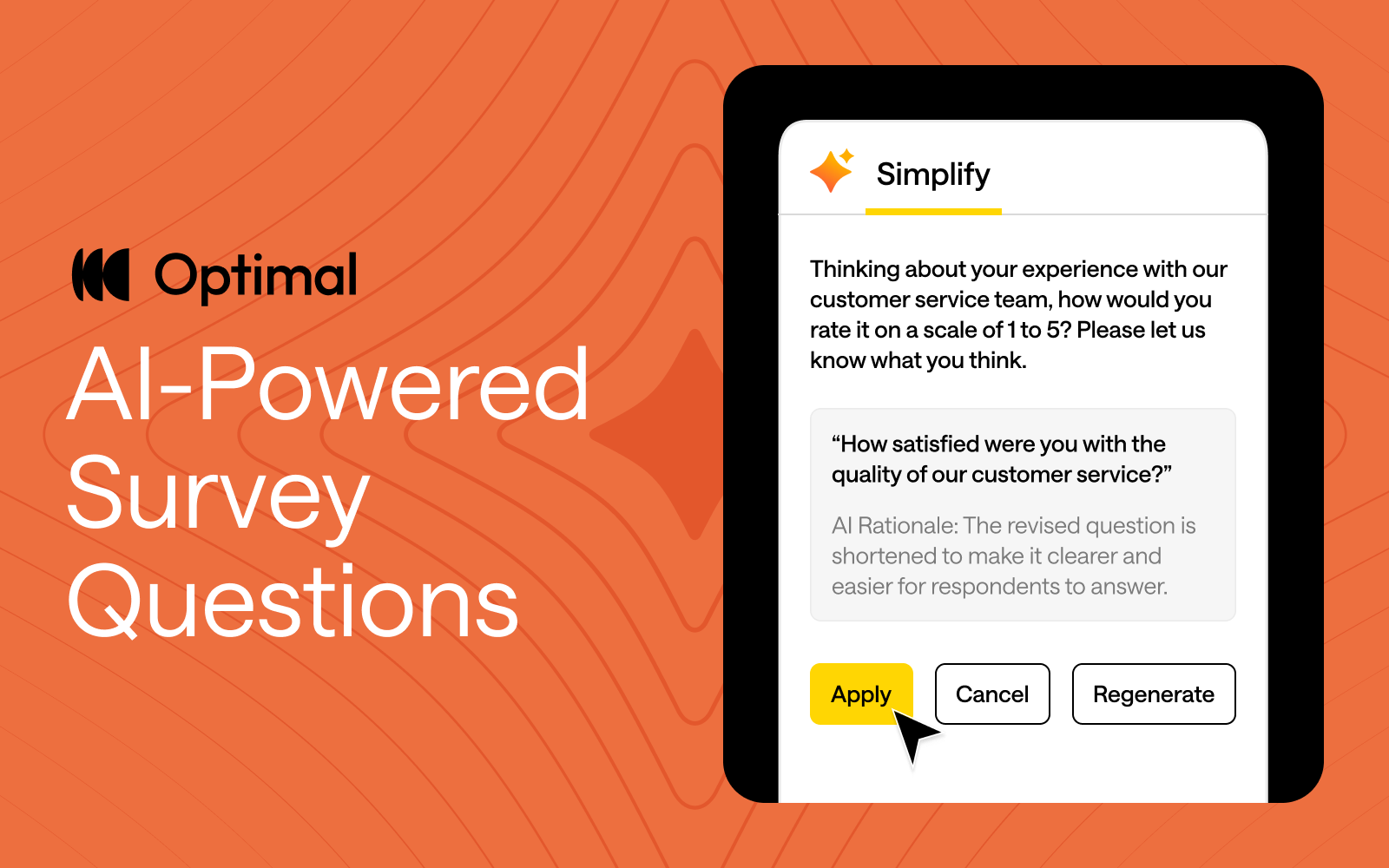
That’s why we’re excited to announce our latest AI feature: AI-Powered Question Simplification.
Ambiguous or overly complex wording can confuse respondents, making it harder to get reliable, accurate insights. Plus, refining survey and question language is manual and can be a time-consuming process with little guidance. To solve this, we built an AI-powered tool to help study creators craft questions that resonate with participants and speed up the process of designing studies.
Our new AI-powered feature helps with:
Apply AI-Powered Question Simplification to any of your survey questions or to screening questions, and pre- and post-study questions in prototype tests, surveys, card sorts, tree tests, and first-click tests.

AI is at the forefront of our innovation at Optimal this year, and we’re building AI into Optimal with clear principles in mind:
Keep an eye out for more updates throughout 2025 as we continue to expand our platform with AI-powered features that help you uncover insights with speed, clarity, and more confidence.
Want to see how AI can speed up your workflow?
Apply AI-Powered Question Simplification today or check out AI Insights to experience it for yourself!

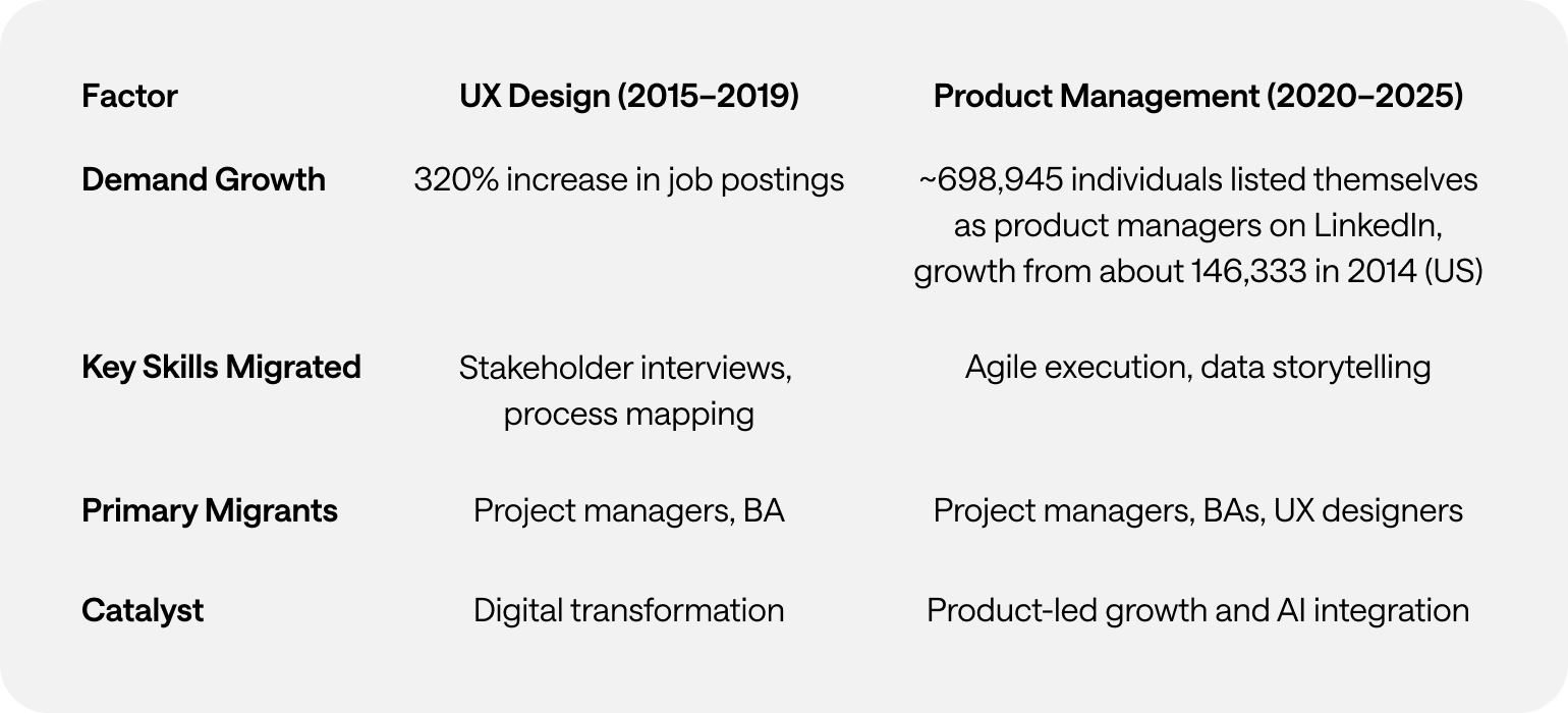
The skills market has a familiar whiff to it. A decade ago, digital execs scratched their heads as great swathes of the delivery workforce decided to retrain as User Experience experts. Project Managers and Business Analysts decided to muscle-in on the creative process that designers insisted was their purview alone. Win for systemised thinking. Loss for magic dust and mystery.
With UX, research and design roles being the first to hit the cutting room floor over the past 24 months, a lot of the responsibility to solve for those missing competencies in the product delivery cycle now resides with the T-shaped Product Managers, because their career origin story tends to embrace a broader foundation across delivery and design disciplines. And so, as UX course providers jostle for position in a distracted market, senior professionals are repackaging themselves as Product Managers.
The skills market has a familiar whiff to it. A decade ago, Project Managers (PMs) and Business Analysts (BAs) pivoted into UX roles in their droves, chasing the north star of digital transformation and user-centric design. Now? The same opportunities to pivot are emerging again—this time into Product Management.
And if history is anything to go by, we already know how this plays out.
Between 2015 and 2019, UX job postings skyrocketed by 320%, fueled by digital-first strategies and a newfound corporate obsession with usability. PMs and BAs, sensing the shift, leaned into their adjacent skills—stakeholder management, process mapping, and research—and suddenly, UX wasn’t just for designers anymore. It was a business function.
Fast-forward to 2025, and Product Management is in the same phase of maturation and despite some Covid-led contraction, bouncing back to 5.1% growth. The role has evolved from feature shipping to strategic value creation while traditional project management roles are trending towards full-stack product managers who handle multiple aspects of product development with fractional PMs for part-time or project-based roles.
📈 Job postings for product management roles grew by 41% between 2020 and 2025, compared to a 23% decline in traditional project management roles during the same period (Indeed Labor Market Analytics).
📉 The demand for product managers has been growing, with roles increasing by 32% yearly in general terms, as mentioned in some reports.
💰 Salary Shenanigans: Product Managers generally earn higher salaries than Business Analysts. In the U.S., PMs earn about 45% more than BAs on average ($124,000 vs. $85,400). In Australia, PMs earn about 4% to 30% more than BAs ($130,000 vs. $105,000 to $125,000) wave.
Same pattern. Different discipline.
👀 Outputs vs. Outcomes – PMs think in deliverables. Transitioning PMs struggle to adjust to measuring success through customer impact instead of project completion.
🛠️ Legacy Tech Debt – Outdated tech stacks can lead to decreased productivity, integration issues, and security concerns. This complexity can slow down operations and hinder the efficiency of teams, including product management.
😰 Imposter Syndrome is Real – New product managers feel unqualified, mirroring the self-doubt UX migrants felt in 2019. Because let’s be honest—jumping into product strategy is a different beast from managing deliverables.
🏆 Structured Reskilling – Programs like Google’s "PM Launchpad" reduce time-to-proficiency for new PMs. Enterprises that invest in structured career shifts will win the talent war.
📊 Hybrid Role Recognition – Expect to see “Analytics-Driven PM” and “Technical Product Owner” job titles formalising this shift, much like “UX Strategist” emerged post-2019.
🚀 AI Will Accelerate the Next Migration – As AI automates routine PM/BA tasks, expect even more professionals to pivot into strategic product roles. The difference? This time, the transition will be even faster.
Tech talent moves in cycles. Product Management is simply the next career gold rush for systems thinkers with a skill for structure, process, and problem-solving. A structural response to the evolution of tech ecosystems.
Companies that recognise and support this transition will outpace those still clinging to rigid org charts. Because one thing is clear—the talent migration isn’t coming. It’s already here.
This article was researched with the help of Perplexity.ai

User Experience (UX) research has always been about people. How they think, how they behave, what they need, and—just as importantly—what they don’t yet realise they need. Traditional UX methodologies have long relied on direct human input: interviews, usability testing, surveys, and behavioral observation. The assumption was clear—if you want to understand people, you have to engage with real humans.
But in 2025, that assumption is being challenged.
The emergence of digital twins and synthetic users—AI-powered simulations of human behavior—is changing how researchers approach user insights. These technologies claim to solve persistent UX research problems: slow participant recruitment, small sample sizes, high costs, and research timelines that struggle to keep pace with product development. The promise is enticing: instantly accessible, infinitely scalable users who can test, interact, and generate feedback without the logistical headaches of working with real participants.
Yet, as with any new technology, there are trade-offs. While digital twins may unlock efficiencies, they also raise important questions: Can they truly replicate human complexity? Where do they fit within existing research practices? What risks do they introduce?
This article explores the evolving role of digital twins in UX research—where they excel, where they fall short, and what their rise means for the future of human-centered design.
For decades, UX research has been grounded in methodologies that involve direct human participation. The core methods—usability testing, user interviews, ethnographic research, and behavioral analytics—have been refined to account for the unpredictability of human nature.
This approach works well, but it has challenges:
In short: traditional UX research provides depth and authenticity, but it’s not always fast or scalable.
Digital twins and synthetic users aim to change that.
While the terms digital twins and synthetic users are sometimes used interchangeably, they are distinct concepts.
A digital twin is a data-driven virtual representation of a real-world entity. Originally developed for industrial applications, digital twins replicate machines, environments, and human behavior in a digital space. They can be updated in real time using live data, allowing organisations to analyse scenarios, predict outcomes, and optimise performance.
In UX research, human digital twins attempt to replicate real users' behavioral patterns, decision-making processes, and interactions. They draw on existing datasets to mirror real-world users dynamically, adapting based on real-time inputs.
While a digital twin is a mirror of a real entity, a synthetic user is a fabricated research participant—a simulation that mimics human decision-making, behaviors, and responses. These AI-generated personas can be used in research scenarios to interact with products, answer questions, and simulate user journeys.
Unlike traditional user personas (which are static profiles based on aggregated research), synthetic users are interactive and capable of generating dynamic feedback. They aren’t modeled after a specific real-world person, but rather a combination of user behaviors drawn from large datasets.
Think of it this way:
Both approaches are still evolving, but their potential applications in UX research are already taking shape.
The appeal of AI-generated users is undeniable. They can:
These capabilities make digital twins particularly useful for:
However, digital twins and synthetic users are not a replacement for human research. Their effectiveness is limited in areas where emotional, cultural, and contextual factors play a major role.
For all their promise, digital twins and synthetic users introduce new challenges.
Rather than viewing digital twins as a replacement for human research, the best UX teams will integrate them as a complementary tool.
The future of UX research is not about choosing between AI and human research—it’s about blending the strengths of both.
Digital twins and synthetic users are exciting, but they are not a magic bullet. They cannot fully replace human users, and relying on them exclusively could lead to false confidence in flawed insights.
Instead, UX researchers should view these technologies as powerful, but imperfect tools—best used in combination with traditional research methods.
As with any new technology, thoughtful implementation is key. The real opportunity lies in designing research methodologies that harness the speed and scale of AI without losing the depth, nuance, and humanity that make UX research truly valuable.
The challenge ahead isn’t about choosing between human or synthetic research. It’s about finding the right balance—one that keeps user experience truly human-centered, even in an AI-driven world.
This article was researched with the help of Perplexity.ai.
.webp)
2025 is already proving to be an exciting year for UX research, and we’re just getting started! With a range of new features and updates that empower teams to move from design to decisions faster, Optimal is bringing the best tools to the table for everyone and making research accessible across all teams. Let’s dive into what’s already here and what's coming next!
Video Recording for Prototype Testing
We’re excited to announce that the closed beta for video recording for prototype testing has launched. By capturing screen, audio, and/or video, this feature takes research beyond metrics to give you a deeper understanding of user intent and pain points. Our Optimal Recruitment service also ensures you connect with the right participants for video recording, driving meaningful insights from the start.
New Study Flow for Faster Study Creation
Say hello to the new Study Flow, an intuitive tab that helps to accelerate study creation, combining the Messages & instructions and Questionnaire tabs into one. Visualize every step of the participant’s journey, from the welcome screen to the final thank-you message with the Study Flow panel. Save time by quickly duplicating questions across Surveys and other study types. Navigate through studies with ease by collapsing and expanding sections as needed.
Dashboard & Templates Library
We’re working to make research more accessible for everyone with the release of 15+ new templates designed to help Optimal users get started quickly. No matter which team you’re on, these use-case focused, ready-to-use templates will set you on the fast track. Use them to preview the participant experience or clone the recommended study and tailor for your own use.
Here’s a sneak peek at some exciting features in the works:
AI-Powered Survey Question Simplification
We’re unleashing an AI-powered feature to help users simplify complex question wording and improve clarity. Users can quickly accept, reject, or regenerate more suggestions with a click. By improving clarity and simplifying your questions, you’ll gather more accurate, higher-quality insights that drive better results.
This AI feature is available for surveys questions as well as screening, pre and post study questions for surveys, prototype tests, card sorts, tree tests and first-click tests. This is just the beginning of even more AI-driven improvements to come, all aimed at helping to accelerate your time to insights.
Advanced Logic Capabilities
We’re working on bringing more advanced logic capabilities to Optimal - one of the most highly requested features for surveys. With display logic, the study changes dynamically - showing or hiding answer options or subsequence questions based on a participant’s previous responses. Apply display logic to Surveys, screening questions, and pre- and post-study questions. This is just the beginning. We’ll be exploring additional advanced logic capabilities in 2025.
Study Creation Enhancements
Optimal will continue to improve on the new Study Flow to make study creation faster and intuitive. You’ll also gain greater flexibility with customizable sections. These upcoming updates are designed to empower you to create dynamic, tailored study experiences for different audiences, helping you unlock more valuable insights with ease.
With custom sections, you’ll be able to organize surveys and questions into distinct sections, such as demographics or product usage, to create a more structured and engaging study. These custom sections allow you to easily add, rename, reorder, duplicate, and move questions between sections.
Join Us on the Journey
Stay tuned for regular updates, and let us know how we can make your research experience even better. Have feedback or feature requests? We’d love to hear from you so we can continue to shape the future of Optimal.
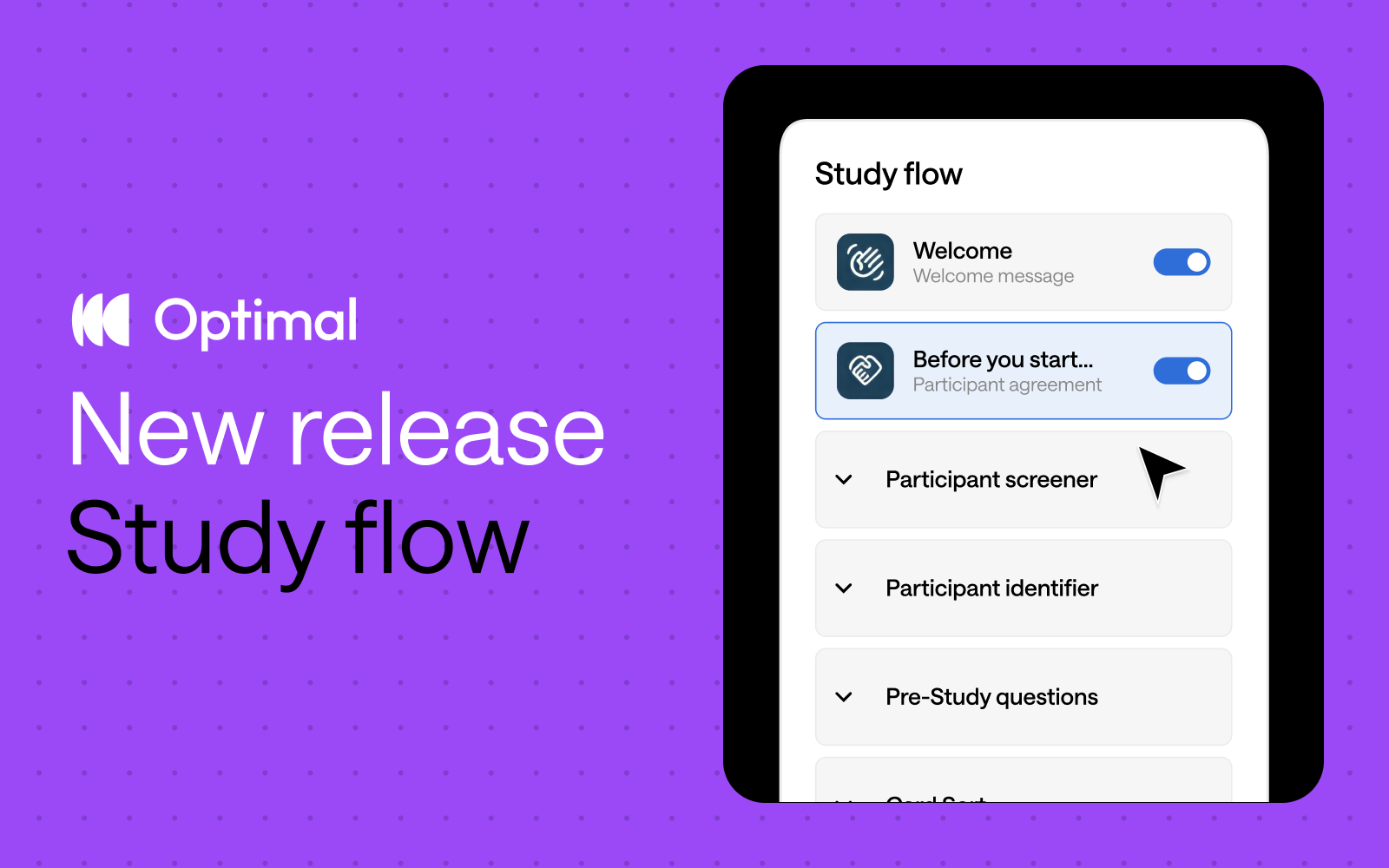
Inspired by insights from Optimal users, we’ve reimagined study creation to bring you a beautifully streamlined experience with the new Study Flow tab.
⚡ Enjoy faster study set up: Messages & instructions and Questionnaire tabs are combined in a single tab - called Study Flow - for faster editing and settings customization.
✨ See it all at a glance: Easily visualize and understand the participant experience—from the welcome message to the final thank-you screen—every step of the way.
🎯 Duplicate questions: Save time and quickly replicate questions for surveys, screening questions, and pre- and post-study questions.
⭐ Experience enhanced UI: Enjoy a modern, clean design with intuitive updates that minimize scrolling and reduce mental load.
🗂️ Collapse and expand sections: Easily navigate studies by collapsing and expanding sections, making it easier to build out specific parts of your study.
This Study Flow tab is available across all Optimal tools, except for Qualitative Insights.
We’re not stopping there. We have some significant improvements on the horizon designed to give you even greater flexibility and control.
Advanced logic: Enhanced logic capabilities is one of our most highly requested features, and we’re thrilled to introduce new capabilities to help you build your ideal study experience – available for surveys and other tools. We will first introduce “display logic”, allowing for:
Customizable sections: Organize your questions into different sections to build a better study experience for your participants. For example, segment your questions into relevant groupings, such as demographics or product usage. With custom sections, you can add new sections, rename, reorder, duplicate, and move questions between different sections.*
*Note: Questions cannot be moved to/from the screening questions section.
These upcoming features will empower you to create dynamic, tailored study experiences for different audiences with ease for more valuable insights.
Start exploring the new Study Flow now.
